-
C# Winfrom Chart 图表控件 柱状图、折线图
目录
效果


一、参考
强大的Winform Chart图表控件使用说明 - 走看看
上面这两个帖子,里面有插件具体的属性介绍,Chart 这个Winform自带的图表控件,其实就是 System.Windows.Forms.DataVisualization.DLL,之前还写过一篇相关的帖子,我还以为什么新鲜玩意儿。
二、柱状图
1.新建项目
新建一个.NET Framework 类型的 Winfrom 项目,在数据里面找到 Chart 控件,拖入到界面中

如下:

拖入控件时,默认的有一个图表的样式,实际运行其实是一片空白

有些地方,没必须完全去写代码,用自带的属性设置也是一样的好用。
2.修改图表样式
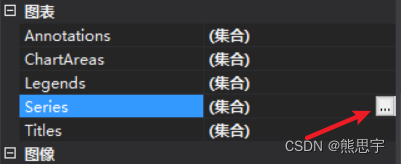
在Series这里,点击集合后面到三个点
这里可以添加图表的样式,在一个图表区域,既可以用柱状图,也可以用折线图。如果你想删除这个图标,也是可以的,看后面的介绍。
 这里可以修改图表的样式,比如柱状图,折线图
3.绑定数据
此时图表还没有任何数据,可以用绑定方式添加数据,如下
- private List<int> XList = new List<int>();
- private List<int> YList = new List<int>();
- private Random randoms = new Random();
- private void Form1_Load(object sender, EventArgs e)
- {
- for (int i = 0; i < 6; i++)
- {
- XList.Add(i);
- YList.Add(randoms.Next(10, 100));
- }
- chart1.Series["Series1"].Points.DataBindXY(XList, YList);
- }
运行后如下

上图有两个问题,
1.柱状图没有显示具体数据,根本看不出来实际数据是多少,
2.背景的网格没有去掉,样式比较难看,
用代码可以解决这两个问题
- private List<int> XList = new List<int>();
- private List<int> YList = new List<int>();
- private Random randoms = new Random();
- //private int index = -1;
- private void Form1_Load(object sender, EventArgs e)
- {
- chart1.ChartAreas[0].AxisX.MajorGrid.LineDashStyle = ChartDashStyle.NotSet; //设置网格类型为虚线
- chart1.ChartAreas[0].AxisY.MajorGrid.LineDashStyle = ChartDashStyle.Dash; //设置网格类型为虚线
- chart1.Series[0].IsValueShownAsLabel = true;//设置显示示数
- for (int i = 0; i < 6; i++)
- {
- XList.Add(i);
- YList.Add(randoms.Next(10, 100));
- }
- //写法同上面到 chart1.ChartAreas[0] 类似
- chart1.Series["Series1"].Points.DataBindXY(XList, YList);
- }
效果
此时和我们想要的效果就差不多了
4.删除Series1标记
在图表的右上角有一个方块状的标记,其实并没有什么作用

删除也很简单,在属性里选择Legends

选中Legend1,点击移除即可。

效果

5.X轴刻度值的修改
在上面的案例中,我们可以看到,x轴显示的都是1,2,3.....按顺序排列的,如果我们想自定义刻度值,要怎么做呢,其实也很简单,X轴绑定数据是string类型的就行了
代码:
- using System;
- using System.Collections.Generic;
- using System.Windows.Forms;
- using System.Windows.Forms.DataVisualization.Charting;
- namespace 统计图
- {
- public partial class Form1 : Form
- {
- public Form1()
- {
- InitializeComponent();
- }
- private List<string> XList = new List<string>();
- private List<int> YList = new List<int>();
- private Random randoms = new Random();
- private void Form1_Load(object sender, EventArgs e)
- {
- chart1.ChartAreas[0].AxisX.MajorGrid.LineDashStyle = ChartDashStyle.NotSet; //设置网格类型为虚线
- chart1.ChartAreas[0].AxisY.MajorGrid.LineDashStyle = ChartDashStyle.Dash; //设置网格类型为虚线
- chart1.Series[0].IsValueShownAsLabel = true;//设置显示示数
- for (int i = 0; i < 5; i++)
- {
- YList.Add(randoms.Next(10, 100));
- XList.Add(string.Format("第{0}号", i + 1));
- }
- chart1.Series["Series1"].Points.DataBindXY(XList, YList);
- }
- }
- }
效果:
至于Y轴要怎么去改变文字,现在还不知道,因为这个Y轴的值必须是数字,我测试过,有汉字在里面根本显示不了,有知道的大佬欢迎告诉我。
三、折线图
1.图表设置
新建一个.NET Framework 类型的 Winfrom 项目,操作同上面一致,将ChartType 这里设置成 Line,并且在Form1界面中添加一个按钮


运行以后,图表依然是一片空白

2.绑定数据
添加代码
- using System;
- using System.Collections.Generic;
- using System.Windows.Forms;
- using System.Windows.Forms.DataVisualization.Charting;
- namespace 折线图
- {
- public partial class Form1 : Form
- {
- public Form1()
- {
- InitializeComponent();
- }
- private List<int> XList = new List<int>();
- private List<int> YList = new List<int>();
- private Random randoms = new Random();
- private int index = -1;
- private void Form1_Load(object sender, EventArgs e)
- {
- chart1.ChartAreas[0].AxisX.MajorGrid.LineDashStyle = ChartDashStyle.NotSet; //设置网格类型为虚线
- chart1.ChartAreas[0].AxisY.MajorGrid.LineDashStyle = ChartDashStyle.Dash; //设置网格类型为虚线
- chart1.Series[0].IsValueShownAsLabel = true;//设置显示示数
- }
- private void button1_Click(object sender, EventArgs e)
- {
- index++;
- XList.Add(index);
- YList.Add(randoms.Next(10, 100));
- //chart1.Series[0].Points.AddXY(index, randoms.Next(10, 100));
- chart1.Series[0].Points.DataBindXY(XList, YList);
- }
- }
- }
运行后,点击添加按钮,效果如下:
这里你会发现一个问题,图中到93这个点,已经跑到顶部了,字都被挡了一半 ,这里可以用代码设置,比如,遍历整个Y轴的值,然后计算出最大值和最小值,并给chart1的Maximum,Minimum赋值,就可以让折线图居中了
chart1.ChartAreas[0].AxisY.Maximum = 200;如果你想要下面的效果,也可以参考我的帖子,虽然DLL不一样,写法基本一致,在下面的源码中也有这个案例到效果,有需要的可以支持一下我了,谢谢。
C# System.Windows.Forms.DataVisualization Demo案例_熊思宇的博客-CSDN博客_c# system.windows.forms
源码下载:点击下载
结束
如果这个帖子对你有用,欢迎 关注 + 点赞 + 留言,谢谢
end
-
相关阅读:
Morris遍历
<C++>初识多态,剖析virtual关键字
Debiased Contrastive Learning of Unsupervised Sentence Representations 论文阅读
高效技巧揭秘:Java轻松批量插入或删除Excel行列操作
typeScript类型学习
jmeter 主从配置
flutter 绘制原理探究
猿创征文|走技术创新路,展时代宏图梦
2023年:我成了半个外包
Kafka消费者Relance机制和分区机制
- 原文地址:https://blog.csdn.net/qq_38693757/article/details/125513359