-
自定义 cube-ui 弹出框dialog支持多个且多种类型的input框
start
- 最近遇到一个需求,给一个移动端项目加一点小功能。
- 移动端 UI 组件库使用的是 cube-ui。
- 但是基础的 cube-ui 不太满足我的需求…
- 重点是记录一下我的思路,其次才是实现的代码。
1. 需求
需要点击按钮弹出一个弹出框,然后再弹出框中可以输入内容,点击确定的时候,调用接口保存。
原生的 cube-ui 仅支持一个输入框,而且这个输入框类型不可控。
我接到的需求呢,是支持多个输入框,且输入框类型还不一样。
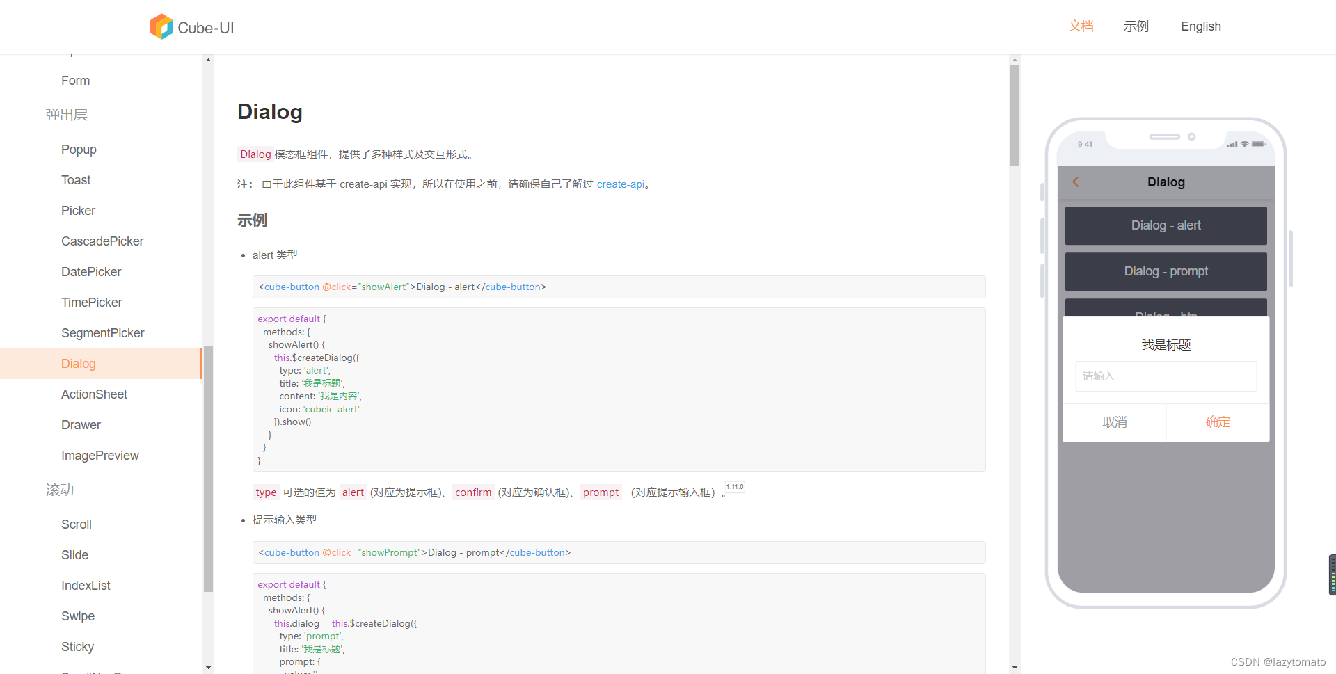
基础cube-ui的prompt弹出框效果如下图:
2. 寻找解决方案
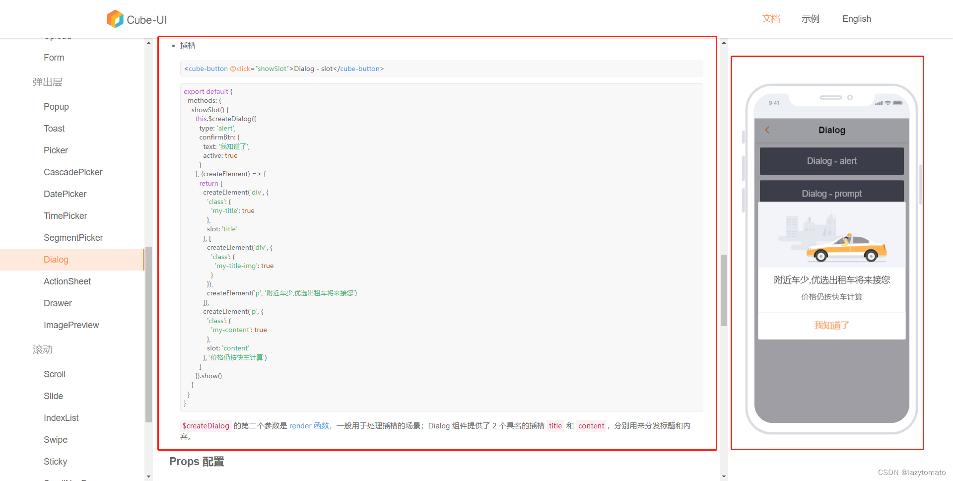
cube-ui是支持插槽的,具体的代码中createElement这个函数结构有点类似于h函数。
通过这个插槽插入文字图片什么的还是可以的。
我如果通过这个函数,向对话框中,插入几个input框。第一有点麻烦。第二可操作性有点低。
基础cube-ui的弹出框-插槽 代码以及效果如下图:
3. 最终的解决方案
正当我思索的时候,我突发奇想,先看看它的对话框源码是怎么写的。
cube-ui的dialog源码
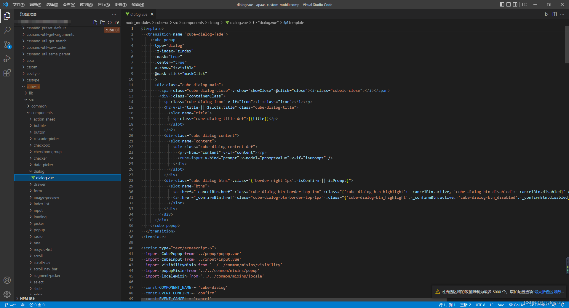
看了一眼他的源码之后,我有解决方案了。他的源码无非就是一个vue组件。我直接cv一套出来,自己加一些自己的额外定制化配置,这样不就可以符合我的需求了?
4.结果
自定义的 基于 cube-ui的一个对话框<template> <transition name="cube-dialog-fade"> <cube-popup ref="selfPopup" type="self-dialog" :z-index="zIndex" :mask="true" :center="true" @mask-click="maskClick" @click.stop="say()" > <div class="self-dialog-main cube-dialog-main" @click.stop="say()"> <!-- <span v-show="showClose" class="cube-dialog-close"> <i class="cubeic-close"></i> </span> --> <div :class="containerClass"> <h2 v-if="title || $slots.title" class="cube-dialog-title"> <slot name="title"> <p class="cube-dialog-title-def"> {{ title }} </p> </slot> </h2> <div class="cube-dialog-content"> <slot name="content"> <div v-if="promptList && promptList.length > 0" class="cube-dialog-content-def"> <div v-for="(item, index) in promptList" :key="index"> <div> {{ item.label }} </div> <div v-if="item.type === 'text' || item.type === 'number'"> <cube-input v-model="item.value" :type="item.type" :placeholder="item.placeholder" /> </div> <div v-if="item.type === 'select'"> <cube-input v-model="item.value" :type="item.type" :placeholder="item.placeholder" :readonly="true" @focus="showPicker(item, index)" /> </div> </div> </div> </slot> </div> <div class="cube-dialog-btns" :class="{ 'border-right-1px': isConfirm || isPrompt }"> <slot name="btns"> <a v-if="isConfirm || isPrompt" :href="cancelBtn.href" class="cube-dialog-btn border-top-1px" :class="{ 'cube-dialog-btn_highlight': cancelBtn.active, 'cube-dialog-btn_disabled': cancelBtn.disabled }" @click="cancel" > {{ cancelBtn.text }} </a> <a :href="confirmBtn.href" class="cube-dialog-btn border-top-1px" :class="{ 'cube-dialog-btn_highlight': confirmBtn.active, 'cube-dialog-btn_disabled': confirmBtn.disabled }" @click="confirm" > {{ confirmBtn.text }} </a> </slot> </div> </div> </div> </cube-popup> </transition> </template> <script> export default { props: { zIndex: { type: Number, default: 100 }, type: { require: true, type: String, default: 'prompt' }, title: { type: String, default: '' }, promptList: { type: Array, default() { return [] } }, cancelBtn: { type: Object, default() { return { href: 'javascript:;', active: false, disabled: false, text: '关闭' } } }, confirmBtn: { type: Object, default() { return { href: 'javascript:;', active: true, disabled: false, text: '确认' } } } }, data() { return {} }, computed: { containerClass() { return `cube-dialog-${this.type}` }, isPrompt() { return this.type === 'prompt' }, isConfirm() { return this.type === 'confirm' } }, methods: { show() { this.$refs.selfPopup.show() }, hide() { this.$refs.selfPopup.hide() }, maskClick(e) { this.maskClosable && this.cancel(e) }, confirm(e) { if (this.confirmBtn.disabled) { return } this.$emit('EVENT_CONFIRM', e, this.promptValue) }, cancel(e) { if (this.cancelBtn.disabled) { return } this.$refs.selfPopup.hide() this.$emit('EVENT_CANCEL', e) }, close(e) { this.$refs.selfPopup.hide() this.$emit('EVENT_CLOSE', e) }, showPicker(item, index) { this.picker = this.$createPicker({ title: item.label, data: [item.column], onSelect: (value, i, text) => { this.promptList[index].value = text[0] this.promptList[index].key = value[0] } // onCancel: this.cancelHandle }) this.picker.show() }, say() {} } } </script> <style> .self-dialog-main .cube-input { border: 0.071429rem solid #ebebeb !important; } .self-dialog-main .cube-input-field { padding: 0.714286rem !important; } </style>- 1
- 2
- 3
- 4
- 5
- 6
- 7
- 8
- 9
- 10
- 11
- 12
- 13
- 14
- 15
- 16
- 17
- 18
- 19
- 20
- 21
- 22
- 23
- 24
- 25
- 26
- 27
- 28
- 29
- 30
- 31
- 32
- 33
- 34
- 35
- 36
- 37
- 38
- 39
- 40
- 41
- 42
- 43
- 44
- 45
- 46
- 47
- 48
- 49
- 50
- 51
- 52
- 53
- 54
- 55
- 56
- 57
- 58
- 59
- 60
- 61
- 62
- 63
- 64
- 65
- 66
- 67
- 68
- 69
- 70
- 71
- 72
- 73
- 74
- 75
- 76
- 77
- 78
- 79
- 80
- 81
- 82
- 83
- 84
- 85
- 86
- 87
- 88
- 89
- 90
- 91
- 92
- 93
- 94
- 95
- 96
- 97
- 98
- 99
- 100
- 101
- 102
- 103
- 104
- 105
- 106
- 107
- 108
- 109
- 110
- 111
- 112
- 113
- 114
- 115
- 116
- 117
- 118
- 119
- 120
- 121
- 122
- 123
- 124
- 125
- 126
- 127
- 128
- 129
- 130
- 131
- 132
- 133
- 134
- 135
- 136
- 137
- 138
- 139
- 140
- 141
- 142
- 143
- 144
- 145
- 146
- 147
- 148
- 149
- 150
- 151
- 152
- 153
- 154
- 155
- 156
- 157
- 158
- 159
- 160
- 161
- 162
- 163
- 164
- 165
- 166
- 167
- 168
- 169
- 170
- 171
- 172
- 173
- 174
- 175
- 176
- 177
- 178
- 179
- 180
- 181
- 182
- 183
- 184
- 185
- 186
- 187
- 188
- 189
- 190
- 191
- 192
- 193
- 194
- 195
- 196
- 197
- 198
主要差异

主要差异就是对
cube-dialog-content的内容进行了扩展,支持传入配置文件进行扩展。其次就是做了一下样式兼容以及点击事件的处理。演示一下传入的 额外配置文件[ { type: 'number', value: '', require: true, label: '数量', placeholder: '数量', rules: { positiveInteger: true // 正整数 } }, { type: 'select', value: '', key: '', label: '原因', require: true, placeholder: '请选择原因', column: [ { text: '破损', value: 'A' }, { text: '丢失', value: 'B' }, { text: '其他', value: 'C' } ] }, { type: 'text', value: '', label: '其他', placeholder: '请输入' } ]- 1
- 2
- 3
- 4
- 5
- 6
- 7
- 8
- 9
- 10
- 11
- 12
- 13
- 14
- 15
- 16
- 17
- 18
- 19
- 20
- 21
- 22
- 23
- 24
- 25
- 26
- 27
- 28
- 29
- 30
- 31
end
- 当然可能目前认知有限,这个可能不是最优解。
- 但是这也是一个可以借鉴的思路,基于原本的ui组件,二次创作,满足定制化需求,也不是不可以。
- 其实我更想说的一个想法是什么,不要仅限于去使用ui框架。总是cv毫无成长。多尝试阅读源码,阅读源码不是目的,学会探究问题的本质才是终点。
- 加油 互勉。
-
相关阅读:
【超好懂的比赛题解】2022 Jiangsu Collegiate Programming Contest 比赛题解
Java数据结构与算法(最长回文子串中心扩散法)
java考点之程序看界面响应
体育赛事直播系统软件开发
shell修改永久性别名,压缩与解压缩(zip gzip bzip2)文件上传预下载(sftp)
利用jenkins直接构件docker镜像并发布
台湾通行证识别易语言代码
Cloudera Manager-6.2.0安装文档
nacos鉴权报invalid username or password
t检验(连续变量)和卡方检验(分类变量)
- 原文地址:https://blog.csdn.net/wswq2505655377/article/details/125441948