library( ggpubr)
library( rstatix)
df <- ToothGrowth
df$ dose <- as.factor( df$ dose)
head( df, 3 )
stat.test <- df %>%
group_by( dose) %>%
t_test( len ~ supp) %>%
adjust_pvalue( method = "bonferroni" ) %>%
add_significance( "p.adj" )
stat.test
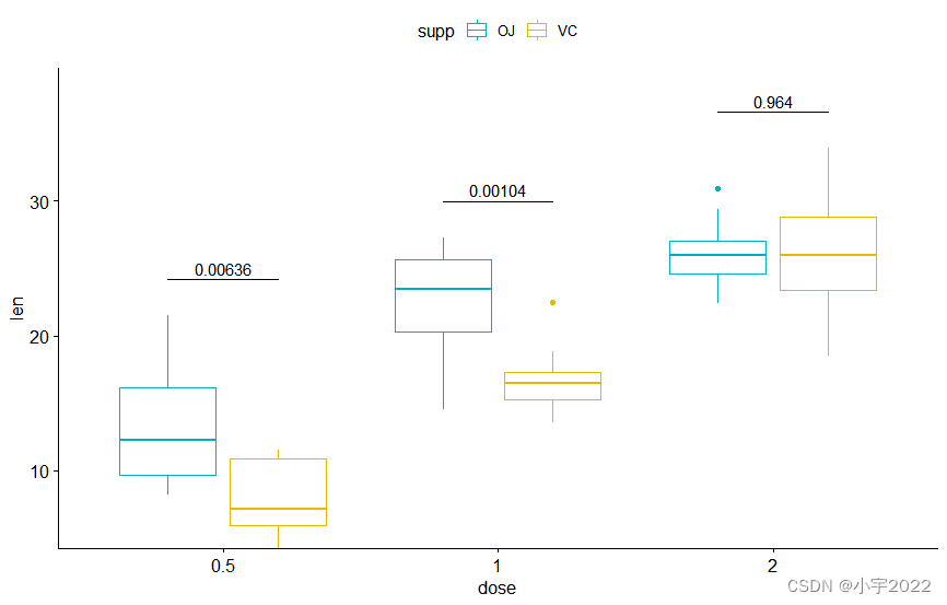
bxp <- ggboxplot(
df, x = "dose" , y = "len" ,
color = "supp" , palette = c( "#00AFBB" , "#E7B800" )
)
stat.test <- stat.test %>%
add_xy_position( x = "dose" , dodge = 0.8 )
bxp + stat_pvalue_manual(
stat.test, label = "p" , tip.length = 0
)
bxp + stat_pvalue_manual(
stat.test, label = "p" , tip.length = 0
) +
scale_y_continuous( expand = expansion( mult = c( 0 , 0.1 ) ) )
1 2 3 4 5 6 7 8 9 10 11 12 13 14 15 16 17 18 19 20 21 22 23 24 25 26 27 28 29 30
library( ggpubr)
library( rstatix)
df <- ToothGrowth
df$ dose <- as.factor( df$ dose)
head( df, 3 )
stat.test <- df %>%
group_by( dose) %>%
t_test( len ~ supp) %>%
adjust_pvalue( method = "bonferroni" ) %>%
add_significance( "p.adj" )
stat.test
bxp <- ggboxplot(
df, x = "dose" , y = "len" ,
color = "supp" , palette = c( "#00AFBB" , "#E7B800" )
)
stat.test <- stat.test %>%
add_xy_position( x = "dose" , dodge = 0.8 )
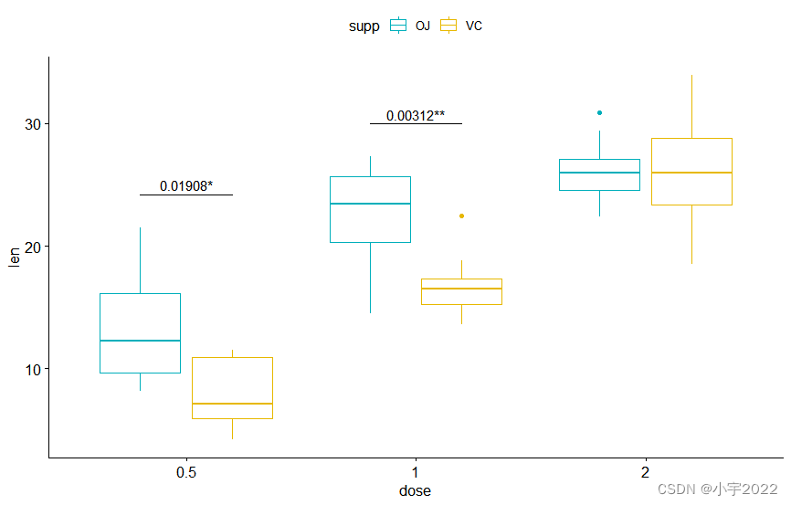
bxp + stat_pvalue_manual(
stat.test, label = "p.adj" , tip.length = 0 ,
remove.bracket = TRUE
)
bxp + stat_pvalue_manual(
stat.test, label = "{p.adj}{p.adj.signif}" ,
tip.length = 0 , hide.ns = TRUE
)
1 2 3 4 5 6 7 8 9 10 11 12 13 14 15 16 17 18 19 20 21 22 23 24 25 26 27 28 29 30 31 32 33 34
library( ggpubr)
library( rstatix)
df <- ToothGrowth
df$ dose <- as.factor( df$ dose)
head( df, 3 )
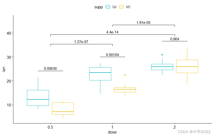
stat.test2 <- df %>%
t_test( len ~ dose, p.adjust.method = "bonferroni" )
stat.test2
stat.test <- stat.test %>%
add_xy_position( x = "dose" , dodge = 0.8 )
bxp.complex <- bxp + stat_pvalue_manual(
stat.test, label = "p" , tip.length = 0
)
stat.test2 <- stat.test2 %>% add_xy_position( x = "dose" )
bxp.complex <- bxp.complex +
stat_pvalue_manual(
stat.test2, label = "p" , tip.length = 0.02 ,
step.increase = 0.05
) +
scale_y_continuous( expand = expansion( mult = c( 0.05 , 0.1 ) ) )
bxp.complex
1 2 3 4 5 6 7 8 9 10 11 12 13 14 15 16 17 18 19 20 21 22 23 24 25 26 27 28 29
library( ggpubr)
library( rstatix)
df <- ToothGrowth
df$ dose <- as.factor( df$ dose)
head( df, 3 )
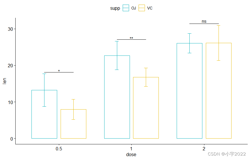
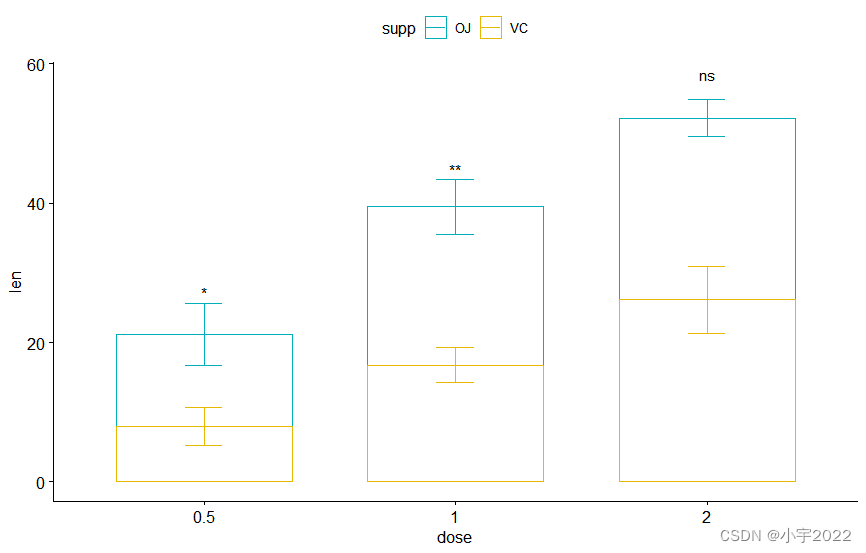
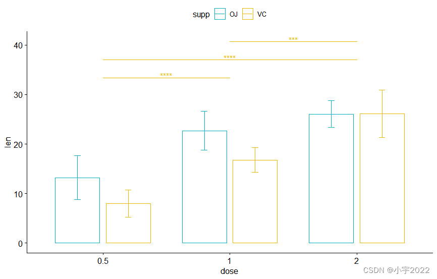
bp <- ggbarplot(
df, x = "dose" , y = "len" , add = "mean_sd" ,
color= "supp" , palette = c( "#00AFBB" , "#E7B800" ) ,
position = position_dodge( 0.8 )
)
stat.test <- stat.test %>%
add_xy_position( fun = "mean_sd" , x = "dose" , dodge = 0.8 )
bp + stat_pvalue_manual(
stat.test, label = "p.adj.signif" , tip.length = 0.01
)
bp + stat_pvalue_manual(
stat.test, label = "p.adj.signif" , tip.length = 0 ,
bracket.nudge.y = - 2
)
1 2 3 4 5 6 7 8 9 10 11 12 13 14 15 16 17 18 19 20 21 22 23 24
library( ggpubr)
library( rstatix)
df <- ToothGrowth
df$ dose <- as.factor( df$ dose)
head( df, 3 )
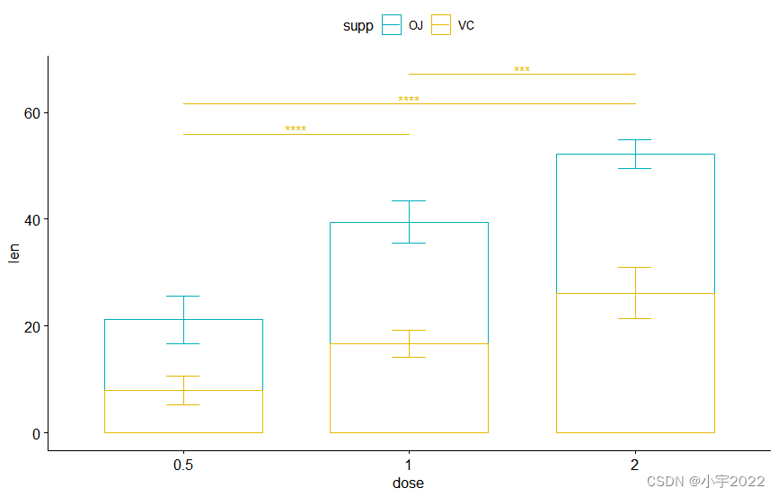
bp2 <- ggbarplot(
df, x = "dose" , y = "len" , add = "mean_sd" ,
color = "supp" , palette = c( "#00AFBB" , "#E7B800" ) ,
position = position_stack( )
)
bp2 + stat_pvalue_manual(
stat.test, label = "p.adj.signif" , tip.length = 0.01 ,
x = "dose" , y.position = c( 30 , 45 , 60 )
)
stat.test <- stat.test %>%
add_xy_position( fun = "mean_sd" , x = "dose" , stack = TRUE )
bp2 + stat_pvalue_manual(
stat.test, label = "p.adj.signif" ,
remove.bracket = TRUE , vjust = - 0.2
)
1 2 3 4 5 6 7 8 9 10 11 12 13 14 15 16 17 18 19 20 21 22 23 24 25 26 27 28
library( ggpubr)
library( rstatix)
df <- ToothGrowth
df$ dose <- as.factor( df$ dose)
head( df, 3 )
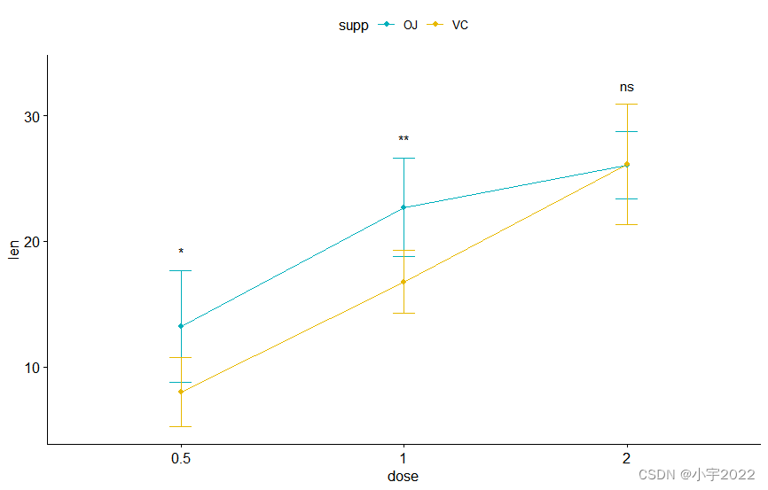
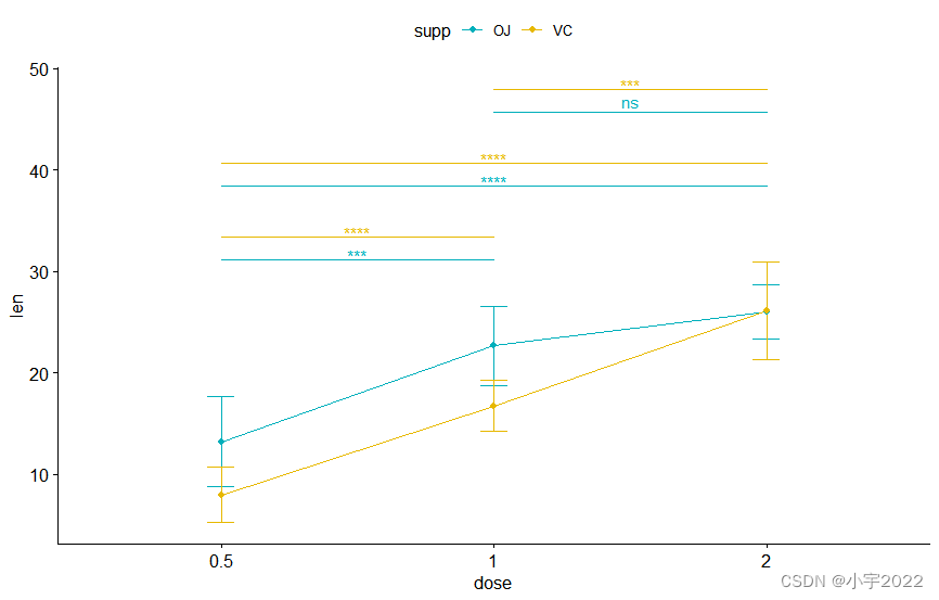
lp <- ggline(
df, x = "dose" , y = "len" , add = "mean_sd" ,
color = "supp" , palette = c( "#00AFBB" , "#E7B800" )
)
stat.test <- stat.test %>%
add_xy_position( fun = "mean_sd" , x = "dose" )
lp + stat_pvalue_manual(
stat.test, label = "p.adj.signif" ,
tip.length = 0 , linetype = "blank"
)
lp + stat_pvalue_manual(
stat.test, label = "p.adj.signif" ,
linetype = "blank" , vjust = 2
)
1 2 3 4 5 6 7 8 9 10 11 12 13 14 15 16 17 18 19 20 21 22 23 24 25 26
library( ggpubr)
library( rstatix)
df <- ToothGrowth
df$ dose <- as.factor( df$ dose)
head( df, 3 )
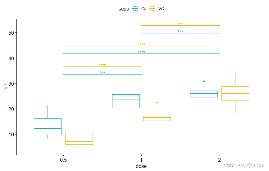
pwc <- df %>%
group_by( supp) %>%
t_test( len ~ dose, p.adjust.method = "bonferroni" )
pwc
pwc <- pwc %>% add_xy_position( x = "dose" )
bxp +
stat_pvalue_manual(
pwc, color = "supp" , step.group.by = "supp" ,
tip.length = 0 , step.increase = 0.1
)
1 2 3 4 5 6 7 8 9 10 11 12 13 14 15 16 17
library( ggpubr)
library( rstatix)
df <- ToothGrowth
df$ dose <- as.factor( df$ dose)
head( df, 3 )
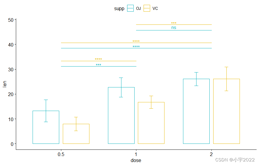
pwc <- pwc %>% add_xy_position( x = "dose" )
bxp +
stat_pvalue_manual(
pwc, color = "supp" , step.group.by = "supp" ,
tip.length = 0 , step.increase = 0.1
)
pwc <- pwc %>% add_xy_position( x = "dose" , fun = "mean_sd" , dodge = 0.8 )
bp + stat_pvalue_manual(
pwc, color = "supp" , step.group.by = "supp" ,
tip.length = 0 , step.increase = 0.1
)
1 2 3 4 5 6 7 8 9 10 11 12 13 14 15 16 17 18 19
library( ggpubr)
library( rstatix)
df <- ToothGrowth
df$ dose <- as.factor( df$ dose)
head( df, 3 )
pwc <- pwc %>% add_xy_position( x = "dose" , fun = "mean_sd" )
lp + stat_pvalue_manual(
pwc, color = "supp" , step.group.by = "supp" ,
tip.length = 0 , step.increase = 0.1
)
library( ggpubr)
library( rstatix)
df <- ToothGrowth
df$ dose <- as.factor( df$ dose)
head( df, 3 )
pwc.filtered <- pwc %>%
add_xy_position( x = "dose" , fun = "mean_sd" , dodge = 0.8 ) %>%
filter( supp == "VC" )
bp +
stat_pvalue_manual(
pwc.filtered, color = "supp" , step.group.by = "supp" ,
tip.length = 0 , step.increase = 0
)
library( ggpubr)
library( rstatix)
df <- ToothGrowth
df$ dose <- as.factor( df$ dose)
head( df, 3 )
pwc.filtered <- pwc %>%
add_xy_position( x = "dose" , fun = "mean_sd" , stack = TRUE ) %>%
filter( supp == "VC" )
bp2 +
stat_pvalue_manual(
pwc.filtered, color = "supp" , step.group.by = "supp" ,
tip.length = 0 , step.increase = 0.1
)
library( ggpubr)
library( rstatix)
df <- ToothGrowth
df$ dose <- as.factor( df$ dose)
head( df, 3 )
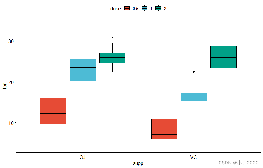
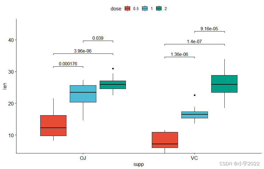
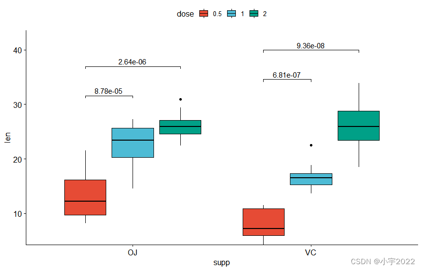
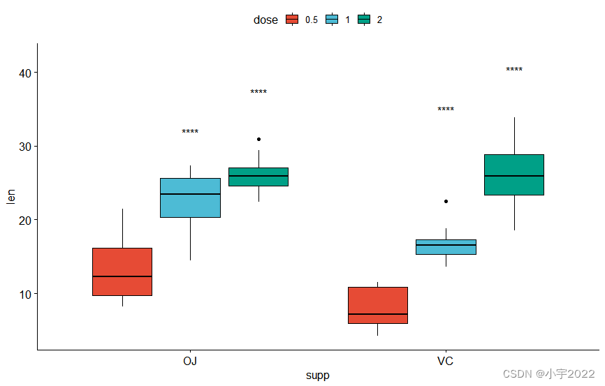
bxp <- ggboxplot(
df, x = "supp" , y = "len" , fill = "dose" ,
palette = "npg"
)
bxp
library( ggpubr)
library( rstatix)
df <- ToothGrowth
df$ dose <- as.factor( df$ dose)
head( df, 3 )
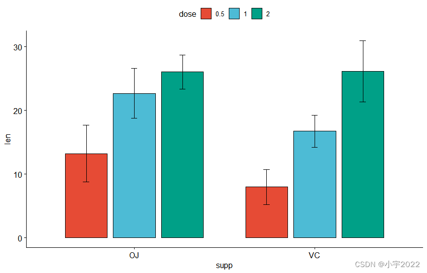
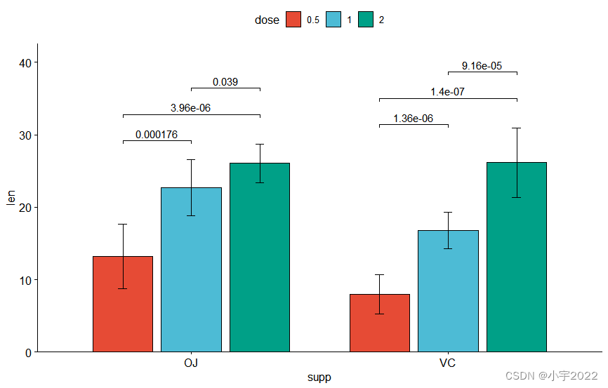
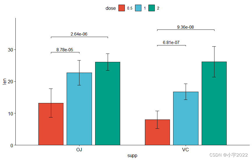
bp <- ggbarplot(
df, x = "supp" , y = "len" , fill = "dose" ,
palette = "npg" , add = "mean_sd" ,
position = position_dodge( 0.8 )
)
bp
library( ggpubr)
library( rstatix)
df <- ToothGrowth
df$ dose <- as.factor( df$ dose)
head( df, 3 )
stat.test <- df %>%
group_by( supp) %>%
t_test( len ~ dose)
stat.test
stat.test <- stat.test %>%
add_xy_position( x = "supp" , dodge = 0.8 )
bxp +
stat_pvalue_manual(
stat.test, label = "p.adj" , tip.length = 0.01 ,
bracket.nudge.y = - 2
) +
scale_y_continuous( expand = expansion( mult = c( 0 , 0.1 ) ) )
1 2 3 4 5 6 7 8 9 10 11 12 13 14 15 16 17 18 19
library( ggpubr)
library( rstatix)
df <- ToothGrowth
df$ dose <- as.factor( df$ dose)
head( df, 3 )
stat.test <- df %>%
group_by( supp) %>%
t_test( len ~ dose)
stat.test
stat.test <- stat.test %>%
add_xy_position( x = "supp" , fun = "mean_sd" , dodge = 0.8 )
bp +
stat_pvalue_manual(
stat.test, label = "p.adj" , tip.length = 0.01 ,
bracket.nudge.y = - 2
) +
scale_y_continuous( expand = expansion( mult = c( 0 , 0.1 ) ) )
1 2 3 4 5 6 7 8 9 10 11 12 13 14 15 16 17 18 19
library( ggpubr)
library( rstatix)
df <- ToothGrowth
df$ dose <- as.factor( df$ dose)
head( df, 3 )
stat.test <- df %>%
group_by( supp) %>%
t_test( len ~ dose, ref.group = "0.5" )
stat.test
stat.test <- stat.test %>%
add_xy_position( x = "supp" , dodge = 0.8 )
bxp +
stat_pvalue_manual(
stat.test, label = "p.adj" , tip.length = 0.01 ,
bracket.nudge.y = - 2
) +
scale_y_continuous( expand = expansion( mult = c( 0 , 0.1 ) ) )
1 2 3 4 5 6 7 8 9 10 11 12 13 14 15 16 17 18 19
library( ggpubr)
library( rstatix)
df <- ToothGrowth
df$ dose <- as.factor( df$ dose)
head( df, 3 )
stat.test <- df %>%
group_by( supp) %>%
t_test( len ~ dose, ref.group = "0.5" )
stat.test
stat.test <- stat.test %>%
add_xy_position( x = "supp" , dodge = 0.8 )
bxp + stat_pvalue_manual(
stat.test, x = "supp" , label = "p.adj.signif" ,
tip.length = 0.01 , vjust = 2
)
1 2 3 4 5 6 7 8 9 10 11 12 13 14 15 16 17 18 19
library( ggpubr)
library( rstatix)
df <- ToothGrowth
df$ dose <- as.factor( df$ dose)
head( df, 3 )
stat.test <- stat.test %>%
add_xy_position( x = "supp" , fun = "mean_sd" , dodge = 0.8 )
bp +
stat_pvalue_manual(
stat.test, label = "p.adj" , tip.length = 0.01 ,
bracket.nudge.y = - 2
) +
scale_y_continuous( expand = expansion( mult = c( 0 , 0.1 ) ) )
原文链接