-
CSS 核心知识点 - grid
思维导图
参考网址: https://developer.mozilla.org/zh-CN/docs/Web/CSS/CSS_grid_layout

一、什么是 grid?
CSS Grid布局是在CSS3规范中引入的一种新的布局方式,旨在解决传统布局方法(如浮动、定位、表格布局)存在的许多问题。CSS Grid布局规范最早由W3C提出,经过多年的发展和标准化,于2017年成为W3C的推荐标准。
二、grid 布局相比 flex 布局有那些方便之处?
Html + Css 核心知识 - flex (超详细)_html flex-CSDN博客
网格布局更为方便
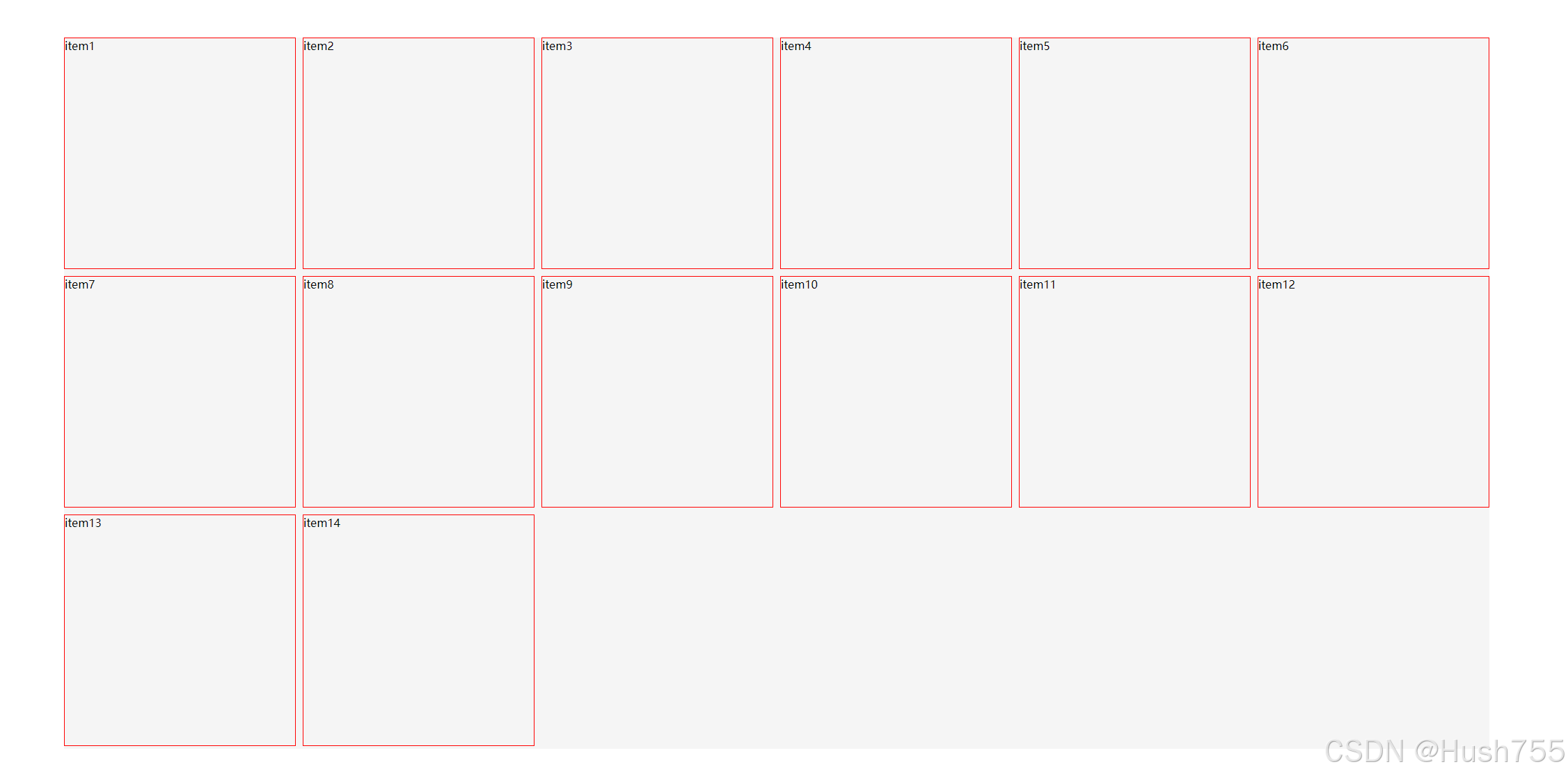
问题场景一:例如想要实现页面内显示多个元素、每个元素大小尺寸间距相同、每行显示个数固定、按行由左向右排序、且在页面中均匀分布。如下所示

这时候很多人第一时间想到了 flex、单行用flex很方便、多行的话需要进行一些额外运算。
- .father{
- height: 80vh;
- width: 80vw;
- background-color: #f5f5f5;
- display: flex;
- flex-wrap: wrap;
- align-content: start;
- gap: 10px;
- }
- .son{
- width: calc((100% - 50px) / 6);
- aspect-ratio: 1 / 1; /* 设置宽高比为1:1 */
- border: 1px solid red;
- box-sizing: border-box;
- }

那有没有不用计算的方案呢! grid 这时候就排上的用场了!
- .father{
- height: 80vh;
- width: 80vw;
- background-color: #f5f5f5;
- display: grid;
- /* grid-template-columns: 1fr 1fr 1fr 1fr 1fr 1fr; */
- grid-template-columns: repeat(6, 1fr); /* 定义六个等宽的列 */
- align-content: start;
- gap: 10px;
- }
- .son{
- /* width: calc((100% - 50px) / 6); */
- aspect-ratio: 1 / 1; /* 设置宽高比为1:1 */
- border: 1px solid red;
- box-sizing: border-box;
- }

问题场景二、实现等比例大小不同盒子布局、场景如下

这时候用其他方案处理就比较麻烦了、而 grid 就能很方便处理
- .father{
- height: 80vh;
- width: 80vw;
- background-color: #f5f5f5;
- display: grid;
- /* grid-template-columns: 1fr 1fr 1fr 1fr 1fr 1fr; */
- grid-template-columns: repeat(6, 1fr); /* 定义六个等宽的列 */
- align-content: start;
- gap: 10px;
- }
- .son{
- /* width: calc((100% - 50px) / 6); */
- aspect-ratio: 1 / 1; /* 设置宽高比为1:1 */
- border: 1px solid red;
- box-sizing: border-box;
- min-width: 200px;
- }
- #item1{
- grid-column: 1/3;
- grid-row: 1/3;
- }
- #item8{
- grid-column: 5/7;
- grid-row: 2/4;
- }
根据可用空间自动填充列(这点个人觉得非常好用)。
- .father{
- height: 80vh;
- width: 80vw;
- background-color: #f5f5f5;
- display: grid;
- /* grid-template-columns: 1fr 1fr 1fr 1fr 1fr 1fr; */
- grid-template-columns: repeat(auto-fill, minmax(300px, 1fr));
- align-content: start;
- gap: 10px;
- }
- .son{
- /* width: calc((100% - 50px) / 6); */
- aspect-ratio: 1 / 1; /* 设置宽高比为1:1 */
- border: 1px solid red;
- box-sizing: border-box;
- }
可以看到宽度是被自动填充到333px

填充到了 359px

-
相关阅读:
月薪9K和年薪30W的职位,有什么区别?
浅谈DDoS攻击和CC攻击的区别
SQL中的索引
android 记录Activity和Fragment生命周期顺序
JVM虚拟机 总结很到位
贪心算法题
索引的优化
半导体动态杂谈
uniapp 总结篇 (小程序)
信息抽取在旅游行业的应用:以景点信息抽取为例
- 原文地址:https://blog.csdn.net/qq_61723274/article/details/140032672