-
ArkTs快速入门
一、声明式UI
声明式UI是一种编写用户界面的范式。
1.1 声明组件

- build() {
- Column() {
- Button({type:ButtonType.Circle}){
- Image('src/main/ets/pages/3.png')
- .width(25)
- .height(25)
- }
- .width(50)
- .height(50)
- .backgroundColor(Color.Red)
- .onClick(() =>{
- console.log('删除');
- })
- }
- .width('100%')
- .height('100%')
- .justifyContent(FlexAlign.Center);
- }
- }
1.2 自定义组件
使用自定义组件,可以使代码结构更加清晰,并且能提高代码的复用性

- @Entry
- @Component
- struct Index {
- @State message: string = 'Hello World'
- build() {
- Column() {
- RedButton({color:Color.Red}) //给自定义组件传参,必须是一个对象
- .onClick(() =>{
- console.log('删除');
- })
- }
- .width('100%')
- .height('100%')
- .justifyContent(FlexAlign.Center);
- }
- }
- @Component
- struct RedButton {
- color:Color = Color.Black;
- build() {
- Button({type:ButtonType.Circle}){
- Image('src/main/ets/pages/3.png')
- .width(25)
- .height(25)
- }
- .width(50)
- .height(50)
- .backgroundColor(this.color)
- }
- }
1.3 渲染控制
1.3.1 条件渲染
条件渲染可根据应用的不同状态渲染不同的UI界面
1.3.2 循环渲染
循环渲染可使用ForEach语句基于一个数组来快速渲染一个组件列表

二、常用组件
2.1 图片
2.1.1图片参数
Image组件的参数类型为string | Resource | media PixeMap
Resource类型:

media PixeMap:
指的是像素位图,其通常是一个二维数组,数组中的每个元素对应着图片中的一个像素,其包含了该像素的颜色等信息。
2.1.2 常用属性

参数有string、number、Resource类型
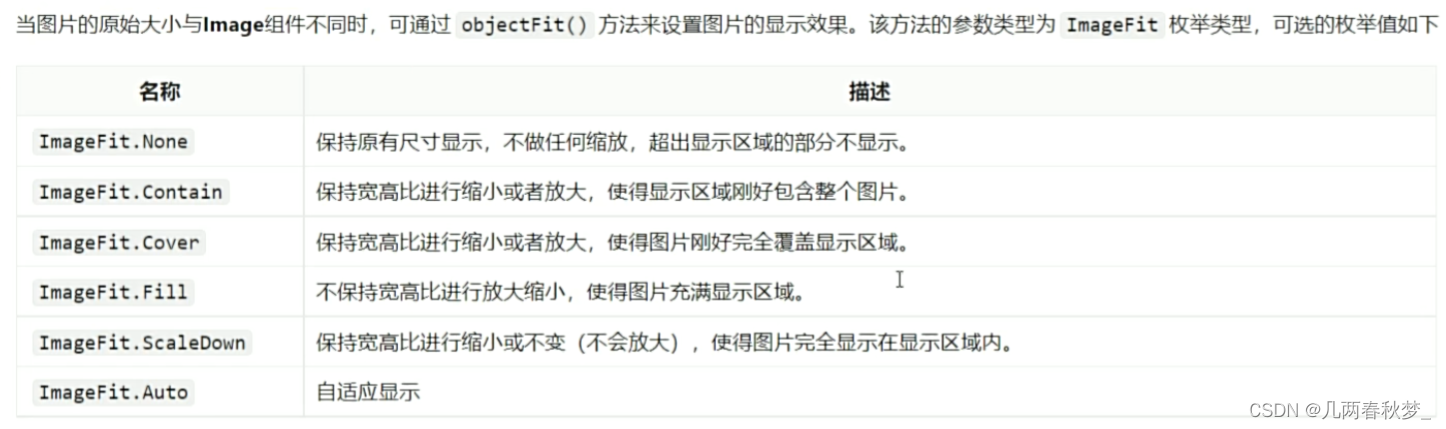
2.1.3 图片缩放
2.1.4 图片插值
是图像过渡更加平滑

-
相关阅读:
elasticsearch bulk数据--ES批量导入json数据
Ant Design表单之labelCol 和wrapperCol的实际开发笔记
电话自动拨号在电脑上自动拨打
VAEGAN:理解 VAE 与 GAN【图像生成】
windows的adb环境安装
图说论文《LSM-based Storage Techniques: A Survey》
(8)Lightweight OpenPose轻量化模型之 模型封装 + 摔倒检测
java8的一些认识
Springboot + Sqlite实战(离线部署成功)
上海理工大学计算机考研资料汇总
- 原文地址:https://blog.csdn.net/weixin_64443786/article/details/137866993