-
【前端】3. CSS【万字长文】
CSS 是什么
层叠样式表 (Cascading Style Sheets).
CSS 能够对网页中元素位置的排版进行像素级精确控制, 实现美化页面的效果. 能够做到页面的样式和结构分离.CSS 就是 “东方四大邪术” 之化妆术.
基本语法规范
选择器 + {一条/N条声明}
- 选择器决定针对谁修改 (找谁)
- 声明决定修改啥. (干啥)
- 声明的属性是键值对. 使用 ; 区分键值对, 使用 : 区分键和值.
<style> p { /* 设置字体颜色 */ color: red; /* 设置字体大小 */ font-size: 30px; } style> <p>hellop>- 1
- 2
- 3
- 4
- 5
- 6
- 7
- 8
- 9

注意:
- CSS 要写到 style 标签中(后面还会介绍其他写法)
- style 标签可以放到页面任意位置. 一般放到 head 标签内.
- CSS 使用 /* */ 作为注释. (使用 ctrl + / 快速切换) .
引入方式
内部样式表
写在 style 标签中. 嵌入到 html 内部.
理论上来说 style 放到 html 的哪里都行. 但是一般都是放到 head 标签中.优点: 这样做能够让样式和页面结构分离.
缺点: 分离的还不够彻底. 尤其是 css 内容多的时候前面写的代码主要都是使用了这种方式. 实际开发中不常用.
PS: 搜狗搜索中仍然保留着这种写法.

行内表达式优先级比内部表达式优先级高行内样式表
通过 style 属性, 来指定某个标签的样式.
只适合于写简单样式. 只针对某个标签生效.
缺点: 不能写太复杂的样式.
这种写法优先级较高, 会覆盖其他的样式.
(可以理解为就近原则)<style> div{ color: red; } style> <div style="color: green"> hello world div>- 1
- 2
- 3
- 4
- 5
- 6
- 7
- 8


可以看到, red 颜色被覆盖了.
外部样式
实际开发中最常用的方式.
- 创建一个 css 文件.
- 使用 link 标签引入 css
<link rel="stylesheet" href="[CSS文件路径]">- 1
创建 html文件
DOCTYPE html> <html lang="en"> <head> <meta charset="UTF-8"> <meta name="viewport" content="width=device-width, initial-scale=1.0"> <title>Documenttitle> <link rel="stylesheet" href="./style.css"> head> <body> <div>hello worlddiv> body> html>- 1
- 2
- 3
- 4
- 5
- 6
- 7
- 8
- 9
- 10
- 11
- 12
创建 style.css
div { color: red; }- 1
- 2
- 3
注意: 不要忘记 link 标签调用 CSS, 否则不生效.
优点: 样式和结构彻底分离了.
缺点: 受到浏览器缓存影响, 修改之后 不一定 立刻生效.关于缓存:
这是计算机中一种常见的提升性能的技术手段.
网页依赖的资源(图片/CSS/JS等)通常是从服务器上获取的. 如果频繁访问该网站, 那么这些外部资源就没必要反复从服务器获取. 就可以使用缓存先存起来(就是存在本地磁盘上了). 从而提高访问效率.
可以通过 ctrl + F5 强制刷新页面, 强制浏览器重新获取 css 文件.代码风格
样式格式
- 紧凑风格
p { color: red; font-size: 30px;}- 1
- 展开风格(推荐)
p { color: red; font-size: 30px; }- 1
- 2
- 3
- 4
样式大小写
虽然 CSS 不区分大小写, 我们开发时统一使用小写字母
空格规范
- 冒号后面带空格
- 选择器和 { 之间也有一个空格.
选择器
选择器的功能
选中页面中指定的标签元素.
要先选中元素, 才能设置元素的属性.
就好比 SC2, War3 这样的游戏, 需要先选中单位, 再指挥该单位行动.选择器的种类
以下内容只是 CSS2 标准中支持的选择器, 在 CSS3 中还做出了一些补充(在这里就不做介绍啦!)
- 基础选择器: 单个选择器构成的
- 标签选择器
- 类选择器
- id 选择器
- 通配符选择器
- 复合选择器: 把多种基础选择器综合运用起来.
- 后代选择器
- 子选择器
- 并集选择器
- 伪类选择器
基础选择器
标签选择器
特点:
- 能快速为同一类型的标签都选择出来.
- 但是不能差异化选择
<style> p{ color: red; } div{ color: green; } style> <p>哈哈哈p> <p>哈哈哈p> <p>哈哈哈p> <p>哈哈哈p> <div>呵呵呵div> <div>呵呵呵div> <div>呵呵呵div> <div>呵呵呵div>- 1
- 2
- 3
- 4
- 5
- 6
- 7
- 8
- 9
- 10
- 11
- 12
- 13
- 14
- 15
- 16
- 17
- 18

类选择器
特点:
- 差异化表示不同的标签
- 可以让多个标签的都使用同一个标签.
<style> .blue { color: blue; } style> <div class="blue">哈哈div> <div>哈哈div>- 1
- 2
- 3
- 4
- 5
- 6
- 7

语法细节:- 类名用 . 开头的
- 下方的标签使用 class 属性来调用.
- 一个类可以被多个标签使用, 一个标签也能使用多个类(多个类名要使用空格分割, 这种做法可以让代码更好复用)
- 如果是长的类名, 可以使用 - 分割.
- 不要使用纯数字, 或者中文, 以及标签名来命名类名.
代码示例: 使用多个类名
注意: 一个标签可以同时使用多个类名
这样做可以把相同的属性提取出来, 达到简化代码的效果<style> .box { width: 200px; height: 150px; } .red { background-color: red; } .green { background-color: green; } style> <div class="box red">div> <div class="box green">div> <div class="box red">div>- 1
- 2
- 3
- 4
- 5
- 6
- 7
- 8
- 9
- 10
- 11
- 12
- 13
- 14
- 15
- 16
- 17

id 选择器
和类选择器类似.
- CSS 中使用 # 开头表示 id 选择器
- id 选择器的值和 html 中某个元素的 id 值相同
- html 的元素 id 不能带 #
- id 是唯一的, 不能被多个标签使用 (是和 类选择器 最大的区别)
<style> #ha { color: red; } style> <div id="ha">蛤蛤蛤div>- 1
- 2
- 3
- 4
- 5
- 6

类比:
姓名是类选择器, 可以重复.
身份证号码是 id 选择器, 是唯一的.通配符选择器
使用 * 的定义, 选取所有的标签.
- { color: red; }- 1
- 2
- 3
页面的所有内容都会被改成 红色 .
不需要被页面结构调用.通配符选择器在实际开发当中用来针对页面中的所有元素默认样式进行消除,主要用来消除边距
基础选择器小结
+----------------------------------------------------------------------+ | | 作用 | 特点 | +----------------------------------------------------------------------+ | 标签选择器 | 能选出所有相同标签 | 不能差异化选择 | | 类选择器 | 能选出一个或多个标签 | 根据需求选择, 最灵活, 最常用. | | id 选择器 | 能选出一个标签 | 同一个id 在一个 HTML 中只能出现一次 | | 通配符选择器 | 选择所有标签 | 特殊情况下使用 | +----------------------------------------------------------------------+- 1
- 2
- 3
- 4
- 5
- 6
- 7
- 8
复合选择器 (选学)
后代选择器
又叫包含选择器. 选择某个父元素中的某个子元素.
元素1 元素2 {样式声明}- 1
- 元素 1 和 元素 2 要使用空格分割
- 元素 1 是父级, 元素 2 是子级, 只选元素 2 , 不影响元素 1
代码示例: 把 ol 中的 li 修改颜色, 不影响 ul
<ul> <li>aaali> <li>bbbli> <li>cccli> ul> <ol> <li>dddli> <li>eeeli> <li>fffli> ol>- 1
- 2
- 3
- 4
- 5
- 6
- 7
- 8
- 9
- 10
ol li { color: red; }- 1
- 2
- 3
代码示例: 元素 2 不一定非是 儿子, 也可以是孙子.
<ul> <li>aaali> <li>bbbli> <li><a href="#">ccca>li> ul>- 1
- 2
- 3
- 4
- 5
ul li a { color: yellow; } 或者 ul a { color: yellow; }- 1
- 2
- 3
- 4
- 5
- 6
- 7
代码示例: 可以是任意基础选择器的组合. (包括类选择器, id 选择器)
<ol class="one"> <li>dddli> <li>eeeli> <li><a href="#">fffa>li> <li><a href="#">fffa>li> <li><a href="#">fffa>li> ol>- 1
- 2
- 3
- 4
- 5
- 6
- 7
.one li a { color: green; }- 1
- 2
- 3
子选择器
和后代选择器类似, 但是只能选择子标签.
元素1>元素2 { 样式声明 }- 1
- 使用大于号分割
- 只选亲儿子, 不选孙子元素
<div class="two"> <a href="#">链接1a> <p><a href="#">链接2a>p> div>- 1
- 2
- 3
- 4
后代选择器的写法, 会把链接1 和 2 都选中.
.two a { color: red; }- 1
- 2
- 3
子选择器的写法, 只选链接 1
.two>a { color: red; }- 1
- 2
- 3
练习
- 把以下代码中的 “小猫” 改成红色
<div class="cat"> <ul> <li><a href="#">小猫a>li> <li><a href="#">小猫a>li> <li><a href="#">小猫a>li> ul> div>- 1
- 2
- 3
- 4
- 5
- 6
- 7
CSS 结果:
.cat ul li a { color: red; }- 1
- 2
- 3
- 把以下代码中的 “小猫” 改成红色
<div class="cat"> <a href="#">小猫a> <ul> <li><a href="#">小狗a>li> <li><a href="#">小狗a>li> ul> div>- 1
- 2
- 3
- 4
- 5
- 6
- 7
使用 Emmet 快捷键生成上面的 html 代码:
.cat>a+ul>li*2>aCSS 结果:
.cat>a { color: red; }- 1
- 2
- 3
并集选择器
用于选择多组标签. (集体声明)
元素1, 元素2 { 样式声明 }- 1
- 通过 逗号 分割等多个元素.
- 表示同时选中元素 1 和 元素 2
- 任何基础选择器都可以使用并集选择器.
- 并集选择器建议竖着写. 每个选择器占一行. (最后一个选择器不能加逗号)
代码示例:
<div>苹果div> <h3>香蕉h3> <ul> <li>鸭梨li> <li>橙子li> ul>- 1
- 2
- 3
- 4
- 5
- 6
- 把苹果和香蕉颜色改成红色
div, h3 { color: red; }- 1
- 2
- 3
- 把鸭梨和橙子也都一起改成红色
div, h3, ul>li { color: red; }- 1
- 2
- 3
- 4
- 5
伪类选择器
- 链接伪类选择器
a:link 选择未被访问过的链接
a:visited 选择已经被访问过的链接
a:hover 选择鼠标指针悬停上的链接
a:active 选择活动链接(鼠标按下了但是未弹起)示例:
<a href="#">小猫a>- 1
a:link { color: black; /* 去掉 a 标签的下划线 */ text-decoration: none; } a:visited { color: green; } a:hover { color: red; } a:active { color: blue; }- 1
- 2
- 3
- 4
- 5
- 6
- 7
- 8
- 9
- 10
- 11
- 12
- 13
- 14
如何让一个已经被访问过的链接恢复成未访问的状态?
清空浏览器历史记录即可. ctrl + shift + delete

注意事项
- 按照 LVHA 的顺序书写, 例如把 active 拿到前面去, 就会导致 active 失效. 记忆规则 “绿化”
- 浏览器的 a 标签都有默认样式, 一般实际开发都需要单独制定样式.
- 实际开发主要给链接做一个样式, 然后给 hover 做一个样式即可. link, visited, active 用的不多.
a { color: black; } a:hover { color: red; }- 1
- 2
- 3
- 4
- 5
- 6
- :force 伪类选择器
选取获取焦点的 input 表单元素.
<div class="three"> <input type="text"> <input type="text"> <input type="text"> <input type="text"> div>- 1
- 2
- 3
- 4
- 5
- 6
.three>input:focus { color: red; }- 1
- 2
- 3
此时被选中的表单的字体就会变成红色.

复合选择器小结+------------------------------------------------------------+ | 选择器 | 作用 | 注意事项 | +------------------------------------------------------------+ | 后代选择器 | 选择后代元素 | 可以是孙子元素 | | 子选择器 | 选择子元素 | 只能选亲儿子, 不能选孙子 | | 并集选择器 | 选择相同样式的元素 | 更好的做到代码重用 | | 链接伪类选择器 | 选择不同状态的链接 | 重点掌握 a:hover 的写法| | :focuse 伪类选择器 | 选择被选中的元素 | 重点掌握 input:focus | +------------------------------------------------------------+- 1
- 2
- 3
- 4
- 5
- 6
- 7
- 8
- 9
常用元素属性
不需要全都背下来, 而是在使用中学习.

字体属性
设置字体
body { font-family: '微软雅黑'; font-family: 'Microsoft YaHei'; }- 1
- 2
- 3
- 4
- 字体名称可以用中文, 但是不建议.
- 多个字体之间使用逗号分隔. (从左到右查找字体, 如果都找不到, 会使用默认字体. )
- 如果字体名有空格, 使用引号包裹.
- 建议使用常见字体, 否则兼容性不好.
<style> .font-family .one { font-family: 'Microsoft YaHei'; } .font-family .two { font-family: '宋体'; } style> <div class="font-family"> <div class="one"> 这是微软雅黑 div> <div class="two"> 这是宋体 div> div>- 1
- 2
- 3
- 4
- 5
- 6
- 7
- 8
- 9
- 10
- 11
- 12
- 13
- 14
- 15
- 16
大小
p { font-size: 20px; }- 1
- 2
- 3
- 不同的浏览器默认字号不一样, 最好给一个明确值. (chrome 默认是 16px)
- 可以给 body 标签使用 font-size
- 要注意单位 px 不要忘记.
- 标题标签需要单独指定大小
注意: 实际上它设置的是字体中字符框的高度;实际的字符字形可能比这些框高或矮
<style> .font-size .one { font-size: 40px; } .font-size .two { font-size: 20px; } style> <div class="font-size"> <div class="one"> 大大大 div> <div class="two"> 小小小 div> div>- 1
- 2
- 3
- 4
- 5
- 6
- 7
- 8
- 9
- 10
- 11
- 12
- 13
- 14
- 15
- 16
粗细
p { font-weight: bold; font-weight: 700; }- 1
- 2
- 3
- 4
- 可以使用数字表示粗细.
700 == bold,400 是不变粗, == normal- 取值范围是 100 -> 900
<style> .font-weight .one { font-weight: 900; } .font-weight .two { font-weight: 100; } style> <div class="font-weight"> <div class="one"> 粗粗粗 div> <div class="two"> 细细细 div> div>- 1
- 2
- 3
- 4
- 5
- 6
- 7
- 8
- 9
- 10
- 11
- 12
- 13
- 14
- 15
- 16
文字样式
/* 设置倾斜 */ font-style: italic; /* 取消倾斜 */ font-style: normal;- 1
- 2
- 3
- 4
很少把某个文字变倾斜.
但是经常要把 em / i 改成不倾斜.

文本属性
文本颜色
认识 RGB
我们的显示器是由很多很多的 “像素” 构成的. 每个像素视为一个点, 这个点就能反映出一个具体的颜色.
我们使用 R (red), G (green), B (blue) 的方式表示颜色(色光三原色). 三种颜色按照不同的比例搭配, 就能
混合出各种五彩斑斓的效果.
计算机中针对 R, G, B 三个分量, 分别使用一个字节表示(8个比特位, 表示的范围是 0-255, 十六进制表示
为 00-FF).
数值越大, 表示该分量的颜色就越浓. 255, 255, 255 就表示白色; 0, 0, 0 就表示黑色.设置文本颜色
color: red; color: #ff0000; /*其中ff表示红色像素点,00表示绿色像素点,00表示蓝色像素点*/ color: rgb(255, 0, 0);- 1
- 2
- 3
鼠标悬停在 vscode 的颜色上, 会出现颜色选择器, 可以手动调整颜色.
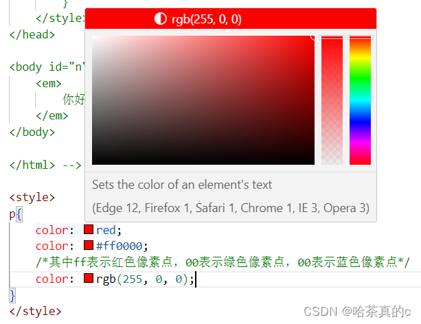
color 属性值的写法:
- 预定义的颜色值(直接是单词)
- [最常用] 十六进制形式
- RGB 方式
十六进制形式表示颜色, 如果两两相同, 就可以用一个来表示.
#ff00ff => #f0f<style> .color { color: red; /* color: rgb(255, 0, 0); */ /* color: #ff0000; */ } style> <div class="color">这是一段话div>- 1
- 2
- 3
- 4
- 5
- 6
- 7
- 8
文本对齐
控制文字水平方向的对齐.
不光能控制文本对齐, 也能控制图片等元素居中或者靠右
text-align: [值];- 1
- center: 居中对齐
- left: 左对齐
- right: 右对齐
<style> .text-align .one { text-align: left; } .text-align .two { text-align: right; } .text-align .three { text-align: center; } style> <div class="text-align"> <div class="one">左对齐div> <div class="two">右对齐div> <div class="three">居中对齐div> div>- 1
- 2
- 3
- 4
- 5
- 6
- 7
- 8
- 9
- 10
- 11
- 12
- 13
- 14
- 15
- 16
文本装饰
text-decoration: [值];- 1
常用取值:
- underline 下划线. [常用]
- none 啥都没有. 可以给 a 标签去掉下划线.
- overline 上划线. [不常用]
- line-through 删除线 [不常用]
<style> .text-decorate .one { text-decoration: none; } .text-decorate .two { text-decoration: underline; } .text-decorate .three { text-decoration: overline; } .text-decorate .four { text-decoration: line-through; } style> <div class="text-decorate"> <div class="one">啥都没有div> <div class="two">下划线div> <div class="three">上划线div> <div class="four">删除线div> div>- 1
- 2
- 3
- 4
- 5
- 6
- 7
- 8
- 9
- 10
- 11
- 12
- 13
- 14
- 15
- 16
- 17
- 18
- 19
- 20
文本缩进
控制段落的 首行 缩进 (其他行不影响)
text-indent: [值];- 1
- 单位可以使用 px 或者 em.
- 使用 em 作为单位更好. 1 个 em 就是当前元素的文字大小.
- 缩进可以是负的, 表示往左缩进. (会导致文字就冒出去了)
<style> .text-indent .one { text-indent: 2em; } .text-indent .two { text-indent: -2em; } style> <div class="text-indent"> <div class="one">正常缩进div> <div class="two">反向缩进div> div>- 1
- 2
- 3
- 4
- 5
- 6
- 7
- 8
- 9
- 10
- 11
- 12
行高
行高指的是上下文本行之间的基线距离.
HTML 中展示文字涉及到这几个基准线:
- 顶线
- 中线
- 基线 (相当于英语四线格的倒数第二条线)
- 底线
内容区:底线和顶线包裹的区域,即下图深灰色背景区域

其实基线之间的距离 = 顶线间距离 = 底线间距离 = 中线间距离
line-height: [值];- 1
注意1: 行高 = 上边距 + 下边距 + 字体大小
上下边距是相等的, 此处字体大小是 16px, 行高 40px, 上下边距就分别是 12px
<style> .line-height .one { line-height: 40px; font-size: 16px; } style> <div class="line-height"> <div> 上一行 div> <div class="one"> 中间行 div> <div> 下一行 div> div>- 1
- 2
- 3
- 4
- 5
- 6
- 7
- 8
- 9
- 10
- 11
- 12
- 13
- 14
- 15
- 16
- 17

注意2: 行高也可以取 normal 等值.这个取决于浏览器的实现. chrome 上 normal 为 21 px
注意3: 行高等与元素高度, 就可以实现文字居中对齐.
<style> .line-height .two { height: 100px; line-height: 100px; } style> <div class="line-height"> <div class="two"> 文本垂直居中 div> div>- 1
- 2
- 3
- 4
- 5
- 6
- 7
- 8
- 9
- 10
- 11

背景属性
背景颜色
background-color: [指定颜色]- 1
默认是 transparent (透明) 的. 可以通过设置颜色的方式修改.
<style> body { background-color: #f3f3f3; } .bgc .one { background-color: red; } .bgc .two { background-color: #0f0; } .bgc .three { /* 背景透明 */ background-color: transparent; } style> <div class="bgc"> <div class="one">红色背景div> <div class="two">绿色背景div> <div class="three">透明背景div> div>- 1
- 2
- 3
- 4
- 5
- 6
- 7
- 8
- 9
- 10
- 11
- 12
- 13
- 14
- 15
- 16
- 17
- 18
- 19
- 20
背景图片
background-image: url(...);- 1
比 image 更方便控制位置(图片在盒子中的位置)
注意:
- url 不要遗漏.
- url 可以是绝对路径, 也可以是相对路径
- url 上可以加引号, 也可以不加.
<style> .bgi .one { background-image: url(rose.jpg); height: 300px; } style> <div class="bgi"> <div class="one">背景图片div> div>- 1
- 2
- 3
- 4
- 5
- 6
- 7
- 8
- 9
背景平铺
background-repeat: [平铺方式]- 1
重要取值:
- repeat: 平铺
- no-repeat: 不平铺
- repeat-x: 水平平铺
- repeat-y: 垂直平铺
默认是 repeat.
背景颜色和背景图片可以同时存在. 背景图片在背景颜色的上方.
<style> .bgr .one { background-image: url(rose.jpg); height: 300px; background-repeat: no-repeat; } .bgr .two { background-image: url(rose.jpg); height: 300px; background-repeat: repeat-x; } .bgr .three { background-image: url(rose.jpg); height: 300px; background-repeat: repeat-y; } style> <div class="bgr"> <div class="one">不平铺div> <div class="two">水平平铺div> <div class="three">垂直平铺div> div>- 1
- 2
- 3
- 4
- 5
- 6
- 7
- 8
- 9
- 10
- 11
- 12
- 13
- 14
- 15
- 16
- 17
- 18
- 19
- 20
- 21
- 22
背景位置
background-position: x y;- 1
修改图片的位置.
参数有三种风格:
- 方位名词: (top, left, right, bottom)
- 精确单位: 坐标或者百分比(以左上角为原点)
- 混合单位: 同时包含方位名词和精确单位
<style> .bgp .one { background-image: url(rose.jpg); height: 500px; background-repeat: no-repeat; background-color: purple; background-position: center; } style> <div class="bgp"> <div class="one">背景居中div> div>- 1
- 2
- 3
- 4
- 5
- 6
- 7
- 8
- 9
- 10
- 11
- 12
注意
- 如果参数的两个值都是方位名词, 则前后顺序无关. (top left 和 left top 等效)
- 如果只指定了一个方位名词, 则第二个默认居中. (left 则意味着水平居中, top 意味着垂直居中. )
- 如果参数是精确值, 则的的第一个肯定是 x , 第二个肯定是 y. (100 200 意味着 x 为 100, y 为 200)
- 如果参数是精确值, 且只给了一个数值, 则该数值一定是 x 坐标, 另一个默认垂直居中.
- 如果参数是混合单位, 则第一个值一定为 x, 第二个值为 y 坐标. (100 center 表示横坐标为 100, 垂直居中)
关于坐标系:
计算机中的平面坐标系, 一般是左手坐标系(和高中数学上常用的右手系不一样. y轴是往下指的).

背景尺寸
background-size: length|percentage|cover|contain;- 1
- 可以填具体的数值: 如 40px 60px 表示宽度为 40px, 高度为 60px
- 也可以填百分比: 按照父元素的尺寸设置.
- cover: 把背景图像扩展至足够大,以使背景图像完全覆盖背景区域。背景图像的某些部分也许无法显示在背景定位区域中。
- 把图像图像扩展至最大尺寸,以使其宽度和高度完全适应内容区域.
<style> .bgs .one { width: 500px; height: 300px; background-image: url(rose.jpg); background-repeat: no-repeat; background-position: center; background-size: contain; } style> <div class="bgs"> <div class="one">背景尺寸div> div>- 1
- 2
- 3
- 4
- 5
- 6
- 7
- 8
- 9
- 10
- 11
- 12
- 13
注意体会 contain 和 cover 的区别. 当元素为矩形(不是正方形) 时, 区别是很明显的.
contain:

cover:

圆角矩形
通过 border-radius 使边框带圆角效果.
基本用法border-radius: length;- 1
length 是内切圆的半径. 数值越大, 弧线越强烈

<div>蛤蛤div>- 1
div { width: 200px; height: 100px; border: 2px solid green; border-radius: 10px; }- 1
- 2
- 3
- 4
- 5
- 6
生成圆形
让 border-radius 的值为正方形宽度的一半即可.
div { width: 200px; height: 200px; border: 2px solid green; border-radius: 100px; /* 或者用 50% 表示宽度的一半 */ border-radius: 50%; }- 1
- 2
- 3
- 4
- 5
- 6
- 7
- 8
生成圆角矩形
让 border-radius 的值为矩形高度的一半即可
div { width: 200px; height: 100px; border: 2px solid green; border-radius: 50px; }- 1
- 2
- 3
- 4
- 5
- 6

展开写法
border-radius 是一个复合写法. 实际上可以针对四个角分别设置.border-radius:2em;- 1
等价于
border-top-left-radius:2em; border-top-right-radius:2em; border-bottom-right-radius:2em; border-bottom-left-radius:2em;- 1
- 2
- 3
- 4
border-radius: 10px 20px 30px 40px;- 1
等价于(按照顺时针排列)
border-top-left-radius:10px; border-top-right-radius:20px; border-bottom-right-radius:30px; border-bottom-left-radius:40px;- 1
- 2
- 3
- 4
Chrome 调试工具 – 查看 CSS 属性
打开浏览器
有两种方式可以打开 Chrome 调试工具- 直接按 F12 键
- 鼠标右键页面 => 检查元素
标签页含义
- elements 查看标签结构
- console 查看控制台
- source 查看源码+断点调试
- network 查看前后端交互过程
- application 查看浏览器提供的一些扩展功能(本地存储等)
- Performance, Memory, Security, Lighthouse 暂时不使用, 先不深究
elements 标签页使用
- ctrl + 滚轮进行缩放, ctrl + 0 恢复原始大小.
- 使用 左上角 箭头选中元素
- 右侧可以查看当前元素的属性, 包括引入的类.
- 右侧可以修改选中元素的 css 属性. 例如颜色, 可以点击颜色图标, 弹出颜色选择器, 修改颜色. 例如 字体大小,可以使用方向键来微调数值.
- 此处的修改不会影响代码, 刷新就还原了~
- 如果 CSS 样式写错了, 也会在这里有提示. (黄色感叹号)

元素的显示模式
在 CSS 中, HTML 的标签的显示模式有很多.
此处只重点介绍两个:- 块级元素
- 行内元素
块级元素
常见的元素:
h1 - h6
p
div
ul
ol
li
…特点:
- 独占一行
- 高度, 宽度, 内外边距, 行高都可以控制.
- 宽度默认是父级元素宽度的 100% (和父元素一样宽)
- 是一个容器(盒子), 里面可以放行内和块级元素.
<style> .demo1 .parent { width: 500px; height: 500px; background-color: green; } .demo1 .child { /* 不写 width, 默认和父元素一样宽 */ /* 不写 height, 默认为 0 (看不到了) */ height: 200px; background-color: red; } style> <div class="demo1"> <div class="parent"> <div class="child"> child1 div> <div class="child"> child2 div> div> div>- 1
- 2
- 3
- 4
- 5
- 6
- 7
- 8
- 9
- 10
- 11
- 12
- 13
- 14
- 15
- 16
- 17
- 18
- 19
- 20
- 21
- 22
- 23
注意:
- 文字类的元素内不能使用块级元素
- p 标签主要用于存放文字, 内部不能放块级元素, 尤其是 div
<body> <p> <div>蛤蛤div> p> body>- 1
- 2
- 3
- 4
- 5
行内元素/内联元素
常见的元素:
a
strong
b
em
i
del
s
ins
u
span
…特点:
不独占一行, 一行可以显示多个
设置高度, 宽度, 行高无效
左右外边距有效(上下无效). 内边距有效.
默认宽度就是本身的内容
行内元素只能容纳文本和其他行内元素, 不能放块级元素<style> .demo2 span { width: 200px; height: 200px; background-color: red; } style> <div class="demo2"> <span>child1span> <span>child2span> <span>child3span> div>- 1
- 2
- 3
- 4
- 5
- 6
- 7
- 8
- 9
- 10
- 11
- 12

注意:- a 标签中不能再放 a 标签 (虽然 chrome 不报错, 但是最好不要这么做).
- a 标签里可以放块级元素, 但是更建议先把 a 转换成块级元素.
行内元素和块级元素的区别
- 块级元素独占一行, 行内元素不独占一行
- 块级元素可以设置宽高, 行内元素不能设置宽高.
- 块级元素四个方向都能设置内外边距, 行内元素垂直方向不能设置.
改变显示模式
使用 display 属性可以修改元素的显示模式.
可以把 div 等变成行内元素, 也可以把 a , span 等变成块级元素.
- display: block 改成块级元素 [常用]
- display: inline 改成行内元素 [很少用]
- display: inline-block 改成行内块元素
盒模型
每一个 HTML 元素就相当于是一个矩形的 “盒子”
这个盒子由这几个部分构成- 边框 border
- 内容 content
- 内边距 padding
- 外边距 margin

边框
基础属性
- 粗细: border-width
- 样式: border-style, 默认没边框. solid 实线边框 dashed 虚线边框 dotted 点线边框
- 颜色: border-color
<div>testdiv>- 1
div { width: 500px; height: 250px; border-width: 10px; border-style: solid; border-color: green; }- 1
- 2
- 3
- 4
- 5
- 6
- 7
支持简写, 没有顺序要求
border: 1px solid red;- 1
可以改四个方向的任意边框.
border-top/bottom/left/right- 1
以下的代码只给上边框设为红色, 其余为蓝色.
利用到的层叠性, 就近原则的生效.border: 1px solid blue; border-top: red;- 1
- 2
边框会撑大盒子
可以看到, width, height 是500 * 250, 而最终整个盒子大小是520 * 270. 边框10个像素相当于扩大了大小.

买房子时:
建筑面积 = 套内面试 + 公摊面试(电梯间)
套内面积 = 使用面积 + 墙占据的空间
蓝色区域就是 “使用面积”, 绿色区域就是 “套内面积”通过 box-sizing 属性可以修改浏览器的行为, 使边框不再撑大盒子.
*为通配符选择器.* { box-sizing: border-box; }- 1
- 2
- 3
内边距
padding 设置内容和边框之间的距离.
基础写法
默认内容是顶着边框来放置的. 用 padding 来控制这个距离
可以给四个方向都加上边距- padding-top
- padding-bottom
- padding-left
- padding-right
<div> test div>- 1
- 2
- 3
div { height: 200px; width: 300px; }- 1
- 2
- 3
- 4

加上 padding 之后div { height: 200px; width: 300px; padding-top: 5px; padding-left: 10px; }- 1
- 2
- 3
- 4
- 5
- 6

此时可以看到带有了一个绿色的内边距.注意:
- 整个盒子的大小从原来的
300 * 200=>310 * 205. 说明内边距也会影响到盒子大小(撑大盒 子).
使用
box-sizing: border-box属性也可以使内边距不再撑大盒子. (和上面 border 类似)复合写法
可以把多个方向的 padding 合并到一起. [四种情况都要记住, 都很常见]padding: 5px; 表示四个方向都是 5px padding: 5px 10px; 表示上下内边距 5px, 左右内边距为 10px padding: 5px 10px 20px; 表示上边距 5px, 左右内边距为 10px, 下内边距为 20px padding: 5px 10px 20px 30px; 表示 上5px, 右10px, 下20px, 左30px (顺时针)- 1
- 2
- 3
- 4
控制台中选中元素, 查看右下角, 是很清楚的

外边距
基础写法
控制盒子和盒子之间的距离.
可以给四个方向都加上边距- margin-top
- margin-bottom
- margin-left
- margin-right
<div class="first">蛤蛤div> <div>呵呵div>- 1
- 2
div { background-color: red; width: 200px; height: 200px; } .first { margin-bottom: 20px; }- 1
- 2
- 3
- 4
- 5
- 6
- 7
- 8

复合写法
规则同 paddingmargin: 10px; // 四个方向都设置 margin: 10px 20px; // 上下为 10, 左右 20 margin: 10px 20px 30px; // 上 10, 左右 20, 下 30 margin: 10px 20px 30px 40px; // 上 10, 右 20, 下 30, 左 40- 1
- 2
- 3
- 4
块级元素水平居中
前提:- 指定宽度(如果不指定宽度, 默认和父元素一致)
- 把水平 margin 设为 auto
三种写法均可.
margin-left: auto; margin-right: auto; margin: auto; margin: 0 auto;- 1
- 2
- 3
示例:
<div>蛤蛤div>- 1
div { width: 500px; height: 200px; background-color: red; margin: 0 auto; }- 1
- 2
- 3
- 4
- 5
- 6
注意:
这个水平居中的方式和 text-align 不一样.
margin: auto 是给块级元素用得到.
text-align: center 是让行内元素或者行内块元素居中的.另外, 对于垂直居中, 不能使用 "上下 margin 为 auto " 的方式.
去除浏览器默认样式
浏览器会给元素加上一些默认的样式, 尤其是内外边距. 不同浏览器的默认样式存在差别.
为了保证代码在不同的浏览器上都能按照统一的样式显示, 往往我们会去除浏览器默认样式.
使用通配符选择器即可完成这件事情.* { marign: 0; padding: 0; }- 1
- 2
- 3
- 4
弹性布局
初体验
创建一个 div, 内部包含三个 span
<div> <span>1span> <span>2span> <span>3span> div> <style> div { width: 100%; height: 150px; background-color: red; } div>span { background-color: green; width: 100px; } style>- 1
- 2
- 3
- 4
- 5
- 6
- 7
- 8
- 9
- 10
- 11
- 12
- 13
- 14
- 15
- 16
此时看到的效果为

当我们给 div 加上 display:flex 之后, 效果为

此时看到, span 有了高度, 不再是 “行内元素了”
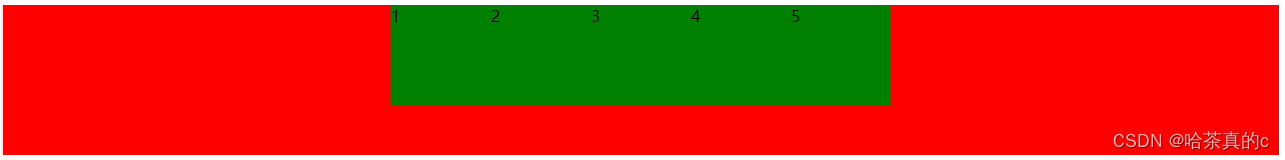
再给 div 加上justify-content: space-around;此时效果为

此时可以看到这些 span 已经能够水平隔开了.
把 justify-content: space-around; 改为 justify-content: flex-end; 可以看到此时三个元素在
右侧显示了.

flex 布局基本概念
flex 是 flexible box 的缩写. 意思为 “弹性盒子”.
任何一个 html 元素, 都可以指定为display:flex完成弹性布局.
flex 布局的本质是给父盒子添加display:flex属性, 来控制子盒子的位置和排列方式.
基础概念:- 被设置为 display:flex 属性的元素, 称为 flex container
- 它的所有子元素立刻称为了该容器的成员, 称为 flex item
- flex item 可以纵向排列, 也可以横向排列, 称为 flex direction(主轴)

注意:
当父元素设置为display: flex之后, 子元素的 float, clear, vertical-align 都会失效.
常用属性
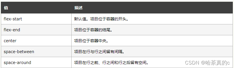
justify-content
设置主轴上的子元素排列方式.使用之前一定要确定好主轴是哪个方向
属性取值
代码示例<div> <span>1span> <span>2span> <span>3span> <span>4span> <span>5span> div> <style> div { width: 100%; height: 150px; background-color: red; display: flex; } div span { width: 100px; height: 100px; background-color: green; } style>- 1
- 2
- 3
- 4
- 5
- 6
- 7
- 8
- 9
- 10
- 11
- 12
- 13
- 14
- 15
- 16
- 17
- 18
- 19
- 20
未指定 justify-content 时, 默认按照从左到右的方向布局.

设置 justify-content: flex-end , 此时元素都排列到右侧了.

设置 jutify-content: center , 此时元素居中排列
设置 justify-content: space-around; 平分了剩余空间.

设置 justify-content: space-between; 先两边元素贴近边缘, 再平分剩余空间.

align-items
设置侧轴上的元素排列方式
在上面的代码中, 我们是让元素按照主轴的方向排列, 同理我们也可以指定元素按照侧轴方向排列.

取值和 justify-content 差不多.理解 stretch(拉伸):
这个是 align-content 的默认值. 意思是如果子元素没有被显式指定高度, 那么就会填充满父元素的高度.形如:
<div> <span>1span> <span>2span> <span>3span> div> <style> div { width: 500px; height: 500px; background-color: green; display: flex; justify-content: space-around; } div span { width: 150px; background-color: red; } style>- 1
- 2
- 3
- 4
- 5
- 6
- 7
- 8
- 9
- 10
- 11
- 12
- 13
- 14
- 15
- 16
- 17
- 18

可以使用 align-items 实现垂直居中<div> <span>1span> <span>2span> <span>3span> div> <style> div { width: 500px; height: 500px; background-color: green; display: flex; justify-content: space-around; align-items: center; } div span { width: 150px; height: 100px; background-color: red; } style>- 1
- 2
- 3
- 4
- 5
- 6
- 7
- 8
- 9
- 10
- 11
- 12
- 13
- 14
- 15
- 16
- 17
- 18
- 19
- 20

注意:align-items 只能针对单行元素来实现. 如果有多行元素, 就需要使用 item-contents
-
相关阅读:
【图论】Linova and Kingdom—CF1336A
ffmpeg 视频转图片 图片集转视频
基于深度学习网络的蔬菜水果种类识别算法matlab仿真
练习3-7 成绩转换
solidworks安装好后打不开显示错误代码
USB应用实战视频教程第3期:手把手玩转USB BULK方式下位机和QT6.4上位机开发(上篇)
一文搞定class的微观结构和指令
Python网络基础爬虫-python基本语法
使用 Apache DolphinScheduler 构建和部署大数据平台,将任务提交至 AWS 的实践经验
58同城2024届校招后端研发一面面经
- 原文地址:https://blog.csdn.net/weixin_60915103/article/details/137876781
