-
【四 (4)数据可视化之 Ploty Express常用图表及代码实现 】
文章导航
一、介绍
plotly是一个基于javascript的绘图库,python语言对相关参数进行了封装,ploty默认是生成HTML网页文件,通过浏览器查看,也可以在jupyter notebook中显示。
二、安装Plotly Express
pip install plotly- 1
三、导入Plotly Express
import plotly.express as px- 1
四、占比类图表
1、饼图
import plotly.express as px import pandas as pd # 假设我们有以下数据 data = { '类别': ['类别A', '类别B', '类别C', '类别D'], '值': [20, 30, 15, 35] } df = pd.DataFrame(data) # 绘制饼图 fig = px.pie(df, values='值', names='类别', title='饼图示例') fig.update_traces(textposition='inside', textinfo='percent+label') fig.show()- 1
- 2
- 3
- 4
- 5
- 6
- 7
- 8
- 9
- 10
- 11
- 12
- 13
- 14
- 15

2、环形图
import plotly.express as px import pandas as pd # 环形图其实就是带孔的饼图 fig = px.pie(df, values='值', names='类别', title='环形图示例', hole=.3) fig.update_layout( font_family="SimHei", title_font_size=16, legend_title_text='类别', legend_font_size=12 ) fig.update_traces(textposition='inside', textinfo='percent+label') fig.show()- 1
- 2
- 3
- 4
- 5
- 6
- 7
- 8
- 9
- 10
- 11
- 12
- 13

3、堆叠条形图
import plotly.express as px import pandas as pd # 假设我们有以下数据,包含多个分类和它们的值 data = { '年份': ['2020', '2020', '2021', '2021'], '类别': ['A', 'B', 'A', 'B'], '值': [10, 15, 20, 25] } df = pd.DataFrame(data) # 绘制堆叠条形图 fig = px.bar(df, x='年份', y='值', color='类别', barmode='stack', title='堆叠条形图示例') def set_text(trace): trace.text = [f"{val:.1f}" for val in trace.y] trace.textposition = 'outside' fig.for_each_trace(set_text) fig.show()- 1
- 2
- 3
- 4
- 5
- 6
- 7
- 8
- 9
- 10
- 11
- 12
- 13
- 14
- 15
- 16
- 17
- 18
- 19

4、百分比堆叠条形图
import plotly.express as px import pandas as pd # 假设数据 data = { '年份': ['2020', '2020', '2021', '2021'], '类别': ['A', 'B', 'A', 'B'], '值': [10, 15, 20, 25] } df = pd.DataFrame(data) # 计算每个年份的总值,用于计算百分比 df['总值'] = df.groupby('年份')['值'].transform('sum') df['百分比'] = (df['值'] / df['总值']) * 100 # 绘制堆叠条形图 fig = px.bar(df, x='年份', y='百分比', color='类别', barmode='stack', title='百分比堆叠条形图示例') # 遍历每个轨迹并设置文本 def set_text(trace): trace.text = [f"{val:.1f}%" for val in trace.y] trace.textposition = 'outside' fig.for_each_trace(set_text) # 显示图表 fig.show()- 1
- 2
- 3
- 4
- 5
- 6
- 7
- 8
- 9
- 10
- 11
- 12
- 13
- 14
- 15
- 16
- 17
- 18
- 19
- 20
- 21
- 22
- 23
- 24
- 25
- 26
- 27
- 28
- 29

五、比较排序类
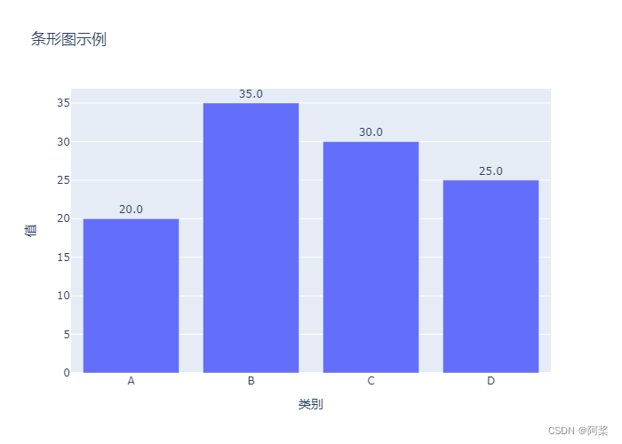
1、条形图
import plotly.express as px import pandas as pd # 假设我们有以下数据 data = { '类别': ['A', 'B', 'C', 'D'], '值': [20, 35, 30, 25] } df = pd.DataFrame(data) # 绘制条形图 fig = px.bar(df, x='类别', y='值', title='条形图示例') # 遍历每个轨迹并设置文本 def set_text(trace): trace.text = [f"{val:.1f}" for val in trace.y] trace.textposition = 'outside' fig.for_each_trace(set_text) # 显示图表 fig.show()- 1
- 2
- 3
- 4
- 5
- 6
- 7
- 8
- 9
- 10
- 11
- 12
- 13
- 14
- 15
- 16
- 17
- 18
- 19
- 20
- 21
- 22
2、漏斗图
import plotly.express as px import pandas as pd data = dict( number=[10000,7000,4000,2000,1000], stage=["浏览次数","关注数量","下载数量","咨询数量","成交数量"]) fig = px.funnel(data,x='number',y='stage') # 显示图表 fig.show()- 1
- 2
- 3
- 4
- 5
- 6
- 7
- 8
- 9
- 10

3、面积漏斗图
import plotly.express as px import pandas as pd data = dict( number=[10000,7000,4000,2000,1000], stage=["浏览次数","关注数量","下载数量","咨询数量","成交数量"]) fig = px.funnel_area(names=data['stage'],values=data['number']) # 显示图表 fig.show()- 1
- 2
- 3
- 4
- 5
- 6
- 7
- 8
- 9
- 10

六、趋势类图表
1、折线图
import plotly.express as px import pandas as pd # 假设的数据集 data = { '月份': ['1月', '2月', '3月', '4月', '5月', '6月'], '销售额': [12000, 15000, 18000, 13000, 16000, 19000] } # 创建Pandas DataFrame df = pd.DataFrame(data) # 使用Plotly Express绘制折线图 fig = px.line(df, x='月份', y='销售额', title='每月销售额趋势', labels={'月份': '月份', '销售额': '销售额'}) # 显示图表 fig.show()- 1
- 2
- 3
- 4
- 5
- 6
- 7
- 8
- 9
- 10
- 11
- 12
- 13
- 14
- 15
- 16
- 17
- 18

2、多图例折线图
import plotly.express as px import pandas as pd # 假设的数据集,包含两个不同类别的销售额 data = { '月份': ['1月', '2月', '3月', '4月', '5月', '6月'], '线上销售额': [12000, 15000, 18000, 13000, 16000, 19000], '线下销售额': [8000, 10000, 12000, 14000, 11000, 13000] } # 创建Pandas DataFrame df = pd.DataFrame(data) # 使用Plotly Express绘制多图例折线图 fig = px.line(df, x='月份', y=['线上销售额', '线下销售额'], title='每月线上与线下销售额趋势') # 显示图表 fig.show()- 1
- 2
- 3
- 4
- 5
- 6
- 7
- 8
- 9
- 10
- 11
- 12
- 13
- 14
- 15
- 16
- 17
- 18
- 19

3、分列折线图
import plotly.express as px import pandas as pd import numpy as np # 创建示例数据 np.random.seed(0) date_rng = pd.date_range(start='2023-01-01', periods=12, freq='M') # 生成12个月的日期范围 categories = ['Category1', 'Category2'] # 分类变量 subcategories = ['Sub1', 'Sub2', 'Sub3'] # 子分类变量 # 生成时间序列数据 df = pd.DataFrame() for cat in categories: for subcat in subcategories: data = np.random.rand(len(date_rng)) # 随机生成数据 df = df.append(pd.DataFrame({ 'Date': date_rng, 'Category': cat, 'Subcategory': subcat, 'Value': data }), ignore_index=True) # 将Date列转换为pandas的日期格式 df['Date'] = pd.to_datetime(df['Date']) # 设置Date列为索引,以便在折线图中使用它作为x轴 df.set_index('Date', inplace=True) # 绘制分列折线图 fig = px.line(df, x=df.index, y='Value', color='Subcategory', #facet_row='Category', # 按照Category进行分行展示 facet_col='Category', # 按照Category进行分列展示 title='分列折线图示例', labels={'Value': '数值', 'Subcategory': '子类别'}, width=1000, height=600 ) # 显示图表 fig.show()- 1
- 2
- 3
- 4
- 5
- 6
- 7
- 8
- 9
- 10
- 11
- 12
- 13
- 14
- 15
- 16
- 17
- 18
- 19
- 20
- 21
- 22
- 23
- 24
- 25
- 26
- 27
- 28
- 29
- 30
- 31
- 32
- 33
- 34
- 35
- 36
- 37
- 38
- 39
- 40

4、面积图
import plotly.express as px import pandas as pd # 假设的数据集 data = { '月份': ['1月', '2月', '3月', '4月', '5月', '6月'], '销售额': [12000, 15000, 18000, 13000, 16000, 19000] } # 创建Pandas DataFrame df = pd.DataFrame(data) # 计算累积销售额 df['累积销售额'] = df['销售额'].cumsum() # 使用Plotly Express绘制面积图 fig = px.area(df, x='月份', y='累积销售额', title='累积销售额趋势', labels={'月份': '月份', '累积销售额': '累积销售额'}) # 设置面积图的颜色填充 fig.update_traces(fill='tonexty', fillcolor='lightskyblue') # 显示图表 fig.show()- 1
- 2
- 3
- 4
- 5
- 6
- 7
- 8
- 9
- 10
- 11
- 12
- 13
- 14
- 15
- 16
- 17
- 18
- 19
- 20
- 21
- 22

5、多图例面积图
import plotly.express as px import pandas as pd # 假设的数据集 data = { '月份': ['1月', '2月', '3月', '4月', '5月', '6月'], '产品A销售额': [1000, 1200, 1500, 1300, 1600, 1800], '产品B销售额': [800, 1000, 1100, 1400, 1500, 1700] } # 创建Pandas DataFrame df = pd.DataFrame(data) # 使用Plotly Express绘制多图例面积图 fig = px.area(df, x='月份', y=['产品A销售额', '产品B销售额'], title='不同产品销售额趋势', labels={'月份': '月份', '产品A销售额': '产品A销售额', '产品B销售额': '产品B销售额'}, color_discrete_sequence=['#1f77b4', '#ff7f0e']) # 更新图表的样式和布局 fig.update_layout( xaxis=dict( titlefont=dict(size=16, color='black'), tickfont=dict(size=12), ), yaxis=dict( titlefont=dict(size=16, color='black'), tickfont=dict(size=12), ), legend=dict( x=0.01, y=0.99, bgcolor='rgba(255, 255, 255, 0.8)', bordercolor='rgba(0, 0, 0, 0.5)' ), font=dict( size=12, color='black' ), plot_bgcolor='rgba(240, 240, 240, 1)', # 设置背景色 paper_bgcolor='rgba(240, 240, 240, 1)', # 设置画布背景色 margin=dict(l=40, r=40, t=60, b=30) # 设置图表边距 ) # 显示图表 fig.show()- 1
- 2
- 3
- 4
- 5
- 6
- 7
- 8
- 9
- 10
- 11
- 12
- 13
- 14
- 15
- 16
- 17
- 18
- 19
- 20
- 21
- 22
- 23
- 24
- 25
- 26
- 27
- 28
- 29
- 30
- 31
- 32
- 33
- 34
- 35
- 36
- 37
- 38
- 39
- 40
- 41
- 42
- 43
- 44
- 45
- 46

七、频率分布类
1、直方图
import plotly.express as px import numpy as np # 生成一个正态分布的数据集 np.random.seed(0) # 设置随机种子以便结果可复现 data = np.random.normal(loc=0, scale=1, size=1000) # 生成均值为0,标准差为1的正态分布数据 # 创建一个简单的DataFrame来存储数据 df = pd.DataFrame(data, columns=['值']) # 绘制直方图 fig = px.histogram(df, x='值', nbins=30, title='数据集的直方图示例', histnorm='probability density', # 归一化为概率密度 opacity=0.8, # 设置条形的透明度 color_discrete_sequence=['#4E79A7']) # 设置条形的颜色 # 更新布局以美化图表 fig.update_layout( font_family="SimHei", # 使用支持中文的字体 title_font_size=16, # 标题字体大小 xaxis_title_text='值', # x轴标题 yaxis_title_text='概率密度', # y轴标题 xaxis_tickfont_size=12, # x轴刻度字体大小 yaxis_tickfont_size=12, # y轴刻度字体大小 barmode='overlay', # 设置条形的堆叠模式(如果需要的话) bargap=0.1, # 设置条形之间的间隙 bargroupgap=0.1 # 设置组之间的间隙 ) # 显示图表 fig.show()- 1
- 2
- 3
- 4
- 5
- 6
- 7
- 8
- 9
- 10
- 11
- 12
- 13
- 14
- 15
- 16
- 17
- 18
- 19
- 20
- 21
- 22
- 23
- 24
- 25
- 26
- 27
- 28
- 29
- 30
- 31
2、箱线图
import plotly.express as px # 假设我们有以下数据,包含分类列'category'和数值列'value' data = { 'category': ['A', 'A', 'B', 'B', 'C', 'C', 'D', 'D'], 'value': [1, 2, 5, 4, 3, 7, 6, 8] } df = pd.DataFrame(data) # 绘制箱线图 fig = px.box(df, x='category', y='value', title='箱线图示例') fig.show()- 1
- 2
- 3
- 4
- 5
- 6
- 7
- 8
- 9
- 10
- 11
- 12
- 13

八、关系类图表
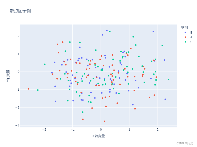
1、散点图
import plotly.express as px import pandas as pd import numpy as np # 创建示例数据 np.random.seed(0) df = pd.DataFrame({ 'x': np.random.randn(200), 'y': np.random.randn(200), 'category': np.random.choice(['A', 'B', 'C'], 200) }) # 绘制散点图 fig = px.scatter(df, x='x', y='y', color='category', title='散点图示例', labels={'x': 'X轴变量', 'y': 'Y轴变量', 'category': '类别'}, width=800, height=600) # 显示图表 fig.show()- 1
- 2
- 3
- 4
- 5
- 6
- 7
- 8
- 9
- 10
- 11
- 12
- 13
- 14
- 15
- 16
- 17
- 18
- 19
- 20
- 21
2、分列散点图
import plotly.express as px import pandas as pd import numpy as np # 创建示例数据 np.random.seed(0) df = pd.DataFrame({ 'Category': np.repeat(['A', 'B'], 200), 'X': np.concatenate((np.random.randn(200) + 2, np.random.randn(200) - 2)), 'Y': np.concatenate((np.random.randn(200) + 2, np.random.randn(200) - 2)), 'Subcategory': np.tile(['Sub1', 'Sub2', 'Sub3', 'Sub4'], 100) }) # 绘制分列散点图 fig = px.scatter(df, x='X', y='Y', color='Subcategory', facet_col='Category', title='分列散点图示例', labels={'X': 'X轴数据', 'Y': 'Y轴数据', 'Subcategory': '子类别'}, width=1000, height=600, facet_col_wrap=2 # 设置每行显示的子图数量 ) # 显示图表 fig.show()- 1
- 2
- 3
- 4
- 5
- 6
- 7
- 8
- 9
- 10
- 11
- 12
- 13
- 14
- 15
- 16
- 17
- 18
- 19
- 20
- 21
- 22
- 23
- 24
- 25

3、气泡图
import plotly.express as px import pandas as pd import numpy as np # 创建一个简单的DataFrame作为示例 np.random.seed(0) # 设置随机种子以便结果可复现 df = pd.DataFrame({ 'x': np.random.randn(200), # x轴数据 'y': np.random.randn(200), # y轴数据 'size': np.random.uniform(10, 50, 200), # 气泡大小 'category': np.random.choice(['A', 'B', 'C', 'D'], 200) # 气泡的类别 }) # 使用px.scatter绘制气泡图 fig = px.scatter(df, x='x', y='y', size='size', color='category', title='气泡图示例', labels={'x': 'X轴数据', 'y': 'Y轴数据', 'size': '大小', 'category': '类别'}, hover_data=['size', 'category'], # 鼠标悬停时显示的数据 log_x=False, # 是否对X轴使用对数尺度,这里我们不使用 width=800, height=600) # 显示图表 fig.show()- 1
- 2
- 3
- 4
- 5
- 6
- 7
- 8
- 9
- 10
- 11
- 12
- 13
- 14
- 15
- 16
- 17
- 18
- 19
- 20
- 21
- 22
- 23

4、热力图
import seaborn as sns # 创建随机二维数据矩阵 data = np.random.rand(10, 12) df_heat = pd.DataFrame(data, columns=[f'Col{i}' for i in range(1, 13)], index=[f'Row{i}' for i in range(1, 11)]) # 绘制热力图 fig = px.imshow(df_heat, title='热力图示例', labels=dict(x="列", y="行", color="值"), x=df_heat.columns, y=df_heat.index, color_continuous_scale='viridis', width=800, height=600) # 显示图表 fig.show()- 1
- 2
- 3
- 4
- 5
- 6
- 7
- 8
- 9
- 10
- 11
- 12
- 13
- 14
- 15
- 16
- 17

5、成对关系图
import seaborn as sns # 使用内置的iris数据集作为示例 df_iris = px.data.iris() # 绘制成对关系图 fig = px.scatter_matrix(df_iris, dimensions=['sepal_length', 'sepal_width', 'petal_length', 'petal_width'], color='species', title='成对关系图示例', width=1000, height=800) # 显示图表 fig.show()- 1
- 2
- 3
- 4
- 5
- 6
- 7
- 8
- 9
- 10
- 11
- 12
- 13
- 14

-
相关阅读:
控件交互的优劣势--自动窗帘系统
[网鼎杯 2020 朱雀组]phpweb-1|反序列化
dhtmlx甘特图marker不随小时移动
ubuntu 客服端同步ntp服务器时间
AI开源 - LangChain UI 之 Flowise
子线程的异常处理
golang gin——controller 模型绑定与参数校验
如何获取standard cell各端口的作用
EasyExcel复杂表头导出(一对多)
可转债市场和发行体制——市场的结构、发行方式、市场参与者与角色
- 原文地址:https://blog.csdn.net/weixin_42924611/article/details/136732708