-
CSS【详解】居中对齐 (水平居中 vs 垂直居中)
水平居中
内部块级元素的宽度要小于容器(父元素)
方案一:文本居中对齐(内联元素)
限制条件:仅用于内联元素 display:inline 和 display: inline-block;
给容器添加样式
text-align:center- 1
DOCTYPE html> <html lang="en"> <head> <meta charset="UTF-8" /> <meta name="viewport" content="width=device-width, initial-scale=1.0" /> <title>Documenttitle> <style> .box { margin: 30px 30px 0px 300px; border: 1px solid gray; text-align: center; } .item { display: inline-block; width: 400px; background: yellow; } style> head> <body> <div class="box"> <span>水平居中 -- display: inlinespan> div> <div class="box"> <div class="item">水平居中 -- display: inline-blockdiv> div> body> html>- 1
- 2
- 3
- 4
- 5
- 6
- 7
- 8
- 9
- 10
- 11
- 12
- 13
- 14
- 15
- 16
- 17
- 18
- 19
- 20
- 21
- 22
- 23
- 24
- 25
- 26
- 27
- 28
方案二:自动外边距(块级元素)
限制条件:仅用于块级元素 display:block;
给内部元素添加样式
margin: auto- 1

DOCTYPE html> <html lang="en"> <head> <meta charset="UTF-8" /> <meta name="viewport" content="width=device-width, initial-scale=1.0" /> <title>Documenttitle> <style> .box { margin: 30px; border: 1px solid gray; } .item { margin: auto; width: 300px; background: yellow; } style> head> <body> <div class="box"> <div class="item">水平居中 -- 块级元素 display:blockdiv> div> body> html>- 1
- 2
- 3
- 4
- 5
- 6
- 7
- 8
- 9
- 10
- 11
- 12
- 13
- 14
- 15
- 16
- 17
- 18
- 19
- 20
- 21
- 22
- 23
- 24
方案三:flex布局【推荐】
给容器添加样式
display: flex; justify-content: center;- 1
- 2
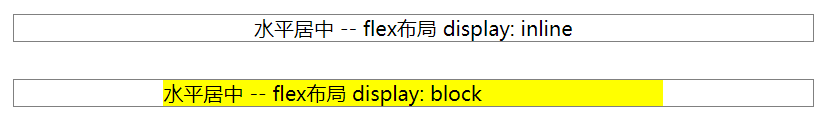
DOCTYPE html> <html lang="en"> <head> <meta charset="UTF-8" /> <meta name="viewport" content="width=device-width, initial-scale=1.0" /> <title>Documenttitle> <style> .box { margin: 30px 30px 0px 300px; border: 1px solid gray; display: flex; justify-content: center; } .item { width: 400px; background: yellow; } style> head> <body> <div class="box"> <span>水平居中 -- flex布局 display: inlinespan> div> <div class="box"> <div class="item">水平居中 -- flex布局 display: blockdiv> div> body> html>- 1
- 2
- 3
- 4
- 5
- 6
- 7
- 8
- 9
- 10
- 11
- 12
- 13
- 14
- 15
- 16
- 17
- 18
- 19
- 20
- 21
- 22
- 23
- 24
- 25
- 26
- 27
- 28
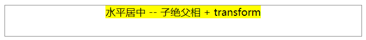
方案四:子绝父相 + transform (CSS3)
限制条件:浏览器需支持CSS3,比较老的浏览器不适用
给容器(父元素)添加样式position: relative- 1
给内部元素添加样式
position: absolute; left: 50%; transform: translate(-50%, 0);- 1
- 2
- 3
DOCTYPE html> <html lang="en"> <head> <meta charset="UTF-8" /> <meta name="viewport" content="width=device-width, initial-scale=1.0" /> <title>Documenttitle> <style> .box { margin: 30px 30px 0px 300px; border: 1px solid gray; height: 50px; position: relative; } .item { background-color: yellow; position: absolute; left: 50%; transform: translate(-50%, 0); } style> head> <body> <div class="box"> <span class="item">水平居中 -- 子绝父相 + transformspan> div> body> html>- 1
- 2
- 3
- 4
- 5
- 6
- 7
- 8
- 9
- 10
- 11
- 12
- 13
- 14
- 15
- 16
- 17
- 18
- 19
- 20
- 21
- 22
- 23
- 24
- 25
- 26
- 27
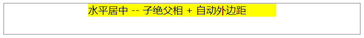
方案五:子绝父相 + 自动外边距 (指定宽度)
限制条件:内部元素需限定宽度
给容器(父元素)添加样式
position: relative- 1
给内部元素添加样式
position: absolute; left: 0; right: 0; margin: auto;- 1
- 2
- 3
- 4
DOCTYPE html> <html lang="en"> <head> <meta charset="UTF-8" /> <meta name="viewport" content="width=device-width, initial-scale=1.0" /> <title>Documenttitle> <style> .box { margin: 30px 30px 0px 300px; border: 1px solid gray; height: 50px; position: relative; } .item { background-color: yellow; position: absolute; left: 0; right: 0; margin: auto; width: 300px; } style> head> <body> <div class="box"> <span class="item">水平居中 -- 子绝父相 + 自动外边距span> div> body> html>- 1
- 2
- 3
- 4
- 5
- 6
- 7
- 8
- 9
- 10
- 11
- 12
- 13
- 14
- 15
- 16
- 17
- 18
- 19
- 20
- 21
- 22
- 23
- 24
- 25
- 26
- 27
- 28
- 29
方案六:子绝父相 + 负外边距 (知道宽度 + 宽度计算)
限制条件:需知道内部元素的宽度(无法预知宽度的内联元素和未知宽度的块级元素都不适用)
给容器(父元素)添加样式
position: relative- 1
给内部元素添加样式
position: absolute; left:50%; margin-left:-内部元素宽度的一半- 1
- 2
- 3
DOCTYPE html> <html lang="en"> <head> <meta charset="UTF-8" /> <meta name="viewport" content="width=device-width, initial-scale=1.0" /> <title>Documenttitle> <style> .box { margin: 30px; border: 1px solid gray; height: 100px; position: relative; } .item { width: 400px; background: yellow; position: absolute; left: 50%; margin-left: -200px; } style> head> <body> <div class="box"> <div class="item">水平居中 -- 绝对定位元素 position:absolutediv> div> body> html>- 1
- 2
- 3
- 4
- 5
- 6
- 7
- 8
- 9
- 10
- 11
- 12
- 13
- 14
- 15
- 16
- 17
- 18
- 19
- 20
- 21
- 22
- 23
- 24
- 25
- 26
- 27
- 28
垂直居中
内部块级元素的高度要小于容器(父元素)
方案一:行高 = 容器高度(单行内联元素)
限制条件:仅用于单行内联元素 display:inline 和 display: inline-block;
给容器添加样式
height: 100px; line-height: 100px;- 1
- 2
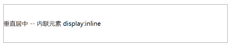
DOCTYPE html> <html lang="en"> <head> <meta charset="UTF-8" /> <meta name="viewport" content="width=device-width, initial-scale=1.0" /> <title>Documenttitle> <style> .box { margin: 30px; border: 1px solid gray; height: 100px; line-height: 100px; } style> head> <body> <div class="box"> <span class="item">垂直居中 -- 内联元素 display:inlinespan> div> body> html>- 1
- 2
- 3
- 4
- 5
- 6
- 7
- 8
- 9
- 10
- 11
- 12
- 13
- 14
- 15
- 16
- 17
- 18
- 19
- 20
- 21
方案二:flex布局【推荐】
给容器添加样式
display: flex; align-items: center;- 1
- 2
方案三:子绝父相 + transform(CSS3)
限制条件:浏览器需支持CSS3,比较老的浏览器不适用
给容器(父元素)添加样式position: relative- 1
给内部元素添加样式
position: absolute; top: 50%; transform: translate(0, -50%);- 1
- 2
- 3
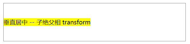
DOCTYPE html> <html lang="en"> <head> <meta charset="UTF-8" /> <meta name="viewport" content="width=device-width, initial-scale=1.0" /> <title>Documenttitle> <style> .box { margin: 30px; border: 1px solid gray; height: 100px; position: relative; } .item { position: absolute; top: 50%; transform: translate(0, -50%); background-color: yellow; } style> head> <body> <div class="box"> <div class="item">垂直居中 -- 子绝父相 transformdiv> div> body> html>- 1
- 2
- 3
- 4
- 5
- 6
- 7
- 8
- 9
- 10
- 11
- 12
- 13
- 14
- 15
- 16
- 17
- 18
- 19
- 20
- 21
- 22
- 23
- 24
- 25
- 26
- 27
- 28
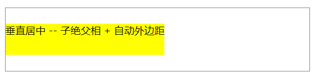
方案四:子绝父相 + 自动外边距(指定高度)
限制条件:内部元素需限定高度
给容器(父元素)添加样式
position: relative- 1
给内部元素添加样式
position: absolute; top: 0; bottom: 0; margin: auto;- 1
- 2
- 3
- 4
- 内联元素也有效,因为内联元素绝对定位后,display 会变为 block
DOCTYPE html> <html lang="en"> <head> <meta charset="UTF-8" /> <meta name="viewport" content="width=device-width, initial-scale=1.0" /> <title>Documenttitle> <style> .box { margin: 30px; border: 1px solid gray; height: 100px; position: relative; } .item { position: absolute; top: 0; bottom: 0; margin: auto; background-color: yellow; height: 50px; } style> head> <body> <div class="box"> <span class="item">垂直居中 -- 子绝父相 + 自动外边距span> div> body> html>- 1
- 2
- 3
- 4
- 5
- 6
- 7
- 8
- 9
- 10
- 11
- 12
- 13
- 14
- 15
- 16
- 17
- 18
- 19
- 20
- 21
- 22
- 23
- 24
- 25
- 26
- 27
- 28
- 29
- 30
方案五:子绝父相 + 负外边距 (知道高度 + 高度计算)
限制条件:需知道内部元素的高度
给容器(父元素)添加样式
position: relative- 1
给内部元素添加样式
position: absolute; top: 50%; margin-top: -内部元素高度的一半;- 1
- 2
- 3
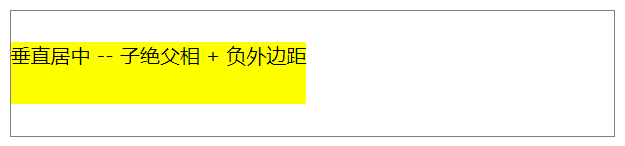
DOCTYPE html> <html lang="en"> <head> <meta charset="UTF-8" /> <meta name="viewport" content="width=device-width, initial-scale=1.0" /> <title>Documenttitle> <style> .box { margin: 30px; border: 1px solid gray; height: 100px; position: relative; } .item { position: absolute; top: 50%; margin-top: -25px; height: 50px; background-color: yellow; } style> head> <body> <div class="box"> <span class="item">垂直居中 -- 子绝父相 + 负外边距span> div> body> html>- 1
- 2
- 3
- 4
- 5
- 6
- 7
- 8
- 9
- 10
- 11
- 12
- 13
- 14
- 15
- 16
- 17
- 18
- 19
- 20
- 21
- 22
- 23
- 24
- 25
- 26
- 27
- 28
- 29
水平垂直居中
参考上文分别实现水平居中和垂直居中即可,常用方案如下:
方案一:flex布局【推荐】
给容器添加样式
display: flex; justify-content: center; align-items: center;- 1
- 2
- 3
方案二:子绝父相 + transform (CSS3)
限制条件:浏览器需支持CSS3,比较老的浏览器不适用
给容器(父元素)添加样式position: relative- 1
给内部元素添加样式
position: absolute; top: 50%; left: 50%; transform: translate(-50%, -50%);- 1
- 2
- 3
- 4
方案三:子绝父相 + 自动外边距(指定高度和宽度)
给容器(父元素)添加样式
position: relative- 1
给内部元素添加样式
position: absolute; top: 0; bottom: 0; left: 0; right: 0; margin: auto;- 1
- 2
- 3
- 4
- 5
- 6
方案四:子绝父相 + 负外边距 (知道宽度和高度 + 宽度和高度计算)
限制条件:需知道内部元素的宽度和高度
给容器(父元素)添加样式position: relative- 1
给内部元素添加样式
position: absolute; left:50%; margin-left:-内部元素宽度的一半; top: 50%; margin-top: -内部元素高度的一半;- 1
- 2
- 3
- 4
- 5
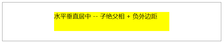
DOCTYPE html> <html lang="en"> <head> <meta charset="UTF-8" /> <meta name="viewport" content="width=device-width, initial-scale=1.0" /> <title>Documenttitle> <style> .box { margin: 30px 30px 0px 300px; border: 1px solid gray; height: 100px; position: relative; } .item { background-color: yellow; position: absolute; left: 50%; margin-left: -150px; top: 50%; margin-top: -25px; width: 300px; height: 50px; } style> head> <body> <div class="box"> <span class="item">水平垂直居中 -- 子绝父相 + 负外边距span> div> body> html>- 1
- 2
- 3
- 4
- 5
- 6
- 7
- 8
- 9
- 10
- 11
- 12
- 13
- 14
- 15
- 16
- 17
- 18
- 19
- 20
- 21
- 22
- 23
- 24
- 25
- 26
- 27
- 28
- 29
- 30
- 31
-
相关阅读:
若依框架前端切换TagView时刷新问题
思科、华为、华三、锐捷网络设备巡检命令
LIN - 基础
SQL面试常问到的sql优化方式
Linux 用户管理与文件权限详解
MySQL 用户权限和远程访问设置
Java MyBatis查询数据库&结果映射 之ResultMap的使用
1543_AURIX_TC275_CPU子系统_CPU内核实现特性
攻防世界WEB练习-Fakebook
使用boost::geometry::union_ 合并边界(内、外)- 方案一
- 原文地址:https://blog.csdn.net/weixin_41192489/article/details/136400747