-
鸿蒙Harmony应用开发—ArkTS声明式开发(通用属性:布局约束)
通过组件的宽高比和显示优先级约束组件显示效果。
说明:
从API Version 7开始支持。后续版本如有新增内容,则采用上角标单独标记该内容的起始版本。
aspectRatio
aspectRatio(value: number)
指定当前组件的宽高比。
卡片能力: 从API version 9开始,该接口支持在ArkTS卡片中使用。
系统能力: SystemCapability.ArkUI.ArkUI.Full
参数:
参数名 类型 必填 说明 value number 是 指定当前组件的宽高比,aspectRatio = width/height。
API version 9及以前,默认值为:1.0。
API version 10:无默认值。
说明:
该属性在不设置值或者设置非法值时不生效。
例如,Row只设置宽度且没有子组件,aspectRatio不设置值或者设置成负数时,此时Row高度为0。displayPriority
displayPriority(value: number)
设置当前组件在布局容器中显示的优先级。
卡片能力: 从API version 9开始,该接口支持在ArkTS卡片中使用。
系统能力: SystemCapability.ArkUI.ArkUI.Full
参数:
参数名 类型 必填 说明 value number 是 设置当前组件在布局容器中显示的优先级,当父容器空间不足时,低优先级的组件会被隐藏。
小数点后的数字不作优先级区分,即区间为[x, x + 1)内的数字视为相同优先级。例如:1.0与1.9为同一优先级。
说明:
仅在Row/Column/Flex(单行)容器组件中生效。示例
示例1
- // xxx.ets
- @Entry
- @Component
- struct AspectRatioExample {
- private children: string[] = ['1', '2', '3', '4', '5', '6']
- build() {
- Column({ space: 20 }) {
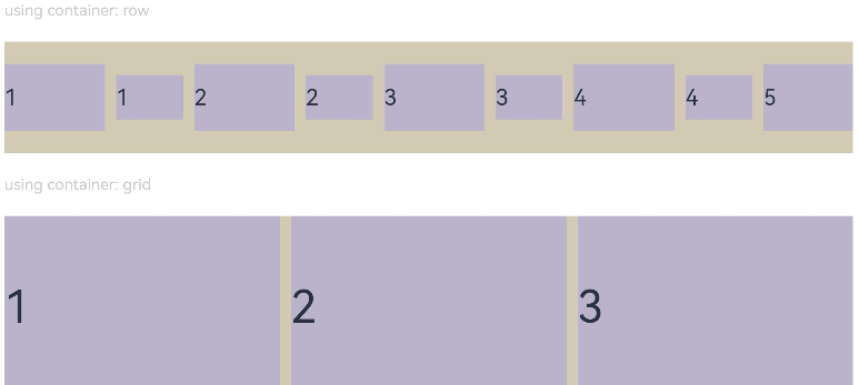
- Text('using container: row').fontSize(14).fontColor(0xCCCCCC).width('100%')
- Row({ space: 10 }) {
- ForEach(this.children, (item:string) => {
- // 组件宽度 = 组件高度*1.5 = 90
- Text(item)
- .backgroundColor(0xbbb2cb)
- .fontSize(20)
- .aspectRatio(1.5)
- .height(60)
- // 组件高度 = 组件宽度/1.5 = 60/1.5 = 40
- Text(item)
- .backgroundColor(0xbbb2cb)
- .fontSize(20)
- .aspectRatio(1.5)
- .width(60)
- }, (item:string) => item)
- }
- .size({ width: "100%", height: 100 })
- .backgroundColor(0xd2cab3)
- .clip(true)
- // grid子元素width/height=3/2
- Text('using container: grid').fontSize(14).fontColor(0xCCCCCC).width('100%')
- Grid() {
- ForEach(this.children, (item:string) => {
- GridItem() {
- Text(item)
- .backgroundColor(0xbbb2cb)
- .fontSize(40)
- .width('100%')
- .aspectRatio(1.5)
- }
- }, (item:string) => item)
- }
- .columnsTemplate('1fr 1fr 1fr')
- .columnsGap(10)
- .rowsGap(10)
- .size({ width: "100%", height: 165 })
- .backgroundColor(0xd2cab3)
- }.padding(10)
- }
- }
图1 竖屏显示

图2 横屏显示
示例2
- class ContainerInfo {
- label: string = '';
- size: string = '';
- }
- class ChildInfo {
- text: string = '';
- priority: number = 0;
- }
- @Entry
- @Component
- struct DisplayPriorityExample {
- // 显示容器大小
- private container: ContainerInfo[] = [
- { label: 'Big container', size: '90%' },
- { label: 'Middle container', size: '50%' },
- { label: 'Small container', size: '30%' }
- ]
- private children: ChildInfo[] = [
- { text: '1\n(priority:2)', priority: 2 },
- { text: '2\n(priority:1)', priority: 1 },
- { text: '3\n(priority:3)', priority: 3 },
- { text: '4\n(priority:1)', priority: 1 },
- { text: '5\n(priority:2)', priority: 2 }
- ]
- @State currentIndex: number = 0;
- build() {
- Column({ space: 10 }) {
- // 切换父级容器大小
- Button(this.container[this.currentIndex].label).backgroundColor(0x317aff)
- .onClick(() => {
- this.currentIndex = (this.currentIndex + 1) % this.container.length;
- })
- // 通过变量设置Flex父容器宽度
- Flex({ justifyContent: FlexAlign.SpaceBetween }) {
- ForEach(this.children, (item:ChildInfo) => {
- // 使用displayPriority给子组件绑定显示优先级
- Text(item.text)
- .width(120)
- .height(60)
- .fontSize(24)
- .textAlign(TextAlign.Center)
- .backgroundColor(0xbbb2cb)
- .displayPriority(item.priority)
- }, (item:ChildInfo) => item.text)
- }
- .width(this.container[this.currentIndex].size)
- .backgroundColor(0xd2cab3)
- }.width("100%").margin({ top: 50 })
- }
- }
横屏显示

最后,有很多小伙伴不知道学习哪些鸿蒙开发技术?不知道需要重点掌握哪些鸿蒙应用开发知识点?而且学习时频繁踩坑,最终浪费大量时间。所以有一份实用的鸿蒙(Harmony NEXT)资料用来跟着学习是非常有必要的。
这份鸿蒙(Harmony NEXT)资料包含了鸿蒙开发必掌握的核心知识要点,内容包含了(ArkTS、ArkUI开发组件、Stage模型、多端部署、分布式应用开发、音频、视频、WebGL、OpenHarmony多媒体技术、Napi组件、OpenHarmony内核、Harmony南向开发、鸿蒙项目实战等等)鸿蒙(Harmony NEXT)技术知识点。
希望这一份鸿蒙学习资料能够给大家带来帮助,有需要的小伙伴自行领取,限时开源,先到先得~无套路领取!!
获取这份完整版高清学习路线,请点击→纯血版全套鸿蒙HarmonyOS学习资料
鸿蒙(Harmony NEXT)最新学习路线

-
HarmonOS基础技能

- HarmonOS就业必备技能

- HarmonOS多媒体技术

- 鸿蒙NaPi组件进阶

- HarmonOS高级技能

- 初识HarmonOS内核
- 实战就业级设备开发

有了路线图,怎么能没有学习资料呢,小编也准备了一份联合鸿蒙官方发布笔记整理收纳的一套系统性的鸿蒙(OpenHarmony )学习手册(共计1236页)与鸿蒙(OpenHarmony )开发入门教学视频,内容包含:ArkTS、ArkUI、Web开发、应用模型、资源分类…等知识点。
获取以上完整版高清学习路线,请点击→纯血版全套鸿蒙HarmonyOS学习资料
《鸿蒙 (OpenHarmony)开发入门教学视频》

《鸿蒙生态应用开发V2.0白皮书》
《鸿蒙 (OpenHarmony)开发基础到实战手册》
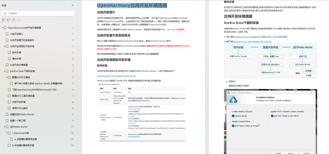
OpenHarmony北向、南向开发环境搭建
《鸿蒙开发基础》
- ArkTS语言
- 安装DevEco Studio
- 运用你的第一个ArkTS应用
- ArkUI声明式UI开发
- .……
《鸿蒙开发进阶》
- Stage模型入门
- 网络管理
- 数据管理
- 电话服务
- 分布式应用开发
- 通知与窗口管理
- 多媒体技术
- 安全技能
- 任务管理
- WebGL
- 国际化开发
- 应用测试
- DFX面向未来设计
- 鸿蒙系统移植和裁剪定制
- ……
《鸿蒙进阶实战》
- ArkTS实践
- UIAbility应用
- 网络案例
- ……
获取以上完整鸿蒙HarmonyOS学习资料,请点击→纯血版全套鸿蒙HarmonyOS学习资料
总结
总的来说,华为鸿蒙不再兼容安卓,对中年程序员来说是一个挑战,也是一个机会。只有积极应对变化,不断学习和提升自己,他们才能在这个变革的时代中立于不败之地。

-
相关阅读:
[项目管理-22]:项目中开环、闭环、安全、监控四种沟通模型:UDP/TCP/SCTP/PID模型
Redis事务+watch+RDB+AOF+发布订阅+主从复制+哨兵模式+缓存穿透和雪崩及解决方案+使用watch实现秒杀相关
计算机毕设 基于大数据的抖音短视频数据分析与可视化 - python 大数据 可视化
Taurus .Net Core 微服务开源框架:Admin 插件【1】 - 微服务节点管理
Python文件操作2-- 小案例
什么是组件
php 将rsa私钥 从DER格式的私钥转换为 PEM 格式
ajax是异步还是同步?
vue-core-video-player-基于vue.js的视频播放器组件
docker--在Anaconda jupyter 容器中使用oracle数据源时,Oracle客户端安装配置及使用示例
- 原文地址:https://blog.csdn.net/m0_64420071/article/details/136399936
