-
创作一款表情包生成微信小程序:功能详解与用户体验优化
一、引言
在当今社交媒体充斥着各种趣味表情包的时代,表情包生成工具成为许多用户创作和分享创意的热门选择。为了迎合这一趋势,我设计并开发了一款功能丰富、用户友好的微信小程序,旨在让用户能够轻松而有趣地创作个性化的表情包。这篇博客将深入介绍我的微信小程序,详解其各项功能,以及为了提升用户体验而进行的设计和优化。无论是内置的上百种头像素材,还是支持自定义上传与编辑的功能,我将逐一展示这个小程序的强大之处,帮助读者更好地理解并使用这款创意工具。
二、背景
在数字创意时代,表情包已经成为人们交流中不可或缺的一部分。然而,尽管微信推出了名为“微信创意表情”的小程序,我却发现它在素材数量和用户自定义方面存在一些限制。素材有限、用户无法自定义上传图片,这些限制让我看到了改进的空间,因此萌发了开发自己的表情包生成微信小程序的念头。
我的小程序的背景正是在这样的需求和不足之下诞生的。通过深入研究用户反馈和市场调研,我决定打造一款更加强大、灵活且富有创意的表情包生成工具。我的初衷是为用户提供一个自由、个性化的创作空间,让他们能够尽情表达自己的创意,而不受素材和功能的限制。通过模仿并超越现有的小程序,我致力于打破创作的边界,让用户在表情包的世界中享受更多的乐趣和创意。这款小程序不仅仅是一款工具,更是我对创意自由和个性表达的热忱回应。
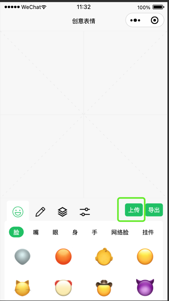
三、已实现功能
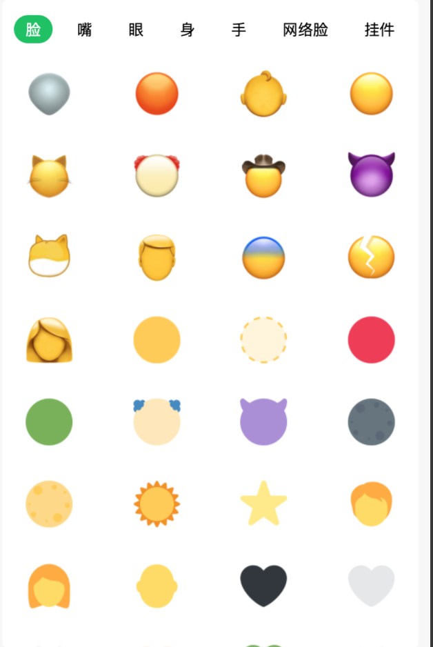
- 1、内置上百种头像合成素材:
提供丰富多样的素材,包括脸、嘴、眼、身体、手、网络脸、挂架等,供用户选择和合成。
- 2、可自定义上传图片:
允许用户自由上传个人照片或网络素材,拓展创作空间,让表情包更具个性。
- 3、图片支持移动、缩放、旋转、批量选择:
提供直观的操作界面,用户可以自由调整图片的位置、大小、旋转角度,并支持批量选择多个元素进行统一操作。
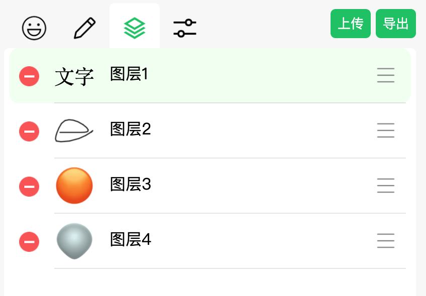
- 4、图层可以通过列表拖拽实现上下排序:
实现直观的图层管理,用户可通过简单的拖拽操作调整图层的顺序,灵活掌握表情包的层次结构。
- 5、不同颜色、触点大小的涂鸦:
提供丰富的涂鸦工具,用户可以自由选择不同颜色和触点大小,为表情包添加更多创意元素。
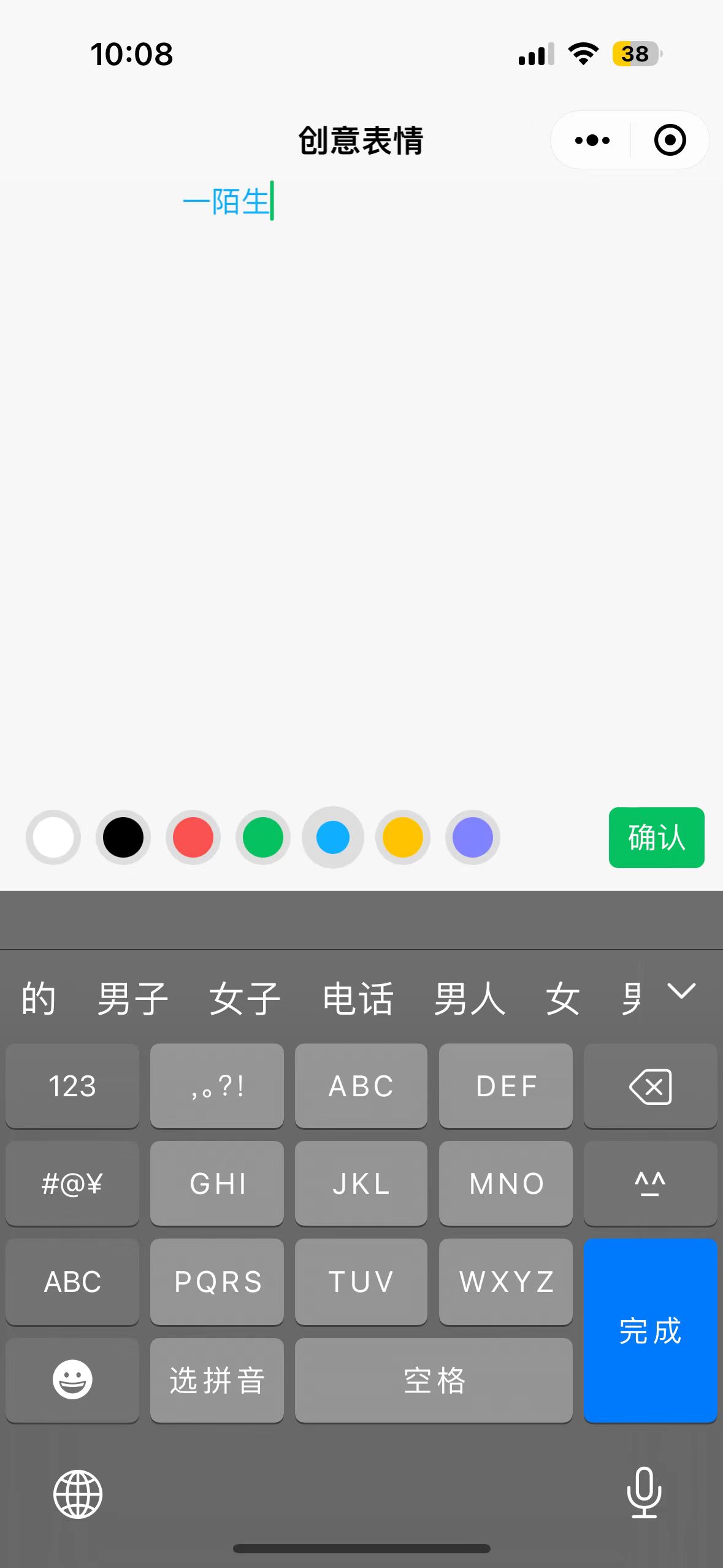
- 6、文字输入:
实现文字输入功能,用户可选择不同颜色的文字,自由添加文字表达情感或创意。
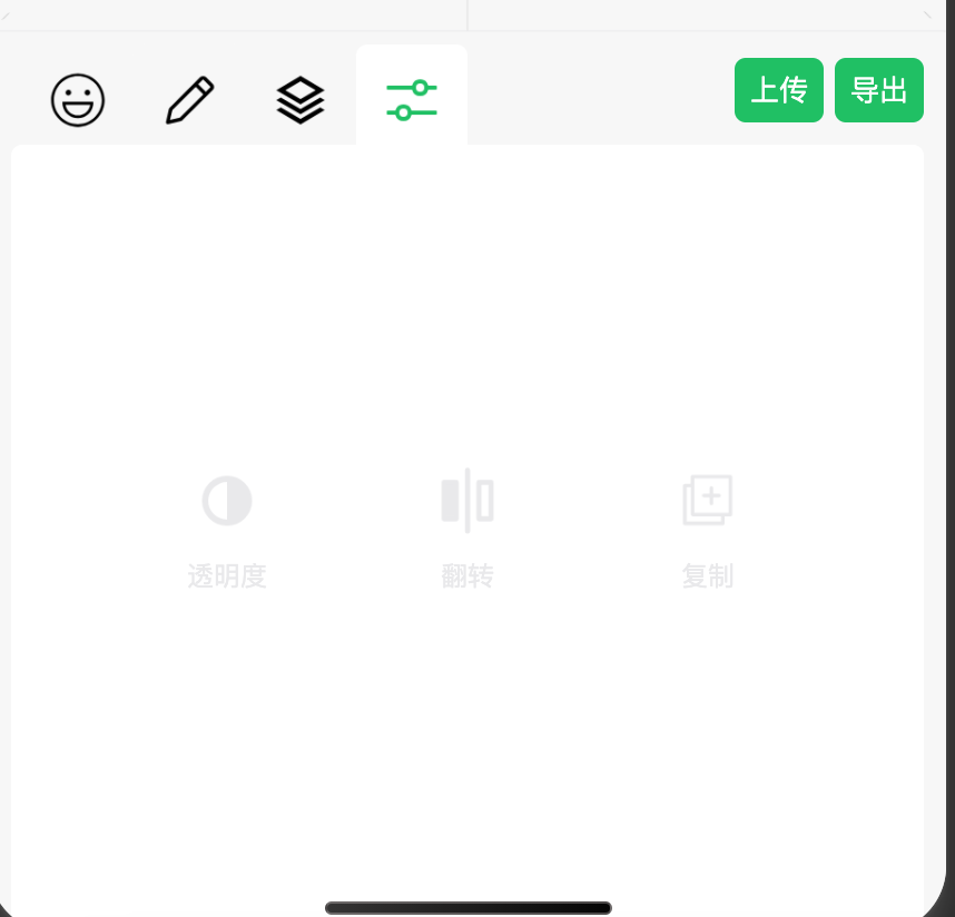
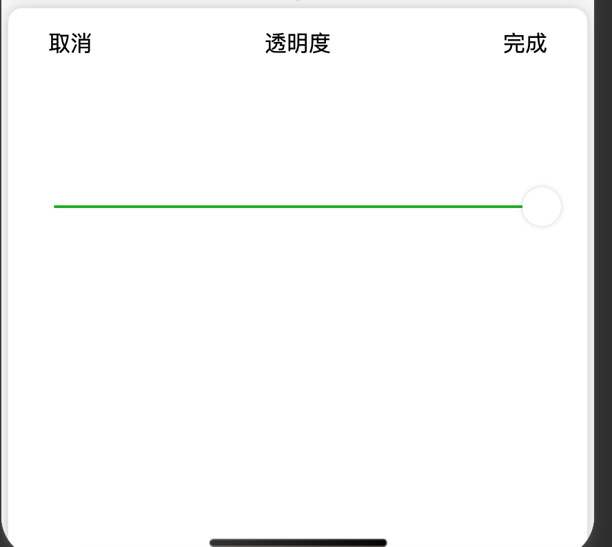
- 7、图层自由调整透明度:
用户可以对每个图层进行透明度调整,实现更丰富的叠加效果。
- 8、图层左右镜像:
提供左右镜像功能,增加表情包的变化和趣味性。
- 9、图层复制:
允许用户复制已有的图层,方便创作时的重复元素使用。
- 10、将合成的图片导出:
提供简便的导出功能,让用户能够保存和分享自己创作的表情包。
四、素材库设计
我定义了一个组件”EmojiCardPanel“,从网上搜罗了许多素材,然后获取到所有素材的宽、高。定义素材相对于图层左上角的坐标值。实现效果。
上层是tab,下层是 swiper+scroll-view
代码如下:
- <script setup lang="ts">
- import { onMounted, ref } from 'vue'
- const emits = defineEmits<{
- //选择emoji
- (e: 'selectEmoji', x: number, y: number, w: number, h: number, url: string): void
- }>()
- /** Tab 选项 */
- type TabOption = {
- id: number
- title: string
- details: TabDetail[]
- }
- /** Tab 明细 */
- type TabDetail = {
- url: string
- x: number
- y: number
- w: number
- h: number
- }
- // 所有tab
- const tabs = ref<TabOption[]>([])
- // 当前选择Tab Index
- const activeTabIndex = ref
(-1) - // 选择图片Id
- const currentTouchImageId = ref
(-1) - onMounted(() => {
- tabs.value = [在这里填充tab数据]
- activeTabIndex.value = 0
- })
- // 选择tab
- const onSelectTab = (index: number) => {
- activeTabIndex.value = index
- }
- // image touch start
- const onImageTouchStart = (img: TabDetail, index: number) => {
- currentTouchImageId.value = index
- }
- // image tap
- const onTap = (img: TabDetail, index: number) => {
- currentTouchImageId.value = index
- uni.downloadFile({
- url: img.url,
- success: (res) => {
- if (res.statusCode === 200) {
- emits('selectEmoji', img.x, img.y, img.w, img.h, res.tempFilePath)
- currentTouchImageId.value = -1
- } else {
- uni.showToast({
- title: '下载资源失败,状态码:' + res.statusCode,
- })
- currentTouchImageId.value = -1
- }
- },
- fail: (error) => {
- uni.showToast({
- title: '资源下载异常',
- })
- currentTouchImageId.value = -1
- },
- })
- }
- // image touch end
- const onImageTouchEnd = () => {
- currentTouchImageId.value = -1
- }
- script>
- <template>
- <view class="emoji-card-panel">
- <view class="tabs">
- <text
- class="text"
- :class="{ select: index === activeTabIndex }"
- v-for="(tab, index) in tabs"
- :key="'tab_' + index"
- @tap="onSelectTab(index)"
- >{{ tab.title }}>view><swiperclass="swiper":current="activeTabIndex"@change="activeTabIndex = $event.detail.current"><swiper-item v-for="(tab, index) in tabs" :key="'detail_' + index"><scroll-view class="tab-detail" scroll-y><view class="images"><imageclass="image":lazy-load="true"mode="widthFix":class="{ touch: ix === currentTouchImageId }"@tap="onTap(img, ix)"@touchstart="onImageTouchStart(img, ix)"@touchend="onImageTouchEnd"v-for="(img, ix) in tab.details":key="'img_' + ix":src="img.url">image>view>scroll-view>swiper-item>swiper>view>template><style lang="scss" scoped>.emoji-card-panel {height: 100%;width: 100%;display: flex;flex-direction: column;padding-top: 5px;font-size: 13px;.tabs {display: flex;justify-content: space-between;align-items: center;height: 40rpx;margin: 10px;.text {padding: 3px 10px;border-radius: 15px;&.select {background-color: #07c160;color: white;/* 过渡效果 */transition: all 0.4s;}}}.tab-detail {flex: 1;.images {display: flex;flex-wrap: wrap;justify-content: space-between;padding: 0 10rpx 10rpx;.image {width: 40px;padding: 10px;border-radius: 12px;margin: 5px;&.touch {background-color: rgba(0, 0, 0, 0.1);}}.image:last-child {margin-right: auto;}}}}style>
五、自定义上传与编辑
这个就不用说了,选择图片,上传,然后图片绘制到最上层图层,并默认选中
六、图层管理
针对图层管理,是最复杂的,同样也增加了一个组件”CanvasDragPanel“,没有使用 2d版本的canvas ,虽然2d渲染速度更快,但是发现图层在移动、缩放时有闪烁,不管是用双缓冲还是requestAnimationFrame 都未能解决这个闪烁问题。因为要涂鸦,所以用了两个canvas,在涂鸦时将主canvas隐藏,涂鸦结束后,再调换过来。
这里的难点是,图层选择、移动、缩放、删除、并且我还设计了批量选择,这些都将是此小程序实现的难点。
- <template>
- <view
- class="canvas-drag-panel"
- :style="{
- width: props.width + 'px',
- height: props.height + 'px',
- }"
- >
- <canvas
- id="mainCanvasId"
- canvas-id="mainCanvasId"
- :class="{
- disabled: mainCanvasDisabled,
- }"
- class="canvas main-canvas"
- @touchstart="touchStart"
- @touchmove="touchMove"
- @touchend="touchEnd"
- @error="touchError"
- @touchcancel="touchCancel"
- :disable-scroll="true"
- >canvas>
- <canvas
- v-show="graffitiCanvasShow"
- canvas-id="graffitiCanvasId"
- @touchstart="graffitiTouchStart"
- @touchmove="graffitiTouchMove"
- @touchend="graffitiTouchEnd"
- :disable-scroll="true"
- class="canvas graffiti-canvas"
- >canvas>
- view>
- template>
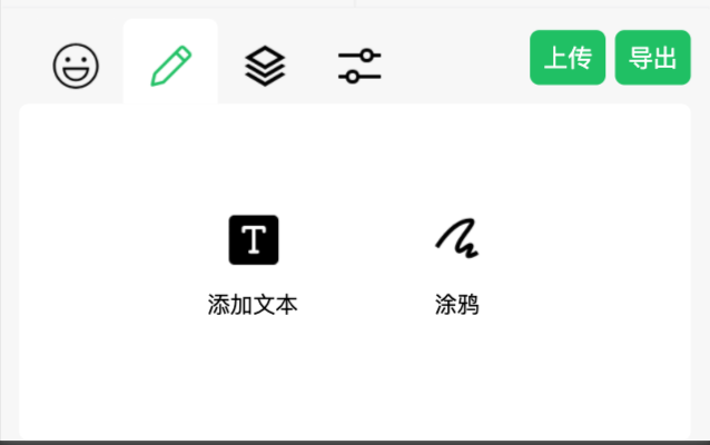
七、涂鸦和文字输入
涂鸦和文字输入也是封装了两个组件分别是”GraffitiPanel“和”AddTextPanel“,至于选择涂鸦还是文字,因为是一个按钮组和后面的调节是一样的,封装了一个组件”ButtonGroupPanel“
涂鸦面板效果:
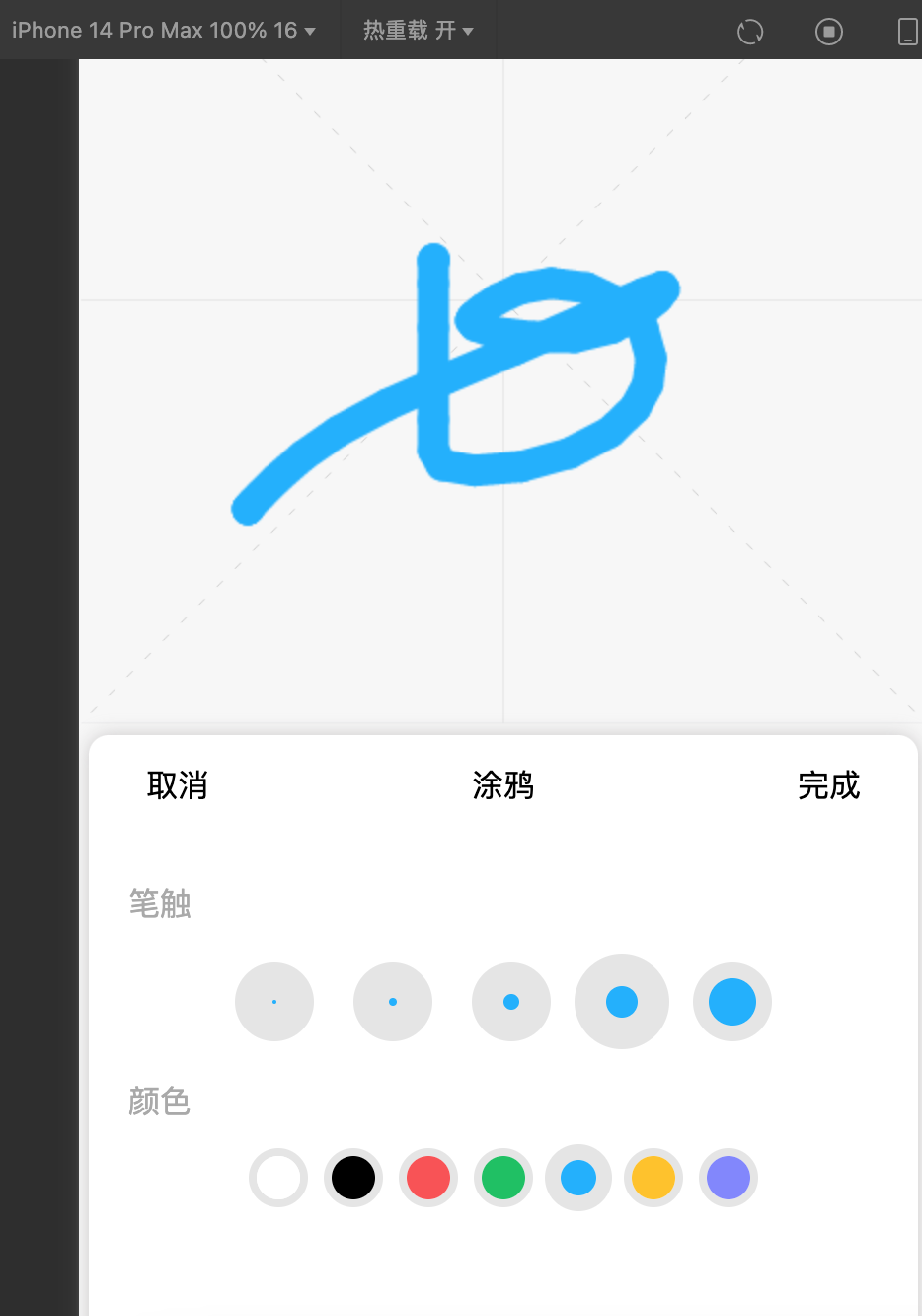
代码如下:
- <script setup lang="ts">
- import { ref } from 'vue'
- const emits = defineEmits<{
- // 取消
- (e: 'cancelGraffiti'): void
- // 完成
- (e: 'completeGraffiti'): void
- // 选择stroke
- (e: 'selectGraffitiStroke', index: number): void
- // 选择color
- (e: 'selectGraffitiColor', index: number): void
- }>()
- // 定义组件属性
- const props = defineProps<{
- top: number
- height: number
- strokeDataList: number[]
- colorDataList: string[]
- }>()
- // 取消
- const cancelGraffiti = () => {
- emits('cancelGraffiti')
- }
- // 完成
- const endGraffiti = () => {
- emits('completeGraffiti')
- }
- // 选择 stroke
- const selectGraffitiStroke = (index: number) => {
- currentGraffitiStrokeIndex.value = index
- emits('selectGraffitiStroke', index)
- }
- // 选择yanse
- const selectGraffitiColor = (index: number) => {
- emits('selectGraffitiColor', index)
- currentGraffitiColorIndex.value = index
- }
- // 当前选择stroke
- const currentGraffitiStrokeIndex = ref
(1) - // 当前选择颜色
- const currentGraffitiColorIndex = ref
(1) - script>
- <template>
- <view
- class="graffiti-panel"
- :style="{
- top: props.top + 'px',
- height: props.height + 'px',
- }"
- >
- <view class="top">
- <text class="left" @tap="cancelGraffiti">取消text>
- <text class="center">涂鸦text>
- <text class="right" @tap="endGraffiti">完成text>
- view>
- <view class="main">
- <view class="title"><text>笔触text>view>
- <view class="content">
- <view
- class="circle-view stroke-view"
- :class="{
- selected: index === currentGraffitiStrokeIndex,
- }"
- @tap="selectGraffitiStroke(index)"
- v-for="(item, index) in props.strokeDataList"
- :key="'stroke_' + index"
- >
- <view
- class="circle"
- :style="{
- width: item + 'px',
- height: item + 'px',
- 'background-color': colorDataList[currentGraffitiColorIndex],
- }"
- >view>
- view>
- view>
- <view class="title"><text>颜色text>view>
- <view class="content">
- <view
- class="circle-view color-view"
- :class="{
- selected: index === currentGraffitiColorIndex,
- }"
- @tap="selectGraffitiColor(index)"
- v-for="(item, index) in props.colorDataList"
- :key="'color_' + index"
- >
- <view
- class="circle"
- :style="{
- 'background-color': item,
- }"
- >view>
- view>
- view>
- view>
- view>
- template>
- <style lang="scss" scoped>
- .graffiti-panel {
- margin: 0px 5px;
- left: 0;
- right: 0;
- box-shadow: 0px 0px 10px rgba(135, 131, 131, 0.4);
- position: absolute;
- border-top-right-radius: 10px;
- border-top-left-radius: 10px;
- background-color: white;
- z-index: 998;
- .top {
- display: flex;
- height: 40px;
- justify-content: center;
- align-items: center;
- margin: 5px 10px;
- text-align: center;
- .left,
- .right {
- flex: 0 0 50px;
- padding: 10px;
- }
- .center {
- flex: 1;
- }
- }
- .main {
- margin: 20px;
- .title {
- height: 40px;
- line-height: 40px;
- color: darkgrey;
- }
- .content {
- display: flex;
- justify-content: center;
- align-items: center;
- .circle-view {
- border-radius: 50%;
- margin: 5px;
- &.stroke-view {
- width: 40px;
- height: 40px;
- display: flex;
- margin: 10px;
- align-items: center;
- justify-content: center;
- background-color: rgba(0, 0, 0, 0.1);
- &.selected {
- width: 48px;
- height: 48px;
- margin: 2px;
- }
- }
- &.color-view {
- width: 30px;
- height: 30px;
- margin: 4px;
- border: 4px solid rgba(0, 0, 0, 0.1);
- &.selected {
- width: 34px;
- height: 34px;
- margin: 2px;
- border: 8px solid rgba(0, 0, 0, 0.1);
- }
- .circle {
- height: 100%;
- width: 100%;
- }
- }
- .circle {
- border-radius: 50%;
- }
- }
- }
- }
- }
- style>
文字输入效果如下,可以选择子颜色:
八、透明度、翻转、复制
透明度、翻转、复制同样用到了按钮组组件”ButtonGroupPanel“,只是如果未选择图层,三个按钮是置灰状态
因为我用的是非 2d canvas 所以 不支持 ”context.scale(-1, 1)“ ,但是水平翻转这行代码是关键,就用了”createOffscreenCanvas“ ,翻转后将canvas存入临时文件,放入图层列表。
九、图层上下顺序调整、删除
此功能增加了一个单独组件”ListDragPanel“,可以删除图层、按住行尾图标可实现,图层上下顺序调整
代码如下:
- <script setup lang="ts">
- import { reactive, ref } from 'vue'
- const emits = defineEmits<{
- //删除拖拽项
- (e: 'delDragItem', id: number): void
- //选择拖拽项
- (e: 'selectDragItem', id: number): void
- //拖拽项顺序调整
- (e: 'changeDragItemOrder', oneId: number, towId: number): void
- }>()
- /** 拖拽列表明细类型声明 */
- type DragListItem = {
- id: number
- url: string
- }
- /** 状态类型声明 */
- type StateType = {
- // 拖拽列表
- dragList: DragListItem[]
- // 初始化明细 左上角坐标
- initListTop: number[]
- // 最新明细 左上角坐标
- newListTop: number[]
- // 记录当前手指的垂直方向的坐标
- touchY: number
- // 记录当前操作的item数据
- currentItemTop: number
- // 当前操作的item的下标
- currentItemIndex: number
- // 当前选择item id
- currentSelectedId: number
- // 控制ScrollView 是否可滚动
- dragListContainerCanScroll: boolean
- }
- // 状态控制
- const state = reactive<StateType>({
- dragList: [],
- initListTop: [],
- // 坐标数据
- newListTop: [],
- // 记录当前手指的垂直方向的坐标
- touchY: 0,
- currentItemTop: 0,
- // 当前操作的item的下标
- currentItemIndex: -1,
- // 当前选择item id
- currentSelectedId: -1,
- // 控制ScrollView 是否可滚动
- dragListContainerCanScroll: true,
- })
- // 拖拽项 每一项高度
- const ITEM_HEIGHT = 55
- // 获取所有项 top
- const getDragItemTop = (): number[] => {
- return state.dragList.map((item, i) => {
- return i * ITEM_HEIGHT
- })
- }
- // 触摸开始
- const onTouchStart = (event: any, index: number) => {
- state.currentSelectedId = state.dragList[index].id
- state.dragListContainerCanScroll = false
- const [{ pageY }] = event.touches
- state.currentItemIndex = index
- state.touchY = pageY
- state.currentItemTop = state.newListTop[index]
- uni.vibrateShort({
- type: 'heavy',
- })
- }
- // 触摸移动
- const onTouchMove = (event: any) => {
- const [{ pageY }] = event.touches
- const current = state.newListTop[state.currentItemIndex]
- const prep = state.newListTop[state.currentItemIndex - 1]
- const next = state.newListTop[state.currentItemIndex + 1]
- // 获取移动差值
- state.newListTop[state.currentItemIndex] = current + (pageY - state.touchY)
- // 记录手指坐标
- state.touchY = pageY
- // 向下移动(超过下一个的1/2就进行换位)
- if (next && current > next - ITEM_HEIGHT / 2) {
- changePosition(state.currentItemIndex + 1)
- } else if (prep && current < prep + ITEM_HEIGHT / 2) {
- // 向上移动(超过上一个的1/2就进行换位)
- changePosition(state.currentItemIndex - 1)
- }
- }
- // 触摸结束
- const onTouchEnd = () => {
- touchFinaly()
- }
- // 触摸异常关闭
- const onTouchCancel = () => {
- touchFinaly()
- }
- // 触摸最终执行
- const touchFinaly = () => {
- // 将拖拽的item归位
- state.newListTop[state.currentItemIndex] = state.initListTop[state.currentItemIndex]
- state.currentItemIndex = -1
- state.dragListContainerCanScroll = true
- }
- // 交换位置
- const changePosition = (index: number) => {
- // 记录当前拖拽的item数据
- const tempItem = state.dragList[state.currentItemIndex]
- const oneId: number = tempItem.id
- const twoId: number = state.dragList[index].id
- // 设置原来位置的item
- state.dragList[state.currentItemIndex] = state.dragList[index]
- // 将临时存放的数据设置好
- state.dragList[index] = tempItem
- emits('changeDragItemOrder', oneId, twoId)
- // 调整位置item
- state.newListTop[index] = state.newListTop[state.currentItemIndex]
- state.newListTop[state.currentItemIndex] = state.currentItemTop
- // 改变当前操作的的下标
- state.currentItemIndex = index
- // 记录新位置的数据
- state.currentItemTop = state.initListTop[state.currentItemIndex]
- uni.vibrateShort({
- type: 'heavy',
- })
- }
- // 删除拖拽明细
- const onDelDragItem = (index: number) => {
- const delItem: DragListItem = state.dragList[index]
- state.dragList.splice(index, 1)
- state.currentSelectedId = -1
- state.initListTop = getDragItemTop()
- state.newListTop = getDragItemTop()
- emits('delDragItem', delItem.id)
- }
- // 选择拖拽项
- const onSelectDragItem = (index: number) => {
- const selectedItem: DragListItem = state.dragList[index]
- state.currentSelectedId = selectedItem.id
- emits('selectDragItem', selectedItem.id)
- }
- // 添加拖拽项
- const addDragItem = (id: number, url: string) => {
- state.dragList.splice(0, 0, {
- id: id,
- url: url,
- })
- const top: number = (state.dragList.length - 1) * ITEM_HEIGHT
- state.initListTop = getDragItemTop()
- state.newListTop = getDragItemTop()
- state.currentSelectedId = id
- }
- // 删除拖拽项
- const delDragItem = (id: number) => {
- const index: number = state.dragList.findIndex((item) => item.id === id)
- state.dragList.splice(index, 1)
- state.initListTop = getDragItemTop()
- state.newListTop = getDragItemTop()
- }
- // 选择拖拽项
- const selectDragItem = (id: number) => {
- state.currentSelectedId = id
- }
- // 暴露函数
- defineExpose({
- addDragItem,
- delDragItem,
- selectDragItem,
- })
- script>
- <template>
- <view class="list-drag-panel">
- <scroll-view
- class="drag-list-scroll"
- :scroll-y="state.dragListContainerCanScroll"
- :style="{ height: '100%' }"
- >
- <view
- class="drag-list-item"
- :class="{ selected: state.currentSelectedId === item.id }"
- v-for="(item, index) in state.dragList"
- :style="{
- top: state.newListTop[index] + 'px',
- }"
- :key="'drag-list-item_' + index"
- >
- <view class="drag-list-item-item drag-list-item-left" @tap="onDelDragItem(index)">
- <image class="remove-icon" lazy-load src="/static/images/del.png" mode="widthFix">image>
- view>
- <view class="drag-list-item-item drag-list-item-center" @tap="onSelectDragItem(index)">
- <image class="layer-img" lazy-load :src="item.url" mode="aspectFit" />
- <text>图层{{ index + 1 }}text>
- view>
- <view
- class="drag-list-item-item drag-list-item-right"
- @touchstart="onTouchStart($event, index)"
- @touchmove="onTouchMove"
- @touchend="onTouchEnd"
- @touchcancel="onTouchCancel"
- >
- <image class="drag-icon" lazy-load src="/static/images/drag.png" mode="widthFix">image>
- view>
- view>
- scroll-view>
- view>
- template>
- <style lang="scss" scoped>
- .list-drag-panel {
- height: 100%;
- .drag-list-scroll {
- height: 100%;
- width: 100%;
- overflow-y: auto;
- position: relative;
- .drag-list-item {
- display: flex;
- position: absolute;
- left: 0;
- right: 0;
- justify-content: space-between;
- align-items: center;
- padding-right: 5px;
- margin: 0px 5px;
- &.selected {
- background-color: #f0fff0;
- border-radius: 10px;
- }
- .drag-list-item-left {
- padding: 5px 10px;
- height: 45px;
- display: flex;
- justify-content: center;
- align-items: center;
- .remove-icon {
- width: 20px;
- height: 20px;
- padding-right: 5px;
- }
- }
- .drag-list-item-center {
- width: 100%;
- padding: 5px 0px;
- border-bottom: 1px solid rgba(0, 0, 0, 0.1);
- .layer-img {
- width: 40px;
- height: 40px;
- margin: 2px 15px 2px 0px;
- }
- }
- .drag-list-item-item:last-child {
- margin-left: auto;
- }
- .drag-list-item-right {
- padding: 0px 10px;
- height: 55px;
- display: flex;
- border-bottom: 1px solid rgba(0, 0, 0, 0.1);
- justify-content: center;
- align-items: center;
- .drag-icon {
- width: 20px;
- height: 20px;
- }
- }
- }
- }
- }
- style>
这里的问题点是 要动态控制”scroll-view“ 是否可滚动,在移动图层顺序时,是不允许滚动的。
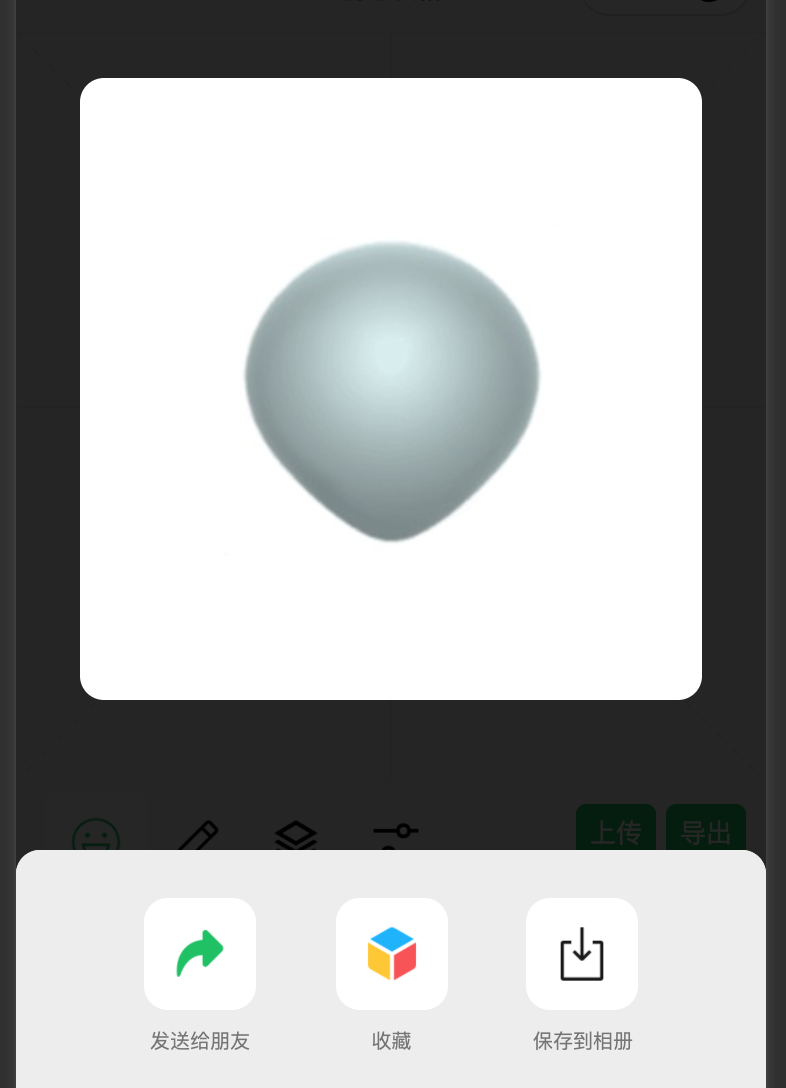
十、导出与分享
将主canvas导出,这里的问题是,因为在选中和居中时,会有特殊线条,希望在导出时,重新绘制图层,可发现有时候重新绘制图层位置会偏移,未找到问题。
十一、未来发展和优化方向
当前这个小程序已上线,有兴趣的可以搜索进去看看,有疑问的大家可以留言交流。
目前此小程序未实现 2d canvas,后续可以研究下2d
后续继续增加undo 效果。
比较鸡肋的是,不能直接将制作的表情加入微信聊天中(腾讯是真坑,自家小程序可以,未开放其他人)。
好了,大家有疑问的可以留言沟通哈。
- 相关阅读:
Python类中的property的用法
马尔科夫链(Markov Chain, MC)算法详解及Python实现
如何判断linux 文件(或lib)是由uclibc还是glibc编译出来的?
Jenkins 执行远程shell脚本部署jar文件问题起不来
人工神经网络预测原理图,神经网络做预测的原理
算法与数据结构 --- 队列的表示和操作的实现
Spring 事务传播机制源码浅析
自动驾驶系列(六)——谈谈车载人机交互技术
[附源码]Python计算机毕业设计SSM酒店停车管理系统(程序+LW)
Spring Boot集成zipkin快速入门Demo
- 原文地址:https://blog.csdn.net/u011837804/article/details/134549423