-
【鸿蒙软件开发】ArkTS常用组件之Button
前言
Button是按钮组件,通常用于响应用户的点击操作,其类型包括胶囊按钮、圆形按钮、普通按钮。Button当做为容器使用时可以通过添加子组件实现包含文字、图片等元素的按钮。具体用法请参考Button。
一、创建按钮
1.1 Button创建接口介绍
Button通过调用接口来创建,接口调用有以下两种形式:
创建不包含子组件的按钮。Button(label?: string, options?: { type?: ButtonType, stateEffect?: boolean })- 1
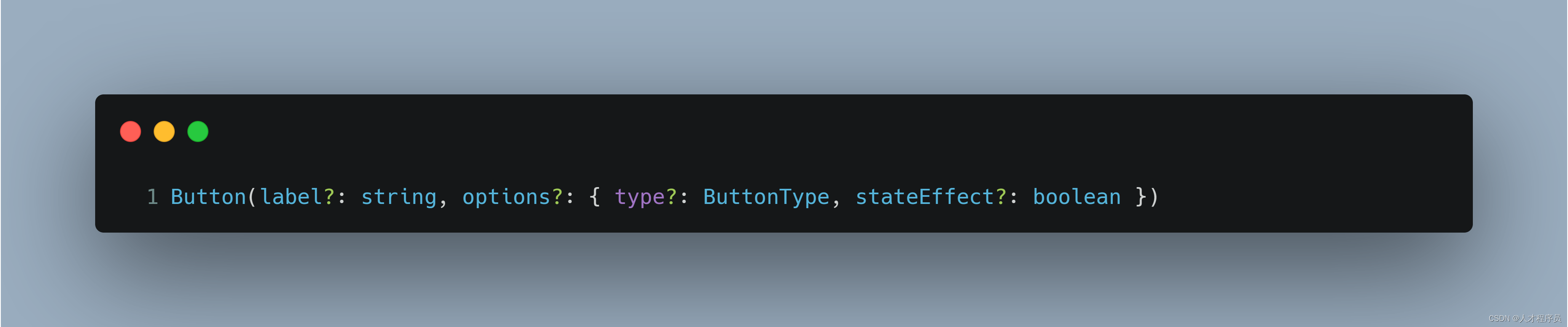
该接口用于创建不包含子组件的按钮,其中label用来设置按钮文字,type用于设置Button类型,stateEffect属性设置Button是否开启点击效果。
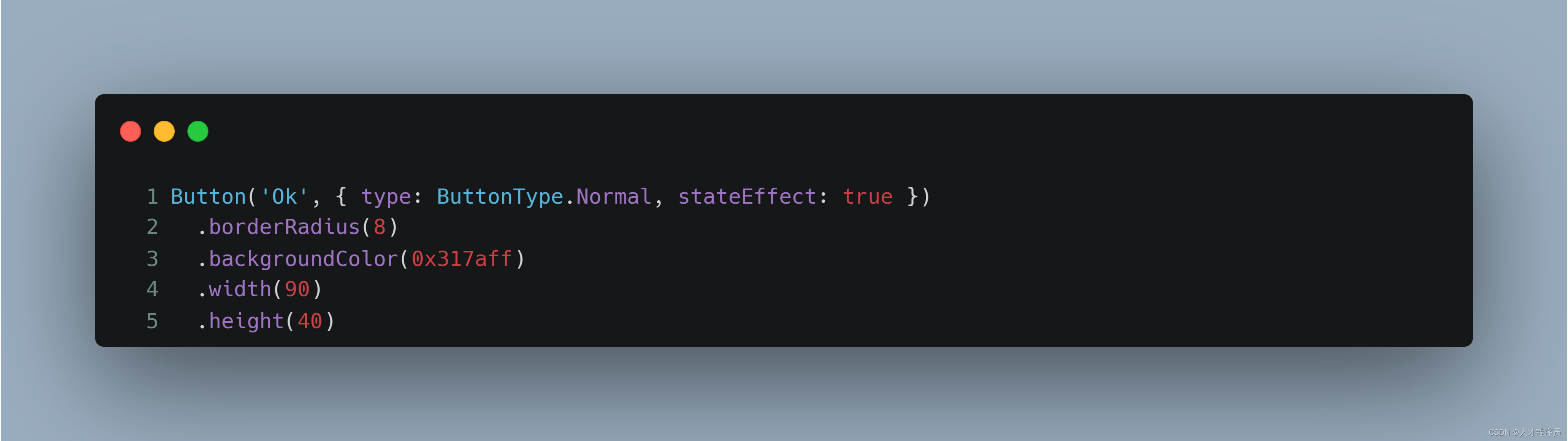
1.2 创建正常的按钮,不包括子组件
我们通过参数1设置上面的字,下一个参数设置type和stateEffect,在他下面使用
.属性可以设置其属性Button('Ok', { type: ButtonType.Normal, stateEffect: true }) .borderRadius(8) .backgroundColor(0x317aff) .width(90) .height(40)- 1
- 2
- 3
- 4
- 5

其中:
.borderRadius为设置圆角
.backgroundColor(0x317aff) 为设置背景颜色
.width(90) .height(40) 为设置按钮的大小
1.3 创建正常的按钮,包括子组件
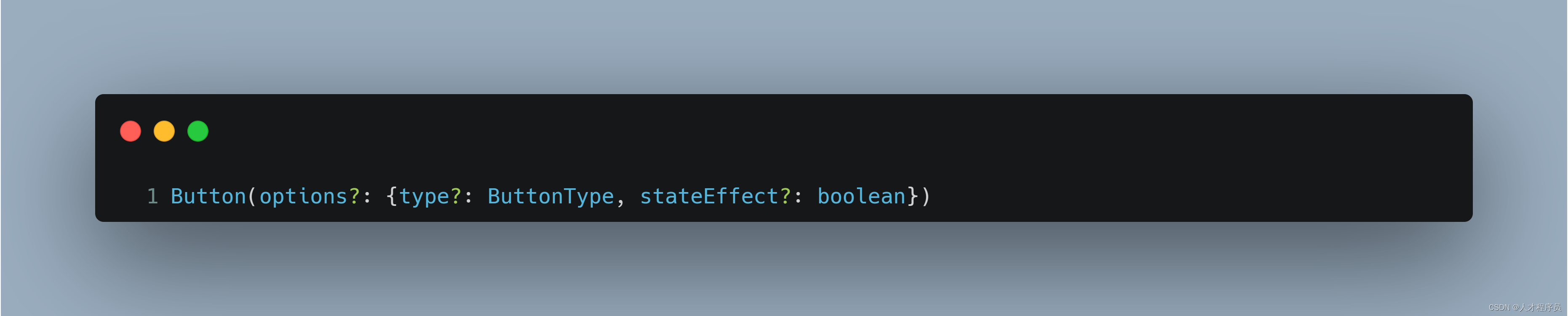
创建包含子组件的按钮。他没有参数1,即上面的字
Button(options?: {type?: ButtonType, stateEffect?: boolean})- 1
示例代码如下:
Button({ type: ButtonType.Normal, stateEffect: true }) { Row() { Image($r('app.media.loading')).width(20).height(40).margin({ left: 12 }) Text('loading').fontSize(12).fontColor(0xffffff).margin({ left: 5, right: 12 }) }.alignItems(VerticalAlign.Center) }.borderRadius(8).backgroundColor(0x317aff).width(90).height(40)- 1
- 2
- 3
- 4
- 5
- 6
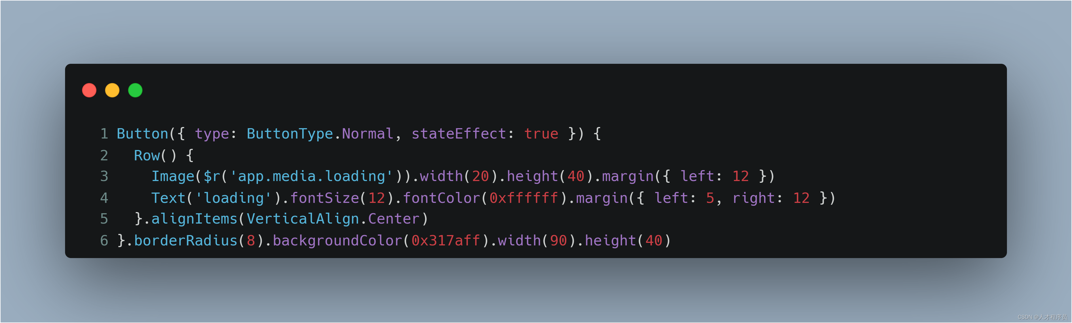
Row()为布局,即水平布局
Image为创建图片控件
Text为创建字控件其中.margin({ left: 12 })为外边距左边12
.fontSize(12)为字体大小
.fontColor(0xffffff)为字体颜色疑问:为什么他们可以连续地这样写
.属性.属性
这样其实和.属性 换行 .属性是一样的,不要误解!.alignItems(VerticalAlign.Center)在后面讲解布局的时候会到来!
1.4 按钮的不同样式
设置按钮类型
Button有三种可选类型,分别为Capsule(胶囊类型)、Circle(圆形按钮)和Normal(普通按钮),通过type进行设置。我们只需要指定type参数即可改变样式
胶囊按钮(默认类型)
此类型按钮的圆角自动设置为高度的一半,不支持通过borderRadius属性重新设置圆角。
Button('Disable', { type: ButtonType.Capsule, stateEffect: false }) .backgroundColor(0x317aff) .width(90) .height(40)- 1
- 2
- 3
- 4

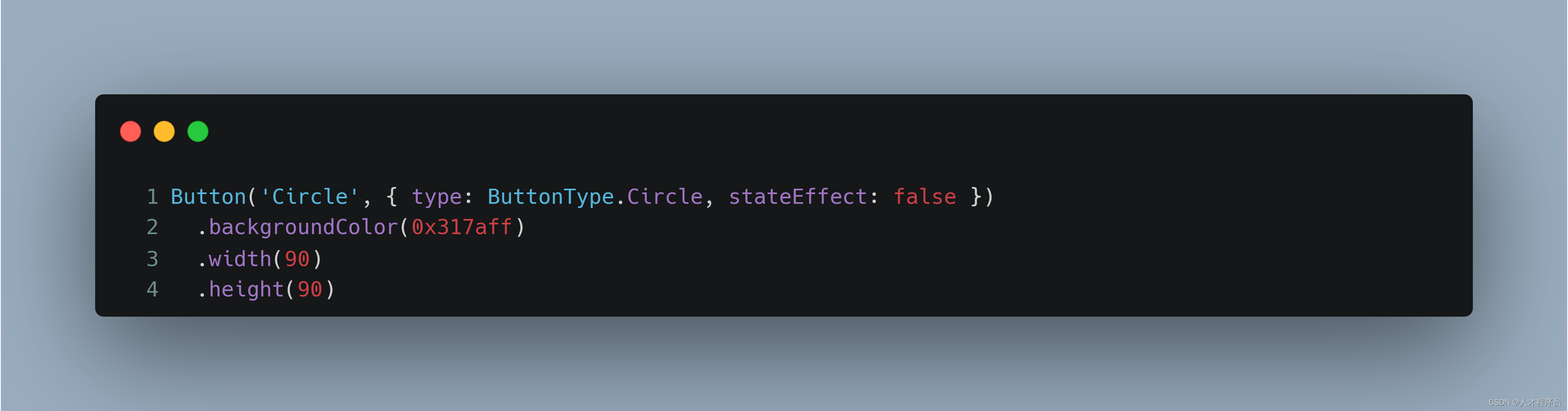
圆形按钮
此类型按钮为圆形,不支持通过borderRadius属性重新设置圆角。
Button('Circle', { type: ButtonType.Circle, stateEffect: false }) .backgroundColor(0x317aff) .width(90) .height(90)- 1
- 2
- 3
- 4
普通按钮
此类型的按钮默认圆角为0,支持通过borderRadius属性重新设置圆角。
Button('Ok', { type: ButtonType.Normal, stateEffect: true }) .borderRadius(8) .backgroundColor(0x317aff) .width(90) .height(40)- 1
- 2
- 3
- 4
- 5
二、添加事件
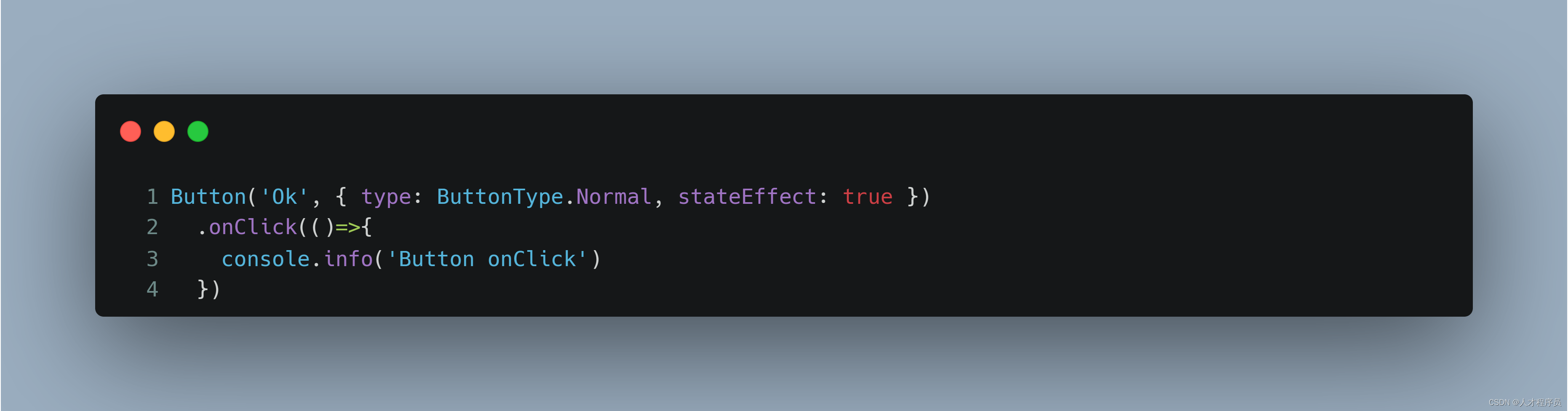
2.1 .onClick事件
Button组件通常用于触发某些操作,可以绑定onClick事件来响应点击操作后的自定义行为。
添加事件
只需要像属性一样在后面写
.onClick(执行函数)即可Button('Ok', { type: ButtonType.Normal, stateEffect: true }) .onClick(()=>{ console.info('Button onClick') })- 1
- 2
- 3
- 4
三、什么时候使用.属性,什么时候用{}
3.1 {}什么时候用
当你需要在这个控件下面添加子类的时候,你需要加{}
例如:
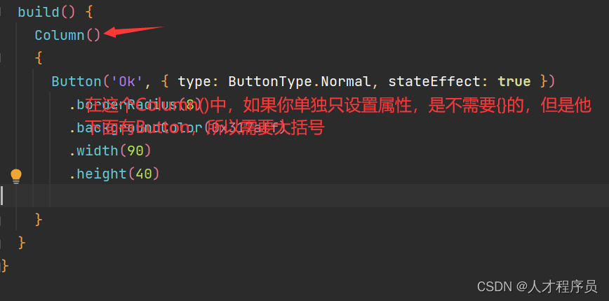
我们的属性一般在大括号的下面.属性什么时候用
那么就是与{}相对的了,只要不是子类的范围就可以使用。
比如属性,事件…
总结
本节课主要是讲解了Button的基础使用和Button事件的基础使用,这是非常easy的!!!
-
相关阅读:
机器学习系统在生产中的挑战
IP-Guard桌面申请管理说明步骤
Python读取mongodb数据库
JavaScript中的浅拷贝与深拷贝
python的堆队列(优先队列)
汇川IT7000系列HMI使用脚本实现画面跳转时自动切换手自动模式
UDP通信
【Spring注解大全】
Web框架中间件插件&BurpSuite&浏览器&被动&主动探针[武装浏览器]
Unity 一些常用特性收集
- 原文地址:https://blog.csdn.net/m0_62599305/article/details/133964687