-
html+css制作简单注册登录页面
目录
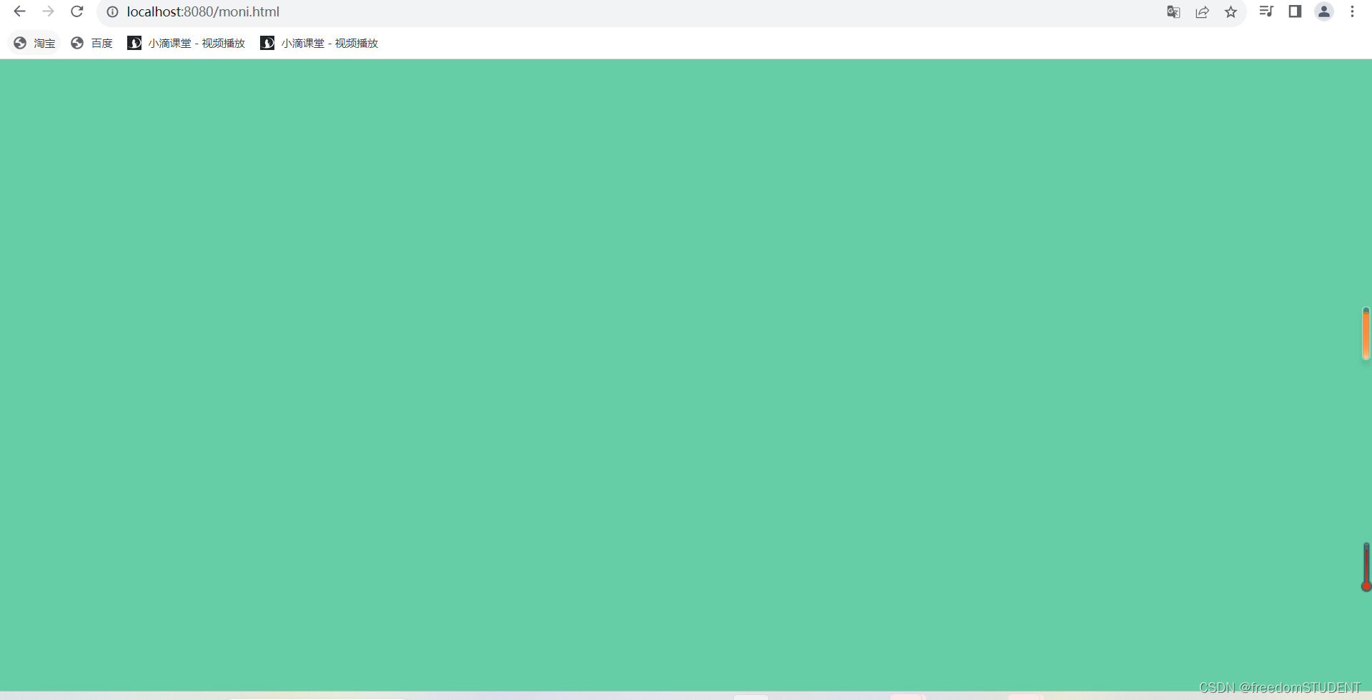
展示图:


设计逻辑:
注册{ 注册
用户名
方框(请输入用户名)
密码
方框(请输入密码)
已注册,去登录
}
登录{ 登录
账号
方框(请输入用户名)
密码(请输入密码)
没有账号,去注册 忘记密码
}
这个标签是一个页面的所有
按照注册登录界面的颜色,我们可以这样写

前端页面要得到css的布局,就得在html页面里调用css文件
例如:我创建了 moni.html moni.css

效果展示:
下一步:制作白色盒子

css中
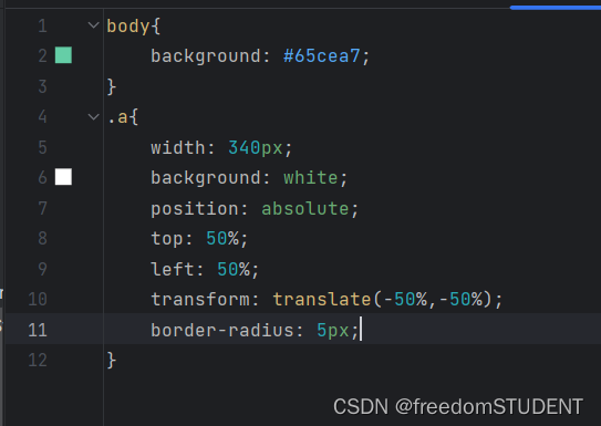
.a{
    width: 340px;
    background: white;
    position: absolute;
    top: 50%;
    left: 50%;
    transform: translate(-50%,-50%);
    border-radius: 5px;
}
写完这一步,然后再去运行,是没有东西的,但是并不是不存在
这么设计是因为他根据你写的内容而改变高度
如果要固定他的高度
在.a{ } 添加height=400
效果:

如果不加,我们可以根据内容的多少,设计多少白色的部分
继续接下去写
html中
根据设计逻辑,我们先写第一行文字(注册)

css中

效果
.b{ } 是针对注册两个字后面的白色部分进行布局

.c{
    width: 340px;
    height: 60px;
    display: inline-block;
    color: black;
    font-size: 18px;
    text-align: center;
    line-height: 60px;
    cursor: pointer;       光标为手的形状,当光标指定这个div的时候,光标为手的形状
}
效果:

- .e {
- margin: 20px 30px;
- text-align: left;
- }
- .p{
- color: #4a4a4a;
- margin-top: 30px;
- margin-bottom: 6px;
- font-size: 15px;
- }
- .e input[type="text"], .e input[type="password"]{
- width: 100%;
- height: 40px;
- border-radius: 3px;
- border: 1px solid #adadad;
- padding: 0 10px;
- box-sizing: border-box;
- }
- .e input[type="submit"]{
- margin-top: 40px;
- width: 100%;
- height: 40px;
- border-radius: 5px;
- color: white;
- border: 1px solid #adadad;
- background: cyan;
- cursor: pointer;
- letter-spacing: 4px;
- margin-bottom: 40px;
- }
效果:

e{} 的部分
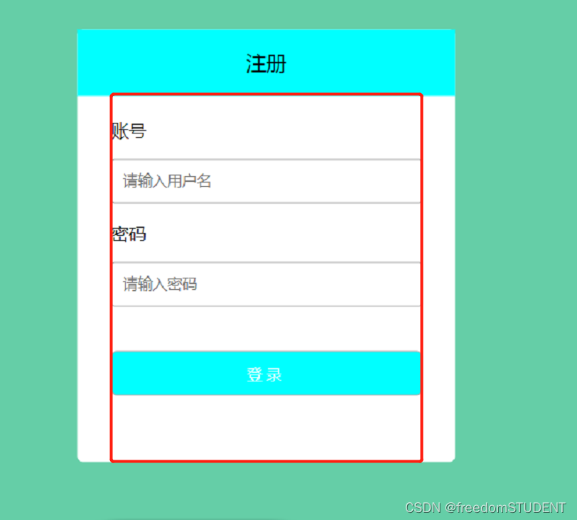
.e {
margin: 20px 30px;
text-align: left; 文本写在左侧
}border-radius: 3px;
设置边框的角弧度


hover的作用就是 当鼠标停在某个地方的时候,哪里就会产生触发效果

例如我在注册这一块级里,我用鼠标指定这一区域时会变成蓝色
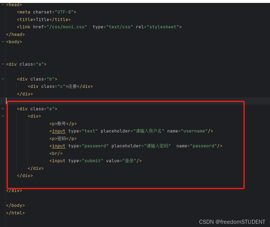
moni.html
- html>
- <html lang="en">
- <head>
- <meta charset="UTF-8">
- <title>Titletitle>
- <link href="/css/moni.css" type="text/css" rel="stylesheet">
- head>
- <body>
- <div class="a">
- <div class="b">
- <div class="c">注册div>
- div>
- <div class="e">
- <p>账号p>
- <input type="text" placeholder="请输入用户名" name="username"/>
- <p>密码p>
- <input type="password" placeholder="请输入密码" name="password"/>
- <br/>
- <input type="submit" value="登录"/>
- div>
- div>
- body>
- html>
moni.css
- body{
- background: #65cea7;
- }
- .a{
- width: 340px;
- background: white;
- position: absolute;
- top: 50%;
- left: 50%;
- transform: translate(-50%,-50%);
- border-radius: 5px;
- }
- .b{
- width: 340px;
- height: 60px;
- background: white;
- }
- .b div{
- width: 340px;
- height: 60px;
- display: inline-block;
- color: black;
- font-size: 18px;
- text-align: center;
- line-height: 60px;
- cursor: pointer;
- }
- .e {
- margin: 20px 30px;
- text-align: left;
- }
- .p{
- color: #4a4a4a;
- margin-top: 30px;
- margin-bottom: 6px;
- font-size: 15px;
- }
- .e input[type="text"], .e input[type="password"]{
- width: 100%;
- height: 40px;
- border-radius: 3px;
- border: 1px solid #adadad;
- padding: 0 10px;
- box-sizing: border-box;
- }
- .e input[type="submit"]{
- margin-top: 40px;
- width: 100%;
- height: 40px;
- border-radius: 5px;
- color: white;
- border: 1px solid #adadad;
- background: cyan;
- cursor: pointer;
- letter-spacing: 4px;
- margin-bottom: 40px;
- }
- .b div:hover{
- background: cyan;
- }
注册登录功能:
https://blog.csdn.net/m0_67930426/article/details/133849132?spm=1001.2014.3001.5501
-
相关阅读:
前端50天50个项目 | 第1个项目 -- 扩展卡片【提供完整代码】
1371. 每个元音包含偶数次的最长子字符串
古诗词学习平台小程序毕业设计
Django templates 存放html目录
【C++ STL】string类-----迭代器(什么是迭代器?迭代器分哪几类?迭代器的接口如何使用?)
JavaWeb 项目 --- 博客系统(前后分离)
UI 自动化测试框架:PO模式+数据驱动
text2sql、nl2sql框架总结
马斯洛的动机与人格、需求层次理论
LLVM之父Chris Lattner:为什么我们要重建AI基础设施软件
- 原文地址:https://blog.csdn.net/m0_67930426/article/details/133915130
