-
QT之可自由折叠和展开的布局
介绍和功能分析
主要是实现控件的折叠和展开,类似抽屉控件,目前Qt自带的控件QToolBox具有这个功能,但是一次只能展开一个,所以针对自己的需求可以自己写一个类似的功能,这里实现的方法比较多,其实原理也比较简单,就是点一次隐藏,再点一次显示的效果。
实现方法
目前实现的方法有两种,原理基本相同,方法一是使用QPushButton结合SetVisible()函数来实现点击后隐藏和显示的效果。其UI布局如下:
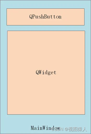
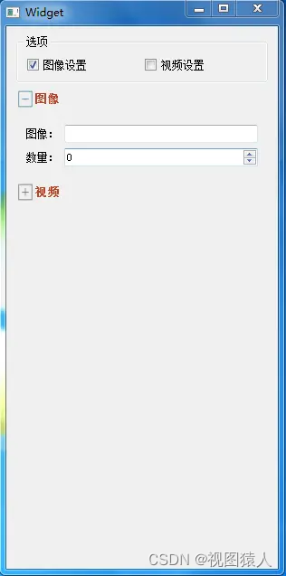
方法一使用点击QPushButton按钮来实现隐藏和显示QWidget的效果,再在QPushButton前增加辅助图标就实现了展开和收起的实际效果,其效果如下图:
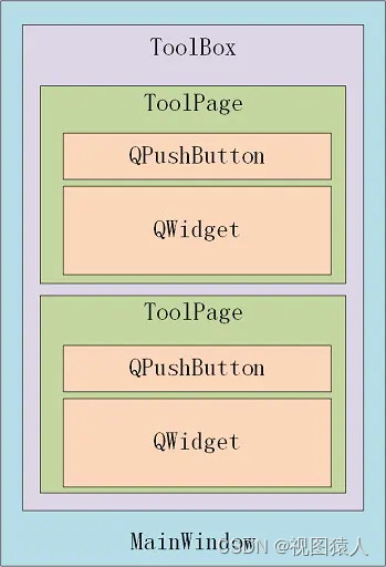
方法二中主要通过ToolBox进行调用,将传入的QWidget传入到ToolPage中,ToolPage自动填充到内容区,再将ToolPage添加到垂直布局中,ToolPage分为标题栏(QPushButton)和内容区(QWidget),点击QPushButton后,循环展开/折叠内容区。方法二与方法一实现原理相同,只是方法二对ToolBox进行了再次封装,然后通过ToolBox直接调用。其UI布局如下:
代码实现
首先重新写一个抽屉的类来创建控件相关功能:
LockerButton.h
- #ifndef LOCKER_BUTTON_H
- #define LOCKER_BUTTON_H
- #include
- #include
- class QLabel;
- class LockerButton : public QPushButton
- {
- Q_OBJECT
- public:
- explicit LockerButton(QWidget* parent = nullptr);
- // 设置按钮图标
- void SetImageLabel(const QPixmap &pixmap);
- // 设置按钮文字
- void SetTextLabel(QString text);
- // 返回图像label句柄
- QLabel* GetImageHandle();
- // 返回文字label句柄
- QLabel* GetTextHandle();
- private:
- // 按钮图标
- QLabel* m_imageLabel;
- // 按钮文字
- QLabel* m_textLabel;
- };
- #endif // LOCKER_BUTTON_H
LockerButton类继承于PushButton类,主要进行控件的图标和文字设置。
LockerButton.cpp
- #include "LockerButton.h"
- #include <QLabel>
- #include <QVBoxLayout>
- #include <QLineEdit>
- #include <QDoubleValidator>
- LockerButton::LockerButton(QWidget* parent)
- : QPushButton(parent)
- {
- m_imageLabel = new QLabel;
- m_imageLabel->setFixedWidth(20);
- m_imageLabel->setScaledContents(true);
- m_imageLabel->setStyleSheet("QLabel{background-color:transparent;}");
- m_textLabel = new QLabel;
- m_textLabel->setStyleSheet("QLabel{background-color:transparent;}");
- QHBoxLayout* mainLayout = new QHBoxLayout;
- mainLayout->addWidget(m_imageLabel);
- mainLayout->addWidget(m_textLabel);
- mainLayout->setMargin(0);
- mainLayout->setSpacing(0);
- this->setLayout(mainLayout);
- }
- void LockerButton::SetImageLabel(const QPixmap &pixmap)
- {
- m_imageLabel->setPixmap(pixmap);
- }
- void LockerButton::SetTextLabel(QString text)
- {
- m_textLabel->setText(text);
- }
- QLabel* LockerButton::GetImageHandle()
- {
- return m_imageLabel;
- }
- QLabel* LockerButton::GetTextHandle()
- {
- return m_textLabel;
- }
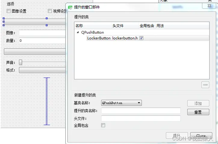
接下来是调用,参考网上大部分是通过代码去创建控件,这里我使用的是PushButton控件在ui上实现,在Form上拉一个PushButton控件,然后提升为LockerButton,如下图:
再接下来就是Widget的实现了
widget.h
- #ifndef WIDGET_H
- #define WIDGET_H
- #include
- namespace Ui {
- class Widget;
- }
- class Widget : public QWidget
- {
- Q_OBJECT
- public:
- explicit Widget(QWidget *parent = 0);
- ~Widget();
- private slots:
- void on_ckbPic_clicked(bool checked);
- void on_ckbVideo_clicked(bool checked);
- private:
- Ui::Widget *ui;
- void initUI();
- int m_PicList;
- int m_VideoList;
- };
- #endif // WIDGET_H
widget.cpp
- #pragma execution_character_set("utf-8")
- #include "widget.h"
- #include "ui_widget.h"
- #include <QDebug>
- Widget::Widget(QWidget *parent) :
- QWidget(parent),
- ui(new Ui::Widget)
- {
- ui->setupUi(this);
- initUI();
- }
- Widget::~Widget()
- {
- delete ui;
- }
- void Widget::initUI()
- {
- this->resize(300, 600);
- m_PicList = 0;
- m_VideoList = 0;
- ui->btnPic->SetTextLabel("图像");
- ui->btnPic->SetImageLabel(QPixmap(":/image/Collapse.png"));
- ui->btnPic->setStyleSheet("#btnPic{background-color:transparent}"
- "#btnPic:hover{background-color:rgba(195,195,195,0.4)}"
- "#btnPic:pressed{background-color:rgba(127,127,127,0.4)}");
- ui->btnVideo->SetTextLabel("视频");
- ui->btnVideo->SetImageLabel(QPixmap(":/image/Collapse.png"));
- ui->btnVideo->setStyleSheet("#btnVideo{background-color:transparent}"
- "#btnVideo:hover{background-color:rgba(195,195,195,0.4)}"
- "#btnVideo:pressed{background-color:rgba(127,127,127,0.4)}");
- QLabel* PicLabel = ui->btnPic->GetTextHandle();
- PicLabel->setStyleSheet("QLabel{color:rgba(183,71,42,1)}");
- PicLabel->setFont(QFont("图像", 10, QFont::Black));
- QLabel* VideoLabel = ui->btnVideo->GetTextHandle();
- VideoLabel->setStyleSheet("QLabel{color:rgba(183,71,42,1)}");
- VideoLabel->setFont(QFont("视频", 10, QFont::Black));
- ui->widget_Pic->setVisible(false);
- ui->widget_Video->setVisible(false);
- ui->btnPic->setEnabled(false);
- ui->btnVideo->setEnabled(false);
- connect(ui->btnPic, &LockerButton::clicked, [this](bool) {
- if (m_PicList % 2)
- {
- ui->btnPic->SetImageLabel(QPixmap(":/image/Collapse.png"));
- //m_sizeList偶数屏蔽Size列表界面,奇数显示Size列表界面
- ui->widget_Pic->setVisible(false);
- }
- else
- {
- ui->btnPic->SetImageLabel(QPixmap(":/image/Expand.png"));
- ui->widget_Pic->setVisible(true);
- }
- m_PicList++; });
- connect(ui->btnVideo, &LockerButton::clicked, [this](bool) {
- if (m_VideoList % 2)
- {
- ui->btnVideo->SetImageLabel(QPixmap(":/image/Collapse.png"));
- ui->widget_Video->setVisible(false);
- }
- else
- {
- ui->btnVideo->SetImageLabel(QPixmap(":/image/Expand.png"));
- ui->widget_Video->setVisible(true);
- }
- m_VideoList++; });
- }
- void Widget::on_ckbPic_clicked(bool checked)
- {
- if(checked)
- {
- qDebug()<<"复选框被选中";
- ui->btnPic->setEnabled(true);
- m_PicList++;
- ui->widget_Pic->setVisible(true);
- ui->btnPic->SetImageLabel(QPixmap(":/image/Expand.png"));
- }
- else
- {
- qDebug()<<"复选框被取消";
- ui->btnPic->setEnabled(false);
- m_PicList++;
- ui->widget_Pic->setVisible(false);
- ui->btnPic->SetImageLabel(QPixmap(":/image/Collapse.png"));
- }
- }
- void Widget::on_ckbVideo_clicked(bool checked)
- {
- if(checked)
- {
- qDebug()<<"复选框被选中";
- ui->btnVideo->setEnabled(true);
- m_VideoList++;
- ui->widget_Video->setVisible(true);
- ui->btnVideo->SetImageLabel(QPixmap(":/image/Expand.png"));
- }
- else
- {
- qDebug()<<"复选框被取消";
- ui->btnVideo->setEnabled(false);
- m_VideoList++;
- ui->widget_Video->setVisible(false);
- ui->btnVideo->SetImageLabel(QPixmap(":/image/Collapse.png"));
- }
- }
-
相关阅读:
分布式文件系统对比与选型参考
SQL中的约束
IPv6环境下的网络安全观察报告总结
SPI机制
C# 颜色与坐标
c++模板进阶
USACO18OPEN Talent Show G
制造业质量管理如何实现数字化?
使用Spark SQL读取阿里云OSS的数据
Flutter系列文章-Flutter进阶
- 原文地址:https://blog.csdn.net/hulinhulin/article/details/133658970
