-
compose——侧边栏
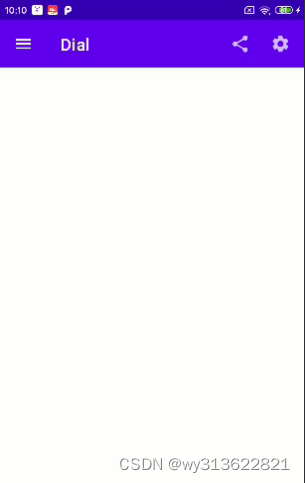
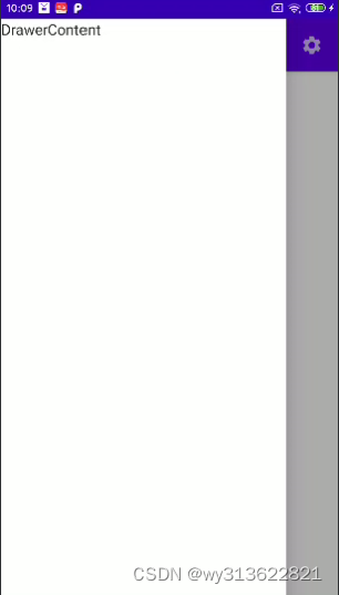
效果图:
依赖引入:
implementation 'com.google.android.material:material:1.5.0'代码如下:
- class MainActivity : ComponentActivity() {
- override fun onCreate(savedInstanceState: Bundle?) {
- super.onCreate(savedInstanceState)
- setContent {
- ComposedrawerTheme {
- Surface(
- modifier = Modifier.fillMaxSize(),
- color = MaterialTheme.colors.background
- ) {
- MainPage()
- }
- }
- }
- }
- }
- @SuppressLint("UnusedMaterialScaffoldPaddingParameter")
- @Composable
- fun MainPage() {
- val scaffoldState = rememberScaffoldState()
- val coroutineScope = rememberCoroutineScope()// 定义协程作用域
- Scaffold(
- topBar = {
- TopAppBar(
- navigationIcon = {
- IconButton(
- onClick = {
- coroutineScope.launch {
- scaffoldState.drawerState.open()
- }
- }
- ) {
- Icon(Icons.Filled.Menu, null)
- }
- },
- title = {
- Text("首页")
- },
- actions = {
- IconButton(
- onClick = {}
- ) {
- Icon(Icons.Filled.Share, null)
- }
- IconButton(
- onClick = {}
- ) {
- Icon(Icons.Filled.Settings, null)
- }
- },
- )
- },
- drawerContent = { DrawerContent() },
- drawerGesturesEnabled = true,
- scaffoldState = scaffoldState,
- ) {
- }
- }
- @Composable
- fun DrawerContent() {
- Text(text = "DrawerContent")
- }
如果要设置侧边栏宽度,代码如下:
- /**
- * 设置抽屉的宽度
- */
- @Composable
- fun CustomDrawerShape(): Shape = object : Shape {
- override fun createOutline(
- size: Size,
- layoutDirection: LayoutDirection,
- density: Density
- ): Outline {
- return Outline.Rectangle(Rect(0f, 0f, 600f, size.height))
- }
- }
在Scaffold里设置属性:
drawerShape = CustomDrawerShape(),
-
相关阅读:
使用koa搭建服务器(一)
一套 .NET开发的邮箱Mail开源库
Elasticsearch 日期数据类型
mysql数据库、表、列的字符集和校对规则
vue使用ant design Vue中的a-select组件实现下拉分页加载数据
Eigen库中MatrixXd类型与VectorXd类型的相互映射与数据复制
kubernetes中Pod调度-Taints污点和污点容忍
【已解决】spring-boot项目使用maven打包时出现BOOT-INF文件夹的问题
java学习第三天笔记-java基础概念14-idea中的操作40
Mybatis学习笔记12 分页插件
- 原文地址:https://blog.csdn.net/wy313622821/article/details/133015911
