-
CSS学习笔记04
CSS笔记04
浮动
标准文档流
- 标准文档流就是浏览器按照各种元素标签排版布局中默认的状态。浏览器在渲染代码的时候是从左往右、从上到下开始渲染,元素也是从左往右、从上往下的流式排列。也就是没有被其他排版浮动和定位相关的 CSS 属性干扰的就叫标准文档流。
- 标准文档流中大部分元素是区分等级的,我们习惯将元素划分为几种常见的加载级别:块级元素,行内元素,行内块元素。
块级元素 - block
- 大部分容器级标签标签都是块级元素,比如
h1~h6,p,div,ul,li等。 - 块级元素通常具有以下特点:
- 可以对其单独设置宽度、高度、外边距和内边距等属性。
- 必须独占一行,不能和其它标签并排占同一行。
- 如果不设置宽度,会自动撑满父级元素的
width区域(即默认width = 100%;);如果设置不高度,会被内容自动撑开。 - 可以容纳内联元素和其他的块级元素
行内元素 - inline
- 大部分文本级标签, 比如
span,a,label,strong等。 - 行内元素通常具有以下特点:
- 设置宽度和高度无效,水平方向上的
padding和margin可以设置,垂直方向上的无效。 - 不论设置宽高,宽度和高度都只能被内容撑开(即默认宽高为其自身内容的宽高)。
- 可以与其它行内或行内块元素并排一行显示。
- 设置宽度和高度无效,水平方向上的
- 特殊的行内元素:
input与img等,它们虽然被归类为行内元素,但可以单独设置宽高和内外边距,在表现上更倾向于inline-block,我们也把它们叫做行内替换元素。(参考:html中的行内替换元素)
行内块元素 - inline-block
- 行内块元素结合了块级元素与行内元素各自的一些特点,通俗的讲:行内块元素就是不独占一行的块级元素。
- 行内块级元素通常具有以下特点:
- 可以设置宽高,内外边距。
- 不独占一行,可以和其它行内元素和行内块元素并排。
- 不设置宽高时,要么以原始尺寸加载,要么被内容撑开。
块级元素、行内元素 与 行内块元素 的相互转换 - display
- 我们可以通过
display属性来转换元素的加载级别或者隐藏元素:display:block;- 定义元素为块级元素。display: inline;- 定义元素为行内元素。display: inline-block;- 定义元素为行内块级元素。display: none;- 隐藏元素。
- 下面我们就通过写代码的方式来加深一下我们对以上知识的理解:
- 先写一个块级元素和一个行内元素,为了便于观察结果,我们给他们都设置好大小和背景颜色:
DOCTYPE html> <html lang="en"> <head> <meta charset="UTF-8"> <title>Titletitle> <style> div { width: 200px; height: 200px; background-color: deepskyblue; } span { width: 200px; height: 200px; background-color: lightpink; } style> head> <body> <div>div块级元素div> <span>span行内元素span> body> html>- 1
- 2
- 3
- 4
- 5
- 6
- 7
- 8
- 9
- 10
- 11
- 12
- 13
- 14
- 15
- 16
- 17
- 18
- 19
- 20
- 21
- 22
- 23
- 24
- 25
- 26
- 27
- 查看此时的网页效果:
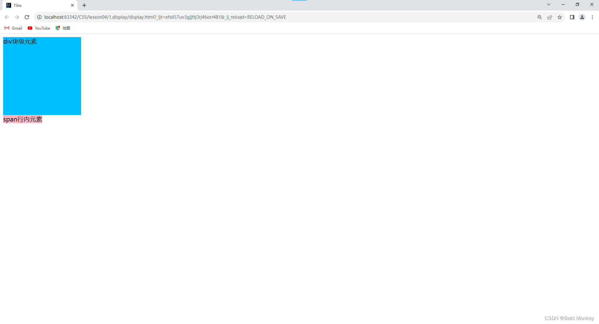
- 我们发现
div块级元素独占一行;span行内元素设置的宽度和高度无效,它的实际大小仅由内容撑开。 - 然后我们使用
display将它们的元素类型都转换为行内块元素(inline-block):
DOCTYPE html> <html lang="en"> <head> <meta charset="UTF-8"> <title>Titletitle> <style> div { width: 200px; height: 200px; background-color: deepskyblue; display: inline-block; } span { width: 200px; height: 200px; background-color: lightpink; display: inline-block; } style> head> <body> <div>div块级元素div> <span>span行内元素span> body> html>- 1
- 2
- 3
- 4
- 5
- 6
- 7
- 8
- 9
- 10
- 11
- 12
- 13
- 14
- 15
- 16
- 17
- 18
- 19
- 20
- 21
- 22
- 23
- 24
- 25
- 26
- 27
- 28
- 29
- 查看此时的网页效果:

- 此时两个元素都是行内块元素,设置的宽高都有效,且都不独占一行,能够和其他元素并列同一行。
- 我们再使用
display将div块级元素隐藏:
DOCTYPE html> <html lang="en"> <head> <meta charset="UTF-8"> <title>Titletitle> <style> div { width: 200px; height: 200px; background-color: deepskyblue; display: none; } span { width: 200px; height: 200px; background-color: lightpink; display: inline-block; } style> head> <body> <div>div块级元素div> <span>span行内元素span> body> html>- 1
- 2
- 3
- 4
- 5
- 6
- 7
- 8
- 9
- 10
- 11
- 12
- 13
- 14
- 15
- 16
- 17
- 18
- 19
- 20
- 21
- 22
- 23
- 24
- 25
- 26
- 27
- 28
- 29
- 查看此时的网页效果:

浮动 - float
- CSS 属性
float(浮动)- 指定一个元素应沿其容器的左侧或右侧放置,允许文本和内联元素环绕它。该元素会脱离正常的文档流,但是仍然保持部分的流动性(与绝对定位相反)。【脱离文档流就是将元素从普通的布局排版中移除】
左右浮动
- 我们先写一个页面,它由一个父级
div(father)四个子级div(layer01~layer04)组成,我们给每个div内都添加一些内容(图片或文字):
index.htmlDOCTYPE html> <html> <meta charset="UTF-8"> <title>浮动title> <link href="css/style.css" rel="stylesheet" type="text/css"/> head> <body> <div id="father"> <div class="layer01"><img src="images/1.jpg" alt=""/>div> <div class="layer02"><img src="images/2.jpg" alt=""/>div> <div class="layer03"><img src="images/3.jpg" alt=""/>div> <div class="layer04"> 浮动的盒子可以向左浮动,也可以向右浮动,直到它的外边缘碰到包含框或另一个浮动盒子为止。 div> div> body> html>- 1
- 2
- 3
- 4
- 5
- 6
- 7
- 8
- 9
- 10
- 11
- 12
- 13
- 14
- 15
- 16
- 17
- 18
- 为了方便观察,我们给每个
div都设置不同颜色的边框,并将它们都设置为行内块元素(inline-block):
style.cssdiv { margin: 10px; padding: 5px; } #father { border: 2px black solid; } .layer01 { border: 2px red dashed; display: inline-block; } .layer02 { border: 2px blue dashed; display: inline-block; } .layer03 { border: 2px green dashed; display: inline-block; } .layer04 { border: 2px grey dashed; font-size: 12px; line-height: 23px; display: inline-block; }- 1
- 2
- 3
- 4
- 5
- 6
- 7
- 8
- 9
- 10
- 11
- 12
- 13
- 14
- 15
- 16
- 17
- 18
- 19
- 20
- 21
- 22
- 23
- 24
- 25
- 26
- 27
- 28
- 29
- 30
- 查看此时的网页效果:

- 现在我们使用
float让layer01向左浮动:
style.cssdiv { margin: 10px; padding: 5px; } #father { border: 2px black solid; } .layer01 { border: 2px red dashed; display: inline-block; float: left; /* 向左浮动 */ } .layer02 { border: 2px blue dashed; display: inline-block; } .layer03 { border: 2px green dashed; display: inline-block; } .layer04 { border: 2px grey dashed; font-size: 12px; line-height: 23px; display: inline-block; }- 1
- 2
- 3
- 4
- 5
- 6
- 7
- 8
- 9
- 10
- 11
- 12
- 13
- 14
- 15
- 16
- 17
- 18
- 19
- 20
- 21
- 22
- 23
- 24
- 25
- 26
- 27
- 28
- 29
- 30
- 31
- 查看此时的网页效果:

- 我们可以观察到此时
layer01的表现就像是漂浮在father的上层,同时father的边框高度变小了(父级边框塌陷问题)。 - 我们再使用
float让layer02向右浮动:
style.cssdiv { margin: 10px; padding: 5px; } #father { border: 2px black solid; } .layer01 { border: 2px red dashed; display: inline-block; float: left; /* 向左浮动 */ } .layer02 { border: 2px blue dashed; display: inline-block; float: right; /* 向右浮动 */ } .layer03 { border: 2px green dashed; display: inline-block; } .layer04 { border: 2px grey dashed; font-size: 12px; line-height: 23px; display: inline-block; }- 1
- 2
- 3
- 4
- 5
- 6
- 7
- 8
- 9
- 10
- 11
- 12
- 13
- 14
- 15
- 16
- 17
- 18
- 19
- 20
- 21
- 22
- 23
- 24
- 25
- 26
- 27
- 28
- 29
- 30
- 31
- 32
- 查看此时的网页效果:

- 我们可以观察到此时
layer02也漂浮了起来,并且向右浮动直到碰到了father右侧的边框,同时father的边框进一步塌陷了。
父级边框塌陷问题
- 在上面学习左右浮动的过程中我们观察到当我们使用浮动(
float)进行网页布局时,当我们将父级元素中的子元素浮动了时,就可能会发生父级边框塌陷问题。因此我们在使用float进行网页布局时,要采取一些措施来防止父级元素的边框发生塌陷。 - 我们接着使用上面的例子,给
layer01~layer04都设置浮动:
style.cssdiv { margin: 10px; padding: 5px; } #father { border: 2px black solid; } .layer01 { border: 2px red dashed; display: inline-block; float: left; /* 向左浮动 */ } .layer02 { border: 2px blue dashed; display: inline-block; float: left; /* 向左浮动 */ } .layer03 { border: 2px green dashed; display: inline-block; float: right; /* 向右浮动 */ } .layer04 { border: 2px grey dashed; font-size: 12px; line-height: 23px; display: inline-block; float: right; /* 向右浮动 */ }- 1
- 2
- 3
- 4
- 5
- 6
- 7
- 8
- 9
- 10
- 11
- 12
- 13
- 14
- 15
- 16
- 17
- 18
- 19
- 20
- 21
- 22
- 23
- 24
- 25
- 26
- 27
- 28
- 29
- 30
- 31
- 32
- 33
- 34
- 查看此时的网页效果:

- 可以观察到此时父级元素
father的边框发生了塌陷。 - 下面我们来学习解决父级边框塌陷问题的办法:
方法一:
-
设置父级元素的高度:(不推荐)
- 父级边框塌陷问题往往发生在父级元素没有设置固定的高度(即高度完全由内容撑开),且我们设置浮动的子元素的高度在同级元素中是最高的时候。这是因为当我们把子元素设置为浮动元素时,该元素就脱离了正常的文档流(可以理解为不再被父元素包裹,也不再撑开父元素的高度),所以此时父元素的边框就发生了塌陷。
- 那么,只要我们把父元素的高度设置成固定的,且足够高时,它的边框就不会再塌陷了。但我们通常不推荐使用这种方法,因为这样一次次地调试合适的高度非常麻烦,也不能从本质上解决问题。
- 示例 - 我们给父级元素
father设置一个合适的固定高度:
style.cssdiv { margin: 10px; padding: 5px; } #father { height: 350px; /* 设置父级元素的高度 */ border: 2px black solid; } .layer01 { border: 2px red dashed; display: inline-block; float: left; } .layer02 { border: 2px blue dashed; display: inline-block; float: left; } .layer03 { border: 2px green dashed; display: inline-block; float: right; } .layer04 { border: 2px grey dashed; font-size: 12px; line-height: 23px; display: inline-block; float: right; }- 1
- 2
- 3
- 4
- 5
- 6
- 7
- 8
- 9
- 10
- 11
- 12
- 13
- 14
- 15
- 16
- 17
- 18
- 19
- 20
- 21
- 22
- 23
- 24
- 25
- 26
- 27
- 28
- 29
- 30
- 31
- 32
- 33
- 34
- 35
- 查看此时的网页效果:

- 可以观察到在给父级元素设置合适的固定高度后,父级元素边框塌陷的问题得到了解决。(优点:简单;缺点:会降低网页的可拓展性,例如:由于我们的高度是固定的,所以当我们又向父级元素中添加了一个高度更高的元素时,我们原本设置的父级元素的高度就不适用了,就又会发生边框塌陷问题)
方法二:
-
在最后一个浮动子元素后加一个空的
div,使用clear清除它两侧的浮动元素:- 这里先学习一下 CSS 属性
clear- 指定该元素的左侧或右侧不允许有浮动的元素。它有四个常见的属性值:clear: left;- 在左侧不允许有浮动元素。clear: right;- 在右侧不允许有浮动元素。clear: both;- 在左右两侧都不允许有浮动元素。clear: none;- 默认值。允许浮动元素出现在左右两侧。
- 示例 - 我们先在
layer04的后面添加一个空的div:
index.htmlDOCTYPE html> <html> <meta charset="UTF-8"> <title>浮动title> <link href="css/style.css" rel="stylesheet" type="text/css"/> head> <body> <div id="father"> <div class="layer01"><img src="images/1.jpg" alt=""/>div> <div class="layer02"><img src="images/2.jpg" alt=""/>div> <div class="layer03"><img src="images/3.jpg" alt=""/>div> <div class="layer04"> 浮动的盒子可以向左浮动,也可以向右浮动,直到它的外边缘碰到包含框或另一个浮动盒子为止。 div> <div class="clear">div> div> body> html>- 1
- 2
- 3
- 4
- 5
- 6
- 7
- 8
- 9
- 10
- 11
- 12
- 13
- 14
- 15
- 16
- 17
- 18
- 19
- 20
- 然后我们给它设置样式:
clear: both;- 在左右两侧都不允许有浮动元素。(规范的写法:为了避免这个空div有默认的内外边距,影响我们的页面效果,通常我们都会手动将它的内外边距设置为0)
style.cssdiv { margin: 10px; padding: 5px; } #father { border: 2px black solid; } .layer01 { border: 2px red dashed; display: inline-block; float: left; } .layer02 { border: 2px blue dashed; display: inline-block; float: left; } .layer03 { border: 2px green dashed; display: inline-block; float: right; } .layer04 { border: 2px grey dashed; font-size: 12px; line-height: 23px; display: inline-block; float: right; } /* 设置不允许两侧出现浮动元素 */ .clear { clear: both; margin: 0; padding: 0; }- 1
- 2
- 3
- 4
- 5
- 6
- 7
- 8
- 9
- 10
- 11
- 12
- 13
- 14
- 15
- 16
- 17
- 18
- 19
- 20
- 21
- 22
- 23
- 24
- 25
- 26
- 27
- 28
- 29
- 30
- 31
- 32
- 33
- 34
- 35
- 36
- 37
- 38
- 39
- 40
- 41
- 查看此时的网页效果:

- 可以观察到在给最后一个子元素后加上一个空的
div,并使用clear清除它两侧的浮动元素后,父级元素边框塌陷的问题也得到了解决。(优点:简单;缺点:空div会使我们 HTML 代码变得冗余,我们在编写代码时应该尽量避免定义空的div)
- 这里先学习一下 CSS 属性
方法三:
-
给父级元素的样式中添加
overflow属性(通常使用overflow: hidden;- 没有滚动条,美观):- 这里我们先了解一下 CSS 属性
overflow- 它指定当元素的内容太大溢出某个元素的框时,会发生什么(是否对内容进行裁剪、是否显示滚动条等行为)。 它有四个常见的属性值: overflow: visible;- 默认值。内容不会被修剪,会呈现在元素框之外。overflow: hidden;- 内容会被修剪,并且其余内容是不可见的。overflow: scroll;- 内容会被修剪,但是浏览器会显示滚动条以便查看其余的内容。overflow: auto;- 如果内容被修剪,则浏览器会显示滚动条以便查看其余的内容。- 补充:
scroll和auto的区别:scroll:在内容没有溢出的时候,也会展示滚动条的样式。auto:只有在内容溢出的时候,才会出现滚动条。- 所以,一般为了更好的展示效果,在这二者中更推荐使用
auto。但在使用auto的时候,写容器内容的样式时,记得将滚动条的宽度预留出来,不然内容溢出的时候,展示效果可能会有些变化。
- 这里引用菜鸟教程中的代码做一个关于
overflow属性的演示:
DOCTYPE html> <html> <head> <meta charset="utf-8"> <title>菜鸟教程(runoob.com)title> <style> div.ex1 { background-color: lightblue; width: 110px; height: 110px; overflow: scroll; } div.ex2 { background-color: lightblue; width: 110px; height: 110px; overflow: hidden; } div.ex3 { background-color: lightblue; width: 110px; height: 110px; overflow: auto; } div.ex4 { background-color: lightblue; width: 110px; height: 110px; overflow: visible; } style> head> <body> <h1>overflow 属性h1> <p>如果元素中的内容超出了给定的宽度和高度属性,overflow 属性可以确定是否显示滚动条等行为。p> <h2>overflow: scroll:h2> <div class="ex1">菜鸟教程 -- 学的不仅是技术,更是梦想!!!菜鸟教程 -- 学的不仅是技术,更是梦想!!!菜鸟教程 -- 学的不仅是技术,更是梦想!!!菜鸟教程 -- 学的不仅是技术,更是梦想!!!div> <h2>overflow: hidden:h2> <div class="ex2">菜鸟教程 -- 学的不仅是技术,更是梦想!!!菜鸟教程 -- 学的不仅是技术,更是梦想!!!菜鸟教程 -- 学的不仅是技术,更是梦想!!!菜鸟教程 -- 学的不仅是技术,更是梦想!!!div> <h2>overflow: auto:h2> <div class="ex3">菜鸟教程 -- 学的不仅是技术,更是梦想!!!菜鸟教程 -- 学的不仅是技术,更是梦想!!!菜鸟教程 -- 学的不仅是技术,更是梦想!!!菜鸟教程 -- 学的不仅是技术,更是梦想!!!div> <h2>overflow: visible (默认):h2> <div class="ex4">菜鸟教程 -- 学的不仅是技术,更是梦想!!!菜鸟教程 -- 学的不仅是技术,更是梦想!!!菜鸟教程 -- 学的不仅是技术,更是梦想!!!菜鸟教程 -- 学的不仅是技术,更是梦想!!!div> body> html>- 1
- 2
- 3
- 4
- 5
- 6
- 7
- 8
- 9
- 10
- 11
- 12
- 13
- 14
- 15
- 16
- 17
- 18
- 19
- 20
- 21
- 22
- 23
- 24
- 25
- 26
- 27
- 28
- 29
- 30
- 31
- 32
- 33
- 34
- 35
- 36
- 37
- 38
- 39
- 40
- 41
- 42
- 43
- 44
- 45
- 46
- 47
- 48
- 49
- 50
- 51
- 52
- 53
- 54
- 网页效果:

- 了解完
overflow,现在我们继续回到之前的例子。给父级元素father的样式中添加overflow: hidden;:
style.cssdiv { margin: 10px; padding: 5px; } #father { border: 2px black solid; overflow: hidden; } .layer01 { border: 2px red dashed; display: inline-block; float: left; } .layer02 { border: 2px blue dashed; display: inline-block; float: left; } .layer03 { border: 2px green dashed; display: inline-block; float: right; } .layer04 { border: 2px grey dashed; font-size: 12px; line-height: 23px; display: inline-block; float: right; }- 1
- 2
- 3
- 4
- 5
- 6
- 7
- 8
- 9
- 10
- 11
- 12
- 13
- 14
- 15
- 16
- 17
- 18
- 19
- 20
- 21
- 22
- 23
- 24
- 25
- 26
- 27
- 28
- 29
- 30
- 31
- 32
- 33
- 34
- 35
- 查看网页效果:

- 可以观察到在我们给父级元素
father的样式中添加overflow: hidden;后,父级元素边框塌陷的问题也得到了解决。(优点:简单;缺点:在有下拉列表框等内容不能被裁剪的场景中应避免使用此方法,若使用overflow: hidden;有可能导致部分溢出的内容被裁剪掉而无法展示完全)
- 这里我们先了解一下 CSS 属性
方法四:
-
使用
::after给浮动元素的父级元素添加一个内容为空的伪元素,设置它的样式为块级元素并清除它两侧的浮动元素:(推荐使用)- 首先我们来了解一下什么是 CSS 伪元素
::after- 它用来创建一个伪元素,作为已选中元素的最后一个子元素。通常会配合content属性来为该元素添加装饰内容。这个虚拟元素默认是行内元素。补充:伪元素 - 所以我们使用
::after给浮动元素的父级元素添加一个伪元素这个方法本质上和方法二中在 HTML 中添加一个空div的原理是一样的,只不过方法四是在 CSS 中添加虚拟的块元素,而方法二是在 HTML 中添加一个真实的块元素。 - 示例 - 使用
::after给浮动元素的父级元素添加一个内容为空的伪元素,设置它的样式为块级元素并清除它两侧的浮动元素
style.cssdiv { margin: 10px; padding: 5px; } #father { border: 2px black solid; overflow: hidden; } /* ::after - 创建一个伪元素,作为此已选中的元素(father)的最后一个子元素 */ #father::after { content: ''; /* 设置伪元素的内容为空 */ display: block; /* 设置伪元素为块级元素 */ clear: both; /* 设置伪元素的左右两侧都不允许有浮动元素 */ } .layer01 { border: 2px red dashed; display: inline-block; float: left; } .layer02 { border: 2px blue dashed; display: inline-block; float: left; } .layer03 { border: 2px green dashed; display: inline-block; float: right; } .layer04 { border: 2px grey dashed; font-size: 12px; line-height: 23px; display: inline-block; float: right; }- 1
- 2
- 3
- 4
- 5
- 6
- 7
- 8
- 9
- 10
- 11
- 12
- 13
- 14
- 15
- 16
- 17
- 18
- 19
- 20
- 21
- 22
- 23
- 24
- 25
- 26
- 27
- 28
- 29
- 30
- 31
- 32
- 33
- 34
- 35
- 36
- 37
- 38
- 39
- 40
- 41
- 42
- 查看网页效果:

- 可以观察到在我们使用
::after给浮动元素的父级元素添加一个内容为空的伪元素,设置它的样式为块级元素并清除它两侧的浮动元素后,父级元素边框塌陷的问题也得到了解决。(除了稍微复杂一点之外,此方法没有任何弊端,推荐使用此方法)
- 首先我们来了解一下什么是 CSS 伪元素
对比:display 与 float
display:不可以选择元素放置的方向,标准文档流。float:可以选择元素放置的方向(靠左或者靠右),浮动元素会脱离标准文档流,需要解决父级边框塌陷问题
-
相关阅读:
Idea 对容器中的 Java 程序断点远程调试
leetcode (力扣) 201. 数字范围按位与 (位运算)
2022 web前端面试宝典 —— 一文带你直击面试重难点(40个经典题目,涵盖近90%的考点,码字2w,干货满满!)
提取PDF数据:Documents for PDF ( GcPdf )
系统内存管理:虚拟内存、内存分段与分页、页表缓存TLB以及Linux内存管理
2.0、C语言数据结构——时间复杂度和空间复杂度 (1)
Frp内网穿透win系统实录
Python-代码封装思想
Integrated LogicAnalyzer v6.2 (Vivado ILA使用方法)
CMD关闭占用端口
- 原文地址:https://blog.csdn.net/weixin_53983068/article/details/132631096
