-
Tailwind CSS 速成
Tailwind CSS 速成
完成了 responsive 和特效的学习后,现在折腾一下 tailwind CSS,这个 CSS 库本身就包含了很多的 utility class,之前跟着 yt 的视频写项目的时候,写了两个项目,好像不记得写过 CSS……
整体来说就是对它好奇了很久,现在系统化的过一遍。
Tailwind CSS 的特点就在于:
-
它是一个原子化的 UI 库
本身实现的颜色、功能其实挺多的,常规项目可能没什么特别需要定制的地方

-
其相对于 bootstrap、material 等 UI 库相比较而言更加 low level 一些
-
因此具有更强的灵活性,同样也能够创造出风格更加独特的样式,不至于像 bootstrap,千页一面
-
它遵循了移动端优先的理念
它的特性和命名规范也有关系,一旦了解了相关的模式之后,理解和记忆起来还是挺简单的,并且也有比较强的一致性,比如说
text-lg指的就是大号字体,font-light指的就是小号的 font weight,总之说理解起来还是比较方便的。下面会就配置和过一下主要的一些特性,这里假设你对 CSS 有所了解(比如知道 grid 和 flex)
配置
开始前可以下载这几个插件方便开发,编辑器我用的是 vscode,所以这里列举的都是 vscode 上肯定有的:
-
liveserver
-
tailwind css intellisense
这个的智能提示真的好用

-
postcss language support
这个插件在这个项目里,主要用途是移除黄色的波浪线
node 的设置配置如下:
firstProj ❯ yarn init -y firstProj ❯ yarn add tailwindcss firstProj ❯ yarn tailwindcss init- 1
- 2
- 3
package.json 配置如下:
{ "scripts": { "build": "tailwind build -i src/styles.css -o public/styles.css --watch" } }- 1
- 2
- 3
- 4
- 5
tailwind config 配置如下:
/** @type {import('tailwindcss').Config} */ module.exports = { content: ['./public/**/*.html'], theme: { extend: {}, }, plugins: [], };- 1
- 2
- 3
- 4
- 5
- 6
- 7
- 8
这一步还是必须的,tailwind@3 版本只会打包使用的 class,因此需要指定 content 让 tailwind 将使用的 class 打包到 public 里的 css 让网页可以正确读取。
最后使用 live server 运行即可。
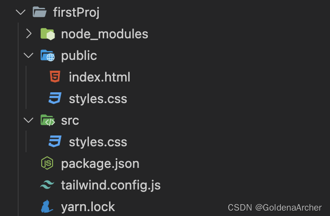
此时的项目结构如下:
这里也有一个需要注意的地方,因为整体的流程是:
保存 src 下的代码,live server reload 的同时 node 重新编译,src 下的代码被成功编译,因此会存在一个时间差的问题。
如果觉得 live server 效果不行的话……那就手动刷新吧。
基础
这里列举一些比较常见的功能,更多功能还是需要到官网上去扒,这里只是做个 intro 没办法写全。
container
和 bootstrap 的 container 很像,使用方法是在 div 中直接加入
container这个类名,它实际底层实现了很多,并且也兼顾了移动端:
margin & padding
明明很简单粗暴,margin 就是
m-,如m-0,这个时候的样式是四遍都应用的,只想要应用上下用 y,左右用 x,上下左右分别是 tblr,对应 top,bottom,left,right,如:<div class="w-10 h-10 bg-red-500 m-10">div> <div class="w-10 h-10 bg-yellow-500 mx-10">div> <div class="w-10 h-10 bg-blue-500 my-10">div> <div class="w-10 h-10 bg-green-500 mt-10">div> <div class="w-10 h-10 bg-gray-500 mb-10">div> <div class="w-10 h-10 bg-violet-500 ml-10">div> <div class="w-10 h-10 bg-rose-500 mr-10">div>- 1
- 2
- 3
- 4
- 5
- 6
- 7
这段代码生成的效果为:

padding 也是差不多的操作。
width & height
命名规范是一样的,这里也用
w-和h=实现。flex
flex 对 responsive 设计还是挺重要的,这里会稍微多提两句,依旧用上面的一堆 box 做案例,将其设置为 flex 就是直接在父元素节点上的类中加一个
flex即可:<div class="container flex"> <div class="w-10 h-10 bg-red-500">div> <div class="w-10 h-10 bg-yellow-500">div> <div class="w-10 h-10 bg-blue-500">div> <div class="w-10 h-10 bg-green-500">div> <div class="w-10 h-10 bg-gray-500">div> <div class="w-10 h-10 bg-violet-500">div> <div class="w-10 h-10 bg-rose-500">div> div>- 1
- 2
- 3
- 4
- 5
- 6
- 7
- 8
- 9

操作方向(col/row)就可以用
flex-col,flex-col-reverse和flex-row-reverse。wrap 的样式则用
flex-wrap,这点与原本的 CSS 也是一致。如下面这段代码:<div class="container flex"> <div class="w-1/2 mr-10 h-10 bg-red-500">div> <div class="w-1/2 mr-10 h-10 bg-yellow-500">div> <div class="w-1/2 mr-10 h-10 bg-blue-500">div> <div class="w-1/2 mr-10 h-10 bg-green-500">div> <div class="w-1/2 mr-10 h-10 bg-gray-500">div> <div class="w-1/2 mr-10 h-10 bg-violet-500">div> <div class="w-1/2 mr-10 h-10 bg-rose-500">div> div>- 1
- 2
- 3
- 4
- 5
- 6
- 7
- 8
- 9
w-1/2代表这width: 50%,这个情况下每个 box 的宽度应该占据页面的 50%,不过 tailwind 默认的行为会对其进行压缩,所以 UI 的呈献为:
这个解决方法有以下几种:
-
父元素中增添
flex-wrap
-
子元素使用
shrink-0
二者处理的场景不太一致,可以根据需求自行搭配。
接下来稍微深入的了解一下 grow/shrink 的系数问题,默认的系数只有 0 和 1,需要调整可以通过修改
theme.flex或 config 文件中的theme.extend.flex实现:// 修改 config 文件 module.exports = { theme: { extend: { flex: { 2: '2 2 0%', }, }, }, };- 1
- 2
- 3
- 4
- 5
- 6
- 7
- 8
- 9
- 10
flex 提供的参数就是根据提供的系数进行调整的:
Class Properties flex-1, 伸缩均为 1,flex-basis 为 0 flex: 1 1 0%; flex-auto,伸缩均为 1,flex-basis 为 auto flex: 1 1 auto; flex-initial, 只缩不伸 flex: 0 1 auto; flex-none,什么都没 flex: none; order
排序,似乎只对添加了
order的 tag 奇效,如:<div class="container flex flex-wrap"> <div class="w-1/2 mr-10 h-10 bg-red-500 order-2">div> <div class="w-1/2 mr-10 h-10 bg-yellow-500 order-3">div> <div class="w-1/2 mr-10 h-10 bg-blue-500 order-4">div> <div class="w-1/2 mr-10 h-10 bg-green-500">div> <div class="w-1/2 mr-10 h-10 bg-gray-500">div> <div class="w-1/2 mr-10 h-10 bg-violet-500">div> <div class="w-1/2 mr-10 h-10 bg-rose-500">div> <div class="w-1/2 mr-10 h-10 bg-black order-1">div> div>- 1
- 2
- 3
- 4
- 5
- 6
- 7
- 8
- 9
- 10

黑色的区块排序就在红色之前,绿色这些没有 order 的 div 就不受影响。
grid
grid 也是一个相对而言比较复杂的布局,这里也会稍微花点时间去说一下。
grid 默认是按行分类,也就是默认
grid-template-rows: auto;,因此想要看到效果的话就要对 column 进行定义。这里参考一下之前做的案例进行实现,图片是背景色就不去做了,这里主要做 6 个对话框的布局,图片如下:

tailwind 实现如下:
<div class="container grid grid-cols-14 grid-rows-11 w-1/2 mx-auto"> <div class="bg-red-500 col-start-3 col-span-3 row-start-2 row-span-2"> <div class="h-20">div> div> <div class="bg-yellow-500 col-start-2 col-span-3 row-start-5 row-span-2" >div> <div class="bg-blue-500 col-start-3 col-span-3 row-start-8 row-span-2">div> <div class="bg-green-500 col-start-10 col-span-3 row-start-2 row-span-2" >div> <div class="bg-gray-500 col-start-11 col-span-3 row-start-5 row-span-2">div> <div class="bg-violet-500 col-start-10 col-span-3 row-start-8 row-span-2" >div> div>- 1
- 2
- 3
- 4
- 5
- 6
- 7
- 8
- 9
- 10
- 11
- 12
- 13
- 14
- 15
- 16
结果:

我这里修改了一下 tailwind 的 config:
/** @type {import('tailwindcss').Config} */ module.exports = { content: ['./public/**/*.html'], theme: { extend: { gridTemplateColumns: { 14: 'repeat(14, minmax(0, 1fr))', }, gridTemplateRows: { 11: 'repeat(11, minmax(0, 1fr))', }, gridRowStart: { 8: '8', }, }, }, plugins: [], };- 1
- 2
- 3
- 4
- 5
- 6
- 7
- 8
- 9
- 10
- 11
- 12
- 13
- 14
- 15
- 16
- 17
- 18
但是有些属性不是很常用的话,可以直接通过添加变量的形式实现:

类名的修改为:
<div class="container grid grid-cols-[repeat(14, 76px)] grid-rows-[repeat(11,40px)] w-1/2 mx-auto" >div>- 1
- 2
- 3
字体相关
这一套也挺多,如果对 CSS 本身就稍微了解一些的话,根据上面的命名规则大概也能推出来 tailwind 的命名:

字体这个我觉得项目中做成原子化还是挺方便的,比如说不少页面 heading、paragraph、一些小卡片之类的字体都会不太一样,每次重复就挺烦的。
另外就是 font-weight,这里就稍微统一一些,使用
font-thin这种取代了数字 100,这样对开发来说也稍微直观一些,毕竟就说 400 和 500 的区别,很难达成共识说粗还是正好,这里 400 就是font-normal,500 是font-medium,500 以上跟 bold 相关,算是用文字同意了一下理解。font-size 这里也预订了一些从 xs 到 9xl 的预设值,同样,对于大多数项目来说达成一致比较容易,比如说正常文章内容同一用 base(这里没有 md 只有 base),小卡片或是中型以下的设备用 sm 这样。
其他的字体相关也一样,取消了用数字定义,转而算是比较约定俗成的文字定义。
border 相关
这个也是比较重要的,默认样式类型就是 solid,对于大多数常见的 case,想要一个边框,直接写
border-2,不过需要注意的有几点:默认的边框都是 2 的倍数,默认颜色是一种很浅的灰,即
#e5e7eb;:
所以还是需要加上
border-color进行修改。box-shadow
即
shadow-+shadow-的搭配,关于 inset 之类的 tailwind 没有内设,需要的话可以自行安排。没有添加颜色的
box-shadow是默认的浅灰色,没有添加大小是不会起效的。:
:意味着该 CSS 会对当前的状态进行反应,如在 hover 情况下北京变色可以用这样的 HTML:<div class="bg-red-500 col-start-3 col-span-3 row-start-2 row-span-2 border-2 hover:bg-red-700 transition-colors" >div>- 1
- 2
- 3
效果如下:

这也包括 pseudo selector,内置的有如 first, last, odd, even 等
breakpoints
breakpoints 是 tailwind 中比较重要的一个工具了,它的用法也是和上面的
:一样:: 因为 tailwind 式 mobile first,所以需要不断修改大设备的样式,如:
<div class="bg-red-50 md:bg-red-200 lg:bg-red-500 col-start-3 col-span-3 row-start-2 row-span-2 border-2" > <div class="h-20">div> div>- 1
- 2
- 3
- 4
- 5
颜色会随着设备由小变大而由浅变深:
directives
directives 官方文档说就是用的
at-rules,基础的包括下面几种:/* 这三个也是合法的 @layer 的值 */ @tailwind base; @tailwind components; @tailwind utilities; @layer base { a { /* apply 用于应用样式 */ @apply text-green-500; } } @layer components { .menu-button { @apply text-white bg-indigo-700; } }- 1
- 2
- 3
- 4
- 5
- 6
- 7
- 8
- 9
- 10
- 11
- 12
- 13
- 14
- 15
- 16
- 17
到这里基础的 tailwind css 知识点就总结的差不多了。
-
-
相关阅读:
java-php-python-ssm点餐系统设计计算机毕业设计
能源消耗监测管理系统:实现企业用能定额、降低成本节能管理
JVM类加载双亲委派机制在漏洞利用时的使用
视频博主都在用的 音频素材网,免费还可商用
使用vite打包时候遇到的坑
MQ - 38 Serverless : 基于Serverless架构实现流式数据处理
FFmpeg实现fmp4+h265 aac切片命令
idea配置文件属性提示消息解决方案
mp4文件怎样提取mp3音频文件
ES6 入门教程 11 对象的新增方法 11.5 Object.keys(),Object.values(),Object.entries()
- 原文地址:https://blog.csdn.net/weixin_42938619/article/details/132730438
