-
CSS学习笔记05
CSS笔记05
定位
position
- CSS 属性
position- 用于指定一个元素在文档中的定位方式。top,right,bottom和left属性则决定了该元素的最终位置。position有以下常用的属性值:position: static;- 默认值。指定元素使用正常的布局行为,即元素在标准文档流中当前的布局位置。此时top,right,bottom,left和z-index属性无效。position: relative;- 相对定位,元素先放置在默认的static位置,再在不改变页面布局的前提下调整元素位置。相对定位的元素不会被移出标准文档流,且元素原先在标准文档流中所占的空间会被保留。position: absolute;- 绝对定位,通过指定元素相对于最近的非static定位祖先元素的偏移,来确定元素位置,如果元素没有非static定位的祖先元素,绝对定位元素会相对于初始块容器的位置进行偏移。(初始块容器是一个有着和浏览器视口一样的尺寸的矩形,它包含根元素。)元素绝对定位后会重新生成一个块级框,而不论原来它在正常文档流中生成何种类型的框。绝对定位的元素会被移出标准文档流,且元素原先在标准文档流中所占的空间不会被保留。position: fixed;- 固定定位,通过指定元素相对于浏览器视口(viewport)本身的位置来指定元素位置。元素的位置在屏幕滚动时不会改变。 元素固定定位后也会重新生成一个块级框,而不论原来它在正常文档流中生成何种类型的框。固定定位的元素也会被移出标准文档流,且元素原先在标准文档流中所占的空间不会被保留。
- 补充 - 视口(
viewport):在电脑图形学里面,视口代表了一个可看见的多边形区域(通常来说是矩形)。在浏览器范畴里,它代表的是浏览器中网站可见内容的部分。视口外的内容在被滚动进来前都是不可见的。 - 下面我们就来详细演示一下这几种定位方式:
静态定位(默认定位) - static
-
position: static;- 默认值。指定元素使用正常的布局行为,即元素在标准文档流中当前的布局位置。此时top,right,bottom,left和z-index属性无效。 -
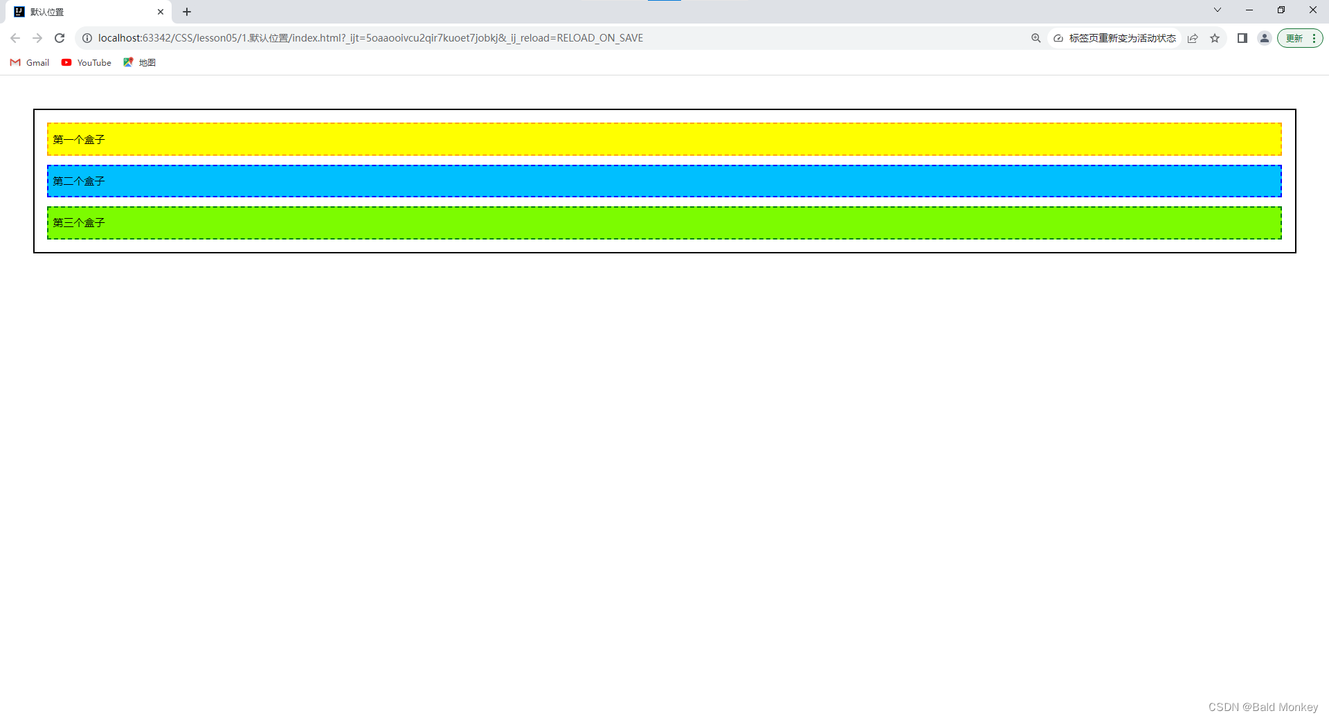
首先我们设计一个页面,它由一个父级
div和三个子级div组成,我们不手动设置position属性(即此时的position属性为其默认值position: static;):
DOCTYPE html> <html lang="en"> <head> <meta charset="UTF-8"> <title>默认位置title> <style> body { padding: 20px; } div { margin: 10px; padding: 5px; font-size: 12px; line-height: 25px; } #father { border: 2px solid black; } #first { background-color: yellow; border: 2px dashed orange; } #second { background-color: deepskyblue; border: 2px dashed blue; } #third { background-color: lawngreen; border: 2px dashed green; } style> head> <body> <div id="father"> <div id="first">第一个盒子div> <div id="second">第二个盒子div> <div id="third">第三个盒子div> div> body> html>- 1
- 2
- 3
- 4
- 5
- 6
- 7
- 8
- 9
- 10
- 11
- 12
- 13
- 14
- 15
- 16
- 17
- 18
- 19
- 20
- 21
- 22
- 23
- 24
- 25
- 26
- 27
- 28
- 29
- 30
- 31
- 32
- 33
- 34
- 35
- 36
- 37
- 38
- 39
- 40
- 41
- 42
- 43
- 44
- 我们查看默认情况下的网页效果:
相对定位 - relative
-
position: relative;- 相对定位,元素先放置在默认的static位置,再在不改变页面布局的前提下调整元素位置。相对定位的元素不会脱离标准文档流,且元素原先在标准文档流中所占的空间会被保留。因此,left: 20px;会向元素的左外边距边界与其包含块左边界之间添加 20 像素的偏移量,其显示效果便是元素相比于默认位置向右移了 20 像素(在左侧留下了 20 像素的空白)。 -
我们使用
position: relative;将上面默认定位网页中的第一个和第三个div设置为相对定位,并使用top,right,bottom和left属性来改变它们的位置:
DOCTYPE html> <html lang="en"> <head> <meta charset="UTF-8"> <title>相对定位title> <style> body { padding: 20px; } div { margin: 10px; padding: 5px; font-size: 12px; line-height: 25px; } #father { border: 2px solid black; } #first { background-color: yellow; border: 2px dashed orange; position: relative; /* 设置定位方式为相对定位 */ left: 20px; top: -20px; } #second { background-color: deepskyblue; border: 2px dashed blue; } #third { background-color: lawngreen; border: 2px dashed green; position: relative; /* 设置定位方式为相对定位 */ right: 20px; bottom: -20px; } style> head> <body> <div id="father"> <div id="first">第一个盒子div> <div id="second">第二个盒子div> <div id="third">第三个盒子div> div> body> html>- 1
- 2
- 3
- 4
- 5
- 6
- 7
- 8
- 9
- 10
- 11
- 12
- 13
- 14
- 15
- 16
- 17
- 18
- 19
- 20
- 21
- 22
- 23
- 24
- 25
- 26
- 27
- 28
- 29
- 30
- 31
- 32
- 33
- 34
- 35
- 36
- 37
- 38
- 39
- 40
- 41
- 42
- 43
- 44
- 45
- 46
- 47
- 48
- 49
- 50
- 查看使用相对定位改变元素位置后的网页效果:

- 练习:
- 使用
div和超链接a布局页面 - 每个超链接宽度和高度都为100px,背景颜色为粉色,当鼠标指针移上去时变为蓝色
- 使用相对定位改变各个超链接的位置
- 使用

- 代码如下:
DOCTYPE html> <html lang="en"> <head> <meta charset="UTF-8"> <title>Titletitle> <style> #box { width: 300px; height: 300px; border: 2px solid red; margin: 0 auto; padding: 10px; } a { width: 100px; height: 100px; display: block; background-color: pink; line-height: 100px; font-size: 15px; color: white; text-align: center; text-decoration: none; } a:hover { background-color: blue; } #second, #fourth { position: relative; left: 200px; top: -100px; } #fifth { position: relative; left: 100px; top: -300px; } style> head> <body> <div id="box"> <a id="first" href="#">链接1a> <a id="second" href="#">链接2a> <a id="third" href="#">链接3a> <a id="fourth" href="#">链接4a> <a id="fifth" href="#">链接5a> div> body> html>- 1
- 2
- 3
- 4
- 5
- 6
- 7
- 8
- 9
- 10
- 11
- 12
- 13
- 14
- 15
- 16
- 17
- 18
- 19
- 20
- 21
- 22
- 23
- 24
- 25
- 26
- 27
- 28
- 29
- 30
- 31
- 32
- 33
- 34
- 35
- 36
- 37
- 38
- 39
- 40
- 41
- 42
- 43
- 44
- 45
- 46
- 47
- 48
- 49
- 50
- 51
- 52
- 53
- 54
- 55
- 56
- 57
- 查看网页效果:

绝对定位 - absolute
position: absolute;- 绝对定位,通过指定元素相对于最近的非static定位祖先元素的偏移,来确定元素位置,如果元素没有非static定位的祖先元素,绝对定位元素会相对于初始块容器的位置进行偏移。(初始块容器是一个有着和浏览器视口一样的尺寸的矩形,它包含根元素。)元素绝对定位后会重新生成一个块级框,而不论原来它在正常文档流中生成何种类型的框。绝对定位的元素会被移出标准文档流,且元素原先在标准文档流中所占的空间不会被保留。- 首先我们来测试一下在没有设置非
static定位的祖先元素时,使用绝对定位改变元素第二个子div的位置:
DOCTYPE html> <html lang="en"> <head> <meta charset="UTF-8"> <title>绝对定位title> <style> body { padding: 20px; } div { margin: 10px; padding: 5px; font-size: 12px; line-height: 25px; } #father { border: 2px solid black; } #first { background-color: yellow; border: 2px dashed orange; } #second { background-color: deepskyblue; border: 2px dashed blue; position: absolute; left: 10px; top: 20px; } #third { background-color: lawngreen; border: 2px dashed green; } style> head> <body> <div id="father"> <div id="first">第一个盒子div> <div id="second">第二个盒子div> <div id="third">第三个盒子div> div> body> html>- 1
- 2
- 3
- 4
- 5
- 6
- 7
- 8
- 9
- 10
- 11
- 12
- 13
- 14
- 15
- 16
- 17
- 18
- 19
- 20
- 21
- 22
- 23
- 24
- 25
- 26
- 27
- 28
- 29
- 30
- 31
- 32
- 33
- 34
- 35
- 36
- 37
- 38
- 39
- 40
- 41
- 42
- 43
- 44
- 45
- 46
- 47
- 查看使用相对定位改变元素位置后的网页效果:

- 分析:

- 接着我们再来测试一下在设置了非
static定位的祖先元素后,使用绝对定位改变元素第二个子div的位置: - 将第二个子
div的父级元素father设置为相对定位 -relative(通常我们都习惯将使用绝对定位的元素的父级元素设置为相对定位 - “ 子绝父相 ” ):
DOCTYPE html> <html lang="en"> <head> <meta charset="UTF-8"> <title>绝对定位title> <style> body { padding: 20px; } div { margin: 10px; padding: 5px; font-size: 12px; line-height: 25px; } /* 设置父级元素为非static定位 */ #father { border: 2px solid black; position: relative; } #first { background-color: yellow; border: 2px dashed orange; } #second { background-color: deepskyblue; border: 2px dashed blue; position: absolute; left: 10px; top: 20px; } #third { background-color: lawngreen; border: 2px dashed green; } style> head> <body> <div id="father"> <div id="first">第一个盒子div> <div id="second">第二个盒子div> <div id="third">第三个盒子div> div> body> html>- 1
- 2
- 3
- 4
- 5
- 6
- 7
- 8
- 9
- 10
- 11
- 12
- 13
- 14
- 15
- 16
- 17
- 18
- 19
- 20
- 21
- 22
- 23
- 24
- 25
- 26
- 27
- 28
- 29
- 30
- 31
- 32
- 33
- 34
- 35
- 36
- 37
- 38
- 39
- 40
- 41
- 42
- 43
- 44
- 45
- 46
- 47
- 48
- 49
- 查看使用绝对定位改变元素位置后的网页效果:

- 分析:

固定定位 - fixed
-
position: fixed;- 固定定位,通过指定元素相对于浏览器视口(viewport)本身的位置来指定元素位置。元素的位置在屏幕滚动时不会改变。 元素固定定位后也会重新生成一个块级框,而不论原来它在正常文档流中生成何种类型的框。固定定位的元素也会被移出标准文档流,且元素原先在标准文档流中所占的空间不会被保留。 -
下面我们重新写一个例子:在网页中定义两个
div,第一个div使用绝对定位移动到初始块容器的右下角,第二个div使用固定定位移动到浏览器视口的右下角:
DOCTYPE html> <html lang="en"> <head> <meta charset="UTF-8"> <title>固定定位title> <style> body { height: 1000px; } /* 绝对定位,相对于初始包含块(和浏览器视口大小相等的一个矩形) */ div:nth-of-type(1) { width: 200px; height: 200px; background-color: red; position: absolute; right: 0; bottom: 0; } /* 固定定位,相对于浏览器视口本身 */ div:nth-of-type(2) { width: 100px; height: 100px; background-color: blue; position: fixed; right: 0; bottom: 0; } style> head> <body> <div>绝对定位divdiv> <div>固定定位divdiv> body> html>- 1
- 2
- 3
- 4
- 5
- 6
- 7
- 8
- 9
- 10
- 11
- 12
- 13
- 14
- 15
- 16
- 17
- 18
- 19
- 20
- 21
- 22
- 23
- 24
- 25
- 26
- 27
- 28
- 29
- 30
- 31
- 32
- 33
- 34
- 35
- 36
- 37
- 38
- 查看网页效果:

- 可以看到此时两个
div都移动到了右下角。那么它们的区别在哪里呢? - 下面我们滑动浏览器侧边的滚动条:

- 我们可以发现使用绝对定位的
div的位置会随着屏幕滚动而变化;而使用固定定位的div的位置则不会随着屏幕滚动而变化,始终在当前浏览器视口的右下角。
z-index 与 不透明度
- 首先我们来理解一下什么是图层:

- CSS 属性
z-index指定一个元素的堆叠顺序。拥有更高堆叠顺序的元素总是会处于堆叠顺序较低的元素的上层。 - 演示:
- 首先我们写一个 HTML 页面:
index.htmlDOCTYPE html> <html lang="en"> <head> <meta charset="UTF-8"> <title>Titletitle> <link rel="stylesheet" href="css/style.css"> head> <body> <div class="content"> <ul> <li><img src="images/bg.png" alt="bg.png">li> <li class="tipText">快来领养猫咪吧li> <li class="tipBg">li> <li>XX宠物救助中心li> ul> div> body> html>- 1
- 2
- 3
- 4
- 5
- 6
- 7
- 8
- 9
- 10
- 11
- 12
- 13
- 14
- 15
- 16
- 17
- 18
- 19
- 20
- 它的页面效果是这样的:

- 我们给它添加一些样式:
style.css#content { width: 460px; margin: 0; padding: 0; overflow-block: hidden; font-size: 12px; line-height: 25px; border: 1px solid black; } ul, li { margin: 0; padding: 0; list-style: none; } /* 设置父级元素相对定位(子绝父相) */ #content { position: relative; } /* 绝对定位 */ .tipText, .tipBg { width: 460px; height: 25px; position: absolute; top: 285px; } .tipText { color: white; } .tipBg { background-color: black; }- 1
- 2
- 3
- 4
- 5
- 6
- 7
- 8
- 9
- 10
- 11
- 12
- 13
- 14
- 15
- 16
- 17
- 18
- 19
- 20
- 21
- 22
- 23
- 24
- 25
- 26
- 27
- 28
- 29
- 30
- 31
- 32
- 33
- 34
- 35
- 36
- 此时的页面效果如下:

- 我们发现我们的提示背景
tipBg覆盖住了我们的提示文字tipText,导致我们看不到我们的提示文字。 - 我们现在给提示文字
tipText设置堆叠顺序,让它的堆叠顺序更高:
style.css#content { width: 460px; margin: 0; padding: 0; overflow-block: hidden; font-size: 12px; line-height: 25px; border: 1px solid black; } ul, li { margin: 0; padding: 0; list-style: none; } #content { position: relative; } .tipText, .tipBg { width: 460px; height: 25px; position: absolute; top: 285px; } /* z-index - 设置元素的堆叠顺序 */ .tipText { color: white; z-index: 99; } .tipBg { background-color: black; }- 1
- 2
- 3
- 4
- 5
- 6
- 7
- 8
- 9
- 10
- 11
- 12
- 13
- 14
- 15
- 16
- 17
- 18
- 19
- 20
- 21
- 22
- 23
- 24
- 25
- 26
- 27
- 28
- 29
- 30
- 31
- 32
- 33
- 34
- 35
- 36
- 此时的页面效果如下:

- 补充:为了让页面更美观,我们还可以使用
opacity属性设置元素的不透明度:
#content { width: 460px; margin: 0; padding: 0; overflow-block: hidden; font-size: 12px; line-height: 25px; border: 1px solid black; } ul, li { margin: 0; padding: 0; list-style: none; } #content { position: relative; } .tipText, .tipBg { width: 460px; height: 25px; position: absolute; top: 285px; } .tipText { color: white; z-index: 99; } /* opacity - 设置元素的不透明度(0.0 ~ 1.0) */ .tipBg { background-color: black; opacity: 0.5; /* filter: alpha(opacity=50); - IE8以及更早版本支持使用filter设置元素的不透明度 */ }- 1
- 2
- 3
- 4
- 5
- 6
- 7
- 8
- 9
- 10
- 11
- 12
- 13
- 14
- 15
- 16
- 17
- 18
- 19
- 20
- 21
- 22
- 23
- 24
- 25
- 26
- 27
- 28
- 29
- 30
- 31
- 32
- 33
- 34
- 35
- 36
- 37
- 38
- 此时的页面效果如下:

- CSS 属性
-
相关阅读:
[攻防世界 XCTF 4th-WHCTF-2017] BABYRE
SSM_整合篇
TRC丨艾美捷 2-OaD-葡萄糖基甘油说明书
Netty5-Netty模型
NR 物理层编码 S2 - 汉明码
纯虚函数和抽象类
基于TI DRV10970驱动直流无刷电机
鼠标移入显示下拉框
EasyX库的下载及基本作图函数的使用【VS编译器】
spark的资源调整参数
- 原文地址:https://blog.csdn.net/weixin_53983068/article/details/132644066
