最近github上发现了一个库(plottable),可以用简单的方式就设置出花哨的 DataFrame 样式。
github上的地址:https://github.com/znstrider/plottable
1. 安装
通过 pip 安装:
pip install plottable
2. 行的颜色
使用 plottable的API,调整背景和字体的颜色非常方便。
2.1. 奇偶行不同颜色
奇偶行设置不同的颜色,让表格看起来有层次感。
import numpy as np

from plottable import Table

data = np.random.random((5, 5))
data = data.round(2)
df = pd.DataFrame(data, columns=["A", "B", "C", "D", "E"])
tbl = Table(df,
            odd_row_color="#f0f0f0",
            even_row_color="#e0f6ff"
           )

2.2. 背景和字体颜色
对于复杂的显示要求,可以逐行设置背景色和字体的颜色。
import numpy as np

from plottable import Table

data = np.random.random((5, 5))
data = data.round(2)
df = pd.DataFrame(data, columns=["A", "B", "C", "D", "E"])
tbl = Table(df)
tbl.rows[0].set_facecolor("red")
tbl.rows[0].set_fontcolor("white")

tbl.rows[1].set_facecolor("blue")
tbl.rows[1].set_fontcolor("white")

tbl.rows[2].set_facecolor("green")
tbl.rows[2].set_fontcolor("white")

tbl.rows[3].set_facecolor("gray")
tbl.rows[3].set_fontcolor("white")

tbl.rows[4].set_facecolor("purple")
tbl.rows[4].set_fontcolor("white")

上例中每一行的背景设置了不同的颜色,字体都设置为白色。
3. 值的显示
调整颜色,字体属于基本的设置,plottable强大之处在于可用图形化的方式来显示数据,
让我们可以一眼看出数据的大小和差距。
比如,下面的示例用 ColumnDefinition 来使用 plottable内置的数据显示方式。
import numpy as np

from matplotlib.colors import LinearSegmentedColormap

from plottable import ColumnDefinition, Table
from plottable.formatters import decimal_to_percent
from plottable.plots import bar, percentile_bars, percentile_stars, progress_donut

data = np.random.random((5, 5))
data = data.round(2)
df = pd.DataFrame(data, columns=["A", "B", "C", "D", "E"])

print(df) # 显示原始数据

cmap = LinearSegmentedColormap.from_list(
    name="bugw", colors=["#ffffff", "#f2fbd2", "#c9ecb4", "#93d3ab", "#35b0ab"], N=256
)
tab = Table(
    df,
    textprops={"ha": "center"},
    column_definitions=[
        ColumnDefinition("index", textprops={"ha": "left"}),
        ColumnDefinition("A", plot_fn=percentile_bars, plot_kw={"is_pct": True}),
        ColumnDefinition(
            "B", width=1.5, plot_fn=percentile_stars, plot_kw={"is_pct": True}
        ),
        ColumnDefinition(
            "C",
            plot_fn=progress_donut,
            plot_kw={"is_pct": True, "formatter": "{:.0%}"},
        ),
        ColumnDefinition(
            "D",
            width=1.25,
            plot_fn=bar,
            plot_kw={
                "cmap": cmap,
                "plot_bg_bar": True,
                "annotate": True,
                "height": 0.5,
                "lw": 0.5,
                "formatter": decimal_to_percent,
            },
        ),
    ],
)
原始数据显示:
plottable强化之后显示: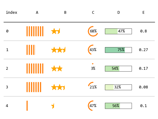
4. 图文混合
最后,演示一个通过 plottable 在表格中插入图片的示例。
其中数据来源是 2023 王者荣耀春季赛各个战队的数据。
主要为了演示表格中插入图片(图片是各个战队的logo),所以只挑选了4个列来展示。
import pandas as pd
import numpy as np

import matplotlib
import matplotlib.pyplot as plt
from matplotlib.colors import LinearSegmentedColormap

from plottable import ColumnDefinition, Table
from plottable.formatters import decimal_to_percent
from plottable.plots import bar, percentile_bars, percentile_stars, progress_donut
from plottable.plots import circled_image

matplotlib.rcParams["font.sans-serif"] = ["Microsoft YaHei Mono"]
matplotlib.rcParams["axes.unicode_minus"] = False

df = pd.read_csv("d:/share/data.csv")
df = df.set_index("排名")
df["胜率"] = df["胜场"] / df["比赛场次"]
df["logo"] = "d:/share/wzry-logos/" + df["战队"] + ".png"
df = df.drop(columns=["胜场", "比赛场次", "场均KDA"])

fig, ax = plt.subplots(figsize=(12, 12))

col_defs = [
        ColumnDefinition("排名", textprops={"ha": "left"}),
        ColumnDefinition(
            name="logo",
            title="",
            textprops={"ha": "center"},
            width=0.5,
            plot_fn=circled_image,
        ),
        ColumnDefinition("战队", textprops={"ha": "center"}),
        ColumnDefinition(
            "胜率",
            plot_fn=progress_donut,
            plot_kw={"is_pct": True, "formatter": "{:.0%}"},
        ),
    ]

tbl = Table(
    df,
    ax=ax,
    textprops={"ha": "center", "fontsize": 20},
    column_definitions=col_defs,
)

上面示例中用到的数据和logo图标分享在:
https://url11.ctfile.com/f/45455611-870642180-a094e4?p=6872 (访问密码: 6872)
有兴趣可以试试看上面的示例,或者继续深入探索 plottable 的强大显示功能。