-
geomtextpath | 成功让你的ggplot注释拥有傲人曲线!~
1写在前面
最近的世界杯结果的确是让人大跌眼镜🕶️, 日本队🇯🇵先后击败世界杯冠军, 德国队🇩🇪和西班牙队🇪🇸, 韩国队🇰🇷逆转葡萄牙🇵🇹, 踩着乌拉圭🇺🇾进入淘汰赛(请韩国队🇰🇷自觉感谢裁判), 让无数人站上天台😂.
不过大家要是看看这几十年日本足球⚽️的发展也就不会觉得奇怪了, 就算有一天日本队将梦想照进现实,捧起大力神杯🏆, 我也不觉得有什么奇怪的.
还是祝各亚洲球队取得好成绩, 也祝梅西和C罗在顶峰相遇, 人生不留遗憾😘.
接着是这一期的教程, 最近用了一下
geomtextpath, 是个不错的ggplot2扩展包, 让你的geom_text卷起来吧.😂主要函数有
2个,geom_textpath和geom_labelpath, 我们逐一介绍吧.🧐2用到的包
rm(list = ls())
# remotes::install_github("AllanCameron/geomtextpath", quiet = TRUE)
library(tidyverse)
library(geomtextpath)
library(ggsci)
library(RColorBrewer)- 1
3等价函数
这里我们给大家补充一下在使用
text或者label时, 用到的包内对等函数, 不同figure可以选用对应的text或者label.😉ggplot geom Text equivalent Label equivalent geom_pathgeom_textpathgeom_labelpathgeom_segmentgeom_textsegmentgeom_labelsegmentgeom_linegeom_textlinegeom_labellinegeom_ablinegeom_textablinegeom_labelablinegeom_hlinegeom_texthlinegeom_labelhlinegeom_vlinegeom_textvlinegeom_labelvlinegeom_curvegeom_textcurvegeom_labelcurvegeom_densitygeom_textdensitygeom_labeldensitygeom_smoothgeom_textsmoothgeom_labelsmoothgeom_contourgeom_textcontourgeom_labelcontourgeom_density2dgeom_textdensity2dgeom_labeldensity2dgeom_sfgeom_textsfgeom_labelsf4示例数据
示例数据我们就用大名鼎鼎的
Orange和iris吧.4.1 示例数据一
dat1 <- Orange
DT::datatable(dat1)- 1

4.2 示例数据二
dat2 <- iris
DT::datatable(dat2)- 1

5标注曲线
5.1 简单绘图
这里用到的是
geom_textline函数, 一起看一下吧.🥳dat1 %>%
dplyr::filter(., Tree == 1) %>%
ggplot(aes(x = age, y = circumference)) +
geom_textline(label = "This is my text oh oh oh!",
size = 4, vjust = -0.2,
linewidth = 1, linecolor = "red4", linetype = 2,
color = "deepskyblue4")- 1

5.2 进阶绘图
有时候我们还想标注上复杂的公式, 大家可以这样试一下.😏
lab <- expression(paste("y = ", frac(1, sigma*sqrt(2*pi)), " ",
                            plain(e)^{frac(-(x-mu)^2, 2*sigma^2)}))

df <- data.frame(x = seq(-2, 0, len = 100),
                 y = dnorm(seq(-2, 0, len = 100)),
                 z = as.character(lab))
df %>%
ggplot(aes(x, y)) +
  geom_textpath(aes(label = z),
                vjust = -0.2, hjust = 0.1,
size = 8, parse = T)- 1

6标注densityplot
6.1 绘图
这里用到的是
geom_textdensity函数, 我们再改一下颜色和主题.🤗dat2 %>%
ggplot(aes(x = Sepal.Width, colour = Species, label = Species)) +
geom_textdensity(size = 6, fontface = 2, hjust = 0.2, vjust = 0.3) +
scale_color_npg()+
theme_bw()+
theme(panel.background = element_blank(),
panel.grid = element_blank(),
legend.position = "none")- 1

6.2 更改文字位置
我们试着把他们改到最大值处.😂
dat2 %>%
ggplot(aes(x = Sepal.Width, colour = Species, label = Species)) +
  scale_color_npg()+
  theme_bw()+
  theme(panel.background = element_blank(),
        panel.grid = element_blank(),
        legend.position = "none")+

  geom_textdensity(size = 5, fontface = 2, spacing = 50,
                   vjust = -0.2, hjust = "ymax") +
ylim(c(0, 1.5))- 1

7标注趋势线
这里用到的是
geom_labelsmooth函数,method可选如下:👇-
"lm"; -
"glm"; -
"gam"; -
"loess";
dat2 %>%
ggplot(aes(x = Sepal.Width, y = Petal.Width, color = Species)) +
  geom_point(alpha = 0.3) +
  geom_labelsmooth(aes(label = Species),
                   text_smoothing = 30,
                   fill = "#F6F6FF", # label背景色
                   method = "loess",
                   formula = y ~ x,
                   size = 4, linewidth = 1,
                   boxlinewidth = 0.3) +
  scale_color_npg()+
  theme_bw()+
  theme(panel.background = element_blank(),
        panel.grid = element_blank(),
legend.position = "none")- 1

Note! 这里你也可以使用
geom_textsmooth, 大家自己试一下有什么区别吧.😗8标注contour lines
我们试着在
contour lines上标注一下吧, 用到的函数是eom_textcontour.🤩df <- expand.grid(x = seq(nrow(volcano)), y = seq(ncol(volcano)))
df$z <- as.vector(volcano)
ggplot(df, aes(x, y, z = z)) +
geom_contour_filled(bins = 6, alpha = 0.8) +
geom_textcontour(bins = 6, size = 2.5, straight = T) +
scale_fill_manual(values = colorRampPalette(brewer.pal(9,"Greens"))(9))+
theme_bw()+
theme(panel.background = element_blank(),
panel.grid = element_blank(),
legend.position = "none")- 1

9标注阈值线
我们在这里可以使用
geom_texthline,geom_textvline,geom_textabline来进行各种阈值线的绘制.🤓dat2 %>%
ggplot(aes(Sepal.Length, Sepal.Width)) +
geom_point() +
geom_texthline(yintercept = 3,
label = "hline",
hjust = 0.8, color = "red4") +
geom_textvline(xintercept = 6,
label = "vline",
hjust = 0.8, color = "blue4",
linetype = 2, vjust = 1.3) +
geom_textabline(slope = 15, intercept = -100,
label = "abline",
color = "green4", hjust = 0.6, vjust = -0.2)+
theme_bw()+
theme(panel.background = element_blank(),
panel.grid = element_blank(),
legend.position = "none")- 1

10标注统计学差异
我们常规使用直线或者直接标注
*的方式来展示统计学差异.😘
这里我们试试换一种方式来绘图吧.🫢dat2 %>%
ggplot(aes(x = Species, y = Sepal.Length)) +
geom_boxplot(aes(fill = Species))+
geom_textcurve(data = data.frame(x = 1, xend = 2,
y = 8.72, yend = 8.52),
aes(x, y, xend = xend, yend = yend),
hjust = 0.35, ncp = 20,
curvature = -0.8,
label = "significant difference") +
scale_y_continuous(limits = c(4, 14))+
scale_fill_aaas()+
theme_bw()+
theme(panel.background = element_blank(),
panel.grid = element_blank(),
legend.position = "none")- 1

11test_smoothing
有的时候画出来的
figure过于尖锐, 不够平滑, 这样就不好标注了, 这里也提供了text_smoothing参数用来解决这个问题,0 (none) to 100 (maximum), 大家试一下吧, 我在这里先做一个示范.😘dat2 %>%
ggplot(aes(Sepal.Length, Petal.Length)) +
geom_textline(linecolour = "red4", size = 4, vjust = -7.5,
label = "smooth_text", text_smoothing = 40)- 1

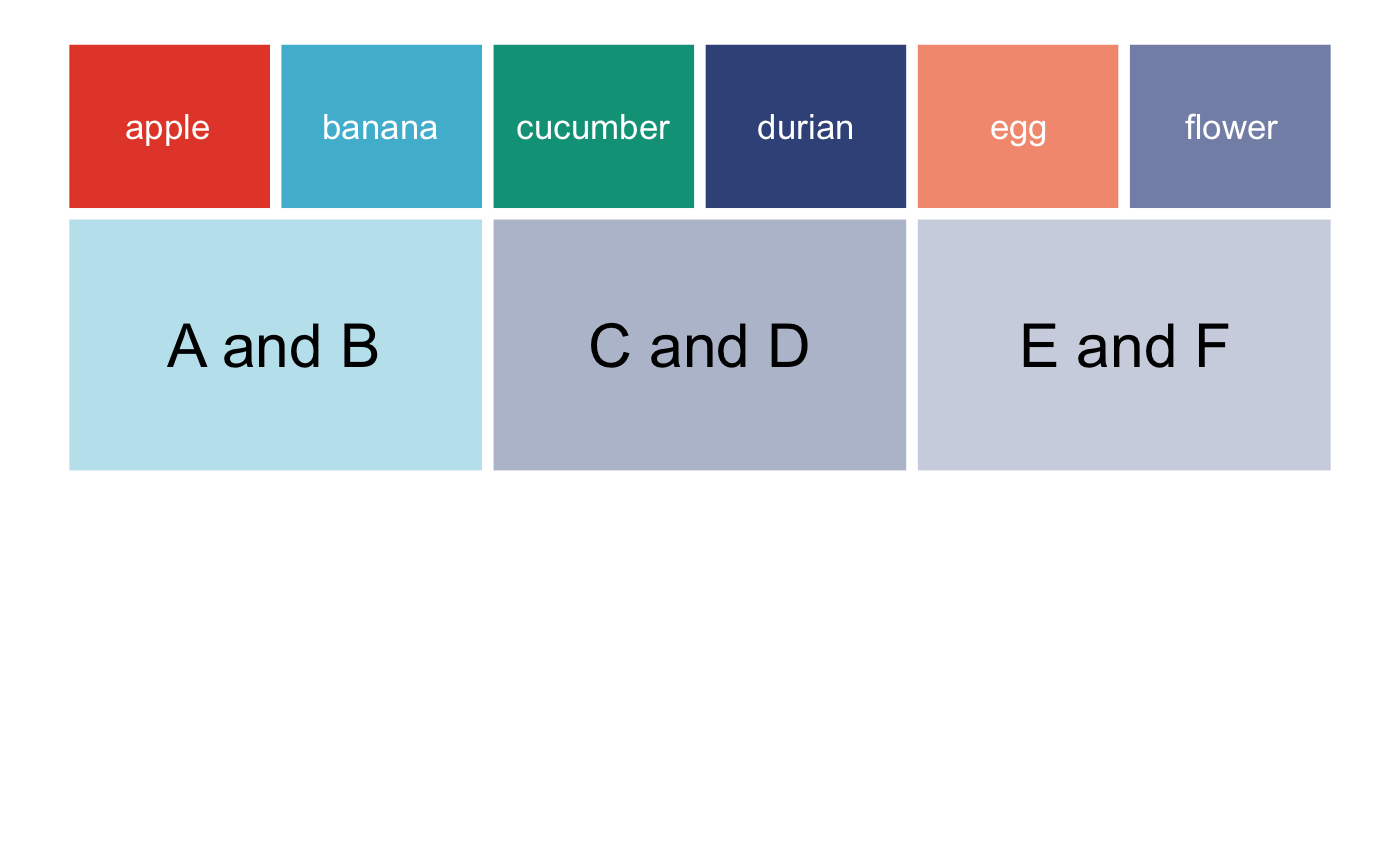
12复杂绘图的坐标轴改变
12.1 初步绘图
我们先画个图, 然后我们再把坐标
coord_polar().🤩p <- data.frame(x1 = c(seq(0, 10/6 * pi, pi/3),
seq(0, 10/6 * pi, 2*pi/3)),
y1 = c(rep(2, 6), rep(-1, 3)),
x2 = c(seq(0, 10/6 * pi, pi/3) + pi/3,
seq(0, 10/6 * pi, 2*pi/3) + 2*pi/3),
y2 = c(rep(4, 6), rep(2, 3)),
group = letters[c(1:6, (1:3) * 2)],
alpha = c(rep(1, 6), rep(0.4, 3))) |>
ggplot(aes(x1, y1)) +
geom_rect(aes(xmin = x1, xmax = x2, ymin = y1, ymax = y2, fill = group,
alpha = alpha),
color = "white", size = 2) +
geom_textpath(data = data.frame(x1 = seq(0, 2 * pi, length = 300),
y1 = rep(0.5, 300),
label = rep(c("A and B", "C and D", "E and F"), each = 100)),
aes(label = label), linetype = 0, size = 8,
upright = TRUE) +
geom_textpath(data = data.frame(x1 = seq(0, 2 * pi, length = 300),
y1 = rep(3, 300),
label = rep(c("apple", "banana", "cucumber", "durian",
"egg", "flower"),
each = 50)),
aes(label = label), linetype = 0, size = 4.6, color = "white",
upright = TRUE) +
scale_y_continuous(limits = c(-5, 4)) +
scale_x_continuous(limits = c(0, 2*pi)) +
scale_fill_npg()+
scale_alpha_identity() +
theme_void() +
theme(legend.position = "none")
p- 1
12.2 更改坐标系
这个包非常强大, 大家完全不用担心使用
coord_polar()后, 文字的位置会有改变, 请放心使用!😂p + coord_polar()- 1

Nice! 这种图无论是在研究型paper还是Review中使用, 都是可以拉高水平的图🌟~
12.3 直接使用coord_curvedpolar()
在这种
polar式的坐标系中, 如果标注的文字太长, 我们可以使用coord_curvedpolar(), 要比coord_polar()合适, 大家试一试吧.😉df <- data.frame(x = c("Apple label", "Banana label",
"Cucumber label", "Durian label"),
y = c(7, 10, 12, 5))
p <- ggplot(df, aes(x, y, fill = x)) +
geom_col(width = 0.5) +
scale_fill_npg()+
theme(axis.text.x = element_text(size = 15),
legend.position = "none")
p- 1

搞定!~🥳🥳🥳
p + coord_curvedpolar()- 1


最后祝大家早日不卷!~
点个在看吧各位~ ✐.ɴɪᴄᴇ ᴅᴀʏ 〰
📍 往期精彩 📍 🤩 ComplexHeatmap | 颜狗写的高颜值热图代码!
📍 🤥 ComplexHeatmap | 你的热图注释还挤在一起看不清吗!?
📍 🤨 Google | 谷歌翻译崩了我们怎么办!?(附完美解决方案)
📍 🤩 scRNA-seq | 吐血整理的单细胞入门教程
📍 🤣 NetworkD3 | 让我们一起画个动态的桑基图吧~
📍 🤩 RColorBrewer | 再多的配色也能轻松搞定!~
📍 🧐 rms | 批量完成你的线性回归
📍 🤩 CMplot | 完美复刻Nature上的曼哈顿图
📍 🤠 Network | 高颜值动态网络可视化工具
📍 🤗 boxjitter | 完美复刻Nature上的高颜值统计图
📍 🤫 linkET | 完美解决ggcor安装失败方案(附教程)
📍 ......本文由 mdnice 多平台发布
-
相关阅读:
2023-10-23 LeetCode每日一题(老人的数目)
python flaskweb与sqlite连接
软件工程与计算总结(二十)软件交付
2022-08-08-w3d1
RPA+人力资源:打造未来自动化时代的企业新标杆
i7 13700k和i7 12700k差距
基于Vue的预约停车位APP设计与实现
领导大规模敏捷 - Leading SAFe认证,SAFe认证Leading SAFe官方认证培训班
BeanShell 如何加密加签?
Java项目---图片服务器
- 原文地址:https://blog.csdn.net/m0_72224305/article/details/128166663
