-
11.前端笔记-CSS盒子模型-外边距margin
1、margin
1.1 margin的语法
盒子与盒子之间的距离
DOCTYPE html> <html lang="en"> <head> <meta charset="UTF-8"> <meta http-equiv="X-UA-Compatible" content="IE=edge"> <meta name="viewport" content="width=device-width, initial-scale=1.0"> <title>Documenttitle> <style> div{ background-color: pink; width: 100px; height: 100px; } .one{ margin-bottom: 20px; } .two{ margin-top: 20px; margin-bottom: 20px; margin-left: 20px; margin-right: 20px; } style> head> <body> <div class="one">div> <div class="two">div> body> html>- 1
- 2
- 3
- 4
- 5
- 6
- 7
- 8
- 9
- 10
- 11
- 12
- 13
- 14
- 15
- 16
- 17
- 18
- 19
- 20
- 21
- 22
- 23
- 24
- 25
- 26
- 27
- 28
- 29

1.2 margin复合写法
DOCTYPE html> <html lang="en"> <head> <meta charset="UTF-8"> <meta http-equiv="X-UA-Compatible" content="IE=edge"> <meta name="viewport" content="width=device-width, initial-scale=1.0"> <title>Documenttitle> <style> div{ background-color: pink; width: 100px; height: 100px; } .one{ margin: 20px; } .two{ margin-top: 20px; margin-bottom: 20px; margin-left: 20px; margin-right: 20px; } style> head> <body> <div class="one">div> <div class="two">div> body> html>- 1
- 2
- 3
- 4
- 5
- 6
- 7
- 8
- 9
- 10
- 11
- 12
- 13
- 14
- 15
- 16
- 17
- 18
- 19
- 20
- 21
- 22
- 23
- 24
- 25
- 26
- 27
- 28
- 29

1.3 margin外边距典型应用
(1)使块级盒子水平居中
条件:
(1)盒子必须指定宽度(width)
(2)盒子左右外边距设置为autoDOCTYPE html> <html lang="en"> <head> <meta charset="UTF-8"> <meta http-equiv="X-UA-Compatible" content="IE=edge"> <meta name="viewport" content="width=device-width, initial-scale=1.0"> <title>Documenttitle> <style> div{ background-color: pink; width: 100px; height: 100px; } .one{ margin: 0 auto; } style> head> <body> <div class="one">div> body> html>- 1
- 2
- 3
- 4
- 5
- 6
- 7
- 8
- 9
- 10
- 11
- 12
- 13
- 14
- 15
- 16
- 17
- 18
- 19
- 20
- 21
- 22
- 23

对行内元素和行内块元素无效,但要实现水平居中的效果,可以其父元素添加text-align:center属性DOCTYPE html> <html lang="en"> <head> <meta charset="UTF-8"> <meta http-equiv="X-UA-Compatible" content="IE=edge"> <meta name="viewport" content="width=device-width, initial-scale=1.0"> <title>Documenttitle> <style> div{ background-color: pink; width: 200px; height: 200px; text-align: center; } .one{ margin: 0 auto; } style> head> <body> <div class="one"> <span>行内元素的居中对齐span> div> body> html>- 1
- 2
- 3
- 4
- 5
- 6
- 7
- 8
- 9
- 10
- 11
- 12
- 13
- 14
- 15
- 16
- 17
- 18
- 19
- 20
- 21
- 22
- 23
- 24
- 25
- 26

1.4 外边距合并和塌陷
使用margin定义块元素的垂直外边距(top和bottom)时,可能会出现外边距的合并和塌陷
主要有两种情况:
(1)相邻块元素垂直外边距的合并(兄弟关系的)
(2)嵌套块元素垂直外边距的塌陷(父子关系的)
什么是外边距合并:
one盒子设置下边距为10,two盒子设置上边距为20.但实际两个盒子的距离不是10+20。而是取的两值间的较大值,这种现象就算相邻块元素垂直外边距的合并
** 浮动的盒子不会有外边距合并塌陷问题**DOCTYPE html> <html lang="en"> <head> <meta charset="UTF-8"> <meta http-equiv="X-UA-Compatible" content="IE=edge"> <meta name="viewport" content="width=device-width, initial-scale=1.0"> <title>Documenttitle> <style> div{ width: 200px; height: 200px; background-color: green; } .one{ margin-bottom: 10px; } .two{ margin-top: 20px; } style> head> <body> <div class="one">div> <div class="two">div> body> html>- 1
- 2
- 3
- 4
- 5
- 6
- 7
- 8
- 9
- 10
- 11
- 12
- 13
- 14
- 15
- 16
- 17
- 18
- 19
- 20
- 21
- 22
- 23
- 24
- 25
- 26

解决方案:
尽量只给一个盒子添加margin值
什么是外边距的塌陷
对于嵌套关系(父子关系)的块元素,父元素有margin-top的同时,子元素也有margin-top,此时父元素会塌陷两者中较大的margin-top值
期望的效果:

实际的效果:

如何解决:
(1)父元素加上边框top(颜色可以设为transparent)–恩断义绝框,影响盒子大小
(2)父元素定义上内边距top。影响盒子大小
(3)给父元素加上overflow:hidden,不影响盒子大小
(4)其他方法:浮动、固定、绝对定位的盒子不会有塌陷问题
执行第(1)种:DOCTYPE html> <html lang="en"> <head> <meta charset="UTF-8"> <meta http-equiv="X-UA-Compatible" content="IE=edge"> <meta name="viewport" content="width=device-width, initial-scale=1.0"> <title>Documenttitle> <style> .farther{ width: 200px; height: 200px; margin-top: 20px; border-top:2px solid black; background-color: green; } .son{ width: 50px; height: 50px; margin-top: 50px; background-color: pink; } style> head> <body> <div class="farther"> <div class="son">div> div> body> html>- 1
- 2
- 3
- 4
- 5
- 6
- 7
- 8
- 9
- 10
- 11
- 12
- 13
- 14
- 15
- 16
- 17
- 18
- 19
- 20
- 21
- 22
- 23
- 24
- 25
- 26
- 27
- 28
- 29
- 30

执行第(2)种:
DOCTYPE html> <html lang="en"> <head> <meta charset="UTF-8"> <meta http-equiv="X-UA-Compatible" content="IE=edge"> <meta name="viewport" content="width=device-width, initial-scale=1.0"> <title>Documenttitle> <style> .farther{ width: 200px; height: 200px; margin-top: 20px; padding-top: 50px; background-color: green; } .son{ width: 50px; height: 50px; margin-top:50px; background-color: pink; } style> head> <body> <div class="farther"> <div class="son">div> div> body> html>- 1
- 2
- 3
- 4
- 5
- 6
- 7
- 8
- 9
- 10
- 11
- 12
- 13
- 14
- 15
- 16
- 17
- 18
- 19
- 20
- 21
- 22
- 23
- 24
- 25
- 26
- 27
- 28
- 29
- 30

(3)执行第(3)种:DOCTYPE html> <html lang="en"> <head> <meta charset="UTF-8"> <meta http-equiv="X-UA-Compatible" content="IE=edge"> <meta name="viewport" content="width=device-width, initial-scale=1.0"> <title>Documenttitle> <style> .farther{ width: 200px; height: 200px; margin-top: 20px; background-color: green; overflow: hidden; } .son{ width: 50px; height: 50px; margin-top: 50px; background-color: pink; } style> head> <body> <div class="farther"> <div class="son">div> div> body> html>- 1
- 2
- 3
- 4
- 5
- 6
- 7
- 8
- 9
- 10
- 11
- 12
- 13
- 14
- 15
- 16
- 17
- 18
- 19
- 20
- 21
- 22
- 23
- 24
- 25
- 26
- 27
- 28
- 29
- 30

1.5 清除内外边距
不同的网页元素(如ul),即使没有设置内外边距,但有的自身默认会有内外边距(不同浏览器默认的也不一致),因此在布局前,首先最好先清除网页元素的内外边距
//可以将这段代码放在css的首行去写 *{ margin:0; padding:0; }- 1
- 2
- 3
- 4
- 5
注意:
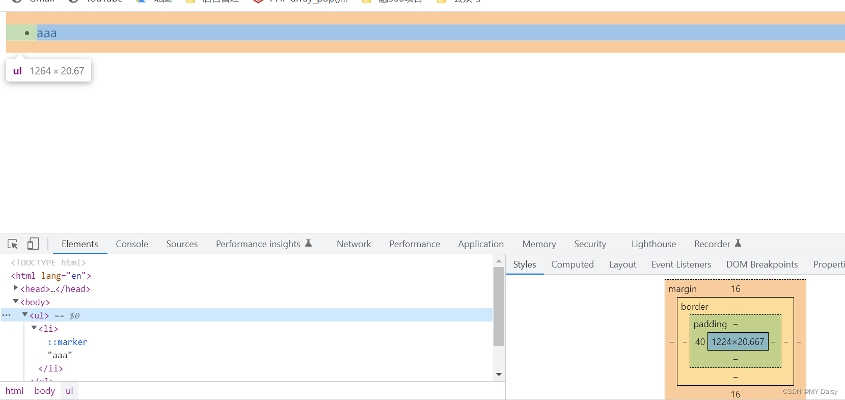
行内元素为了照顾兼容性,尽量只设置左右内外边距,不要设置上下内外边距,但是转换为块级和行内块元素就可以了ul没有设置padding-left,但实际看浏览器是由一个40px的padding-left
DOCTYPE html> <html lang="en"> <head> <meta charset="UTF-8"> <meta http-equiv="X-UA-Compatible" content="IE=edge"> <meta name="viewport" content="width=device-width, initial-scale=1.0"> <title>Documenttitle> head> <body> <ul> <li>aaali> ul> body> html>- 1
- 2
- 3
- 4
- 5
- 6
- 7
- 8
- 9
- 10
- 11
- 12
- 13
- 14
清除自带的内外边距:DOCTYPE html> <html lang="en"> <head> <meta charset="UTF-8"> <meta http-equiv="X-UA-Compatible" content="IE=edge"> <meta name="viewport" content="width=device-width, initial-scale=1.0"> <title>Documenttitle> <style> *{ margin: 0; padding: 0; } style> head> <body> <ul> <li>aaali> ul> body> html>- 1
- 2
- 3
- 4
- 5
- 6
- 7
- 8
- 9
- 10
- 11
- 12
- 13
- 14
- 15
- 16
- 17
- 18
- 19
- 20

行内元素设置上下边距:DOCTYPE html> <html lang="en"> <head> <meta charset="UTF-8"> <meta http-equiv="X-UA-Compatible" content="IE=edge"> <meta name="viewport" content="width=device-width, initial-scale=1.0"> <title>Documenttitle> <style> *{ margin: 0; padding: 0; } span{ margin: 20px; } style> head> <body> <ul> <li>aaali> ul> <span> span span> body> html>- 1
- 2
- 3
- 4
- 5
- 6
- 7
- 8
- 9
- 10
- 11
- 12
- 13
- 14
- 15
- 16
- 17
- 18
- 19
- 20
- 21
- 22
- 23
- 24
- 25
- 26

-
相关阅读:
WindivertDotnet快速发Ping
《Java基础——方法的调用》
java培训课程之页面中获取国际化资源信息
突破从0到1后,鲜花电商2.0时代怎么走?
新疆旅游创新产品迎活力 伊吾胡杨文旅品牌发布
Cocos Creator发布微信小游戏包内体积过大问题
Jmeter安装(快速入门)
八个解决你80%需求的CSS动画库
千万支持补助让人心动?成都市关于加快发展先进制造业实现工业转型升级发展若干政策的意见
FPGA优质开源项目 – UDP万兆光纤以太网通信
- 原文地址:https://blog.csdn.net/Ambition_ZM/article/details/128065630
