-
前端css样式小知识点(大杂烩)
文章目录
一、前言
一些前端css样式的知识点、琐碎,但是有些很常用,当时却总是想不起来,又要自己进行搜索,就很麻烦,就部分简单记录一下。
二、图文实操讲解
1、使用微信开发者工具,如何整洁代码的快捷键
Shift+Alt+F //代码格式化- 1
2、微信小程序中rpx和px有什么区别
区别:①rpx是相对长度单位,而px是固定长度单位;②rpx可以自适应手机分辨率,适配当前机型,而px不能很好的适应不同分辨率的手机。
3、css中flex设置为1是什么意思
flex包含三个属性:flex-grow,flex-shrink,flex-basis
flex-grow: 默认值为0,代表元素的放大比例,当一个容器有多余的空间时,设置容器内某个元素的放大比例,该元素会对多余空间根据设置的比例分配大小
flex-shrink:默认值为1,代表元素的缩小比例,当空间不足时,多个元素会按照比例同样缩小,如果设置某个元素这个值为0,代表空间不足时该元素不缩小
flex-basis:代表元素再分配多余空间前所占比例,默认值auto等于元素本身大小不变
flex设置为1等同与flex-grow设置为1,元素分配剩余空间时按照设置的值进行等比例分配.item { flex: 1; } /* 等同 */ .item { flex-grow: 1; flex-shrink: 1; flex-basis: 0%; }- 1
- 2
- 3
- 4
- 5
- 6
- 7
- 8
- 9
4、opacity:1 的作用是什么
opacity从0-1表示了一个元素的可见度,在0时会完全看不见,1表示完全可见。opacity的用处要参考设计,是否要设置一个元素恰当的透明度值
.div{ width: 100px; height: 100px; border: 1px solid #000; background-color: red; border-radius: 50%; opacity: 0.5; //设置了0.5 } .div2{ width: 100px; height: 100px; border: 1px solid #000; background-color: red; border-radius: 50%; opacity: 1; //正常默认1 }- 1
- 2
- 3
- 4
- 5
- 6
- 7
- 8
- 9
- 10
- 11
- 12
- 13
- 14
- 15
- 16
- 17
效果图:

5、css样式如何实现半圆等
border-radius的顺序是 左上 右上 右下 左下
.div{ width: 100px; height: 100px; border: 1px solid #000; background-color: red; border-radius: 50%; } .div2{ width: 100px; height: 50px; border: 1px solid #000; background-color: red; /* border-radius的顺序是 左上 右上 右下 左下 */ /* 半圆朝左,右边上下角是圆的,左边上下角的宽度设置为0 */ /* div盒子宽度为高度的一半 */ /* 右上和右下的宽度与高度取50或者100都没问题 */ border-radius: 0 0 100px 100px; }- 1
- 2
- 3
- 4
- 5
- 6
- 7
- 8
- 9
- 10
- 11
- 12
- 13
- 14
- 15
- 16
- 17
- 18
圆形就更简单了设置 border-radius:50%;即可。
效果图:

6、css样式如何将图片置于元素最上面
在css中,可以利用“z-index”属性将图片置于元素最上面,该属性用于设置元素的堆叠顺序,属性的值越大,元素显示的顺序也就越靠前,语法为“图片元素{z-index:number;}”。
.div image{ width: 100px; height: 100px; border: 1px solid #000; border-radius: 50%; z-index: 0; } image{ position: absolute; top: 0px; left: 0px; width: 50px; height: 50px; z-index: 1; }- 1
- 2
- 3
- 4
- 5
- 6
- 7
- 8
- 9
- 10
- 11
- 12
- 13
- 14
- 15
效果图:

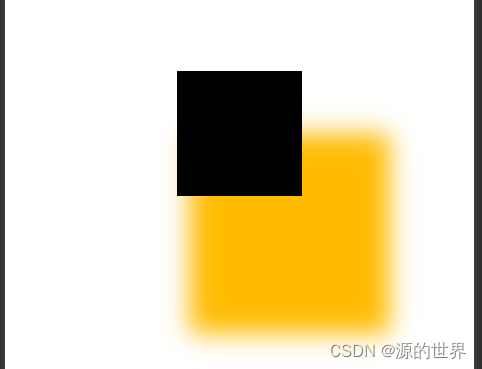
7、css样式,字体阴影效果
①盒子阴影
box-shadow: h-shadow v-shadow blur spread color inset;- 1
- h-shadow 必需的。水平阴影的位置。允许负值
- v-shadow 必需的。垂直阴影的位置。允许负值
- blur 可选。模糊距离
- spread 可选。阴影的大小
- color 可选。阴影的颜色。在CSS颜色值寻找颜色值的完整列表
- inset 可选。从外层的阴影(开始时)改变阴影内侧阴影
<!--index.wxml--> <view class="container"> <view class="shadow">阴影</view> </view> <!--index.wxss--> .shadow{ width:200rpx; height:200rpx; background-color: #000000; box-shadow: 40px 80px 20px 30px #00FF00; }- 1
- 2
- 3
- 4
- 5
- 6
- 7
- 8
- 9
- 10
- 11
- 12
效果图:
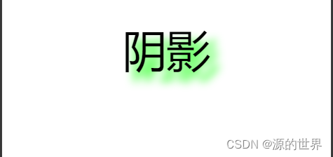
②文字阴影
text-shadow:hpx vhpx rpx color- 1
- hpx 水平偏移
- vpx 垂直偏移
- rpx 模糊度
- color 阴影颜色
- 多个阴影用逗号隔开
<!--index.wxml--> <view class="container"> <view class="shadow">阴影</view> </view> <!--index.wxss--> .shadow{ font-size:100rpx; text-shadow: 10px 10px 10px #09ff00; }- 1
- 2
- 3
- 4
- 5
- 6
- 7
- 8
- 9
- 10
效果图:
8、padding-bottom: env(safe-area-inset-bottom);的作用
示例一:自定义tabBar
page{
width: 100%;
height: 50px;
position: fixed;
botttom: env(safe-area-inset-bottom);
background-color: #108ee9;
}
编译到IOS端,正常显示为:固定在底部安全距离之上的tab条
编译到Android机器,fixed布局失效,悬浮在顶部示例二:自定义全屏遮罩
page{
width: 100%;
position: fixed;
top: 0;
botttom: env(safe-area-inset-bottom);
background-color: rgba(0,0,0,0.3);
}
编译到IOS端,正常显示为:遮盖除底部安全距离之外的区域,黑色半透明遮罩层
编译到Android机器,没掉,需改为bottom: 0,方可正常显示9、css样式基础文字样式
① color:属性值;文字颜色
其中属性值包括颜色名称,如red、blue、yellow等等;
②font-family:宋体;文字类型
font-family后可以写三种字体样式,以应对不同浏览器的适用。若设置的样式对应的浏览器都不支持,那么将使用对应浏览器默认的样式。这里的样式值可以写中文如:宋体、楷体等等,也可以是英文如Time New Roman
③font-size:18px; 文字大小
font-size后直接跟学要设置的字体大小,这里的值可以是数字,数字加单位,也可以是英文,如:small、large、medium等等
④ font-weight:400; 文字粗细
font-weight表示字体的粗细,可以设置100、200~700,其中400表示默认粗细,700表示加粗和bold相同作用,还可以是bold,lighter,normal等等
⑤font-style:normal; 字体样式
font-style可以填的属性包括normal,italic,oblique。后两个表示斜体,但主要使用italic,oblique支持的浏览器比较少
⑥line-height:18px; 字体行高
可以给文字段落设置行高,一般行高要求设置的值要大于文字的大小,防止文字被挤压变形。字体行高还有一个作用就是可以让文字垂直居中显示。
⑦letter-spacing: 0.1em; 设置字体间距属性
⑧text-align:center; 文本对齐
文本对齐可以填入的值包括center,left,right,justify(两端对齐),inherit(表示继承自父元素的text-align的样式)
⑨ text-indent:2rem; 文本间距
文本缩进,text-indent:2rem;正数表示文本向右缩进的距离,反之负数表示文本向左缩进的距离
10、white-space: nowrap;作用
white-space:nowrap强制同一行内显示所有文本文字,让所有文字内容中一排显示不换行。
normal 默认。空白会被浏览器忽略。
pre 空白会被浏览器保留。其行为方式类似 HTML 中的 pre标签。
nowrap 文本不会换行,文本会在在同一行上继续,直到遇到
标签为止。
pre-wrap 保留空白符序列,但是正常地进行换行。
pre-line 合并空白符序列,但是保留换行符。
inherit 规定应该从父元素继承 white-space 属性的值。11、CSS position(定位)属性
①CSS position(定位)属性
absolute:生成绝对定位的元素,相对于 static 定位以外的第一个父元素进行定位。元素的位置通过 “left”, “top”, “right” 以及 “bottom” 属性进行规定。
fixed:生成绝对定位的元素,相对于浏览器窗口进行定位。元素的位置通过 “left”, “top”,“right” 以及 “bottom” 属性进行规定。
relative:生成相对定位的元素,相对于其正常位置进行定位。因此,“left: 20px” 会向元素的 left 位置移动 20 像素。
static:默认值。没有定位,元素出现在正常的流中(忽略 top, bottom, left, right 或者 z-index 声明)。
inherit:规定应该从父元素继承 position 属性的值。
CSS position属性用于指定一个元素在文档中的定位方式。top、right、bottom、left 属性则决定了该元素的最终位置。
什么是文档流(normal flow)
normal flow 国内多译为文档流;
窗体自上而下分成一行一行,并在每行中按从左至右的顺序排放元素;
每个非浮动块级元素都独占一行, 浮动元素则按规定浮在行的一端,若当前行容不下,则另起一行再浮动;
内联元素也不会独占一行,几乎所有元素(包括块级,内联和列表元素)均可生成子行,用于摆放子元素;
有三种情况将使得元素脱离normal flow而存在,分别是 float,absolute ,fixed,但是在IE6中浮动元素也存在于normal flow中。②position: static
该关键字指定元素使用正常的布局行为,即元素在文档常规流中当前的布局位置。此时 top、right、bottom、left 属性无效。static是position的默认值
<!--index.wxml--> <view class="container"> <view class="content">static是position的默认值</view> </view> /* index.wxss */ .container{ background-color: #868686; width: 100%; height: 300px; } .content{ background-color: yellow; width: 100px; height: 100px; position: static; left: 10px;/* 这个left没有起作用 */ }- 1
- 2
- 3
- 4
- 5
- 6
- 7
- 8
- 9
- 10
- 11
- 12
- 13
- 14
- 15
- 16
- 17
- 18
对 content 的 position 设定 static 后,left就失效了,而元素(content)就以正常的 normal flow 形式呈现。
效果图:

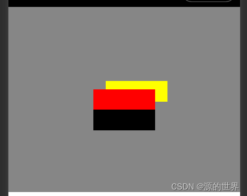
③position: relative
该关键字下,元素先放置在未添加定位时的位置,再在不改变页面布局的前提下调整元素位置(因此会在此元素未添加定位时所在位置留下空白)。position:relative 对 table-*-group, table-row, table-column, table-cell, table-caption 元素无效。相对于normal flow中的原位置来定位。
这个属性是指元素会依据自己原先的位置为基准进行偏移,但是其原先位置依然会存在,不会干扰相邻的元素。<!--index.wxml--> <view class="container"> <view class="content"></view> <view class="content1"></view> <view class="content2"></view> </view> /* index.wxss */ .container { background-color: #868686; width: 100%; height: 300px; } .content { background-color: yellow; width: 100px; height: 100px; } .content1 { background-color: red; width: 100px; height: 100px; position: relative;/* 这里使用了relative */ } .content2 { background-color: black; width: 100px; height: 100px; }- 1
- 2
- 3
- 4
- 5
- 6
- 7
- 8
- 9
- 10
- 11
- 12
- 13
- 14
- 15
- 16
- 17
- 18
- 19
- 20
- 21
- 22
- 23
- 24
- 25
- 26
- 27
- 28
- 29
- 30
效果图:

这是没有设置left、top等属性时,正常出现在normal flow中的位置。
接着添加left、top:可以看到,元素(content1)的位置相对于其原位置(normal flow中的正常位置)进行了移动。.content { background-color: yellow; width: 100px; height: 100px; position: relative; /* 这里使用了relative */ left: 20px; top: 20px; /* 这里设置了left和top */ }- 1
- 2
- 3
- 4
- 5
- 6
- 7
- 8
- 9
- 10
效果图:
④position: absolute
不为元素预留空间,通过指定元素相对于最近的非 static 定位祖先元素的偏移,来确定元素位置。绝对定位的元素可以设置外边距(margin),且不会与其他边距合并。
生成绝对定位的元素,其相对于 static 定位以外的第一个父元素进行定位,会脱离normal flow。注意:是除了static外<!--index.wxml--> <view class="container"> <view class="content"></view> </view> /* index.wxss */ .container { background-color: #868686; width: 100%; height: 300px; margin-top: 50px; } .content { background-color: red; width: 100px; height: 100px; position: absolute; top: 10px; }- 1
- 2
- 3
- 4
- 5
- 6
- 7
- 8
- 9
- 10
- 11
- 12
- 13
- 14
- 15
- 16
- 17
- 18
- 19
效果图:

因为 content 的父元素 container 没有设置 position,默认为 static,所以找到的第一个父元素是 body,可以看成是元素(content)相对于 body 向下移动10px。
绝对定位,当有一级父对象(无论是父对象还是祖父对象)的Position属性值为Relative或者absolute时,则上述的相对浏览器窗口定位将会变成相对父对象定位,这对精确定位是很有帮助的以父级元素为基础进行定位,若没有父级定位则以浏览器为基准进行定位 并且会影响相邻的元素⑤position: fixed
不为元素预留空间,而是通过指定元素相对于屏幕视口(viewport)的位置来指定元素位置。元素的位置在屏幕滚动时不会改变。打印时,元素会出现在的每页的固定位置。fixed属性会创建新的层叠上下文。当元素祖先的 transform 属性非 none 时,容器由视口改为该祖先。
fixed相对于window固定,滚动浏览器窗口并不会使其移动,会脱离normal flow。<!--index.wxml--> <view class="container"> <view class="content"></view> </view> /* index.wxss */ .container { background-color: #868686; width: 100%; height: 300px; margin-top: 50px; } .content { background-color: red; width: 100px; height: 100px; position: fixed; /* 这里使用了fixed */ left: 200px }- 1
- 2
- 3
- 4
- 5
- 6
- 7
- 8
- 9
- 10
- 11
- 12
- 13
- 14
- 15
- 16
- 17
- 18
- 19
效果图:

⑥position: sticky
盒位置根据正常流计算(这称为正常流动中的位置),然后相对于该元素在流中的 flow root(BFC)和 containing block(最近的块级祖先元素)定位。在所有情况下(即便被定位元素为 table时),该元素定位均不对后续元素造成影响。当元素 B 被粘性定位时,后续元素的位置仍按照 B 未定位时的位置来确定。position: sticky对 table元素的效果与 position: relative 相同。
/* 顶部logo和导航区 */ .top { width: 100%; height: 78px; background: #58bc58; position: sticky; top: 0; /* 设置层级,防止被其他定位元素覆盖 */ z-index: 300; /* 给导航栏加上阴影,显得更加真实 */ box-shadow: 0 0 15px rgb(0 0 0 / 80%); }- 1
- 2
- 3
- 4
- 5
- 6
- 7
- 8
- 9
- 10
- 11
- 12
使用案例效果图:

⑦position: inherit
规定应该从父元素继承 position 属性的值。
<!--index.wxml--> <view class="container"> <view class="content"></view> </view> /* index.wxss */ .container { position: fixed; left: 0; top: 0; background-color: #868686; width: 100%; height: 100px; /* 注意 */ } .content { position: inherit; /* 继承了父元素的fixed;此时就会相对于浏览器定位;不会相对于父元素定位 */ background-color: red; width: 100px; height: 100px; top: 100px; left: 200px }- 1
- 2
- 3
- 4
- 5
- 6
- 7
- 8
- 9
- 10
- 11
- 12
- 13
- 14
- 15
- 16
- 17
- 18
- 19
- 20
- 21
- 22
- 23
- 24
⑧总结
position: relative;不会脱离文档流,position: fixed,position: absolute会脱离文档流
position: relative; 相对于自己在文档流中的初始位置偏移定位。
position: fixed; 相对于浏览器窗口定位。
position: absolute; 是相对于父级非 position:static 浏览器定位。
如果没有任何一个父级元素是非 position:static属性,则会相对于文档定位。
这里它的父级元素是包含爷爷级元素、祖爷爷级元素、祖宗十八代级元素的。任意一级都可以。
如果它的父级元素和爷爷级元素都是非 position:static 属性,则,它会选择距离最近的父元素。12、CSS display:flex(弹性布局)
Flex是Flexible Box的缩写,意为"弹性布局",用来为盒状模型提供最大的灵活性。
设为Flex布局以后,子元素的float、clear和vertical-align属性将失效。
它即可以应用于容器中,也可以应用于行内元素。(以上说明结合微信开发者工具说明)2009年,W3C提出了一种新的方案----Flex布局,可以简便、完整、响应式地实现各种页面布局。①flex布局的基本概念
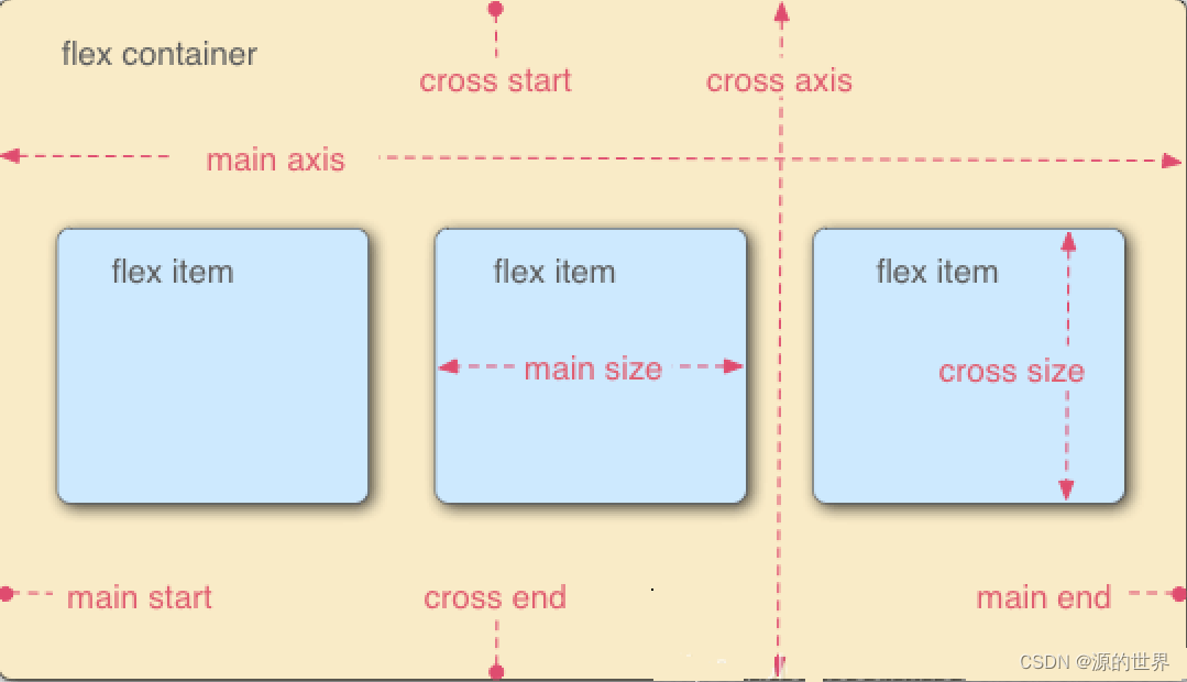
采用Flex布局的元素,称为Flex容器(flex container),简称"容器"。它的所有子元素自动成为容器成员,称为Flex子项(flex item),简称"子项"。容器默认存在两根轴:水平的主轴(main axis)和垂直的交叉轴(cross axis)。主轴的开始位置(与边框的交叉点)叫做main start,结束位置叫做main end;交叉轴的开始位置叫做cross start,结束位置叫做cross end。子项默认沿主轴排列。单个子项占据的主轴空间叫做main size,占据的交叉轴空间叫做cross size。
容器属性
属性名称 属性含义
flex-direction 容器内子项的排列方向(默认横向排列)
flex-wrap 容器内子项换行方式
flex-flow 以上两个属性的简写方式
justify-content 子项在主轴上的对齐方式
align-items 子项在交叉轴上如何对齐
align-content 定义了多根轴线的对齐方式。如果子项只有一根轴线,该属性不起作用。
元素属性- order
- flex-grow
- flex-shrink
- flex-basis
- flex
- align-self
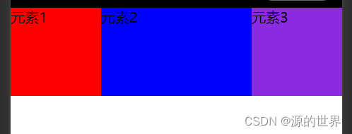
②flex-direction: row; 布局的排列方向 (主轴排列方向)
row :显示为行。方向为当前文档水平流方向,默认情况下是从左往右(默认值);
row-reverse :显示为行。但方向和row属性值是反的,在水平方向上为从右往左;
column: 显示为列 方向为在垂直方向上从上到下;
column-reverse :显示为列。但方向和column属性值是反的。<!--index.wxml--> <view class="containers"> <view class="content">元素1</view> <view class="content2">元素2</view> <view class="content3">元素3</view> </view> /* index.wxss */ .containers { display: flex; /*默认*/ } .content{ background-color: red; width: 100px; height: 100px; } .content2{ background-color: blue; width: 100px; height: 100px; } .content3{ background-color: blueviolet; width: 100px; height: 100px; }- 1
- 2
- 3
- 4
- 5
- 6
- 7
- 8
- 9
- 10
- 11
- 12
- 13
- 14
- 15
- 16
- 17
- 18
- 19
- 20
- 21
- 22
- 23
- 24
- 25
- 26
- 27
- 28
- 29
效果图:

修改后:
.containers { display: flex; flex-direction: column; }- 1
- 2
- 3
- 4
效果图:

③flex-wrap : nowrap; 是否进行换行处理。此语法是加在父元素身上的。
nowrap:默认值,不换行处理;
wrap: 换行处理;
wrap-reverse: 反向换行;
flex-flow : flex-direction flex-wrap 复合写法 (是有顺序的,顺序一定不能乱)。
举个例子:比如容器宽度为100%,容器中有3个宽度为150px的元素,nowrap情况下,项目会强行等分容器宽度从而不换行,那么项目实际宽度也就不到150px了,而非我们自己设置的150px。<!--index.wxml--> <view class="containers"> <view class="content">元素1</view> <view class="content2">元素2</view> <view class="content3">元素3</view> </view> /* index.wxss */ .containers { display: flex; flex-wrap: wrap; } .content{ background-color: red; width: 150px; height: 100px; } .content2{ background-color: blue; width: 150px; height: 100px; } .content3{ background-color: blueviolet; width: 150px; height: 100px; }- 1
- 2
- 3
- 4
- 5
- 6
- 7
- 8
- 9
- 10
- 11
- 12
- 13
- 14
- 15
- 16
- 17
- 18
- 19
- 20
- 21
- 22
- 23
- 24
- 25
- 26
- 27
- 28
换行效果图:

不换行效果图( flex-wrap: nowrap;)

④justify-content ; 属性决定了主轴方向上子项的对齐和分布方式。
flex-start : 左对齐(默认);
flex-end : 右对齐;
center : 居中;
space-between : 两端对齐,项目之间的间隔都相等;
space-around : 每个项目两侧的间隔相等。所以,项目之间的间隔比项目与边框的间隔大一倍。
space-evenly : evenly是匀称、平等的意思。也就是视觉上,每个flex子项两侧空白间距完全相等。<!--index.wxml--> <view class="containers"> <view class="content">元素1</view> <view class="content2">元素2</view> <view class="content3">元素3</view> </view> /* index.wxss */ .containers { display: flex; justify-content: center; } .content{ background-color: red; width: 100px; height: 100px; } .content2{ background-color: blue; width: 100px; height: 100px; } .content3{ background-color: blueviolet; width: 100px; height: 100px; }- 1
- 2
- 3
- 4
- 5
- 6
- 7
- 8
- 9
- 10
- 11
- 12
- 13
- 14
- 15
- 16
- 17
- 18
- 19
- 20
- 21
- 22
- 23
- 24
- 25
- 26
- 27
- 28
- 29
居中效果图:

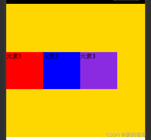
⑤align-items : 每一行中的子元素上下对齐方式。
stretch:如果项目未设置高度或设为auto,将占满整个容器的高度(默认值)
flex-start:顶部对齐
center:居中对齐
flex-end:底部对齐
baseline:项目的第一行文字的基线对齐<!--index.wxml--> <view class="containers"> <view class="content">元素1</view> <view class="content2">元素2</view> <view class="content3">元素3</view> </view> /* index.wxss */ .containers { display: flex; align-items: center; height: 360px; background: gold; } .content{ background-color: red; width: 100px; height: 100px; } .content2{ background-color: blue; width: 100px; height: 100px; } .content3{ background-color: blueviolet; width: 100px; height: 100px; }- 1
- 2
- 3
- 4
- 5
- 6
- 7
- 8
- 9
- 10
- 11
- 12
- 13
- 14
- 15
- 16
- 17
- 18
- 19
- 20
- 21
- 22
- 23
- 24
- 25
- 26
- 27
- 28
- 29
- 30
- 31
居中对齐效果图
⑥align-content :
与justify-content相反的操作。侧轴的对齐方式。(最少需要两行才能看出效果,因为他是多行的一个上下对齐方式)
用于控制多行项目的对齐方式,如果项目只有一行则不会起作用,需设置flex-wrap: wrap;默认stretch,即在项目没设置高度,或高度为auto情况下让项目填满整个容器,与align-items类似。stretch:轴线占满整个交叉轴(默认值);
flex-start:与交叉轴的起点对齐;
flex-end:与交叉轴的终点对齐;
center:与交叉轴的中点对齐;
space-between:与交叉轴两端对齐,轴线之间的间隔平均分布;
space-around:每根轴线两侧的间隔都相等。所以,轴线之间的间隔比轴线与边框的间隔大一倍;<!--index.wxml--> <view class="containers"> <view class="content">元素1</view> <view class="content2">元素2</view> <view class="content3">元素3</view> <view class="content4">元素4</view> <view class="content5">元素5</view> </view> /* index.wxss */ .containers { display: flex; flex-wrap: wrap; align-content:center; } .content{ background-color: red; width: 150px; height: 100px; } .content2{ background-color: blue; width: 150px; height: 100px; } .content3{ background-color: blueviolet; width: 150px; height: 100px; } .content4{ background-color: black; width: 150px; height: 100px; } .content5{ background-color: burlywood; width: 150px; height: 100px; }- 1
- 2
- 3
- 4
- 5
- 6
- 7
- 8
- 9
- 10
- 11
- 12
- 13
- 14
- 15
- 16
- 17
- 18
- 19
- 20
- 21
- 22
- 23
- 24
- 25
- 26
- 27
- 28
- 29
- 30
- 31
- 32
- 33
- 34
- 35
- 36
- 37
- 38
- 39
- 40
- 41
中点对齐效果图:

⑦flex-shrink
项目的缩小比例,默认为1,即如果空间不足,该项目将缩小。
如果所有项目的flex-shrink属性都为1,当空间不足时,都将等比例缩小。
如果一个项目的flex-shrink属性为0,其他项目都为1,则空间不足时,前者不缩小。
负值对该属性无效/* index.wxss */ .containers { display: flex; flex-shrink: 0; }- 1
- 2
- 3
- 4
- 5
效果图:
13、css居中实现方式
使用flex布局设置居中。
使用flex 时也能通过给子项设置margin: auto实现居中。
使用绝对定位的方式实现水平垂直居中。
使用tabel-cell实现垂直居中。
使用grid设置居中。
使用grid时还能通过给子项设置margin: auto实现居中。①flex布局设置居中
利用弹性布局(flex),实现水平居中,其中justify-content 用于设置弹性盒子元素在主轴(横轴)方向上的对齐方式
- display: flex;写在父元素上这就是定义了一个伸缩容器
- justify-content 主轴对齐方式,默认是横轴
- align-items 纵轴对齐方式,默认是纵轴
<!--index.wxml--> <view class="containers"> <view class="content">元素1</view> </view> /* index.wxss */ .containers { display: flex; align-items: center; /*// 纵轴对齐方式,默认是纵轴 子元素垂直居中 */ justify-content: center; /*//纵轴对齐方式,默认是纵轴 */ height: 360px; border: 1px solid red; } .content{ width: 100px; height: 100px; background: red; }- 1
- 2
- 3
- 4
- 5
- 6
- 7
- 8
- 9
- 10
- 11
- 12
- 13
- 14
- 15
- 16
- 17
- 18
- 19
效果图:

②flex-给子项设置
第一种方式是给父盒子设置属性,这一种是给子盒子设置margin: auto实现居中。给容器设置 display: flex; 子项设置 margin: auto;
<!--index.wxml--> <view class="containers"> <view class="content">元素1</view> </view> /* index.wxss */ .containers { display: flex; height: 360px; border: 1px solid red; } .content{ margin: auto; /* // 水平垂直居中 */ width: 100px; height: 100px; background: red; }- 1
- 2
- 3
- 4
- 5
- 6
- 7
- 8
- 9
- 10
- 11
- 12
- 13
- 14
- 15
- 16
- 17
- 18
- 19
效果图-同上
③绝对定位
使用绝对定位的方式实现水平垂直居中。容器设置position: relative。子元素设置 position: absolute; left: 50%; top: 50%; transfrom: translate(-50%, -50%);
优点就是不用关心子元素的长和宽,但是这种方法兼容性依赖translate2d的兼容性
<!--index.wxml--> <view class="containers"> <view class="content">元素1</view> </view> /* index.wxss */ .containers { position: relative; height: 360px; border: 1px solid red; } .content{ position: absolute; left: 50%; top: 50%; transform: translate(-50%, -50%); width: 100px; height: 100px; background: red; }- 1
- 2
- 3
- 4
- 5
- 6
- 7
- 8
- 9
- 10
- 11
- 12
- 13
- 14
- 15
- 16
- 17
- 18
- 19
- 20
- 21
- 22
效果图-同上
④tabel-cell实现垂直居中
css新增的table属性,可以让我们把普通元素,变为table元素的现实效果,通过这个特性也可以实现水平垂直居中。
而且tabel单元格中的内容天然就是垂直居中的,只要添加一个水平居中属性就好了:
:使用tabel-cell实现垂直居中,容器设置 display: table-cell;
:vertical-align: middle属性设置元素的垂直对齐方式
:子元素如果是块级元素,直接使用左右margin:auto实现水平居中。如果是行内元素,给容器设置text-align: center
利用 text-align: center 可以实现在块级元素内部的内联元素水平居中。此方法对内联元素inline, 内联块inline-block, 内联表inline-table, inline-flex元素水平居中都有效。<!--index.wxml--> <view class="containers"> <view class="content">元素1</view> </view> /* index.wxss */ .containers { display: table-cell; vertical-align: middle; /*// 设置元素在垂直方向上的对齐方式 */ text-align: center; height: 360px; border: 1px solid red; } .content{ display: inline-block; width: 100px; height: 100px; background: red; }- 1
- 2
- 3
- 4
- 5
- 6
- 7
- 8
- 9
- 10
- 11
- 12
- 13
- 14
- 15
- 16
- 17
- 18
- 19
- 20
- 21
效果图-同上
⑤grid设置居中
使用grid设置居中。给容器设置 display: grid; align-items: center; justify-content: center;
通过给容器设置属性,达到居中效果,但是这种方式兼容性较差,不推荐。<!--index.wxml--> <view class="containers"> <view class="content">元素1</view> </view> /* index.wxss */ .containers { display: grid; align-items: center; justify-content: center; height: 360px; border: 1px solid red; } .content{ width: 100px; height: 100px; background: red; }- 1
- 2
- 3
- 4
- 5
- 6
- 7
- 8
- 9
- 10
- 11
- 12
- 13
- 14
- 15
- 16
- 17
- 18
- 19
效果图-同上
待更新完成

各位看官》创作不易,点个赞!!!
诸君共勉:万事开头难,只愿肯放弃。免责声明:本文章仅用于学习参考
-
相关阅读:
【Markdown】 Markdown 操作备忘录
Linux目录信息补充
关于在 Linux 下多个不相干的进程互斥访问同一片共享内存的问题
AI中文版怎么用,版本分享,GPT官网入口
基于opencv的图像阴影消除&车辆变道检测
使用 yum 安装 mysql 目录结构
基于jsp的学生培训管理系统
C#对图片Image转换为Bitmap并解析图片中的条码
思科设备命令那么多,这10个一定是最常用的。
信创国产化大背景下,应用性能体验如何保障?
- 原文地址:https://blog.csdn.net/SoulNone/article/details/128048813
