-
Flutter组件--TabBar使用详情(分段控制器)
TabBar介绍
一个显示水平行选项卡的
Widget。 通常创建为AppBar的AppBar.bottom部分并与TabBarView结合使用在什么情况下使用TabBar
当你的app内容类别比较多的时候,我们常常会用到
TabBar,例如网易新闻、京东、B站等,所以TabBar是一个使用非常频繁的组件。如何创建
步骤一:创建TabController
为了使所选的
tab与它所对应的内容能够同步变化,需要用 TabController 进行控制。我们既可以手动创建一个TabController,也能够直接使用 DefaultTabController widget。最简单的选择是使用DefaultTabControllerwidget,因为它能够创建出一个可供所有子 widgets 使用的TabController- DefaultTabController(
- // 选项卡的数量
- length: 3,
- child: // 在下一步完成此代码
- );
步骤二:创建tabs
当我们创建
DefaultTabController, 接下来就可以用 TabBar widget 来创建 tabs。下面这个创建了包含三组 Tab widget 的TabBar(一个),并把它放置于 AppBar widget 中。- DefaultTabController(
- length: 3,
- child: Scaffold(
- appBar: AppBar(
- title: Text("TabBar"),
- bottom: TabBar(
- tabs: [
- Tab(icon: Icon(Icons.directions_bike),),
- Tab(icon: Icon(Icons.directions_boat),),
- Tab(icon: Icon(Icons.directions_car),),
- ],
- ),
- ),
- ),
- );
步骤三:为每个Tab创建内容
现在我们已经成功创建了一些 tabs,接下来要实现的是 tab 被选中时显示其对应的内容。为了实现这个效果,我们将使用 TabBarView widget。
- import 'package:flutter/material.dart';
- class TabBarExample extends StatefulWidget {
- @override
- _TabBarExampleState createState() => _TabBarExampleState();
- }
- class _TabBarExampleState extends State<TabBarExample> {
- @override
- Widget build(BuildContext context) {
- return DefaultTabController(
- length: 3,
- child: Scaffold(
- appBar: AppBar(
- title: Text("TabBar"),
- bottom: TabBar(
- tabs: [
- Tab(icon: Icon(Icons.directions_bike),),
- Tab(icon: Icon(Icons.directions_boat),),
- Tab(icon: Icon(Icons.directions_car),),
- ],
- ),
- ),
- body: TabBarView(
- children: [
- Icon(Icons.directions_bike),
- Icon(Icons.directions_boat),
- Icon(Icons.directions_car),
- ],
- ),
- ),
- );
- }
- }
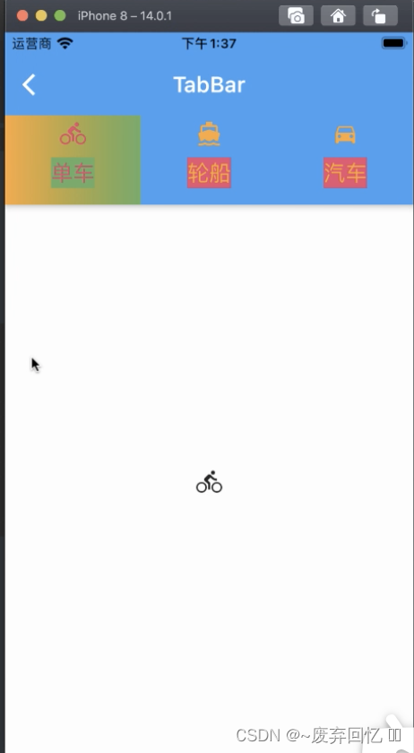
TabBar效果图
注意事项:
如果TabBar是需要在首页进行展示,而此时首页又有BottomNavigationBarItem的时候,因为TabBar和BottomNavigationBarItem都需要使用到Scaffold.所以两者会产生冲突异常.这个时候直接在需要使用TabBar的页面重新创建Scaffold即可(只需要将Scaffold下面的appbar中的title直接更换成Tab组件即可).
步骤四:自定义缓存组件(如果用户在第一个栏位下滑到底部,然后向右滑动到其他栏位,这个时候重新回到第一个栏位的时候,第一个栏位就会重新加载,而不会停留在上次底部位置,为此自定义了缓存功能)
- import 'package:flutter/material.dart';
- class KeepAliveWrapper extends StatefulWidget {
- final Widget? child;
- final bool keepAlive;
- const KeepAliveWrapper({Key? key,@required this.child,this.keepAlive=true}) : super(key: key);
- @override
- State
createState() => _KeepAliveWrapperState(); - }
- class _KeepAliveWrapperState extends State<KeepAliveWrapper> with AutomaticKeepAliveClientMixin{
- @override
- Widget build(BuildContext context) {
- return widget.child!;
- }
- @override
- bool get wantKeepAlive => widget.keepAlive;
- @override
- void didUpdateWidget(covariant KeepAliveWrapper oldWidget) {
- // TODO: implement didUpdateWidget
- if(oldWidget.keepAlive !=widget.keepAlive)
- {
- // keepAlive 状态需要更新,实现在 AutomaticKeepAliveClientMixin 中 updateKeepAlive();
- updateKeepAlive();
- }
- super.didUpdateWidget(oldWidget);
- }
- }
调用
- /*
- *在TabBarView直接进行调用 调用详情
- * body: TabBarView(
- * controller: _tabController,
- * children:[
- * KeepAliveWrapper(
- * child:***
- * ),
- * ],
- * )
- * */
TabBar属性和说明
序列号 字段 属性 描述 1 tabs List 两个多个的Tab列表 2 controller TabController 控制tab的控制器 3 isScrollable bool 标签栏是否可以水平滚动 4 indicatorColor Color 设置选中Tab指示器的颜色 5 automaticIndicatorColorAdjustment bool 是否自动调整indicatorColor 6 indicatorWeight double 设置选中Tab指示器线条的粗细 7 indicatorPadding EdgeInsetsGeometry 设置选中Tab指示器间距,默认值为 EdgeInsets.zero 8 indicator Decoration 设置选中Tab指示器的外观 9 indicatorSize TabBarIndicatorSize 设置选中Tab指示器的大小 10 labelColor Color 设置选中Tab文字的颜色 11 labelStyle TextStyle 设置选中Tab文字的样式 12 labelPadding EdgeInsetsGeometry 设置选中Tab文字的间距 13 unselectedLabelColor Color 设置未选中Tab文字的颜色 14 unselectedLabelStyle TextStyle 设置未选中Tab文字的样式 15 dragStartBehavior DragStartBehavior 处理拖动开始行为的方式 16 overlayColor MaterialStateProperty 定义响应焦点、悬停和飞溅颜色 17 mouseCursor MouseCursor 鼠标指针进入或悬停在鼠标指针上时的光标 18 enableFeedback bool 检测到的手势是否应提供声音和/或触觉反馈 19 onTap ValueChanged 单击Tab时的回调 20 physics ScrollPhysics TabBar的滚动视图如何响应用户输入 TabBar属性详细使用
1.tabs
由两个多个组成的Tab列表
- TabBar(
- tabs: [
- Tab(icon: Icon(Icons.directions_bike),),
- Tab(icon: Icon(Icons.directions_boat),),
- Tab(icon: Icon(Icons.directions_car),),
- ],
- )
2.controller
可以控制tab的控制器
- TabController _tabController;
- @override
- void initState() {
- // TODO: implement initState
- super.initState();
- _tabController = TabController(length: 3, vsync: this);
- _tabController.addListener(()
- {
- //如果不做下面判断的话,单击页面的时候此处监听会执行2次
- if (_tabController.animation!.value == _tabController.index)
- {
- print(_tabController.index);
- //获取点击或滑动页面的索引值
- } });
- }
- TabBar(
- controller: _tabController,
- tabs: [
- Tab(icon: Icon(Icons.directions_bike),),
- Tab(icon: Icon(Icons.directions_boat),),
- Tab(icon: Icon(Icons.directions_car),),
- ],
- )
3.isScrollable
标签栏是否可以水平滚动
- TabBar(
- isScrollable: false,
- tabs: [
- Tab(icon: Icon(Icons.directions_bike),),
- Tab(icon: Icon(Icons.directions_boat),),
- Tab(icon: Icon(Icons.directions_car),),
- ],
- )
4.indicatorColor
设置选中Tab指示器的颜色
- TabBar(
- indicatorColor: Colors.red,
- tabs: [
- Tab(icon: Icon(Icons.directions_bike),),
- Tab(icon: Icon(Icons.directions_boat),),
- Tab(icon: Icon(Icons.directions_car),),
- ],
- )
5.automaticIndicatorColorAdjustment
是否自动调整
indicatorColor,如果automaticIndicatorColorAdjustment为true时,那么indicatorColor会自动调整成Colors.white- TabBar(
- automaticIndicatorColorAdjustment: false,
- tabs: [
- Tab(icon: Icon(Icons.directions_bike),),
- Tab(icon: Icon(Icons.directions_boat),),
- Tab(icon: Icon(Icons.directions_car),),
- ],
- )
6.indicatorWeight
设置选中Tab指示器线条的粗细
- TabBar(
- indicatorColor: Colors.red,
- indicatorWeight: 5,
- tabs: [
- Tab(icon: Icon(Icons.directions_bike),),
- Tab(icon: Icon(Icons.directions_boat),),
- Tab(icon: Icon(Icons.directions_car),),
- ],
- )
7.indicatorPadding
设置选中Tab指示器间距,默认值为 EdgeInsets.zero
- TabBar(
- indicatorColor: Colors.red,
- indicatorWeight: 5,
- indicatorPadding: EdgeInsets.only(bottom: 2),
- tabs: [
- Tab(icon: Icon(Icons.directions_bike),),
- Tab(icon: Icon(Icons.directions_boat),),
- Tab(icon: Icon(Icons.directions_car),),
- ],
- )
8.indicator
设置选中Tab指示器的外观
- TabBar(
- indicatorColor: Colors.red,
- indicatorWeight: 5,
- indicatorPadding: EdgeInsets.only(bottom: 2),
- indicator: BoxDecoration(
- gradient: LinearGradient(colors: [
- Colors.orange,
- Colors.green
- ]),
- ),
- tabs: [
- Tab(icon: Icon(Icons.directions_bike),),
- Tab(icon: Icon(Icons.directions_boat),),
- Tab(icon: Icon(Icons.directions_car),),
- ],
- )
9.indicatorSize
设置选中Tab指示器的大小,该值是一个枚举类型,
TabBarIndicatorSize.tab跟随Tab的宽度,TabBarIndicatorSize.label跟随Tab内容文字的宽度。- TabBar(
- indicatorColor: Colors.red,
- indicatorSize: TabBarIndicatorSize.tab,
- tabs: [
- Tab(icon: Icon(Icons.directions_bike),),
- Tab(icon: Icon(Icons.directions_boat),),
- Tab(icon: Icon(Icons.directions_car),),
- ],
- )
10.labelColor
设置选中Tab文字的颜色
- TabBar(
- indicatorColor: Colors.red,
- labelColor: Colors.pink,
- tabs: [
- Tab(icon: Icon(Icons.directions_bike),),
- Tab(icon: Icon(Icons.directions_boat),),
- Tab(icon: Icon(Icons.directions_car),),
- ],
- )
11.labelStyle
设置选中Tab文字的样式
- TabBar(
- labelStyle: TextStyle(
- backgroundColor: Colors.green,
- fontSize: 20
- ),
- tabs: [
- Tab(icon: Icon(Icons.directions_bike), text: "单车",),
- Tab(icon: Icon(Icons.directions_boat), text: "轮船",),
- Tab(icon: Icon(Icons.directions_car), text: "汽车",),
- ],
- )
12.labelPadding
设置选中Tab内容的间距
- TabBar(
- labelStyle: TextStyle(
- backgroundColor: Colors.green,
- fontSize: 20
- ),
- labelPadding: EdgeInsets.all(0),
- tabs: [
- Tab(icon: Icon(Icons.directions_bike), text: "单车",),
- Tab(icon: Icon(Icons.directions_boat), text: "轮船",),
- Tab(icon: Icon(Icons.directions_car), text: "汽车",),
- ],
- )
13.unselectedLabelColor
设置未选中Tab文字的颜色
- TabBar(
- unselectedLabelColor: Colors.orange,
- tabs: [
- Tab(icon: Icon(Icons.directions_bike), text: "单车",),
- Tab(icon: Icon(Icons.directions_boat), text: "轮船",),
- Tab(icon: Icon(Icons.directions_car), text: "汽车",),
- ],
- )
14.unselectedLabelStyle
设置未选中Tab文字的样式
- TabBar(
- unselectedLabelColor: Colors.orange,
- unselectedLabelStyle: TextStyle(
- backgroundColor: Colors.pink
- ),
- tabs: [
- Tab(icon: Icon(Icons.directions_bike), text: "单车",),
- Tab(icon: Icon(Icons.directions_boat), text: "轮船",),
- Tab(icon: Icon(Icons.directions_car), text: "汽车",),
- ],
- )
15.dragStartBehavior
处理拖动开始行为的方式
- TabBar(
- unselectedLabelColor: Colors.orange,
- unselectedLabelStyle: TextStyle(
- backgroundColor: Colors.pink
- ),
- dragStartBehavior: DragStartBehavior.start,
- tabs: [
- Tab(icon: Icon(Icons.directions_bike), text: "单车",),
- Tab(icon: Icon(Icons.directions_boat), text: "轮船",),
- Tab(icon: Icon(Icons.directions_car), text: "汽车",),
- ],
- )
16.overlayColor
定义响应焦点、悬停和飞溅颜色。
17.mouseCursor
鼠标指针进入或悬停在鼠标指针上时的光标,针对
Flutter web应用- TabBar(
- unselectedLabelColor: Colors.orange,
- unselectedLabelStyle: TextStyle(
- backgroundColor: Colors.pink
- ),
- mouseCursor: SystemMouseCursors.allScroll,
- tabs: [
- Tab(icon: Icon(Icons.directions_bike), text: "单车",),
- Tab(icon: Icon(Icons.directions_boat), text: "轮船",),
- Tab(icon: Icon(Icons.directions_car), text: "汽车",),
- ],
- )
18.enableFeedback
检测到的手势是否应提供声音和/或触觉反馈,默认为
true- TabBar(
- enableFeedback: true,
- tabs: [
- Tab(icon: Icon(Icons.directions_bike), text: "单车",),
- Tab(icon: Icon(Icons.directions_boat), text: "轮船",),
- Tab(icon: Icon(Icons.directions_car), text: "汽车",),
- ],
- )
19.onTap
单击Tab时的回调
- TabBar(
- enableFeedback: true,
- onTap: (index) {
- //只能监听到单击事件,无法监听到滑动事件
- print(index);
- },
- tabs: [
- Tab(icon: Icon(Icons.directions_bike), text: "单车",),
- Tab(icon: Icon(Icons.directions_boat), text: "轮船",),
- Tab(icon: Icon(Icons.directions_car), text: "汽车",),
- ],
- )
20.physics
TabBar的滚动视图如何响应用户输入,
例如,确定在用户停止拖动滚动视图后滚动视图如何继续动画
- TabBar(
- physics: NeverScrollableScrollPhysics(),
- tabs: [
- Tab(icon: Icon(Icons.directions_bike), text: "单车",),
- Tab(icon: Icon(Icons.directions_boat), text: "轮船",),
- Tab(icon: Icon(Icons.directions_car), text: "汽车",),
- ],
- )
-
相关阅读:
spring boot 自定义 starter
Android AMS——进程优先级更新(十八)
Nginx显示failed (13: Permission denied)
API First——微服务架构下API接口驱动设计与开发
Serverless 架构下的 AI 应用开发
kubectl应用
手写数组方法之会改变原数组方法
51单片机入门——I2C总线与EEPROM
企业数智化:为什么选择梧桐数据库?
信号完整性(SI)电源完整性(PI)学习笔记(三十一)电源分配网路(三)
- 原文地址:https://blog.csdn.net/eastWind1101/article/details/127961345
