-
【 css动画 】—— 把你喜欢css动画嵌入到浏览器中
项目前期回顾
 回顾 前期
回顾 前期 
目录
效果图


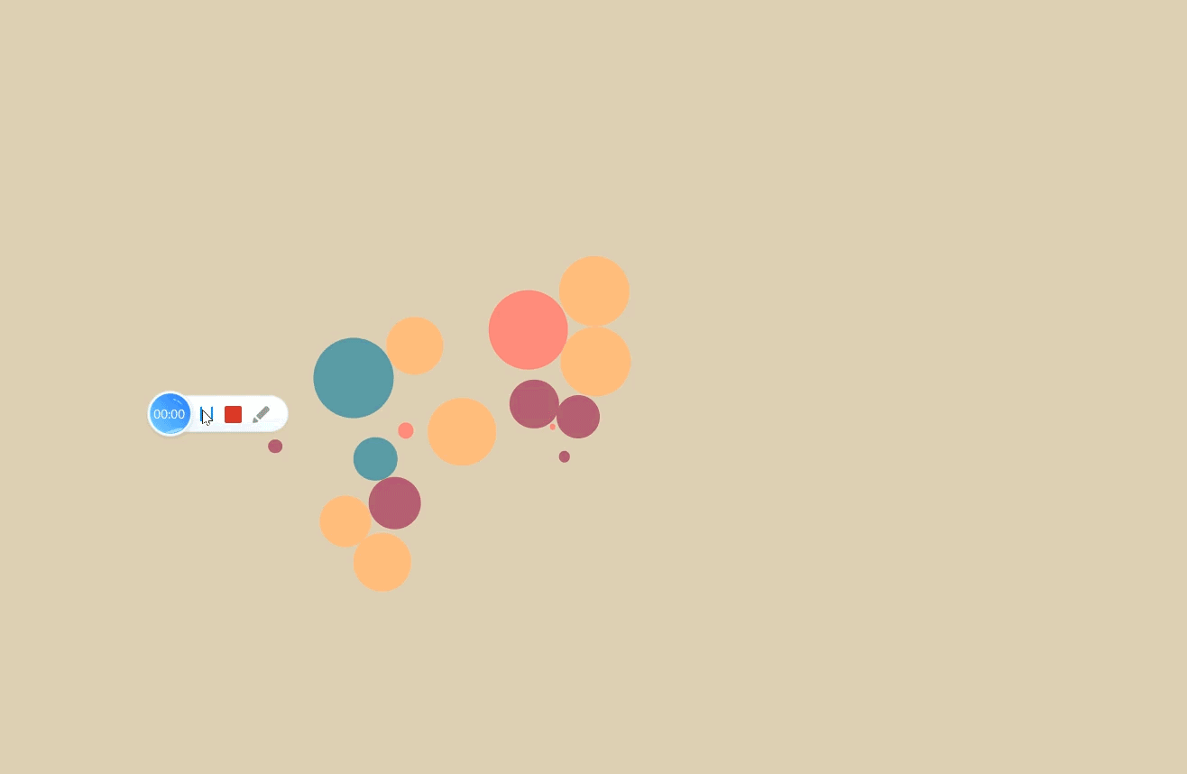

效果图过多不在一一展示 代码开始
按钮相关
荧光按钮

- html>
- <html lang="en">
- <head>
- <meta charset="UTF-8">
- <meta http-equiv="X-UA-Compatible" content="IE=edge">
- <meta name="viewport" content="width=device-width, initial-scale=1.0">
- <title>发光按钮title>
- head>
- <style>
- body{
- background-color: #000;
- }
- button {
- --glow-color: rgb(217, 176, 255);
- --glow-spread-color: rgba(191, 123, 255, 0.781);
- --enhanced-glow-color: rgb(231, 206, 255);
- --btn-color: rgb(100, 61, 136);
- border: .25em solid var(--glow-color);
- padding: 1em 3em;
- color: var(--glow-color);
- font-size: 15px;
- font-weight: bold;
- background-color: var(--btn-color);
- border-radius: 1em;
- outline: none;
- -webkit-box-shadow: 0 0 1em .25em var(--glow-color),
- 0 0 4em 1em var(--glow-spread-color),
- inset 0 0 .75em .25em var(--glow-color);
- box-shadow: 0 0 1em .25em var(--glow-color),
- 0 0 4em 1em var(--glow-spread-color),
- inset 0 0 .75em .25em var(--glow-color);
- text-shadow: 0 0 .5em var(--glow-color);
- position: relative;
- -webkit-transition: all 0.3s;
- transition: all 0.3s;
- }
- button::after {
- pointer-events: none;
- content: "";
- position: absolute;
- top: 120%;
- left: 0;
- height: 100%;
- width: 100%;
- background-color: var(--glow-spread-color);
- -webkit-filter: blur(2em);
- filter: blur(2em);
- opacity: .7;
- -webkit-transform: perspective(1.5em) rotateX(35deg) scale(1, .6);
- transform: perspective(1.5em) rotateX(35deg) scale(1, .6);
- }
- button:hover {
- color: var(--btn-color);
- background-color: var(--glow-color);
- -webkit-box-shadow: 0 0 1em .25em var(--glow-color),
- 0 0 4em 2em var(--glow-spread-color),
- inset 0 0 .75em .25em var(--glow-color);
- box-shadow: 0 0 1em .25em var(--glow-color),
- 0 0 4em 2em var(--glow-spread-color),
- inset 0 0 .75em .25em var(--glow-color);
- }
- button:active {
- -webkit-box-shadow: 0 0 0.6em .25em var(--glow-color),
- 0 0 2.5em 2em var(--glow-spread-color),
- inset 0 0 .5em .25em var(--glow-color);
- box-shadow: 0 0 0.6em .25em var(--glow-color),
- 0 0 2.5em 2em var(--glow-spread-color),
- inset 0 0 .5em .25em var(--glow-color);
- }
- style>
- <body>
- <button> Button button>
- body>
- html>
流光按钮

- html>
- <html lang="en">
- <head>
- <meta charset="UTF-8">
- <meta http-equiv="X-UA-Compatible" content="IE=edge">
- <meta name="viewport" content="width=device-width, initial-scale=1.0">
- <title>流光按钮title>
- head>
- <style>
- body {
- background-color: #000;
- }
- button {
- --green: #1BFD9C;
- font-size: 15px;
- padding: 0.7em 2.7em;
- letter-spacing: 0.06em;
- position: relative;
- font-family: inherit;
- border-radius: 0.6em;
- overflow: hidden;
- -webkit-transition: all 0.3s;
- transition: all 0.3s;
- line-height: 1.4em;
- border: 2px solid var(--green);
- background: -webkit-gradient(linear, left top, right top, color-stop(1%, rgba(27, 253, 156, 0.1)), color-stop(40%, transparent), color-stop(60%, transparent), to(rgba(27, 253, 156, 0.1)));
- background: linear-gradient(to right, rgba(27, 253, 156, 0.1) 1%, transparent 40%, transparent 60%, rgba(27, 253, 156, 0.1) 100%);
- color: var(--green);
- -webkit-box-shadow: inset 0 0 10px rgba(27, 253, 156, 0.4), 0 0 9px 3px rgba(27, 253, 156, 0.1);
- box-shadow: inset 0 0 10px rgba(27, 253, 156, 0.4), 0 0 9px 3px rgba(27, 253, 156, 0.1);
- }
- button:hover {
- color: #82ffc9;
- -webkit-box-shadow: inset 0 0 10px rgba(27, 253, 156, 0.6), 0 0 9px 3px rgba(27, 253, 156, 0.2);
- box-shadow: inset 0 0 10px rgba(27, 253, 156, 0.6), 0 0 9px 3px rgba(27, 253, 156, 0.2);
- }
- button:before {
- content: "";
- position: absolute;
- left: -4em;
- width: 4em;
- height: 100%;
- top: 0;
- -webkit-transition: -webkit-transform .4s ease-in-out;
- transition: -webkit-transform .4s ease-in-out;
- transition: transform .4s ease-in-out;
- transition: transform .4s ease-in-out, -webkit-transform .4s ease-in-out;
- background: -webkit-gradient(linear, left top, right top, color-stop(1%, transparent), color-stop(40%, rgba(27, 253, 156, 0.1)), color-stop(60%, rgba(27, 253, 156, 0.1)), to(transparent));
- background: linear-gradient(to right, transparent 1%, rgba(27, 253, 156, 0.1) 40%, rgba(27, 253, 156, 0.1) 60%, transparent 100%);
- }
- button:hover:before {
- -webkit-transform: translateX(15em);
- -ms-transform: translateX(15em);
- transform: translateX(15em);
- }
- style>
- <body>
- <button> 流光按钮button>
- body>
- html>
hover渐变 按钮

- html>
- <html lang="en">
- <head>
- <meta charset="UTF-8">
- <meta http-equiv="X-UA-Compatible" content="IE=edge">
- <meta name="viewport" content="width=device-width, initial-scale=1.0">
- <title>渐变title>
- head>
- <style>
- body {
- background-color: #fff;
- }
- button {
- -webkit-box-align: center;
- -ms-flex-align: center;
- align-items: center;
- background-image: linear-gradient(144deg, #AF40FF, #5B42F3 50%, #00DDEB);
- border: 0;
- border-radius: 8px;
- -webkit-box-shadow: rgba(151, 65, 252, 0.2) 0 15px 30px -5px;
- box-shadow: rgba(151, 65, 252, 0.2) 0 15px 30px -5px;
- -webkit-box-sizing: border-box;
- box-sizing: border-box;
- color: #FFFFFF;
- display: -webkit-box;
- display: -ms-flexbox;
- display: flex;
- font-family: Phantomsans, sans-serif;
- font-size: 18px;
- -webkit-box-pack: center;
- -ms-flex-pack: center;
- justify-content: center;
- line-height: 1em;
- max-width: 100%;
- min-width: 140px;
- padding: 3px;
- text-decoration: none;
- -moz-user-select: none;
- -ms-user-select: none;
- user-select: none;
- -webkit-user-select: none;
- -ms-touch-action: manipulation;
- touch-action: manipulation;
- white-space: nowrap;
- cursor: pointer;
- -webkit-transition: all .3s;
- transition: all .3s;
- }
- button:active,
- button:hover {
- outline: 0;
- }
- button span {
- background-color: rgb(5, 6, 45);
- padding: 16px 24px;
- border-radius: 6px;
- width: 100%;
- height: 100%;
- -webkit-transition: 300ms;
- transition: 300ms;
- }
- button:hover span {
- background: none;
- }
- button:active {
- -webkit-transform: scale(0.9);
- -ms-transform: scale(0.9);
- transform: scale(0.9);
- }
- style>
- <body>
- <button>
- <span class="text">渐变Buttonspan>
- button>
- body>
- html>
跑马灯 按钮

- html>
- <html lang="en">
- <head>
- <meta charset="UTF-8">
- <meta http-equiv="X-UA-Compatible" content="IE=edge">
- <meta name="viewport" content="width=device-width, initial-scale=1.0">
- <title>跑马灯按钮title>
- head>
- <style>
- button {
- --border-radius: 15px;
- --border-width: 4px;
- -webkit-appearance: none;
- -moz-appearance: none;
- appearance: none;
- position: relative;
- padding: 1em 2em;
- border: 0;
- /* background-color: #212121; */
- font-family: "Roboto", Arial, "Segoe UI", sans-serif;
- font-size: 18px;
- font-weight: 500;
- color: #000;
- z-index: 2;
- }
- button::after {
- --m-i: linear-gradient(#000, #000);
- --m-o: content-box, padding-box;
- content: "";
- position: absolute;
- left: 0;
- top: 0;
- width: 100%;
- height: 100%;
- padding: var(--border-width);
- border-radius: var(--border-radius);
- background-image: conic-gradient(#488cfb,
- #29dbbc,
- #ddf505,
- #ff9f0e,
- #e440bb,
- #655adc,
- #488cfb);
- -webkit-mask-image: var(--m-i), var(--m-i);
- mask-image: var(--m-i), var(--m-i);
- -webkit-mask-origin: var(--m-o);
- mask-origin: var(--m-o);
- -webkit-mask-clip: var(--m-o);
- mask-composite: exclude;
- -webkit-mask-composite: destination-out;
- -webkit-filter: hue-rotate(0);
- filter: hue-rotate(0);
- -webkit-animation: rotate-hue linear 500ms infinite;
- animation: rotate-hue linear 500ms infinite;
- -webkit-animation-play-state: paused;
- animation-play-state: paused;
- }
- button:hover::after {
- -webkit-animation-play-state: running;
- animation-play-state: running;
- }
- @-webkit-keyframes rotate-hue {
- to {
- -webkit-filter: hue-rotate(1turn);
- filter: hue-rotate(1turn);
- }
- }
- @keyframes rotate-hue {
- to {
- -webkit-filter: hue-rotate(1turn);
- filter: hue-rotate(1turn);
- }
- }
- button,
- button::after {
- -webkit-box-sizing: border-box;
- box-sizing: border-box;
- }
- button:active {
- --border-width: 5px;
- }
- style>
- <body>
- <button>跑马灯button>
- body>
- html>
下载按钮(带下载动画)

- html>
- <html lang="en">
- <head>
- <meta charset="UTF-8">
- <meta http-equiv="X-UA-Compatible" content="IE=edge">
- <meta name="viewport" content="width=device-width, initial-scale=1.0">
- head>
- <style>
- .buttonDownload {
- display: inline-block;
- position: relative;
- padding: 10px 25px;
- background-color: #4CC713;
- color: white;
- font-family: sans-serif;
- text-decoration: none;
- font-size: 0.9em;
- text-align: center;
- text-indent: 15px;
- border: none;
- }
- .buttonDownload:hover {
- background-color: #45a21a;
- color: white;
- }
- .buttonDownload:before,
- .buttonDownload:after {
- content: ' ';
- display: block;
- position: absolute;
- left: 15px;
- top: 52%;
- }
- .buttonDownload:before {
- width: 10px;
- height: 2px;
- border-style: solid;
- border-width: 0 2px 2px;
- }
- .buttonDownload:after {
- width: 0;
- height: 0;
- margin-left: 3px;
- margin-top: -7px;
- border-style: solid;
- border-width: 4px 4px 0 4px;
- border-color: transparent;
- border-top-color: inherit;
- -webkit-animation: downloadArrow 1s linear infinite;
- animation: downloadArrow 1s linear infinite;
- -webkit-animation-play-state: paused;
- animation-play-state: paused;
- }
- .buttonDownload:hover:before {
- border-color: #cdefbd;
- }
- .buttonDownload:hover:after {
- border-top-color: #cdefbd;
- -webkit-animation-play-state: running;
- animation-play-state: running;
- }
- @-webkit-keyframes downloadArrow {
- 0% {
- margin-top: -7px;
- opacity: 1;
- }
- 0.001% {
- margin-top: -15px;
- opacity: 0.4;
- }
- 50% {
- opacity: 1;
- }
- 100% {
- margin-top: 0;
- opacity: 0.4;
- }
- }
- @keyframes downloadArrow {
- 0% {
- margin-top: -7px;
- opacity: 1;
- }
- 0.001% {
- margin-top: -15px;
- opacity: 0.4;
- }
- 50% {
- opacity: 1;
- }
- 100% {
- margin-top: 0;
- opacity: 0.4;
- }
- }
- style>
- <body>
- <button class="buttonDownload">下载button>
- body>
- html>
下一步按钮(带动画)

- html>
- <html lang="en">
- <head>
- <meta charset="UTF-8">
- <meta http-equiv="X-UA-Compatible" content="IE=edge">
- <meta name="viewport" content="width=device-width, initial-scale=1.0">
- head>
- <style>
- button {
- position: relative;
- font-size: 14px;
- letter-spacing: 3px;
- height: 3em;
- padding: 0 3em;
- border: none;
- background-color: #c41b54;
- color: #fff;
- text-transform: uppercase;
- overflow: hidden;
- border-radius: 5px
- }
- button::before {
- content: '';
- display: block;
- position: absolute;
- z-index: 0;
- bottom: 0;
- left: 0;
- height: 0px;
- width: 100%;
- background: rgb(196, 27, 84);
- background: -webkit-gradient(linear, left top, right top, color-stop(20%, rgba(196, 27, 84, 1)), to(rgba(124, 7, 46, 1)));
- background: linear-gradient(90deg, rgba(196, 27, 84, 1) 20%, rgba(124, 7, 46, 1) 100%);
- -webkit-transition: 0.2s;
- transition: 0.2s;
- }
- button .label {
- position: relative;
- }
- button .icon {
- display: -webkit-box;
- display: -ms-flexbox;
- display: flex;
- -webkit-box-align: center;
- -ms-flex-align: center;
- align-items: center;
- -webkit-box-pack: center;
- -ms-flex-pack: center;
- justify-content: center;
- height: 3em;
- width: 3em;
- position: absolute;
- top: 3em;
- right: 0;
- opacity: 0;
- -webkit-transition: 0.4s;
- transition: 0.4s;
- }
- button:hover::before {
- height: 100%;
- }
- button:hover .icon {
- top: 0;
- opacity: 1;
- }
- style>
- <body>
- <button>
- <span class="label">Nextspan>
- <span class="icon">
- <svg xmlns="http://www.w3.org/2000/svg" viewBox="0 0 24 24" width="24" height="24">
- <path fill="none" d="M0 0h24v24H0z">path>
- <path fill="currentColor"
- d="M16.172 11l-5.364-5.364 1.414-1.414L20 12l-7.778 7.778-1.414-1.414L16.172 13H4v-2z">path>
- svg>
- span>
- button>
- body>
- html>
边框线滑动 按钮

- html>
- <html lang="en">
- <head>
- <meta charset="UTF-8">
- <meta http-equiv="X-UA-Compatible" content="IE=edge">
- <meta name="viewport" content="width=device-width, initial-scale=1.0">
- head>
- <style>
- .main_div {
- --color: #3992e6;
- position: relative;
- z-index: 1;
- width: 162px;
- height: 44px;
- }
- .main_div::before {
- content: '';
- position: absolute;
- width: 30px;
- height: 30px;
- background: transparent;
- top: -7px;
- left: -7px;
- z-index: -5;
- border-top: 3px solid var(--color);
- border-left: 3px solid var(--color);
- -webkit-transition: 0.5s;
- transition: 0.5s;
- }
- .main_div::after {
- content: '';
- position: absolute;
- width: 30px;
- height: 30px;
- background: transparent;
- bottom: -7px;
- right: -7px;
- z-index: -5;
- border-right: 3px solid var(--color);
- border-bottom: 3px solid var(--color);
- -webkit-transition: 0.5s;
- transition: 0.5s;
- }
- .main_div:hover::before {
- width: 100%;
- height: 100%;
- }
- .main_div:hover::after {
- width: 100%;
- height: 100%;
- }
- .main_div button {
- padding: 0.7em 2em;
- font-size: 16px;
- background: #222222;
- color: #fff;
- border: none;
- cursor: pointer;
- font-family: inherit;
- }
- style>
- <body>
- <div class="main_div">
- <button>表框双线按钮button>
- div>
- body>
- html>
下载按钮

- html>
- <html lang="en">
- <head>
- <meta charset="UTF-8">
- <meta http-equiv="X-UA-Compatible" content="IE=edge">
- <meta name="viewport" content="width=device-width, initial-scale=1.0">
- head>
- <style>
- .cssbuttons-io-button {
- display: -webkit-box;
- display: -ms-flexbox;
- display: flex;
- -webkit-box-align: center;
- -ms-flex-align: center;
- align-items: center;
- font-family: inherit;
- font-weight: 500;
- font-size: 17px;
- padding: 0.8em 1.5em 0.8em 1.2em;
- color: white;
- background: #ad5389;
- background: -webkit-gradient(linear, left bottom, left top, from(rgba(77, 54, 208, 1)), to(rgba(132, 116, 254, 1)));
- background: linear-gradient(0deg, rgba(77, 54, 208, 1) 0%, rgba(132, 116, 254, 1) 100%);
- border: none;
- -webkit-box-shadow: 0 0.7em 1.5em -0.5em #4d36d0be;
- box-shadow: 0 0.7em 1.5em -0.5em #4d36d0be;
- letter-spacing: 0.05em;
- border-radius: 20em;
- }
- .cssbuttons-io-button svg {
- margin-right: 8px;
- }
- .cssbuttons-io-button:hover {
- -webkit-box-shadow: 0 0.5em 1.5em -0.5em #4d36d0be;
- box-shadow: 0 0.5em 1.5em -0.5em #4d36d0be;
- }
- .cssbuttons-io-button:active {
- -webkit-box-shadow: 0 0.3em 1em -0.5em #4d36d0be;
- box-shadow: 0 0.3em 1em -0.5em #4d36d0be;
- }
- style>
- <body>
- <button class="cssbuttons-io-button">
- <svg height="24" width="24" viewBox="0 0 24 24" xmlns="http://www.w3.org/2000/svg">
- <path d="M0 0h24v24H0z" fill="none">path>
- <path
- d="M1 14.5a6.496 6.496 0 0 1 3.064-5.519 8.001 8.001 0 0 1 15.872 0 6.5 6.5 0 0 1-2.936 12L7 21c-3.356-.274-6-3.078-6-6.5zm15.848 4.487a4.5 4.5 0 0 0 2.03-8.309l-.807-.503-.12-.942a6.001 6.001 0 0 0-11.903 0l-.12.942-.805.503a4.5 4.5 0 0 0 2.029 8.309l.173.013h9.35l.173-.013zM13 12h3l-4 5-4-5h3V8h2v4z"
- fill="currentColor">path>
- svg>
- <span>下载span>
- button>
- body>
- html>
hover 对角聚中 按钮

- html>
- <html lang="en">
- <head>
- <meta charset="UTF-8">
- <meta http-equiv="X-UA-Compatible" content="IE=edge">
- <meta name="viewport" content="width=device-width, initial-scale=1.0">
- head>
- <style>
- .btn {
- --color: #00A97F;
- --color2: rgb(10, 25, 30);
- padding: 0.8em 1.75em;
- background-color: transparent;
- border-radius: 6px;
- border: .3px solid var(--color);
- -webkit-transition: .5s;
- transition: .5s;
- position: relative;
- overflow: hidden;
- cursor: pointer;
- z-index: 1;
- font-weight: 300;
- font-size: 17px;
- font-family: 'Roboto', 'Segoe UI', sans-serif;
- text-transform: uppercase;
- color: var(--color);
- }
- .btn::after, .btn::before {
- content: '';
- display: block;
- height: 100%;
- width: 100%;
- -webkit-transform: skew(90deg) translate(-50%, -50%);
- -ms-transform: skew(90deg) translate(-50%, -50%);
- transform: skew(90deg) translate(-50%, -50%);
- position: absolute;
- inset: 50%;
- left: 25%;
- z-index: -1;
- -webkit-transition: .5s ease-out;
- transition: .5s ease-out;
- background-color: var(--color);
- }
- .btn::before {
- top: -50%;
- left: -25%;
- -webkit-transform: skew(90deg) rotate(180deg) translate(-50%, -50%);
- -ms-transform: skew(90deg) rotate(180deg) translate(-50%, -50%);
- transform: skew(90deg) rotate(180deg) translate(-50%, -50%);
- }
- .btn:hover::before {
- -webkit-transform: skew(45deg) rotate(180deg) translate(-50%, -50%);
- -ms-transform: skew(45deg) rotate(180deg) translate(-50%, -50%);
- transform: skew(45deg) rotate(180deg) translate(-50%, -50%);
- }
- .btn:hover::after {
- -webkit-transform: skew(45deg) translate(-50%, -50%);
- -ms-transform: skew(45deg) translate(-50%, -50%);
- transform: skew(45deg) translate(-50%, -50%);
- }
- .btn:hover {
- color: var(--color2);
- }
- .btn:active {
- -webkit-filter: brightness(.7);
- filter: brightness(.7);
- -webkit-transform: scale(.98);
- -ms-transform: scale(.98);
- transform: scale(.98);
- }
- style>
- <body>
- <button class="btn"> Button button>
- body>
- html>
hover 折角按钮

- html>
- <html lang="en">
- <head>
- <meta charset="UTF-8">
- <meta http-equiv="X-UA-Compatible" content="IE=edge">
- <meta name="viewport" content="width=device-width, initial-scale=1.0">
- head>
- <style>
- body{
- background-color: #000;
- }
- button {
- position: relative;
- font-size: 1.2em;
- padding: 0.7em 1.4em;
- background-color: #BF0426;
- text-decoration: none;
- border: none;
- border-radius: 0.5em;
- color: #DEDEDE;
- box-shadow: 0.5em 0.5em 0.5em rgba(0, 0, 0, 0.3);
- }
- button::before {
- position: absolute;
- content: '';
- height: 0;
- width: 0;
- top: 0;
- left: 0;
- background: linear-gradient(135deg, rgba(33,33,33,1) 0%, rgba(33,33,33,1) 50%, rgba(150,4,31,1) 50%, rgba(191,4,38,1) 60%);
- border-radius: 0 0 0.5em 0;
- box-shadow: 0.2em 0.2em 0.2em rgba(0, 0, 0, 0.3);
- transition: 0.3s;
- }
- button:hover::before {
- width: 2em;
- height: 2em;
- }
- button:active {
- box-shadow: 0.2em 0.2em 0.3em rgba(0, 0, 0, 0.3);
- transform: translate(0.1em, 0.1em);
- }
- style>
- <body>
- <button>
- <b>hover 折角按钮b>
- button>
- body>
- html>
动画提示 按钮

- html>
- <html lang="en">
- <head>
- <meta charset="UTF-8">
- <meta http-equiv="X-UA-Compatible" content="IE=edge">
- <meta name="viewport" content="width=device-width, initial-scale=1.0">
- head>
- <style>
- .uiverse {
- position: relative;
- top: 200px;
- background: #ffffff;
- color: #000;
- /* padding: 15px; */
- /* margin: 10px; */
- border-radius: 10px;
- width: 150px;
- height: 50px;
- font-size: 17px;
- display: -webkit-box;
- display: -ms-flexbox;
- display: flex;
- -webkit-box-pack: center;
- -ms-flex-pack: center;
- justify-content: center;
- -webkit-box-align: center;
- -ms-flex-align: center;
- align-items: center;
- -webkit-box-orient: vertical;
- -webkit-box-direction: normal;
- -ms-flex-direction: column;
- flex-direction: column;
- -webkit-box-shadow: 0 10px 10px rgba(0, 0, 0, 0.1);
- box-shadow: 0 10px 10px rgba(0, 0, 0, 0.1);
- cursor: pointer;
- -webkit-transition: all 0.2s cubic-bezier(0.68, -0.55, 0.265, 1.55);
- transition: all 0.2s cubic-bezier(0.68, -0.55, 0.265, 1.55);
- }
- .tooltip {
- position: absolute;
- top: 0;
- font-size: 14px;
- background: #ffffff;
- color: #ffffff;
- padding: 5px 8px;
- border-radius: 5px;
- -webkit-box-shadow: 0 10px 10px rgba(0, 0, 0, 0.1);
- box-shadow: 0 10px 10px rgba(0, 0, 0, 0.1);
- opacity: 0;
- pointer-events: none;
- -webkit-transition: all 0.3s cubic-bezier(0.68, -0.55, 0.265, 1.55);
- transition: all 0.3s cubic-bezier(0.68, -0.55, 0.265, 1.55);
- }
- .tooltip::before {
- position: absolute;
- content: "";
- height: 8px;
- width: 8px;
- background: #ffffff;
- bottom: -3px;
- left: 50%;
- -webkit-transform: translate(-50%) rotate(45deg);
- -ms-transform: translate(-50%) rotate(45deg);
- transform: translate(-50%) rotate(45deg);
- -webkit-transition: all 0.3s cubic-bezier(0.68, -0.55, 0.265, 1.55);
- transition: all 0.3s cubic-bezier(0.68, -0.55, 0.265, 1.55);
- }
- .uiverse:hover .tooltip {
- top: -45px;
- opacity: 1;
- visibility: visible;
- pointer-events: auto;
- }
- svg:hover span,
- svg:hover .tooltip {
- text-shadow: 0px -1px 0px rgba(0, 0, 0, 0.1);
- }
- .uiverse:hover,
- .uiverse:hover .tooltip,
- .uiverse:hover .tooltip::before {
- background: linear-gradient(320deg, rgb(3, 77, 146), rgb(0, 60, 255));
- color: #ffffff;
- }
- style>
- <body>
- <div class="uiverse">
- <span class="tooltip">uiverse.iospan>
- <span>
- Tooltip
- span>
- div>
- body>
- html>
流光按钮:

- html>
- <html lang="en">
- <head>
- <meta charset="UTF-8" />
- <title>渐变按钮title>
- <style>
- .BlueButton {
- color: #fff;
- width: 8rem;
- margin: 0.8rem auto;
- border-radius: 0.3rem;
- padding: 0.5rem;
- text-align: center;
- display: block;
- text-decoration: none;
- background: linear-gradient(90deg, #03a9f4, #f441a5, #ffeb3b, #03a9f4);
- background-size: 400%;
- }
- .BlueButton:hover {
- animation: animate 8s linear infinite;
- }
- @keyframes animate {
- 0% {
- background-position: 0%;
- }
- 100% {
- background-position: 400%;
- }
- }
- .BlueButton::before {
- background: linear-gradient( #03a9f4, #f441a5, #ffeb3b, #03a9f4);
- background-size: 400%;
- border-radius: 0.3rem;
- opacity: 0;
- transition: 0.5s;
- }
- style>
- head>
- <body>
- <a
- class="BlueButton"
- href="#"
- target="_blank"
- >博客源码body>html>
跑马灯

- <div>
- <div class="voltage-button">
- <button>敏感数据分布分析button>
- <svg
- version="1.1"
- xmlns="http://www.w3.org/2000/svg"
- x="0px"
- y="0px"
- viewBox="0 0 234.6 61.3"
- preserveAspectRatio="none"
- xml:space="preserve"
- >
- <filter id="glow">
- <feGaussianBlur
- class="blur"
- result="coloredBlur"
- stdDeviation="2"
- >feGaussianBlur>
- <feTurbulence
- type="fractalNoise"
- baseFrequency="0.075"
- numOctaves="0.3"
- result="turbulence"
- >feTurbulence>
- <feDisplacementMap
- in="SourceGraphic"
- in2="turbulence"
- scale="30"
- xChannelSelector="R"
- yChannelSelector="G"
- result="displace"
- >feDisplacementMap>
- <feMerge>
- <feMergeNode in="coloredBlur">feMergeNode>
- <feMergeNode in="coloredBlur">feMergeNode>
- <feMergeNode in="coloredBlur">feMergeNode>
- <feMergeNode in="displace">feMergeNode>
- <feMergeNode in="SourceGraphic">feMergeNode>
- feMerge>
- filter>
- <path
- class="voltage line-1"
- d="m216.3 51.2c-3.7 0-3.7-1.1-7.3-1.1-3.7 0-3.7 6.8-7.3 6.8-3.7 0-3.7-4.6-7.3-4.6-3.7 0-3.7 3.6-7.3 3.6-3.7 0-3.7-0.9-7.3-0.9-3.7 0-3.7-2.7-7.3-2.7-3.7 0-3.7 7.8-7.3 7.8-3.7 0-3.7-4.9-7.3-4.9-3.7 0-3.7-7.8-7.3-7.8-3.7 0-3.7-1.1-7.3-1.1-3.7 0-3.7 3.1-7.3 3.1-3.7 0-3.7 10.9-7.3 10.9-3.7 0-3.7-12.5-7.3-12.5-3.7 0-3.7 4.6-7.3 4.6-3.7 0-3.7 4.5-7.3 4.5-3.7 0-3.7 3.6-7.3 3.6-3.7 0-3.7-10-7.3-10-3.7 0-3.7-0.4-7.3-0.4-3.7 0-3.7 2.3-7.3 2.3-3.7 0-3.7 7.1-7.3 7.1-3.7 0-3.7-11.2-7.3-11.2-3.7 0-3.7 3.5-7.3 3.5-3.7 0-3.7 3.6-7.3 3.6-3.7 0-3.7-2.9-7.3-2.9-3.7 0-3.7 8.4-7.3 8.4-3.7 0-3.7-14.6-7.3-14.6-3.7 0-3.7 5.8-7.3 5.8-2.2 0-3.8-0.4-5.5-1.5-1.8-1.1-1.8-2.9-2.9-4.8-1-1.8 1.9-2.7 1.9-4.8 0-3.4-2.1-3.4-2.1-6.8s-9.9-3.4-9.9-6.8 8-3.4 8-6.8c0-2.2 2.1-2.4 3.1-4.2 1.1-1.8 0.2-3.9 2-5 1.8-1 3.1-7.9 5.3-7.9 3.7 0 3.7 0.9 7.3 0.9 3.7 0 3.7 6.7 7.3 6.7 3.7 0 3.7-1.8 7.3-1.8 3.7 0 3.7-0.6 7.3-0.6 3.7 0 3.7-7.8 7.3-7.8h7.3c3.7 0 3.7 4.7 7.3 4.7 3.7 0 3.7-1.1 7.3-1.1 3.7 0 3.7 11.6 7.3 11.6 3.7 0 3.7-2.6 7.3-2.6 3.7 0 3.7-12.9 7.3-12.9 3.7 0 3.7 10.9 7.3 10.9 3.7 0 3.7 1.3 7.3 1.3 3.7 0 3.7-8.7 7.3-8.7 3.7 0 3.7 11.5 7.3 11.5 3.7 0 3.7-1.4 7.3-1.4 3.7 0 3.7-2.6 7.3-2.6 3.7 0 3.7-5.8 7.3-5.8 3.7 0 3.7-1.3 7.3-1.3 3.7 0 3.7 6.6 7.3 6.6s3.7-9.3 7.3-9.3c3.7 0 3.7 0.2 7.3 0.2 3.7 0 3.7 8.5 7.3 8.5 3.7 0 3.7 0.2 7.3 0.2 3.7 0 3.7-1.5 7.3-1.5 3.7 0 3.7 1.6 7.3 1.6s3.7-5.1 7.3-5.1c2.2 0 0.6 9.6 2.4 10.7s4.1-2 5.1-0.1c1 1.8 10.3 2.2 10.3 4.3 0 3.4-10.7 3.4-10.7 6.8s1.2 3.4 1.2 6.8 1.9 3.4 1.9 6.8c0 2.2 7.2 7.7 6.2 9.5-1.1 1.8-12.3-6.5-14.1-5.5-1.7 0.9-0.1 6.2-2.2 6.2z"
- fill="transparent"
- stroke="#fff"
- >path>
- <path
- class="voltage line-2"
- d="m216.3 52.1c-3 0-3-0.5-6-0.5s-3 3-6 3-3-2-6-2-3 1.6-6 1.6-3-0.4-6-0.4-3-1.2-6-1.2-3 3.4-6 3.4-3-2.2-6-2.2-3-3.4-6-3.4-3-0.5-6-0.5-3 1.4-6 1.4-3 4.8-6 4.8-3-5.5-6-5.5-3 2-6 2-3 2-6 2-3 1.6-6 1.6-3-4.4-6-4.4-3-0.2-6-0.2-3 1-6 1-3 3.1-6 3.1-3-4.9-6-4.9-3 1.5-6 1.5-3 1.6-6 1.6-3-1.3-6-1.3-3 3.7-6 3.7-3-6.4-6-6.4-3 2.5-6 2.5h-6c-3 0-3-0.6-6-0.6s-3-1.4-6-1.4-3 0.9-6 0.9-3 4.3-6 4.3-3-3.5-6-3.5c-2.2 0-3.4-1.3-5.2-2.3-1.8-1.1-3.6-1.5-4.6-3.3s-4.4-3.5-4.4-5.7c0-3.4 0.4-3.4 0.4-6.8s2.9-3.4 2.9-6.8-0.8-3.4-0.8-6.8c0-2.2 0.3-4.2 1.3-5.9 1.1-1.8 0.8-6.2 2.6-7.3 1.8-1 5.5-2 7.7-2 3 0 3 2 6 2s3-0.5 6-0.5 3 5.1 6 5.1 3-1.1 6-1.1 3-5.6 6-5.6 3 4.8 6 4.8 3 0.6 6 0.6 3-3.8 6-3.8 3 5.1 6 5.1 3-0.6 6-0.6 3-1.2 6-1.2 3-2.6 6-2.6 3-0.6 6-0.6 3 2.9 6 2.9 3-4.1 6-4.1 3 0.1 6 0.1 3 3.7 6 3.7 3 0.1 6 0.1 3-0.6 6-0.6 3 0.7 6 0.7 3-2.2 6-2.2 3 4.4 6 4.4 3-1.7 6-1.7 3-4 6-4 3 4.7 6 4.7 3-0.5 6-0.5 3-0.8 6-0.8 3-3.8 6-3.8 3 6.3 6 6.3 3-4.8 6-4.8 3 1.9 6 1.9 3-1.9 6-1.9 3 1.3 6 1.3c2.2 0 5-0.5 6.7 0.5 1.8 1.1 2.4 4 3.5 5.8 1 1.8 0.3 3.7 0.3 5.9 0 3.4 3.4 3.4 3.4 6.8s-3.3 3.4-3.3 6.8 4 3.4 4 6.8c0 2.2-6 2.7-7 4.4-1.1 1.8 1.1 6.7-0.7 7.7-1.6 0.8-4.7-1.1-6.8-1.1z"
- fill="transparent"
- stroke="#fff"
- >path>
- svg>
- <div class="dots">
- <div class="dot dot-1">div>
- <div class="dot dot-2">div>
- <div class="dot dot-3">div>
- <div class="dot dot-4">div>
- <div class="dot dot-5">div>
- div>
- div>
- div>
- <style scoped lang="scss">
- .voltage-button {
- position: relative;
- height: 3rem;
- width: 14rem;
- // background-color: red;
- z-index: 120;
- top: -180px;
- left: 15%;
- }
- .voltage-button button {
- color: white;
- background: #0d1127;
- border-radius: 6rem;
- height: 3rem;
- width: 14rem;
- border: 1px solid #5978f3;
- font-size: 1.2rem;
- line-height: 1em;
- letter-spacing: 0.075em;
- transition: background 0.3s;
- }
- .voltage-button button:hover {
- cursor: pointer;
- background: #0f1c53;
- }
- .voltage-button button:hover + svg,
- .voltage-button button:hover + svg + .dots {
- opacity: 1;
- }
- .voltage-button svg {
- display: block;
- position: absolute;
- top: -0.75em;
- left: -0.25em;
- height: 4.5rem;
- width: 15rem;
- pointer-events: none;
- opacity: 0;
- transition: opacity 0.4s;
- transition-delay: 0.1s;
- }
- .voltage-button svg path {
- stroke-dasharray: 100;
- filter: url("#glow");
- }
- .voltage-button svg path.line-1 {
- stroke: #f6de8d;
- stroke-dashoffset: 0;
- animation: spark-1 3s linear infinite;
- }
- .voltage-button svg path.line-2 {
- stroke: #6bfeff;
- stroke-dashoffset: 500;
- animation: spark-2 3s linear infinite;
- }
- .voltage-button .dots {
- opacity: 0;
- transition: opacity 0.3s;
- transition-delay: 0.4s;
- }
- .voltage-button .dots .dot {
- width: 1rem;
- height: 1rem;
- background: white;
- border-radius: 100%;
- position: absolute;
- opacity: 0;
- }
- .voltage-button .dots .dot-1 {
- top: 0;
- left: 20%;
- animation: fly-up 3s linear infinite;
- }
- .voltage-button .dots .dot-2 {
- top: 0;
- left: 55%;
- animation: fly-up 3s linear infinite;
- animation-delay: 0.5s;
- }
- .voltage-button .dots .dot-3 {
- top: 0;
- left: 80%;
- animation: fly-up 3s linear infinite;
- animation-delay: 1s;
- }
- .voltage-button .dots .dot-4 {
- bottom: 0;
- left: 30%;
- animation: fly-down 3s linear infinite;
- animation-delay: 2.5s;
- }
- .voltage-button .dots .dot-5 {
- bottom: 0;
- left: 65%;
- animation: fly-down 3s linear infinite;
- animation-delay: 1.5s;
- }
- @keyframes spark-1 {
- to {
- stroke-dashoffset: -1000;
- }
- }
- @keyframes spark-2 {
- to {
- stroke-dashoffset: -500;
- }
- }
- @keyframes fly-up {
- 0% {
- opacity: 0;
- transform: translateY(0) scale(0.2);
- }
- 5% {
- opacity: 1;
- transform: translateY(-1.5rem) scale(0.4);
- }
- 10%,
- 100% {
- opacity: 0;
- transform: translateY(-3rem) scale(0.2);
- }
- }
- @keyframes fly-down {
- 0% {
- opacity: 0;
- transform: translateY(0) scale(0.2);
- }
- 5% {
- opacity: 1;
- transform: translateY(1.5rem) scale(0.4);
- }
- 10%,
- 100% {
- opacity: 0;
- transform: translateY(3rem) scale(0.2);
- }
- }
- style>
loading相关
loading网站,一键复制
 https://epic-spinners.epicmax.co/?mode=light
经典loading

- html>
- <html lang="en">
- <head>
- <meta charset="UTF-8">
- <meta http-equiv="X-UA-Compatible" content="IE=edge">
- <meta name="viewport" content="width=device-width, initial-scale=1.0">
- <title>经典loadingtitle>
- head>
- <style>
- svg {
- width: 3.25em;
- -webkit-transform-origin: center;
- -ms-transform-origin: center;
- transform-origin: center;
- -webkit-animation: rotate4 2s linear infinite;
- animation: rotate4 2s linear infinite;
- }
- circle {
- fill: none;
- stroke: hsl(214, 97%, 59%);
- stroke-width: 2;
- stroke-dasharray: 1, 200;
- stroke-dashoffset: 0;
- stroke-linecap: round;
- -webkit-animation: dash4 1.5s ease-in-out infinite;
- animation: dash4 1.5s ease-in-out infinite;
- }
- @-webkit-keyframes rotate4 {
- 100% {
- -webkit-transform: rotate(360deg);
- transform: rotate(360deg);
- }
- }
- @keyframes rotate4 {
- 100% {
- -webkit-transform: rotate(360deg);
- transform: rotate(360deg);
- }
- }
- @-webkit-keyframes dash4 {
- 0% {
- stroke-dasharray: 1, 200;
- stroke-dashoffset: 0;
- }
- 50% {
- stroke-dasharray: 90, 200;
- stroke-dashoffset: -35px;
- }
- 100% {
- stroke-dashoffset: -125px;
- }
- }
- @keyframes dash4 {
- 0% {
- stroke-dasharray: 1, 200;
- stroke-dashoffset: 0;
- }
- 50% {
- stroke-dasharray: 90, 200;
- stroke-dashoffset: -35px;
- }
- 100% {
- stroke-dashoffset: -125px;
- }
- }
- style>
- <body>
- <svg viewBox="25 25 50 50">
- <circle r="20" cy="50" cx="50">circle>
- svg>
- body>
- html>
荧光文字loading

- html>
- <html lang="en">
- <head>
- <meta charset="UTF-8">
- <meta http-equiv="X-UA-Compatible" content="IE=edge">
- <meta name="viewport" content="width=device-width, initial-scale=1.0">
- head>
- <style>
- .scanner span {
- color: transparent;
- font-size: 1.4rem;
- position: relative;
- overflow: hidden;
- }
- .scanner span::before {
- content: "Loading...";
- position: absolute;
- top: 0;
- left: 0;
- width: 0;
- height: 100%;
- border-right: 4px solid #17FEFF;
- overflow: hidden;
- color: #17FEFF;
- -webkit-animation: load91371 2s linear infinite;
- animation: load91371 2s linear infinite;
- }
- @-webkit-keyframes load91371 {
- 0%,
- 10%,
- 100% {
- width: 0;
- }
- 10%,
- 20%,
- 30%,
- 40%,
- 50%,
- 60%,
- 70%,
- 80%,
- 90%,
- 100% {
- border-right-color: transparent;
- }
- 11%,
- 21%,
- 31%,
- 41%,
- 51%,
- 61%,
- 71%,
- 81%,
- 91% {
- border-right-color: #17FEFF;
- }
- 60%,
- 80% {
- width: 100%;
- }
- }
- @keyframes load91371 {
- 0%,
- 10%,
- 100% {
- width: 0;
- }
- 10%,
- 20%,
- 30%,
- 40%,
- 50%,
- 60%,
- 70%,
- 80%,
- 90%,
- 100% {
- border-right-color: transparent;
- }
- 11%,
- 21%,
- 31%,
- 41%,
- 51%,
- 61%,
- 71%,
- 81%,
- 91% {
- border-right-color: #17FEFF;
- }
- 60%,
- 80% {
- width: 100%;
- }
- }
- style>
- <body>
- <div class="loader">
- <div class="scanner">
- <span>Loading...span>
- div>
- div>
- body>
- html>
方块弹性旋转loading

- html>
- <html lang="en">
- <head>
- <meta charset="UTF-8">
- <meta http-equiv="X-UA-Compatible" content="IE=edge">
- <meta name="viewport" content="width=device-width, initial-scale=1.0">
- head>
- <style>
- .loader {
- width: 48px;
- height: 48px;
- margin: auto;
- position: relative;
- }
- .loader:before {
- content: '';
- width: 48px;
- height: 5px;
- background: #f0808050;
- position: absolute;
- top: 60px;
- left: 0;
- border-radius: 50%;
- -webkit-animation: shadow324 0.5s linear infinite;
- animation: shadow324 0.5s linear infinite;
- }
- .loader:after {
- content: '';
- width: 100%;
- height: 100%;
- background: #f08080;
- position: absolute;
- top: 0;
- left: 0;
- border-radius: 4px;
- -webkit-animation: jump7456 0.5s linear infinite;
- animation: jump7456 0.5s linear infinite;
- }
- @-webkit-keyframes jump7456 {
- 15% {
- border-bottom-right-radius: 3px;
- }
- 25% {
- -webkit-transform: translateY(9px) rotate(22.5deg);
- transform: translateY(9px) rotate(22.5deg);
- }
- 50% {
- -webkit-transform: translateY(18px) scale(1, .9) rotate(45deg);
- transform: translateY(18px) scale(1, .9) rotate(45deg);
- border-bottom-right-radius: 40px;
- }
- 75% {
- -webkit-transform: translateY(9px) rotate(67.5deg);
- transform: translateY(9px) rotate(67.5deg);
- }
- 100% {
- -webkit-transform: translateY(0) rotate(90deg);
- transform: translateY(0) rotate(90deg);
- }
- }
- @keyframes jump7456 {
- 15% {
- border-bottom-right-radius: 3px;
- }
- 25% {
- -webkit-transform: translateY(9px) rotate(22.5deg);
- transform: translateY(9px) rotate(22.5deg);
- }
- 50% {
- -webkit-transform: translateY(18px) scale(1, .9) rotate(45deg);
- transform: translateY(18px) scale(1, .9) rotate(45deg);
- border-bottom-right-radius: 40px;
- }
- 75% {
- -webkit-transform: translateY(9px) rotate(67.5deg);
- transform: translateY(9px) rotate(67.5deg);
- }
- 100% {
- -webkit-transform: translateY(0) rotate(90deg);
- transform: translateY(0) rotate(90deg);
- }
- }
- @-webkit-keyframes shadow324 {
- 0%,
- 100% {
- -webkit-transform: scale(1, 1);
- transform: scale(1, 1);
- }
- 50% {
- -webkit-transform: scale(1.2, 1);
- transform: scale(1.2, 1);
- }
- }
- @keyframes shadow324 {
- 0%,
- 100% {
- -webkit-transform: scale(1, 1);
- transform: scale(1, 1);
- }
- 50% {
- -webkit-transform: scale(1.2, 1);
- transform: scale(1.2, 1);
- }
- }
- style>
- <body>
- <div class="loader">div>
- body>
- html>
阶梯 loading

- html>
- <html lang="en">
- <head>
- <meta charset="UTF-8">
- <meta http-equiv="X-UA-Compatible" content="IE=edge">
- <meta name="viewport" content="width=device-width, initial-scale=1.0">
- head>
- <style>
- body {
- background: rgba(0, 0, 0, .25);
- }
- .loader {
- position: relative;
- width: 120px;
- height: 90px;
- margin: 200px auto;
- }
- .loader:before {
- content: "";
- position: absolute;
- bottom: 30px;
- left: 50px;
- height: 30px;
- width: 30px;
- border-radius: 50%;
- background: #2a9d8f;
- -webkit-animation: loading-bounce 0.5s ease-in-out infinite alternate;
- animation: loading-bounce 0.5s ease-in-out infinite alternate;
- }
- .loader:after {
- content: "";
- position: absolute;
- right: 0;
- top: 0;
- height: 7px;
- width: 45px;
- border-radius: 4px;
- -webkit-box-shadow: 0 5px 0 #f2f2f2, -35px 50px 0 #f2f2f2, -70px 95px 0 #f2f2f2;
- box-shadow: 0 5px 0 #f2f2f2, -35px 50px 0 #f2f2f2, -70px 95px 0 #f2f2f2;
- -webkit-animation: loading-step 1s ease-in-out infinite;
- animation: loading-step 1s ease-in-out infinite;
- }
- @-webkit-keyframes loading-bounce {
- 0% {
- -webkit-transform: scale(1, 0.7);
- transform: scale(1, 0.7);
- }
- 40% {
- -webkit-transform: scale(0.8, 1.2);
- transform: scale(0.8, 1.2);
- }
- 60% {
- -webkit-transform: scale(1, 1);
- transform: scale(1, 1);
- }
- 100% {
- bottom: 140px;
- }
- }
- @keyframes loading-bounce {
- 0% {
- -webkit-transform: scale(1, 0.7);
- transform: scale(1, 0.7);
- }
- 40% {
- -webkit-transform: scale(0.8, 1.2);
- transform: scale(0.8, 1.2);
- }
- 60% {
- -webkit-transform: scale(1, 1);
- transform: scale(1, 1);
- }
- 100% {
- bottom: 140px;
- }
- }
- @-webkit-keyframes loading-step {
- 0% {
- -webkit-box-shadow: 0 10px 0 rgba(0, 0, 0, 0),
- 0 10px 0 #f2f2f2,
- -35px 50px 0 #f2f2f2,
- -70px 90px 0 #f2f2f2;
- box-shadow: 0 10px 0 rgba(0, 0, 0, 0),
- 0 10px 0 #f2f2f2,
- -35px 50px 0 #f2f2f2,
- -70px 90px 0 #f2f2f2;
- }
- 100% {
- -webkit-box-shadow: 0 10px 0 #f2f2f2,
- -35px 50px 0 #f2f2f2,
- -70px 90px 0 #f2f2f2,
- -70px 90px 0 rgba(0, 0, 0, 0);
- box-shadow: 0 10px 0 #f2f2f2,
- -35px 50px 0 #f2f2f2,
- -70px 90px 0 #f2f2f2,
- -70px 90px 0 rgba(0, 0, 0, 0);
- }
- }
- @keyframes loading-step {
- 0% {
- -webkit-box-shadow: 0 10px 0 rgba(0, 0, 0, 0),
- 0 10px 0 #f2f2f2,
- -35px 50px 0 #f2f2f2,
- -70px 90px 0 #f2f2f2;
- box-shadow: 0 10px 0 rgba(0, 0, 0, 0),
- 0 10px 0 #f2f2f2,
- -35px 50px 0 #f2f2f2,
- -70px 90px 0 #f2f2f2;
- }
- 100% {
- -webkit-box-shadow: 0 10px 0 #f2f2f2,
- -35px 50px 0 #f2f2f2,
- -70px 90px 0 #f2f2f2,
- -70px 90px 0 rgba(0, 0, 0, 0);
- box-shadow: 0 10px 0 #f2f2f2,
- -35px 50px 0 #f2f2f2,
- -70px 90px 0 #f2f2f2,
- -70px 90px 0 rgba(0, 0, 0, 0);
- }
- }
- style>
- <body>
- <div class="loader">div>
- body>
- html>
手机端 loading

- html>
- <html lang="en">
- <head>
- <meta charset="UTF-8">
- <meta http-equiv="X-UA-Compatible" content="IE=edge">
- <meta name="viewport" content="width=device-width, initial-scale=1.0">
- <title>Documenttitle>
- head>
- <style>
- .spinner .path {
- -webkit-animation: infinity-load 1.5s infinite cubic-bezier(.65, .05, .36, 1);
- animation: infinity-load 1.5s infinite cubic-bezier(.65, .05, .36, 1)
- }
- @-webkit-keyframes infinity-load {
- to {
- stroke-dashoffset: 10
- }
- }
- @keyframes infinity-load {
- to {
- stroke-dashoffset: 10
- }
- }
- style>
- <body>
- <div class="spinner">
- <svg viewBox="0 0 24 24" xmlns="http://www.w3.org/2000/svg" width="100" height="100" fill="none">
- <path stroke="#E91E63" stroke-width="1.5"
- d="M9.743 10.25c3.213 1.96 5.017 4.676 7.248 4.676 2.588 0 2.791-4.8.518-5.668-3.107-1.187-5.178 3.719-8.284 5.03-1.415.677-3.41 1.014-4.09-1.14-.251-.797-.13-1.65.133-2.442v0c.425-1.278 2.132-1.66 3.35-1.081.304.144.668.346 1.125.625z"
- stroke-dashoffset="100" stroke-dasharray="100" class="path">
- path>
- svg>
- div>
- body>
- html>
经典loading

- html>
- <html lang="en">
- <head>
- <meta charset="UTF-8">
- <meta http-equiv="X-UA-Compatible" content="IE=edge">
- <meta name="viewport" content="width=device-width, initial-scale=1.0">
- <title>Documenttitle>
- head>
- <style>
- .loader {
- width: 60px;
- height: 60px;
- }
- .loader::before {
- content: "";
- -webkit-box-sizing: border-box;
- box-sizing: border-box;
- position: absolute;
- width: 60px;
- height: 60px;
- border-radius: 50%;
- border-top: 2px solid #8900FF;
- border-right: 2px solid transparent;
- -webkit-animation: spinner8217 0.8s linear infinite;
- animation: spinner8217 0.8s linear infinite;
- }
- @-webkit-keyframes spinner8217 {
- to {
- -webkit-transform: rotate(360deg);
- transform: rotate(360deg);
- }
- }
- @keyframes spinner8217 {
- to {
- -webkit-transform: rotate(360deg);
- transform: rotate(360deg);
- }
- }
- style>
- <body>
- <div class="loader">div>
- body>
- html>
杠杆loading

- html>
- <html lang="en">
- <head>
- <meta charset="UTF-8">
- <meta http-equiv="X-UA-Compatible" content="IE=edge">
- <meta name="viewport" content="width=device-width, initial-scale=1.0">
- <title>Documenttitle>
- head>
- <style>
- * {
- margin: 0;
- padding: 0;
- }
- .wrap,
- body {
- width: 100%;
- height: 100%;
- background-color: #000;
- }
- .ball {
- position: relative;
- bottom: 50px;
- left: calc(100% - 20px);
- width: 50px;
- height: 50px;
- background: #fff;
- border-radius: 50%;
- -webkit-animation: ball-move8234 3s ease-in-out 1s infinite alternate;
- animation: ball-move8234 3s ease-in-out 1s infinite alternate;
- }
- .ball::after {
- position: absolute;
- content: '';
- top: 25px;
- right: 5px;
- width: 5px;
- height: 5px;
- background: #000;
- border-radius: 50%;
- }
- .bar {
- position: fixed;
- top: 50%;
- left: 40%;
- transform: translate(-50%, -50%);
- width: 200px;
- height: 12.5px;
- background: #FFDAAF;
- border-radius: 30px;
- -webkit-transform: rotate(-15deg);
- -ms-transform: rotate(-15deg);
- transform: rotate(-15deg);
- -webkit-animation: up-down6123 3s ease-in-out 1s infinite alternate;
- animation: up-down6123 3s ease-in-out 1s infinite alternate;
- }
- @-webkit-keyframes up-down6123 {
- from {
- -webkit-transform: rotate(-15deg);
- transform: rotate(-15deg);
- }
- to {
- -webkit-transform: rotate(15deg);
- transform: rotate(15deg);
- }
- }
- @keyframes up-down6123 {
- from {
- -webkit-transform: rotate(-15deg);
- transform: rotate(-15deg);
- }
- to {
- -webkit-transform: rotate(15deg);
- transform: rotate(15deg);
- }
- }
- @-webkit-keyframes ball-move8234 {
- from {
- left: calc(100% - 40px);
- -webkit-transform: rotate(360deg);
- transform: rotate(360deg);
- }
- to {
- left: calc(0% - 20px);
- -webkit-transform: rotate(0deg);
- transform: rotate(0deg);
- }
- }
- @keyframes ball-move8234 {
- from {
- left: calc(100% - 40px);
- -webkit-transform: rotate(360deg);
- transform: rotate(360deg);
- }
- to {
- left: calc(0% - 20px);
- -webkit-transform: rotate(0deg);
- transform: rotate(0deg);
- }
- }
- style>
- <body>
- <div class="wrap">
- <div class="bar">
- <div class="ball">div>
- div>
- div>
- body>
- html>
齿轮loading

- html>
- <html lang="en">
- <head>
- <meta charset="UTF-8">
- <meta http-equiv="X-UA-Compatible" content="IE=edge">
- <meta name="viewport" content="width=device-width, initial-scale=1.0">
- <title>Documenttitle>
- head>
- <style>
- .spinner {
- width: 56px;
- height: 56px;
- display: grid;
- color: #004dff;
- background: radial-gradient(farthest-side, currentColor calc(100% - 7px), #0000 calc(100% - 6px) 0);
- -webkit-mask: radial-gradient(farthest-side, #0000 calc(100% - 15px), #000 calc(100% - 13px));
- border-radius: 50%;
- animation: spinner-sm4bhi 2s infinite linear;
- }
- .spinner::before,
- .spinner::after {
- content: "";
- grid-area: 1/1;
- background: linear-gradient(currentColor 0 0) center,
- linear-gradient(currentColor 0 0) center;
- background-size: 100% 11px, 11px 100%;
- background-repeat: no-repeat;
- }
- .spinner::after {
- transform: rotate(45deg);
- }
- @keyframes spinner-sm4bhi {
- 100% {
- transform: rotate(1turn);
- }
- }
- style>
- <body>
- <div class="spinner">div>
- body>
- html>
流线边框

- html>
- <html lang="en">
- <head>
- <meta charset="UTF-8">
- <meta http-equiv="X-UA-Compatible" content="IE=edge">
- <meta name="viewport" content="width=device-width, initial-scale=1.0">
- <title>Documenttitle>
- head>
- <style>
- /* From cssbuttons.io by @satyamchaudharydev */
- .loader {
- --loader: rgb(226, 13, 13);
- --loader-size: 3px;
- position: relative;
- width: 400px;
- height: 200px;
- overflow: hidden;
- transition: .5s;
- letter-spacing: 2px;
- border: 1px solid #000;
- }
- .loader span {
- position: absolute;
- }
- .loader span:nth-child(1) {
- top: 0;
- left: -100%;
- width: 100%;
- height: var(--loader-size);
- background: linear-gradient(90deg, transparent, var(--loader));
- animation: loader-anim1 5s linear infinite;
- }
- @keyframes loader-anim1 {
- 0% {
- left: -100%;
- }
- 50%,
- 100% {
- left: 100%;
- }
- }
- .loader span:nth-child(2) {
- top: -100%;
- right: 0;
- width: var(--loader-size);
- height: 100%;
- background: linear-gradient(180deg, transparent, var(--loader));
- animation: loader-anim2 5s linear infinite;
- animation-delay: .25s
- }
- @keyframes loader-anim2 {
- 0% {
- top: -100%;
- }
- 50%,
- 100% {
- top: 100%;
- }
- }
- .loader span:nth-child(3) {
- bottom: 0;
- right: -100%;
- width: 100%;
- height: var(--loader-size);
- background: linear-gradient(270deg, transparent, var(--loader));
- animation: loader-anim3 5s linear infinite;
- animation-delay: .5s
- }
- @keyframes loader-anim3 {
- 0% {
- right: -100%;
- }
- 50%,
- 100% {
- right: 100%;
- }
- }
- .loader span:nth-child(4) {
- bottom: -100%;
- left: 0;
- width: var(--loader-size);
- height: 100%;
- background: linear-gradient(360deg, transparent, var(--loader));
- animation: loader-anim4 5s linear infinite;
- animation-delay: .75s
- }
- @keyframes loader-anim4 {
- 0% {
- bottom: -100%;
- }
- 50%,
- 100% {
- bottom: 100%;
- }
- }
- style>
- <body>
- <div class="loader">
- <span>span>
- <span>span>
- <span>span>
- <span>span>
- div>
- body>
- html>
计算机
- html>
- <html>
- <head>
- <title>Calculator | Javascript Mini Projecttitle>
- <link rel="stylesheet" type="text/css" href="style.css">
- head>
- <body>
- <div class="toggleBtn">div>
- <div class="calculator">
- <div class="buttons">
- <h2 id="value">h2>
- <span id="clear">Clearspan>
- <span>/span>
- <span>*span>
- <span>7span>
- <span>8span>
- <span>9span>
- <span>-span>
- <span>4span>
- <span>5span>
- <span>6span>
- <span id="plus">+span>
- <span>1span>
- <span>2span>
- <span>3span>
- <span>0span>
- <span>00span>
- <span>.span>
- <span id="equal">=span>
- div>
- div>
- <script>
- let buttons = document.querySelector(".buttons");
- let btn = buttons.querySelectorAll("span");
- let value = document.getElementById("value");
- let toggleBtn = document.querySelector('.toggleBtn')
- let body = document.querySelector('body')
- for(let i=0; i
- btn[i].addEventListener("click", function () {
- if(this.innerHTML=="="){
- value.innerHTML = eval(value.innerHTML);
- }else{
- if(this.innerHTML=='Clear'){
- value.innerHTML = "";
- }
- else{
- value.innerHTML += this.innerHTML;
- }
- }
- });
- }
- toggleBtn.onclick = function(){
- body.classList.toggle('dark')
- }
- script>
- body>
- html>
- *
- {
- margin: 0;
- padding: 0;
- box-sizing: border-box;
- font-family: consolas;
- }
- body
- {
- display: flex;
- justify-content: center;
- align-items: center;
- min-height: 100vh;
- background: #edf1f4;
- }
- .calculator
- {
- position: relative;
- width: 340px;
- padding: 20px;
- border-radius: 20px;
- box-shadow: 15px 15px 20px rgba(0,0,0,0.1),
- -15px -15px 20px #fffb;
- }
- .calculator .buttons
- {
- position: relative;
- display: grid;
- }
- .calculator .buttons #value
- {
- position: relative;
- left: 8px;
- grid-column: span 4;
- height: 100px;
- line-height: 100px;
- padding: 0 20px;
- border-radius: 10px;
- text-align: end;
- font-size: 2em;
- margin-bottom: 12px;
- color: #5166d6;
- overflow: hidden;
- font-weight: 500;
- width: calc(100% - 16px);
- user-select: none;
- box-shadow: inset 5px 5px 10px rgba(0,0,0,0.1),
- inset -5px -5px 20px #fff;
- }
- .calculator .buttons span
- {
- position: relative;
- display: flex;
- justify-content: center;
- align-items: center;
- padding: 10px;
- border-radius: 10px;
- margin: 10px;
- min-width: 40px;
- font-size: 1.2em;
- color: #666;
- font-weight: 700;
- border: 2px solid #edf1f4;
- box-shadow: 5px 5px 10px rgba(0,0,0,0.1),
- -5px -5px 10px #fff;
- cursor: pointer;
- user-select: none;
- }
- .calculator .buttons span:active
- {
- color: #f44336;
- box-shadow: inset 5px 5px 10px rgba(0,0,0,0.1),
- inset -5px -5px 10px #fff;
- }
- .calculator .buttons span#clear
- {
- grid-column: span 2;
- background: #f44336;
- border: 2px solid #edf1f4;
- color: #fff;
- }
- .calculator .buttons span#plus
- {
- grid-row: span 2;
- background: #31a935;
- border: 2px solid #edf1f4;
- color: #fff;
- }
- .calculator .buttons span#equal
- {
- grid-row: span 2;
- background: #2196f3;
- border: 2px solid #edf1f4;
- color: #fff;
- }
- .calculator .buttons span#clear:active,
- .calculator .buttons span#plus:active,
- .calculator .buttons span#equal:active
- {
- box-shadow: 5px 5px 10px rgba(0,0,0,0.1),
- -5px -5px 10px #fff,
- inset 5px 5px 10px rgba(0,0,0,0.1);
- }
- .toggleBtn
- {
- position: fixed;
- top: 20px;
- right: 20px;
- background: #555;
- width: 20px;
- height: 20px;
- border-radius: 50%;
- cursor: pointer;
- border: 2px solid #edf1f4;
- box-shadow: 5px 5px 10px rgba(0,0,0,0.1),
- -5px -5px 10px #fff;
- }
- .dark .toggleBtn
- {
- background: #edf1f4;
- border: 2px solid #333;
- box-shadow: 5px 5px 10px rgba(0,0,0,0.5),
- -5px -5px 10px rgba(255,255,255,0.25);
- }
- .dark
- {
- background: #282c2f;
- }
- .dark .calculator
- {
- background: #33393e;
- box-shadow: 15px 15px 20px rgba(0,0,0,0.25),
- -15px -15px 20px rgba(255,255,255,0.1);
- }
- .dark .calculator #value
- {
- color: #eee;
- box-shadow: inset 5px 5px 10px rgba(0,0,0,0.5),
- inset -5px -5px 20px rgba(255,255,255,0.1);
- }
- .dark .calculator .buttons span
- {
- color: #eee;
- border: 2px solid #333;
- box-shadow: 5px 5px 10px rgba(0,0,0,0.25),
- -5px -5px 10px rgba(255,255,255,0.1);
- }
- .dark .calculator .buttons span:active
- {
- box-shadow: inset 5px 5px 10px rgba(0,0,0,0.25),
- inset -5px -5px 10px rgba(255,255,255,0.1);
- }
- .dark .calculator .buttons span#clear,
- .dark .calculator .buttons span#plus,
- .dark .calculator .buttons span#equal
- {
- border: 2px solid #333;;
- }
- .dark .calculator .buttons span#clear:active,
- .dark .calculator .buttons span#plus:active,
- .dark .calculator .buttons span#equal:active
- {
- box-shadow: inset 5px 5px 10px rgba(0,0,0,0.1);
- }
齿轮loading

- html>
- <html>
- <head>
- <meta charset="UTF-8">
- <title>CSS3网页齿轮动画加载Loading代码title>
- <link rel="stylesheet" href="1.css">
- head>
- <body>
- <div class='loader_overlay'>div>
- <div class='loader_cogs'>
- <div class='loader_cogs__top'>
- <div class='top_part'>div>
- <div class='top_part'>div>
- <div class='top_part'>div>
- <div class='top_hole'>div>
- div>
- <div class='loader_cogs__left'>
- <div class='left_part'>div>
- <div class='left_part'>div>
- <div class='left_part'>div>
- <div class='left_hole'>div>
- div>
- <div class='loader_cogs__bottom'>
- <div class='bottom_part'>div>
- <div class='bottom_part'>div>
- <div class='bottom_part'>div>
- <div class='bottom_hole'>div>
- div>
- <p>loadingp>
- div>
- body>
- html>
- .loader_overlay {
- width: 150px;
- height: 150px;
- background: transparent;
- box-shadow: 0px 0px 0px 100vw rgba(121, 114, 114, 0.67),
- 0px 0px 19px 0px rgba(0, 0, 0, 0.16) inset;
- border-radius: 100%;
- z-index: -1;
- position: absolute;
- left: 0;
- right: 0;
- top: 0;
- bottom: 0;
- margin: auto;
- }
- .loader_cogs {
- z-index: -2;
- width: 100px;
- height: 100px;
- top: -120px !important;
- position: absolute;
- left: 0;
- right: 0;
- top: 0;
- bottom: 0;
- margin: auto;
- }
- .loader_cogs__top {
- position: relative;
- width: 100px;
- height: 100px;
- -webkit-transform-origin: 50px 50px;
- transform-origin: 50px 50px;
- -webkit-animation: rotate 10s infinite linear;
- animation: rotate 10s infinite linear;
- }
- .loader_cogs__top div:nth-of-type(1) {
- -webkit-transform: rotate(30deg);
- transform: rotate(30deg);
- }
- .loader_cogs__top div:nth-of-type(2) {
- -webkit-transform: rotate(60deg);
- transform: rotate(60deg);
- }
- .loader_cogs__top div:nth-of-type(3) {
- -webkit-transform: rotate(90deg);
- transform: rotate(90deg);
- }
- .loader_cogs__top div.top_part {
- width: 100px;
- border-radius: 10px;
- position: absolute;
- height: 100px;
- background: #f98db9;
- }
- .loader_cogs__top div.top_hole {
- width: 50px;
- height: 50px;
- border-radius: 100%;
- background: white;
- position: absolute;
- position: absolute;
- left: 0;
- right: 0;
- top: 0;
- bottom: 0;
- margin: auto;
- }
- .loader_cogs__left {
- position: relative;
- width: 80px;
- -webkit-transform: rotate(16deg);
- transform: rotate(16deg);
- top: 28px;
- -webkit-transform-origin: 40px 40px;
- transform-origin: 40px 40px;
- -webkit-animation: rotate_left 10s 0.1s infinite reverse linear;
- animation: rotate_left 10s 0.1s infinite reverse linear;
- left: -24px;
- height: 80px;
- }
- .loader_cogs__left div:nth-of-type(1) {
- -webkit-transform: rotate(30deg);
- transform: rotate(30deg);
- }
- .loader_cogs__left div:nth-of-type(2) {
- -webkit-transform: rotate(60deg);
- transform: rotate(60deg);
- }
- .loader_cogs__left div:nth-of-type(3) {
- -webkit-transform: rotate(90deg);
- transform: rotate(90deg);
- }
- .loader_cogs__left div.left_part {
- width: 80px;
- border-radius: 6px;
- position: absolute;
- height: 80px;
- background: #97ddff;
- }
- .loader_cogs__left div.left_hole {
- width: 40px;
- height: 40px;
- border-radius: 100%;
- background: white;
- position: absolute;
- position: absolute;
- left: 0;
- right: 0;
- top: 0;
- bottom: 0;
- margin: auto;
- }
- .loader_cogs__bottom {
- position: relative;
- width: 60px;
- top: -65px;
- -webkit-transform-origin: 30px 30px;
- transform-origin: 30px 30px;
- -webkit-animation: rotate_left 10.2s 0.4s infinite linear;
- animation: rotate_left 10.2s 0.4s infinite linear;
- -webkit-transform: rotate(4deg);
- transform: rotate(4deg);
- left: 79px;
- height: 60px;
- }
- .loader_cogs__bottom div:nth-of-type(1) {
- -webkit-transform: rotate(30deg);
- transform: rotate(30deg);
- }
- .loader_cogs__bottom div:nth-of-type(2) {
- -webkit-transform: rotate(60deg);
- transform: rotate(60deg);
- }
- .loader_cogs__bottom div:nth-of-type(3) {
- -webkit-transform: rotate(90deg);
- transform: rotate(90deg);
- }
- .loader_cogs__bottom div.bottom_part {
- width: 60px;
- border-radius: 5px;
- position: absolute;
- height: 60px;
- background: #ffcd66;
- }
- .loader_cogs__bottom div.bottom_hole {
- width: 30px;
- height: 30px;
- border-radius: 100%;
- background: white;
- position: absolute;
- position: absolute;
- left: 0;
- right: 0;
- top: 0;
- bottom: 0;
- margin: auto;
- }
- /* Animations */
- @-webkit-keyframes rotate {
- from {
- -webkit-transform: rotate(0deg);
- transform: rotate(0deg);
- }
- to {
- -webkit-transform: rotate(360deg);
- transform: rotate(360deg);
- }
- }
- @keyframes rotate {
- from {
- -webkit-transform: rotate(0deg);
- transform: rotate(0deg);
- }
- to {
- -webkit-transform: rotate(360deg);
- transform: rotate(360deg);
- }
- }
- @-webkit-keyframes rotate_left {
- from {
- -webkit-transform: rotate(16deg);
- transform: rotate(16deg);
- }
- to {
- -webkit-transform: rotate(376deg);
- transform: rotate(376deg);
- }
- }
- @keyframes rotate_left {
- from {
- -webkit-transform: rotate(16deg);
- transform: rotate(16deg);
- }
- to {
- -webkit-transform: rotate(376deg);
- transform: rotate(376deg);
- }
- }
- @-webkit-keyframes rotate_right {
- from {
- -webkit-transform: rotate(4deg);
- transform: rotate(4deg);
- }
- to {
- -webkit-transform: rotate(364deg);
- transform: rotate(364deg);
- }
- }
- @keyframes rotate_right {
- from {
- -webkit-transform: rotate(4deg);
- transform: rotate(4deg);
- }
- to {
- -webkit-transform: rotate(364deg);
- transform: rotate(364deg);
- }
- }
3D 旋转魔方
文件较多已上传资源
新年快乐 大灯笼

- <div class="lantern-box left">
- <div class="lantern-line">div>
- <div class="lantern-body">
- <div class="lantern-circle">
- <div class="lantern-rect">
- <div class="lantern-text">福div>
- div>
- div>
- <div class="lantern-tassel">div>
- div>
- div>
- <div class="lantern-box right">
- <div class="lantern-line">div>
- <div class="lantern-body">
- <div class="lantern-circle">
- <div class="lantern-rect">
- <div class="lantern-text">福div>
- div>
- div>
- <div class="lantern-tassel">div>
- div>
- div>
- <style lang="scss" scoped>
- .lantern-box {
- display: flex;
- flex-direction: column;
- align-items: center;
- /* 设置旋转点 */
- transform-origin: top center;
- animation: swing 3s infinite ease-in-out;
- position: relative;
- z-index: 999;
- }
- .left {
- position: fixed;
- left: 20px;
- top: 0;
- }
- .right {
- position: fixed;
- right: 20px;
- top: 0;
- }
- .lantern-line {
- width: 5px;
- height: 80px;
- background-color: #dc8f03;
- }
- .lantern-body {
- position: relative;
- width: 250px;
- height: 170px;
- background-color: #f00;
- border-radius: 120px;
- // 水平,垂直,模糊半径,阴影大小,颜色,内阴影
- // 可用逗号分隔多个阴影,制作复杂重叠阴影效果
- // box-shadow: 0 30px 115px -10px #f00 inset, 0 0 10px #f00;
- box-shadow: 0 30px 115px -10px #f00;
- /* 设置旋转点 */
- transform-origin: top center;
- animation: swing 3s infinite ease-in-out;
- }
- .lantern-body::before {
- content: "";
- position: absolute;
- top: -20px;
- left: 50%;
- transform: translate(-50%, 0);
- width: 100px;
- height: 20px;
- background-color: #dc8f03;
- border-radius: 5px 5px 0 0;
- }
- .lantern-body::after {
- content: "";
- position: absolute;
- bottom: -20px;
- left: 50%;
- transform: translate(-50%, 0);
- width: 100px;
- height: 20px;
- background-color: #dc8f03;
- border-radius: 0 0 5px 5px;
- }
- /* 灯笼的动画效果 */
- @keyframes swing {
- 0% {
- transform: rotate(-6deg);
- }
- 50% {
- transform: rotate(6deg);
- }
- 100% {
- transform: rotate(-6deg);
- }
- }
- .lantern-circle {
- position: absolute;
- top: -5px;
- left: 50%;
- transform: translate(-50%, 0);
- width: 200px;
- height: 190px;
- border: 2px solid #dc8f03;
- border-radius: 50%;
- }
- .lantern-rect {
- display: flex;
- flex-direction: column;
- position: absolute;
- top: -5px;
- left: 50%;
- transform: translate(-50%, 0);
- width: 90px;
- height: 240px;
- border: 2px solid #dc8f03;
- border-radius: 50%;
- }
- .lantern-text {
- position: absolute;
- top: 42%;
- left: 50%;
- transform: translate(-50%, -50%);
- font-size: 20px;
- font-family: "楷体"; /*设置字体*/
- font-size: 64px; /*设置字体大小*/
- font-weight: bold; /*设置字体粗细*/
- -webkit-text-stroke: 1px rgb(255, 183, 0); /*文字描边*/
- -webkit-text-fill-color: transparent; /*设置文字的填充颜色*/
- -webkit-animation: shine 3s infinite; /*设置动画 字体阴影闪烁*/
- }
- @-webkit-keyframes shine {
- 0% {
- text-shadow: 0 0 5px rgb(255, 183, 0), 0 0 5px rgb(255, 183, 0);
- }
- 100% {
- text-shadow: 0 0 50px rgb(255, 183, 0), 0 0 50px rgb(255, 183, 0);
- }
- }
- .lantern-tassel {
- position: absolute;
- bottom: -45%;
- left: 50%;
- transform: translate(-50%, 0);
- width: 5px;
- height: 75px;
- background-color: #dc8f03;
- /* 设置旋转点 */
- animation: swing 3s infinite ease-in-out;
- }
- .lantern-tassel::before {
- content: "";
- position: absolute;
- bottom: 0;
- left: 50%;
- transform: translate(-50%, 0);
- width: 30px;
- height: 30px;
- background-color: #dc8f03;
- border-radius: 50%;
- }
- .lantern-tassel::after {
- content: "";
- position: absolute;
- bottom: -100%;
- left: 50%;
- transform: translate(-50%, 20%);
- width: 20px;
- height: 100px;
- background-color: #ffa500;
- border-radius: 0 0 5px 10px;
- }
- @media screen and (max-width: 1500px) {
- .lantern-box {
- display: none;
- }
- }
- style>
闪动 呼吸灯
- html>
- <html lang="en">
- <head>
- <meta charset="UTF-8" />
- <meta http-equiv="X-UA-Compatible" content="IE=edge" />
- <meta name="viewport" content="width=device-width, initial-scale=1.0" />
- <title>Documenttitle>
- <style>
- body {
- background-color: #000;
- }
- .box {
- width: 50px;
- height: 50px;
- overflow: hidden;
- text-overflow: ellipsis;
- white-space: nowrap;
- background-color: rgb(171, 10, 37);
- animation: breath_light 3s ease infinite;
- }
- @keyframes breath_light {
- 0% {
- filter: brightness(100%);
- }
- 50% {
- filter: brightness(220%);
- }
- 100% {
- filter: brightness(100%);
- }
- }
- style>
- head>
- <body>
- <div class="box">animation: breath_light 3s ease infinite;div>
- body>
- html>
扫描 效果
- html>
- <html lang="en">
- <head>
- <meta charset="UTF-8" />
- <meta http-equiv="X-UA-Compatible" content="IE=edge" />
- <meta name="viewport" content="width=device-width, initial-scale=1.0" />
- <title>Documenttitle>
- <style>
- .container-title-scanning {
- position: relative;
- overflow: hidden;
- &::after {
- content: " ";
- display: block;
- position: absolute;
- top: 0;
- width: 30px;
- height: 100%;
- background-image: linear-gradient(to right, transparent 0%, #ff8000 100%);
- z-index: -10;
- animation: scanning 2s infinite linear;
- opacity: 0.7;
- }
- }
- /* 定义一个从左向右的扫描动画 */
- @keyframes scanning {
- 0% {
- left: 0;
- opacity: 0.7;
- }
- 90% {
- left: 100%;
- opacity: 0.3;
- }
- 100% {
- right: -20px;
- opacity: 0;
- }
- }
- style>
- head>
- <body>
- <div class="container-title">
- <span class="title-text container-title-scanning">项目分析项目分析项目分析span>
- div>
- body>
- html>
打赏动画
- html>
- <html lang="en">
- <head>
- <meta charset="UTF-8" />
- <meta http-equiv="X-UA-Compatible" content="IE=edge" />
- <meta name="viewport" content="width=device-width, initial-scale=1.0" />
- <title>Chat-4彩色之外title>
- <link rel="shortcut icon" href="/favicon.ico" />
- <script src="https://cdn.jsdelivr.net/npm/vue/dist/vue.js">script>
- <style>
- #app {
- position: relative;
- }
- .reward-btn {
- position: fixed;
- top: 5%;
- left: 50%;
- transform: translate(-50%, -50%);
- animation: breath_light 2s infinite;
- }
- @keyframes breath_light {
- 0% {
- filter: brightness(100%);
- }
- 50% {
- filter: brightness(80%);
- transform: scale(1.1);
- }
- 100% {
- filter: brightness(120%);
- }
- }
- .reward-support {
- position: fixed;
- top: 0;
- left: 0;
- width: 100%;
- height: 100%;
- }
- .reward-support .reward-support__card {
- position: absolute;
- top: 10%;
- left: 50%;
- transform: translateX(-50%);
- width: 300px;
- padding: 24px;
- border-radius: 12px;
- background-color: #f8f8f8;
- z-index: 1;
- }
- .reward-support .reward-support__head {
- display: flex;
- justify-content: center;
- margin-bottom: 14px;
- }
- .reward-support .reward-support__btn {
- width: 65px;
- height: 25px;
- border: 0;
- margin-right: 10px;
- border-radius: 6px;
- font-size: 14px;
- background-color: #ebebeb;
- cursor: pointer;
- color: #8e8e94;
- }
- .reward-support .reward-support__QRCode {
- width: 163px;
- height: 163px;
- margin: 0 auto;
- background-color: #fff;
- }
- .reward-support .reward-support__QRCode img {
- width: 100%;
- }
- .reward-support .reward-support__quit {
- text-align: center;
- }
- .reward-support .reward-support__quit span {
- width: 120px;
- height: 36px;
- line-height: 36px;
- display: inline-block;
- border-radius: 6px;
- background-color: #ffffff;
- cursor: pointer;
- font-size: 14px;
- }
- .reward-support .reward-support__quit span:hover {
- background-color: #ebebeb;
- }
- .reward-support .reward-support__btn--active {
- background-color: #1777ff;
- color: #fff;
- }
- .reward-support .reward-support__shadow {
- width: 100%;
- height: 100%;
- background-color: #7f7f7f;
- opacity: 0.7;
- }
- style>
- head>
- <body>
- <div id="app">
- <span class="reward-btn" style="padding: 5px 12px; cursor: pointer" @click="rewardSupportCard = true">🎉span>
- <div class="reward-support" v-show="rewardSupportCard">
- <div class="reward-support__card">
- <div class="reward-support__head">
- <button type="button" :class="{ 'reward-support__btn--active': QRCodeModel == 1 }"
- class="reward-support__btn" @click="QRCodeModel = 1">
- 支付宝
- button>
- <button type="button" :class="{ 'reward-support__btn--active': QRCodeModel == 2 }"
- :style="{ 'backgroundColor': QRCodeModel == 2 ? '#21aa38' : '' }" class="reward-support__btn"
- @click="QRCodeModel = 2">
- 微信
- button>
- div>
- <div class="reward-support__QRCode" style="margin-bottom: 10px">
- <img v-if="QRCodeModel == 1" src="http://project.webcats.cn/bx/43924/11742/assets/zhifubao.jpg"
- alt="" />
- <img v-else src="http://project.webcats.cn/bx/43924/11742/assets/weixin.jpg" alt="" />
- div>
- <div style="margin-bottom: 10px; text-align: center; color: #baccbe">
- <span v-if="QRCodeModel == 1">支付宝扫一扫span>
- <span v-else>微信扫一扫span>
- div>
- <div class="reward-support__quit">
- <span @click="rewardSupportCard = false">下次一定span>
- div>
- div>
- <div class="reward-support__shadow" @click.stop="rewardSupportCard = false">div>
- div>
- <iframe id="my-iframe" src="https://www.twmm.eu.org/#/" frameborder="0"
- style="width: 100%; height: 96vh">iframe>
- div>
- body>
- <script>
- const app = new Vue({
- el: "#app",
- data: {
- // 打赏支持
- rewardSupportCard: false,
- // 1: 支付宝 2: 微信
- QRCodeModel: 1,
- },
- mounted() {
- // 禁止打开控制台
- document.onkeydown = function (e) {
- var currKey = 0, e = e || event || window.event;
- currKey = e.keyCode || e.which || e.charCode;
- if (currKey == 123) {
- window.event.cancelBubble = true;
- window.event.returnValue = false;
- }
- }
- // 禁止右键菜单
- document.oncontextmenu = function () {
- return false;
- }
- },
- });
- script>
- html>
黑夜白天切换

- html>
- <html lang="en">
- <head>
- <meta charset="UTF-8" />
- <meta name="viewport" content="width=device-width, initial-scale=1.0" />
- <title>Documenttitle>
- <style>
- /* 全局样式 */
- *,
- *::before,
- *::after {
- margin: 0;
- padding: 0;
- box-sizing: border-box;
- }
- /* 属性选择器 */
- [data-theme="light"] {
- --bg-color: #fff;
- --text-color: #333;
- background-color: #fff;
- }
- [data-theme="dark"] {
- --bg-color: #222;
- --text-color: #fff;
- /* 解决 在dark模式下,刷新先白屏在变暗问题,加个默认色 */
- background-color: #222;
- }
- body {
- background-color: var(--bg-color);
- color: var(--text-color);
- }
- .container {
- width: 100%;
- height: 100vh;
- }
- /* 开关样式 */
- .switch {
- font-size: 17px;
- position: fixed;
- right: 40px;
- top: 25px;
- display: inline-block;
- width: 64px;
- height: 34px;
- }
- .switch input {
- opacity: 0;
- width: 0;
- height: 0;
- }
- .slider {
- position: absolute;
- cursor: pointer;
- top: 0;
- left: 0;
- right: 0;
- bottom: 0;
- background-color: #73c0fc;
- transition: 0.4s;
- border-radius: 30px;
- }
- .slider:before {
- position: absolute;
- content: "";
- height: 30px;
- width: 30px;
- border-radius: 20px;
- left: 2px;
- bottom: 2px;
- z-index: 2;
- background-color: #e8e8e8;
- transition: 0.4s;
- }
- .sun svg {
- position: absolute;
- top: 6px;
- left: 36px;
- z-index: 1;
- width: 24px;
- height: 24px;
- }
- .moon svg {
- fill: #73c0fc;
- position: absolute;
- top: 5px;
- left: 5px;
- z-index: 1;
- width: 24px;
- height: 24px;
- }
- .input:checked+.slider {
- background-color: #183153;
- }
- .input:focus+.slider {
- box-shadow: 0 0 1px #183153;
- }
- .input:checked+.slider:before {
- transform: translateX(30px);
- }
- style>
- head>
- <body>
- <div class="wrapper">
- <label class="switch">
- <span class="sun"><svg xmlns="http://www.w3.org/2000/svg" viewBox="0 0 24 24">
- <g fill="#ffd43b">
- <circle r="5" cy="12" cx="12">circle>
- <path
- d="m21 13h-1a1 1 0 0 1 0-2h1a1 1 0 0 1 0 2zm-17 0h-1a1 1 0 0 1 0-2h1a1 1 0 0 1 0 2zm13.66-5.66a1 1 0 0 1 -.66-.29 1 1 0 0 1 0-1.41l.71-.71a1 1 0 1 1 1.41 1.41l-.71.71a1 1 0 0 1 -.75.29zm-12.02 12.02a1 1 0 0 1 -.71-.29 1 1 0 0 1 0-1.41l.71-.66a1 1 0 0 1 1.41 1.41l-.71.71a1 1 0 0 1 -.7.24zm6.36-14.36a1 1 0 0 1 -1-1v-1a1 1 0 0 1 2 0v1a1 1 0 0 1 -1 1zm0 17a1 1 0 0 1 -1-1v-1a1 1 0 0 1 2 0v1a1 1 0 0 1 -1 1zm-5.66-14.66a1 1 0 0 1 -.7-.29l-.71-.71a1 1 0 0 1 1.41-1.41l.71.71a1 1 0 0 1 0 1.41 1 1 0 0 1 -.71.29zm12.02 12.02a1 1 0 0 1 -.7-.29l-.66-.71a1 1 0 0 1 1.36-1.36l.71.71a1 1 0 0 1 0 1.41 1 1 0 0 1 -.71.24z">
- path>
- g>
- svg>span>
- <span class="moon"><svg xmlns="http://www.w3.org/2000/svg" viewBox="0 0 384 512">
- <path
- d="m223.5 32c-123.5 0-223.5 100.3-223.5 224s100 224 223.5 224c60.6 0 115.5-24.2 155.8-63.4 5-4.9 6.3-12.5 3.1-18.7s-10.1-9.7-17-8.5c-9.8 1.7-19.8 2.6-30.1 2.6-96.9 0-175.5-78.8-175.5-176 0-65.8 36-123.1 89.3-153.3 6.1-3.5 9.2-10.5 7.7-17.3s-7.3-11.9-14.3-12.5c-6.3-.5-12.6-.8-19-.8z">
- path>
- svg>
- span>
- <input type="checkbox" class="input" />
- <span class="slider">span>
- label>
- div>
- <div class="container">
- <img src="https://pic1.58cdn.com.cn/anjuke_58/337f2d80b07ba0b29f667c29536fb775" style="width: 500px" />
- 我是一个测试文字
- div>
- <script>
- // 获取input元素
- const toggleSwitch = document.querySelector(".input");
- // 手动切换主题
- function switchTheme(event) {
- if (event.target.checked) {
- // 设置css变量
- document.documentElement.setAttribute("data-theme", "dark");
- // 存入本地
- localStorage.setItem("theme", "dark");
- } else {
- document.documentElement.setAttribute("data-theme", "light");
- localStorage.setItem("theme", "light");
- }
- }
- // 监听input元素
- toggleSwitch.addEventListener("change", switchTheme, false);
- /**
- * 默认展示 light
- *`DOMContentLoaded` 事件在 HTML 文档解析完成后就会触发,不用等待图片和其他资源都加载完成。
- *而 `window.onload` 事件会在整个页面及其包含的所有资源(如图片、样式表等)都加载完成后才会触发。
- *因此,`DOMContentLoaded` 事件触发的时机早于 `window.onload`,可以在一些不需要等待所有资源加载完成的场景下使用。
- *`window.onload` 适用于需要等页面包括所有图片、样式表等资源都加载完成后再执行的情况。
- * @lastFixDate 2023/06/13 17:42:35
- */
- window.addEventListener("DOMContentLoaded", function () {
- // 获取本地存储的主题
- const currentTheme = localStorage.getItem("theme");
- // 如果有本地存储的主题,则设置为当前主题
- if (currentTheme) {
- document.documentElement.setAttribute("data-theme", currentTheme);
- // 如果是 dark 主题,则将 switch 开关设置为 checked 状态
- if (currentTheme === "dark") {
- toggleSwitch.checked = true;
- }
- } else {
- // 如果没有本地存储的主题,则设置 dark 模式
- document.documentElement.setAttribute("data-theme", "dark");
- toggleSwitch.checked = true;
- }
- // 隐藏加载提示,显示页面内容
- document.querySelector(".loading").style.display = "none";
- container.style.display = "block";
- });
- script>
- body>
- html>
模块选择

- html>
- <html lang="en">
- <head>
- <meta charset="UTF-8">
- <meta name="viewport" content="width=device-width, initial-scale=1.0">
- <title>Chat4移动版下载-彩色之外title>
- <style>
- .main_back {
- position: absolute;
- border-radius: 10px;
- transform: rotate(90deg);
- width: 11em;
- height: 11em;
- background: linear-gradient(270deg, #03a9f4, #cc39a4, #ffb5d2);
- z-index: -2;
- box-shadow: inset 0px 0px 180px 5px #ffffff;
- }
- .cantainer {
- display: block;
- margin: 50px 0 0 200px;
- padding: 15px;
- width: fit-content;
- height: fit-content;
- }
- .welcome {
- /* 渐变字体 */
- background: linear-gradient(270deg, #03a9f4, #cc39a4, #ffb5d2);
- -webkit-background-clip: text;
- -webkit-text-fill-color: transparent;
- font-size: 2.5em;
- }
- .info {
- font-size: 14px;
- color: #200505;
- }
- .main {
- margin: 200px auto;
- display: flex;
- flex-wrap: wrap;
- width: 14em;
- align-items: center;
- justify-content: center;
- z-index: -1;
- }
- .card {
- width: 60px;
- height: 60px;
- border-top-left-radius: 10px;
- background: lightgrey;
- transition: .4s ease-in-out, .2s background-color ease-in-out, .2s background-image ease-in-out;
- background: rgba(255, 255, 255, 0.596);
- backdrop-filter: blur(5px);
- border: 1px solid transparent;
- -webkit-backdrop-filter: blur(5px);
- display: flex;
- align-items: center;
- justify-content: center;
- }
- .card .instagram {
- opacity: 0;
- transition: .2s ease-in-out;
- fill: #cc39a4;
- }
- .card:nth-child(2) {
- border-radius: 0px;
- }
- .card:nth-child(2) .twitter {
- opacity: 0;
- transition: .2s ease-in-out;
- fill: #03A9F4;
- }
- .card:nth-child(3) {
- border-top-right-radius: 10px;
- border-top-left-radius: 0px;
- }
- .card:nth-child(3) .dribble {
- opacity: 0;
- transition: .2s ease-in-out;
- fill: #ffb5d2;
- }
- .card:nth-child(4) {
- border-radius: 0px;
- }
- .card:nth-child(4) .codepen {
- opacity: 0;
- transition: .2s ease-in-out;
- fill: black;
- }
- .card:nth-child(5) {
- border-radius: 0px;
- }
- .card:nth-child(5) .uiverse {
- position: absolute;
- margin-left: 0.2em;
- margin-top: 0.2em;
- opacity: 0;
- transition: .2s ease-in-out;
- }
- .card:nth-child(6) {
- border-radius: 0px;
- }
- .card:nth-child(6) .discord {
- opacity: 0;
- transition: .2s ease-in-out;
- fill: #8c9eff;
- }
- .card:nth-child(7) {
- border-bottom-left-radius: 10px;
- border-top-left-radius: 0px;
- }
- .card:nth-child(7) .github {
- opacity: 0;
- transition: .2s ease-in-out;
- fill: black;
- }
- .card:nth-child(8) {
- border-radius: 0px;
- }
- .card:nth-child(8) .telegram {
- opacity: 0;
- transition: .2s ease-in-out;
- fill: #29b6f6;
- }
- .card:nth-child(9) {
- border-bottom-right-radius: 10px;
- border-top-left-radius: 0px;
- }
- .card:nth-child(9) .reddit {
- opacity: 0;
- transition: .2s ease-in-out;
- }
- .main:hover {
- width: 14em;
- cursor: pointer;
- }
- .main:hover .main_back {
- opacity: 0;
- }
- .main:hover .card {
- margin: .2em;
- border-radius: 10px;
- box-shadow: 0 4px 30px rgba(0, 0, 0, 0.1);
- border: 1px solid rgba(255, 255, 255, 0.3);
- background: rgba(255, 255, 255, 0.2);
- }
- .main:hover .card:nth-child(5) {
- border: transparent;
- }
- .main:hover .text {
- opacity: 0;
- z-index: -3;
- }
- .main:hover .instagram {
- opacity: 1;
- }
- .main:hover .twitter {
- opacity: 1;
- }
- .main:hover .dribble {
- opacity: 1;
- }
- .main:hover .codepen {
- opacity: 1;
- }
- .main:hover .uiverse {
- opacity: 1;
- }
- .main:hover .discord {
- opacity: 1;
- }
- .main:hover .github {
- opacity: 1;
- }
- .main:hover .telegram {
- opacity: 1;
- }
- .main:hover .reddit {
- opacity: 1;
- }
- .card:nth-child(1):hover {
- background-color: #cc39a4;
- }
- .card:nth-child(1):hover .instagram {
- fill: white;
- }
- .card:nth-child(2):hover {
- background-color: #03A9F4;
- }
- .card:nth-child(2):hover .twitter {
- fill: white;
- }
- .card:nth-child(3):hover {
- background-color: #ffb5d2;
- }
- .card:nth-child(3):hover .dribble {
- fill: white;
- }
- .card:nth-child(4):hover {
- background-color: #1E1F26;
- }
- .card:nth-child(4):hover .codepen {
- fill: white;
- }
- .card:nth-child(5):hover {
- animation: backgroundIMG .1s;
- animation-fill-mode: forwards;
- }
- .card:nth-child(5):hover .uiverse #paint0_linear_501_142 stop {
- stop-color: white;
- }
- .card:nth-child(5):hover .uiverse #paint1_linear_501_142 stop {
- stop-color: white;
- }
- .card:nth-child(5):hover .uiverse #paint2_linear_501_142 stop {
- stop-color: white;
- }
- @keyframes backgroundIMG {
- 100% {
- background-image: linear-gradient(#BF66FF, #6248FF, #00DDEB);
- }
- }
- .card:nth-child(6):hover {
- background-color: #8c9eff;
- }
- .card:nth-child(6):hover .discord {
- fill: white;
- }
- .card:nth-child(7):hover {
- background-color: black;
- }
- .card:nth-child(7):hover .github {
- fill: white;
- }
- .card:nth-child(8):hover {
- background-color: #29b6f6;
- }
- .card:nth-child(8):hover .telegram>path:nth-of-type(1) {
- fill: white;
- }
- .card:nth-child(8):hover .telegram>path:nth-of-type(2) {
- fill: #29b6f6;
- }
- .card:nth-child(8):hover .telegram>path:nth-of-type(3) {
- fill: #29b6f6;
- }
- .card:nth-child(9):hover {
- background-color: rgb(255, 69, 0);
- }
- .card:nth-child(9) .reddit>g circle {
- fill: rgb(255, 69, 0);
- }
- .card:nth-child(9) .reddit>g path {
- fill: white;
- }
- .text {
- position: absolute;
- font-size: 0.7em;
- transition: .4s ease-in-out;
- color: black;
- text-align: center;
- font-weight: bold;
- letter-spacing: 0.33em;
- z-index: 3;
- }
- style>
- head>
- <body>
- <div class="cantainer">
- <h1 class="welcome">欢迎来到彩色之外,您好h1>
- <div class="info">其余ICON,更多功能在开发,请您点击中间UI,或者点击GitHub查阅文档div>
- div>
- <div class="main">
- <div class="card">
- <svg fill-rule="nonzero" height="30px" width="30px" viewBox="0,0,256,256"
- xmlns:xlink="http://www.w3.org/1999/xlink" xmlns="http://www.w3.org/2000/svg" class="instagram">
- <g style="mix-blend-mode: normal" text-anchor="none" font-size="none" font-weight="none"
- font-family="none" stroke-dashoffset="0" stroke-dasharray="" stroke-miterlimit="10"
- stroke-linejoin="miter" stroke-linecap="butt" stroke-width="1" stroke="none" fill-rule="nonzero">
- <g transform="scale(8,8)">
- <path
- d="M11.46875,5c-3.55078,0 -6.46875,2.91406 -6.46875,6.46875v9.0625c0,3.55078 2.91406,6.46875 6.46875,6.46875h9.0625c3.55078,0 6.46875,-2.91406 6.46875,-6.46875v-9.0625c0,-3.55078 -2.91406,-6.46875 -6.46875,-6.46875zM11.46875,7h9.0625c2.47266,0 4.46875,1.99609 4.46875,4.46875v9.0625c0,2.47266 -1.99609,4.46875 -4.46875,4.46875h-9.0625c-2.47266,0 -4.46875,-1.99609 -4.46875,-4.46875v-9.0625c0,-2.47266 1.99609,-4.46875 4.46875,-4.46875zM21.90625,9.1875c-0.50391,0 -0.90625,0.40234 -0.90625,0.90625c0,0.50391 0.40234,0.90625 0.90625,0.90625c0.50391,0 0.90625,-0.40234 0.90625,-0.90625c0,-0.50391 -0.40234,-0.90625 -0.90625,-0.90625zM16,10c-3.30078,0 -6,2.69922 -6,6c0,3.30078 2.69922,6 6,6c3.30078,0 6,-2.69922 6,-6c0,-3.30078 -2.69922,-6 -6,-6zM16,12c2.22266,0 4,1.77734 4,4c0,2.22266 -1.77734,4 -4,4c-2.22266,0 -4,-1.77734 -4,-4c0,-2.22266 1.77734,-4 4,-4z">
- path>
- g>
- g>
- svg>
- div>
- <div class="card">
- <svg height="30px" width="30px" viewBox="0 0 48 48" xmlns="http://www.w3.org/2000/svg" class="twitter">
- <path
- d="M42,12.429c-1.323,0.586-2.746,0.977-4.247,1.162c1.526-0.906,2.7-2.351,3.251-4.058c-1.428,0.837-3.01,1.452-4.693,1.776C34.967,9.884,33.05,9,30.926,9c-4.08,0-7.387,3.278-7.387,7.32c0,0.572,0.067,1.129,0.193,1.67c-6.138-0.308-11.582-3.226-15.224-7.654c-0.64,1.082-1,2.349-1,3.686c0,2.541,1.301,4.778,3.285,6.096c-1.211-0.037-2.351-0.374-3.349-0.914c0,0.022,0,0.055,0,0.086c0,3.551,2.547,6.508,5.923,7.181c-0.617,0.169-1.269,0.263-1.941,0.263c-0.477,0-0.942-0.054-1.392-0.135c0.94,2.902,3.667,5.023,6.898,5.086c-2.528,1.96-5.712,3.134-9.174,3.134c-0.598,0-1.183-0.034-1.761-0.104C9.268,36.786,13.152,38,17.321,38c13.585,0,21.017-11.156,21.017-20.834c0-0.317-0.01-0.633-0.025-0.945C39.763,15.197,41.013,13.905,42,12.429">
- path>
- svg>
- div>
- <div class="card">
- <svg height="30px" width="30px" viewBox="0 0 40 40" xmlns="http://www.w3.org/2000/svg" class="dribble">
- <path
- d="M20,38.5C9.799,38.5,1.5,30.201,1.5,20S9.799,1.5,20,1.5S38.5,9.799,38.5,20S30.201,38.5,20,38.5z">
- path>
- <path
- d="M20,2c9.925,0,18,8.075,18,18s-8.075,18-18,18S2,29.925,2,20S10.075,2,20,2 M20,1 C9.507,1,1,9.507,1,20s8.507,19,19,19s19-8.507,19-19S30.493,1,20,1L20,1z"
- fill="#ea4c89">path>
- <path
- d="M28.352 36.914c0 0-3.032-21.087-15.63-34.292M1.269 17.848c0 0 24.2 2.117 32.075-11.102M7.804 34.152c0 0 8.624-19.807 31.058-12.194"
- stroke-miterlimit="10" stroke="#ea4c89" fill="none">path>
- svg>
- div>
- <div class="card">
- <svg height="30px" width="30px" viewBox="0 0 50 50" xmlns="http://www.w3.org/2000/svg" class="codepen">
- <path
- d="M 25 4 L 4 17.34375 L 4 32.652344 L 25 46 L 46 32.65625 L 46 17.34375 Z M 25 29.183594 L 19.066406 25.070313 L 25 21.023438 L 30.933594 25.070313 Z M 27 17.605469 L 27 9.949219 L 40.429688 18.484375 L 34.410156 22.65625 Z M 23 17.605469 L 15.589844 22.65625 L 9.570313 18.484375 L 23 9.949219 Z M 12.09375 25.042969 L 8 27.832031 L 8 22.203125 Z M 15.570313 27.453125 L 23 32.605469 L 23 40.050781 L 9.589844 31.527344 Z M 27 32.605469 L 34.429688 27.453125 L 40.410156 31.527344 L 27 40.050781 Z M 37.90625 25.042969 L 42 22.203125 L 42 27.832031 Z">
- path>
- svg>
- div>
- <div class="card" title="下载">
- <svg xmlns="http://www.w3.org/2000/svg" viewBox="0 0 100 100" height="23x" width="23px" class="uiverse">
- <path fill="url(#paint0_linear_501_142)"
- d="M38.0481 4.82927C38.0481 2.16214 40.018 0 42.4481 0H51.2391C53.6692 0 55.6391 2.16214 55.6391 4.82927V40.1401C55.6391 48.8912 53.2343 55.6657 48.4248 60.4636C43.6153 65.2277 36.7304 67.6098 27.7701 67.6098C18.8099 67.6098 11.925 65.2953 7.11548 60.6663C2.37183 56.0036 3.8147e-06 49.2967 3.8147e-06 40.5456V4.82927C3.8147e-06 2.16213 1.96995 0 4.4 0H13.2405C15.6705 0 17.6405 2.16214 17.6405 4.82927V39.1265C17.6405 43.7892 18.4805 47.2018 20.1605 49.3642C21.8735 51.5267 24.4759 52.6079 27.9678 52.6079C31.4596 52.6079 34.0127 51.5436 35.6268 49.4149C37.241 47.2863 38.0481 43.8399 38.0481 39.0758V4.82927Z">
- path>
- <path fill="url(#paint1_linear_501_142)"
- d="M86.9 61.8682C86.9 64.5353 84.9301 66.6975 82.5 66.6975H73.6595C71.2295 66.6975 69.2595 64.5353 69.2595 61.8682V4.82927C69.2595 2.16214 71.2295 0 73.6595 0H82.5C84.9301 0 86.9 2.16214 86.9 4.82927V61.8682Z">
- path>
- <path fill="url(#paint2_linear_501_142)"
- d="M2.86102e-06 83.2195C2.86102e-06 80.5524 1.96995 78.3902 4.4 78.3902H83.6C86.0301 78.3902 88 80.5524 88 83.2195V89.1707C88 91.8379 86.0301 94 83.6 94H4.4C1.96995 94 0 91.8379 0 89.1707L2.86102e-06 83.2195Z">
- path>
- <defs>
- <linearGradient gradientUnits="userSpaceOnUse" y2="87.6201" x2="96.1684" y1="0" x1="0"
- id="paint0_linear_501_142">
- <stop stop-color="#BF66FF">stop>
- <stop stop-color="#6248FF" offset="0.510417">stop>
- <stop stop-color="#00DDEB" offset="1">stop>
- linearGradient>
- <linearGradient gradientUnits="userSpaceOnUse" y2="87.6201" x2="96.1684" y1="0" x1="0"
- id="paint1_linear_501_142">
- <stop stop-color="#BF66FF">stop>
- <stop stop-color="#6248FF" offset="0.510417">stop>
- <stop stop-color="#00DDEB" offset="1">stop>
- linearGradient>
- <linearGradient gradientUnits="userSpaceOnUse" y2="87.6201" x2="96.1684" y1="0" x1="0"
- id="paint2_linear_501_142">
- <stop stop-color="#BF66FF">stop>
- <stop stop-color="#6248FF" offset="0.510417">stop>
- <stop stop-color="#00DDEB" offset="1">stop>
- linearGradient>
- defs>
- svg>
- div>
- <div class="card">
- <svg xmlns="http://www.w3.org/2000/svg" viewBox="0 0 48 48" width="30px" height="30px" class="discord">
- <path
- d="M40,12c0,0-4.585-3.588-10-4l-0.488,0.976C34.408,10.174,36.654,11.891,39,14c-4.045-2.065-8.039-4-15-4s-10.955,1.935-15,4c2.346-2.109,5.018-4.015,9.488-5.024L18,8c-5.681,0.537-10,4-10,4s-5.121,7.425-6,22c5.162,5.953,13,6,13,6l1.639-2.185C13.857,36.848,10.715,35.121,8,32c3.238,2.45,8.125,5,16,5s12.762-2.55,16-5c-2.715,3.121-5.857,4.848-8.639,5.815L33,40c0,0,7.838-0.047,13-6C45.121,19.425,40,12,40,12z M17.5,30c-1.933,0-3.5-1.791-3.5-4c0-2.209,1.567-4,3.5-4s3.5,1.791,3.5,4C21,28.209,19.433,30,17.5,30z M30.5,30c-1.933,0-3.5-1.791-3.5-4c0-2.209,1.567-4,3.5-4s3.5,1.791,3.5,4C34,28.209,32.433,30,30.5,30z">
- path>
- svg>
- div>
- <div class="card" title="博文">
- <svg height="30px" width="30px" viewBox="0 0 30 30" xmlns="http://www.w3.org/2000/svg" class="github">
- <path
- d="M15,3C8.373,3,3,8.373,3,15c0,5.623,3.872,10.328,9.092,11.63C12.036,26.468,12,26.28,12,26.047v-2.051 c-0.487,0-1.303,0-1.508,0c-0.821,0-1.551-0.353-1.905-1.009c-0.393-0.729-0.461-1.844-1.435-2.526 c-0.289-0.227-0.069-0.486,0.264-0.451c0.615,0.174,1.125,0.596,1.605,1.222c0.478,0.627,0.703,0.769,1.596,0.769 c0.433,0,1.081-0.025,1.691-0.121c0.328-0.833,0.895-1.6,1.588-1.962c-3.996-0.411-5.903-2.399-5.903-5.098 c0-1.162,0.495-2.286,1.336-3.233C9.053,10.647,8.706,8.73,9.435,8c1.798,0,2.885,1.166,3.146,1.481C13.477,9.174,14.461,9,15.495,9 c1.036,0,2.024,0.174,2.922,0.483C18.675,9.17,19.763,8,21.565,8c0.732,0.731,0.381,2.656,0.102,3.594 c0.836,0.945,1.328,2.066,1.328,3.226c0,2.697-1.904,4.684-5.894,5.097C18.199,20.49,19,22.1,19,23.313v2.734 c0,0.104-0.023,0.179-0.035,0.268C23.641,24.676,27,20.236,27,15C27,8.373,21.627,3,15,3z">
- path>
- svg>
- div>
- <div class="card">
- <svg height="30px" width="30px" viewBox="0 0 48 48" xmlns="http://www.w3.org/2000/svg" class="telegram">
- <path d="M24 4A20 20 0 1 0 24 44A20 20 0 1 0 24 4Z">path>
- <path
- d="M33.95,15l-3.746,19.126c0,0-0.161,0.874-1.245,0.874c-0.576,0-0.873-0.274-0.873-0.274l-8.114-6.733 l-3.97-2.001l-5.095-1.355c0,0-0.907-0.262-0.907-1.012c0-0.625,0.933-0.923,0.933-0.923l21.316-8.468 c-0.001-0.001,0.651-0.235,1.126-0.234C33.667,14,34,14.125,34,14.5C34,14.75,33.95,15,33.95,15z"
- fill="#fff">path>
- <path
- d="M23,30.505l-3.426,3.374c0,0-0.149,0.115-0.348,0.12c-0.069,0.002-0.143-0.009-0.219-0.043 l0.964-5.965L23,30.505z"
- fill="#b0bec5">path>
- <path
- d="M29.897,18.196c-0.169-0.22-0.481-0.26-0.701-0.093L16,26c0,0,2.106,5.892,2.427,6.912 c0.322,1.021,0.58,1.045,0.58,1.045l0.964-5.965l9.832-9.096C30.023,18.729,30.064,18.416,29.897,18.196z"
- fill="#cfd8dc">path>
- svg>
- div>
- <div class="card">
- <svg xml:space="preserve" viewBox="0 0 256 256" height="30" width="30" version="1.1"
- xmlns:xlink="http://www.w3.org/1999/xlink" xmlns="http://www.w3.org/2000/svg" class="reddit">
- <defs>
- defs>
- <g transform="translate(1.4065934065934016 1.4065934065934016) scale(2.81 2.81)"
- style="stroke: none; border-radius:50%; stroke-width: 0; stroke-dasharray: none; stroke-linecap: butt; stroke-linejoin: miter; stroke-miterlimit: 10; fill: none; fill-rule: nonzero; opacity: 1;">
- <circle transform="matrix(1 0 0 1 0 0)"
- style="stroke: none; stroke-width: 0; stroke-dasharray: none; stroke-linecap: butt; stroke-linejoin: miter; stroke-miterlimit: 10; fill-rule: nonzero; opacity: 1;"
- r="45" cy="45" cx="45">circle>
- <path stroke-linecap="round" transform="matrix(1 0 0 1 0 0)"
- style="stroke: none; stroke-width: 1; stroke-dasharray: none; stroke-linecap: butt; stroke-linejoin: miter; stroke-miterlimit: 10; fill-rule: nonzero; opacity: 1;"
- d="M 75.011 45 c -0.134 -3.624 -3.177 -6.454 -6.812 -6.331 c -1.611 0.056 -3.143 0.716 -4.306 1.823 c -5.123 -3.49 -11.141 -5.403 -17.327 -5.537 l 2.919 -14.038 l 9.631 2.025 c 0.268 2.472 2.483 4.262 4.955 3.993 c 2.472 -0.268 4.262 -2.483 3.993 -4.955 s -2.483 -4.262 -4.955 -3.993 c -1.421 0.145 -2.696 0.973 -3.4 2.204 L 48.68 17.987 c -0.749 -0.168 -1.499 0.302 -1.667 1.063 c 0 0.011 0 0.011 0 0.022 l -3.322 15.615 c -6.264 0.101 -12.36 2.025 -17.55 5.537 c -2.64 -2.483 -6.801 -2.36 -9.284 0.291 c -2.483 2.64 -2.36 6.801 0.291 9.284 c 0.515 0.481 1.107 0.895 1.767 1.186 c -0.045 0.66 -0.045 1.32 0 1.98 c 0 10.078 11.745 18.277 26.23 18.277 c 14.485 0 26.23 -8.188 26.23 -18.277 c 0.045 -0.66 0.045 -1.32 0 -1.98 C 73.635 49.855 75.056 47.528 75.011 45 z M 30.011 49.508 c 0 -2.483 2.025 -4.508 4.508 -4.508 c 2.483 0 4.508 2.025 4.508 4.508 s -2.025 4.508 -4.508 4.508 C 32.025 53.993 30.011 51.991 30.011 49.508 z M 56.152 62.058 v -0.179 c -3.199 2.405 -7.114 3.635 -11.119 3.468 c -4.005 0.168 -7.919 -1.063 -11.119 -3.468 c -0.425 -0.515 -0.347 -1.286 0.168 -1.711 c 0.447 -0.369 1.085 -0.369 1.544 0 c 2.707 1.98 6.007 2.987 9.362 2.83 c 3.356 0.179 6.667 -0.783 9.407 -2.74 c 0.492 -0.481 1.297 -0.47 1.779 0.022 C 56.655 60.772 56.644 61.577 56.152 62.058 z M 55.537 54.34 c -0.078 0 -0.145 0 -0.224 0 l 0.034 -0.168 c -2.483 0 -4.508 -2.025 -4.508 -4.508 s 2.025 -4.508 4.508 -4.508 s 4.508 2.025 4.508 4.508 C 59.955 52.148 58.02 54.239 55.537 54.34 z">
- path>
- g>
- svg>
- div>
- <p class="text">HOVER<br><br>FOR<br><br>SOCIALp>
- <div class="main_back">div>
- div>
- <script>
- // 点击github图标跳转到github
- document.querySelector('.github').onclick = function () {
- window.open('https://blog.csdn.net/m0_57904695/article/details/129950163');
- }
- // 点击uiverse图标跳转到uiverse
- document.querySelector('.uiverse').onclick = function () {
- // window.open('https://blog.csdn.net/m0_57904695/article/details/129950163');
- // 在当前页面打开
- window.location.href = 'http://project.webcats.cn/bx/43924/11808/Chat-4-AI v1.21.apk';
- }
- script>
- body>
- html>
- 相关阅读:
xml转txt出现以下报错该如何解决
数据结构——树(树的概念、优缺点、二叉树)
基于JAVA社区养老服务管理系统计算机毕业设计源码+系统+mysql数据库+lw文档+部署
HDFS 高可用分布式环境搭建
Stable Diffusion进阶玩法说明
Kubernetes v1.25 源码编译
【云原生之kubernetes实战】在k8s环境下部署OrangeHRM人力资源管理系统
java计算机毕业设计基于ssm的校园二手短期闲置资源置换平台(源代码+数据库+Lw文档)
教师工作量管理系统思路(链表应用)
Java 对象内存占用分析
- 原文地址:https://blog.csdn.net/m0_57904695/article/details/127846345