-
修改 echarts 默认样式记录
1、修改折线图上的数据标记点
showSymbol:false, 表示不展示数据点,只有鼠标 hover 时, tooltip 展示。


series: [ { name: '进场', // 名称,图例和 tooltip 中展示 showSymbol: false, // 不展示数据标记点 type: 'line', // 类型 color: '#0091FF', // smooth: true, // 平滑曲线 data: [120, 132, 101, 134, 90, 230, 210, 120, 132, 101, 134, 90, 230] },- 1
- 2
- 3
- 4
- 5
- 6
- 7
- 8
- 9
label {}为数据点添加文本


自定义数据标记点 :
symbol数据标记点可自定义为图片或者 base64 格式。,symbolSize 来更改标记点的大小。
注意地址要以image://开头拼接base64 。

showSymbol: false, symbol: symbolIcon, symbolSize: 14, type: 'line',- 1
- 2
- 3
- 4
使用 svg path d 数据参考:http://t.zoukankan.com/liuXiaoDi-p-13539718.html2、修改折线的宽度
lineStyle: { width: 4 }

3、修改图例
legenditemGap修改每个图例之间的间隙;itemWidth修改图例宽度;textStyle修改图例文字样式


设置不展示图例上的
图形itemStyle: { opacity: 0 // 不绘制图例上的图形 },- 1
- 2
- 3

4、 修改提示框坐标轴指示器的线条样式
tooltip
// 提示框 tooltip: { trigger: 'axis', axisPointer: { lineStyle: { color: '#EBEEF5', // 指示器线条颜色 type: 'solid' // 线条类型 } } },- 1
- 2
- 3
- 4
- 5
- 6
- 7
- 8
- 9
- 10

5、
y轴名称样式修改nameTextStyleyAxis: { name: '人次', nameGap: 24, // 名称距离底部轴线的距离 nameTextStyle: { fontSize: 14, color: systemTheme === 'light' ? '#646C73' : '#A5AAC0', // 文字颜色 align: 'right', // 右对齐 padding: [0, 2, 0, 0] // [上,右, 下, 左] }, type: 'value' }- 1
- 2
- 3
- 4
- 5
- 6
- 7
- 8
- 9
- 10
- 11

6、
y轴刻度标签样式设置。axisLabel

7、y 轴 在坐标系中
分割线样式设置。yAxis
splitLine进行分割线样式设置yAxis: { name: '人次', nameGap: 24, // 名称距离底部轴线的距离 nameTextStyle: { fontSize: 14, color: systemTheme === 'light' ? '#646C73' : '#A5AAC0', // 文字颜色 align: 'right', // 右对齐 padding: [0, 2, 0, 0] // [上,右, 下, 左] }, type: 'value', // 坐标轴刻度标签设置 axisLabel: { color: systemTheme === 'light' ? '#646C73' : '#A5AAC0', // 文字颜色 fontsize: 14 }, // 在 grid 坐标系中的分隔线设置 splitLine: { lineStyle: { type: 'dashed', color: systemTheme === 'light' ? '#C3C7CB' : '#5D6179' } } },- 1
- 2
- 3
- 4
- 5
- 6
- 7
- 8
- 9
- 10
- 11
- 12
- 13
- 14
- 15
- 16
- 17
- 18
- 19
- 20
- 21
- 22
- 23
8、设置不显示 x 轴
刻度。xAxisaxisTick
xAxis: { type: 'category', boundaryGap: false, data: ['00', '02', '04', '06', '08', '10', '12', '14', '16', '18', '20', '22', '23'], // 刻度标签设置 axisLabel: { color: systemTheme === 'light' ? '#646C73' : '#A5AAC0', // 文字颜色 fontsize: 14 }, // 坐标轴刻度设置 axisTick: { show: false // 不显示坐标轴刻度 } },- 1
- 2
- 3
- 4
- 5
- 6
- 7
- 8
- 9
- 10
- 11
- 12
- 13
- 14

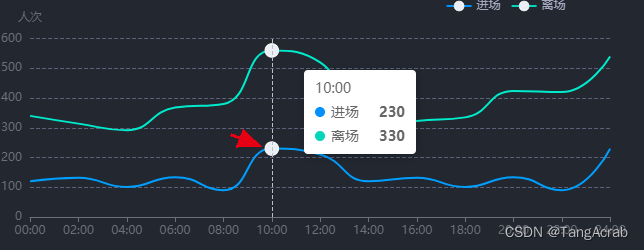
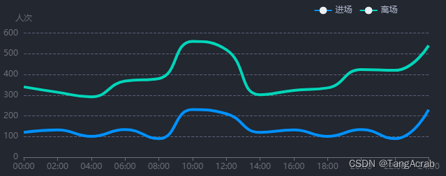
9、自定义提示框内容
tooltip// 提示框 tooltip: { trigger: 'axis', // 提示框内文字样式设置 textStyle: { color: systemTheme === 'light' ? '#1F2429' : '#EBEEF5', fontSize: 16 }, padding: [12, 22, 12, 15], // 提示框内边距 [上,右,下,左] backgroundColor: systemTheme === 'light' ? '#ffffff' : '#222730', borderColor: systemTheme === 'light' ? '#ffffff' : '#404759', // 提示框边框颜色 borderWidth: 1, // 提示框边框宽度 formatter: params => { const { seriesName, value } = params[0] const { seriesName: seriesNameNext, value: valueNext } = params[1] return `` }, // 提示框坐标轴指示器样式 axisPointer: { lineStyle: { color: systemTheme === 'light' ? '#1F2429' : '#EBEEF5', // 指示器线条颜色 type: 'solid' // 线条类型 } } },${seriesName}人数:${value} 人
${seriesNameNext}人数:${valueNext} 人
- 1
- 2
- 3
- 4
- 5
- 6
- 7
- 8
- 9
- 10
- 11
- 12
- 13
- 14
- 15
- 16
- 17
- 18
- 19
- 20
- 21
- 22
- 23
- 24
- 25
- 26
- 27
- 28
组件内设置自定义提示框样式:


10、修改 x 轴刻度标签宽度,和超出宽度展示样式…
xAxis中设置
axisLabel

// 刻度标签设置 axisLabel: { interval: 0, // 强制显示所有刻度标签 width: 70, // 刻度标签宽度 overflow: 'truncate', // 超出宽度展示... color: systemTheme === 'light' ? '#646C73' : '#A5AAC0', // 文字颜色 fontsize: 12 }- 1
- 2
- 3
- 4
- 5
- 6
- 7
- 8
11、设置出现横向滚动条
dataZoom, 并优化滚动条样式
一般页面中 只需要存在 drag 手柄实现左右拖拽。

dataZoom: [ { show: true, type: 'slider', // 单独滚动条 filterMode: 'none', // 不过滤数据 - 保证 y 轴数据范围不变 brushSelect: true, bottom: 0, height: 10, backgroundColor: 'transparent', // 选中范围的填充颜色 fillerColor: 'transparent', borderWidth: 0, borderColor: 'transparent', dataBackground: { lineStyle: { color: 'transparent' }, areaStyle: { color: 'transparent' } }, selectedDataBackground: { lineStyle: { color: 'transparent' }, areaStyle: { color: 'transparent' } }, startValue: 0, endValue: 18, xAxisIndex: [0], showDetail: false, handleSize: '0%', // 移动手柄尺寸高度 // 测试发现手柄颜色和边框颜色会出现 偏差,所有设置手柄高度为0, 添加边框高度。由边框撑起高度 moveHandleSize: 0, // 设置拖动手柄高度为0,只由边框负责高度展示 // 不展示拖动手柄图标 moveHandleIcon: 'none', moveHandleStyle: { borderColor: systemTheme === 'light' ? '#E4E6E7' : '#5d6177', borderWidth: 10, // 设置边框高度 borderType: 'solid', borderCap: 'round', // 保证拖动手柄右边框结尾有圆角 borderJoin: 'round' }, // 拖动高亮时设置 emphasis: { moveHandleStyle: { borderColor: systemTheme === 'light' ? '#E4E6E7' : '#5d6177', borderWidth: 10, borderType: 'solid', borderCap: 'round' } } } // 添加鼠标滚轮控制左右滑动 // { // type: 'inside', // zoomOnMouseWheel: false, // 滚轮是否触发缩放 // moveOnMouseMove: true, // 鼠标滚轮触发滚动 // moveOnMouseWheel: true // } ]- 1
- 2
- 3
- 4
- 5
- 6
- 7
- 8
- 9
- 10
- 11
- 12
- 13
- 14
- 15
- 16
- 17
- 18
- 19
- 20
- 21
- 22
- 23
- 24
- 25
- 26
- 27
- 28
- 29
- 30
- 31
- 32
- 33
- 34
- 35
- 36
- 37
- 38
- 39
- 40
- 41
- 42
- 43
- 44
- 45
- 46
- 47
- 48
- 49
- 50
- 51
- 52
- 53
- 54
- 55
- 56
- 57
- 58
- 59
- 60
- 61
- 62
- 63
- 64
- 65
- 66
- 67
12、多 y 轴时,强制设置 多 y 值 映射到 坐标系的刻度线对齐
alignTicks

13、设置 坐标轴 标签 溢出
...显示,并鼠标hover 上去展示 tip 全称提示效果:

a、先设置坐标轴标签可以响应鼠标事件、 添加tiggerEvent: true

b、自定义函数
mouseover 事件回调的 params 参数里,拥有需要的标签名称数据/** * @description hover 上去 echarts 轴标签名称,显示全轴刻度标签名称 * @param {*} myChart echarts 实例 * @param {string} axis 对应哪条轴线的坐标标签内容超出展示 * @param {number} chartWidth 图表容器宽度 */ export const extension = (myChart, axis = 'xAxis', chartWidth = 794, onlyChart = true) => { // 注意这里,是以X轴显示内容过长为例,如果是y轴的话,需要把params.componentType == 'xAxis'改为yAxis // 判断是否创建过div框,如果创建过就不再创建了 // 该div用来盛放文本显示内容的,方便对其悬浮位置进行处理 const elementDiv = document.getElementById('extension') if (!elementDiv) { // 添加展示容器 const div = document.createElement('div') div.setAttribute('id', 'extension') div.style.display = 'block' document.querySelector('html').appendChild(div) } myChart.on('mouseover', function (params) { if (params.componentType === axis) { const elementBox = document.querySelector('#extension'), // 设置悬浮文本的位置以及样式 elementStyle = 'position: absolute;z-index: 9999;color: #EBEEF5;font-size: 16px;padding: 8px 12px;display: inline;border-radius: 4px;border: 1px solid #404759;background-color: #222730;box-shadow: 0px 2px 10px rgba(0, 0, 0, 0.3), 0px 0px 0px 1px #404759;max-width:380px;min-width:85px;' elementBox.style.cssText = elementStyle elementBox.innerHTML = params.value document.querySelector('html').onmousemove = function (event) { const elementDom = document.querySelector('#extension') let xx = event.pageX - 10 const yy = event.pageY - 50 const { width } = elementDom.getBoundingClientRect() const setWidth = event.screenX // 防止超出图表容器宽度 if (!onlyChart) { // 页面还有其他 图表外的 dom 时, 判断基于屏幕位置 if (setWidth + width > document.body.clientWidth) { xx = document.body.clientWidth - width - 5 } } else { if (event.pageX + width > chartWidth) { xx = chartWidth - width - 5 } } elementDom.style.top = yy + 'px' elementDom.style.left = xx + 'px' } } }) // 鼠标移出隐藏 myChart.on('mouseout', function (params) { // 注意这里,我是以X轴显示内容过长为例,如果是y轴的话,需要改为yAxis if (params.componentType === axis) { const tipsDom = document.querySelector('#extension') tipsDom.style.cssText = 'display:none' } }) }- 1
- 2
- 3
- 4
- 5
- 6
- 7
- 8
- 9
- 10
- 11
- 12
- 13
- 14
- 15
- 16
- 17
- 18
- 19
- 20
- 21
- 22
- 23
- 24
- 25
- 26
- 27
- 28
- 29
- 30
- 31
- 32
- 33
- 34
- 35
- 36
- 37
- 38
- 39
- 40
- 41
- 42
- 43
- 44
- 45
- 46
- 47
- 48
- 49
- 50
- 51
- 52
- 53
- 54
- 55
- 56
- 57
- 58
c、图表初始化完成之后 注册事件。

14、横坐标标签按指定间隔展示
axisLabel// 刻度标签设置 axisLabel: { color: systemTheme === 'light' ? '#646C73' : '#A5AAC0', // 文字颜色 fontsize: 14, margin: 12, // 刻度标签与轴线之间的距离 // 指定 %4 === 0 的进行展示 interval: function (index, value) { if (index % 4 === 0) { return true } return false },- 1
- 2
- 3
- 4
- 5
- 6
- 7
- 8
- 9
- 10
- 11
- 12
-
相关阅读:
班级网站的设计与实现
跨越单线程限制:Thread类的魅力,引领你进入Java并发编程的新纪元
如何从 Ubuntu 卸载 Redis
一图读懂账号安全的防护实践
N32G45之串口+DMA数据收发
为什么说企业需要MES系统? MES系统的作用和意义是什么?
winsw 注册的java服务jps process information unavailable
Springboot毕设项目马寨工业园区招商管理系统e0539(java+VUE+Mybatis+Maven+Mysql)
JavaScript—获取当前时间 并转化为yyyy-MM-dd hh:mm:ss格式
Springboot垃圾识别工具箱0g1f8计算机毕业设计-课程设计-期末作业-毕设程序代做
- 原文地址:https://blog.csdn.net/weixin_39786582/article/details/127648732
