-
Flutter布局组件:水平/垂直组件、叠加布局组件、流式布局组件
前言
参考:老孟 Flutter教程
水平/垂直组件
Row 是将子组件以水平方式布局的组件, Column 是将子组件以垂直方式布局的组件。项目中 90% 的页面布局都可以通过 Row 和 Column 来实现。
将3个组件水平排列
Row( children: [ Container( width: 100, height: 60, color: Colors.red, ), Container( width: 100, height: 60, color: Colors.green, ), Container( width: 100, height: 60, color: Colors.blue, ) ], );- 1
- 2
- 3
- 4
- 5
- 6
- 7
- 8
- 9
- 10
- 11
- 12
- 13
- 14
- 15
- 16
- 17
- 18
- 19

将3个组件垂直排列Column( children: [ Container( width: 100, height: 60, color: Colors.red, ), Container( width: 100, height: 60, color: Colors.green, ), Container( width: 100, height: 60, color: Colors.blue, ) ], );- 1
- 2
- 3
- 4
- 5
- 6
- 7
- 8
- 9
- 10
- 11
- 12
- 13
- 14
- 15
- 16
- 17
- 18
- 19
主轴与交叉轴
在 Row 和 Column 中有一个非常重要的概念:主轴( MainAxis ) 和 交叉轴( CrossAxis ),主轴就是与组件布局方向一致的轴,交叉轴就是与主轴方向垂直的轴。
具体到 Row 组件,主轴 是水平方向,交叉轴 是垂直方向。而 Column 与 Row 正好相反,主轴 是垂直方向,交叉轴 是水平方向。
主轴尺寸
mainAxisSize 表示主轴尺寸,有 min 和 max 两种方式。默认是最大值,继承父元素的尺寸;最小值是包裹自身
主轴对齐与文本对齐的区别
mainAxisAlignment: MainAxisAlignment.end,- 1

textDirection: TextDirection.rtl,- 1

主轴的靠右对齐是整体靠右对齐,元素的顺序还是从做往右;文本的顺序会改变元素的顺序。叠加布局组件
Stack
Stack 组件将子组件叠加显示,根据子组件的顺序依次向上叠加
Stack( children: [ Container( width: 200, height: 200, color: Colors.red, ), Container( width: 100, height: 100, color: Colors.blue, ), ], );- 1
- 2
- 3
- 4
- 5
- 6
- 7
- 8
- 9
- 10
- 11
- 12
- 13
- 14

未定位组件- 大小
Stack 对未定位(不被 Positioned 包裹)子组件的大小由 fit 参数决定,默认值是 StackFit.loose ,表示子组件自己决定,StackFit.expand 表示尽可能的大
fit:StackFit.expand,- 1
设置完上面的属性后,最上面的组件会尽可能的大(充满父元素,自身的宽高将不会生效)
- 对齐方式
Stack 对未定位(不被 Positioned 包裹)子组件的对齐方式由 alignment 控制,默认左上角对齐
alignment: AlignmentDirectional.center,- 1

定位组件
Stack( children: [ Container( width: 200, height: 200, color: Colors.red, ), Positioned( top: 20, left: 20, child: Container( width: 100, height: 100, color: Colors.blue, ), ) ], );- 1
- 2
- 3
- 4
- 5
- 6
- 7
- 8
- 9
- 10
- 11
- 12
- 13
- 14
- 15
- 16
- 17
- 18

IndexedStack
IndexedStack 通过 index 只显示指定索引的子组件
class _YcHomeBodyState extends State<YcHomeBody> { int _index = 0; @override Widget build(BuildContext context) { return Column( children: [ _buildIndexedStack(), _buildRow(), ], ); } _buildIndexedStack() { return IndexedStack( index: _index, children: <Widget>[ Center( child: Container( height: 300, width: 300, color: Colors.red, alignment: Alignment.center, child: const Icon( Icons.fastfood, size: 60, color: Colors.blue, ), ), ), Center( child: Container( height: 300, width: 300, color: Colors.green, alignment: Alignment.center, child: const Icon( Icons.cake, size: 60, color: Colors.blue, ), ), ) ], ); } _buildRow() { return Row( mainAxisAlignment: MainAxisAlignment.center, children: <Widget>[ IconButton( icon: const Icon(Icons.fastfood), onPressed: () { setState(() { _index = 0; }); }, ), IconButton( icon: const Icon(Icons.cake), onPressed: () { setState(() { _index = 1; }); }, ) ], ); } }- 1
- 2
- 3
- 4
- 5
- 6
- 7
- 8
- 9
- 10
- 11
- 12
- 13
- 14
- 15
- 16
- 17
- 18
- 19
- 20
- 21
- 22
- 23
- 24
- 25
- 26
- 27
- 28
- 29
- 30
- 31
- 32
- 33
- 34
- 35
- 36
- 37
- 38
- 39
- 40
- 41
- 42
- 43
- 44
- 45
- 46
- 47
- 48
- 49
- 50
- 51
- 52
- 53
- 54
- 55
- 56
- 57
- 58
- 59
- 60
- 61
- 62
- 63
- 64
- 65
- 66
- 67
- 68
- 69
- 70
- 71
核心是通过两个返回组件的函数来决定最终渲染什么组件。

流式布局组件
Wrap 为子组件进行水平或者垂直方向布局,且当空间用完时,Wrap 会自动换行,也就是流式布局。
Wrap( children: List.generate(10, (index) { double w = 50.0 + 10.0 * index; return Container( width: w, height: 50, color: Colors.primaries[index], child: Text('$index'), ); }), ); }- 1
- 2
- 3
- 4
- 5
- 6
- 7
- 8
- 9
- 10
- 11
- 12
direction
direction 属性控制布局方向,默认为水平方向direction:Axis.vertical ,- 1

alignment 和 crossAxisAlignmentalignment 属性控制主轴对齐方式,crossAxisAlignment 属性控制交叉轴对齐方式,对齐方式只对有剩余空间的行或者列起作用
这个与flex弹性布局基本是一致的spacing 和 runSpacing
spacing 是主轴方向上的间隔,runSpacing是交叉轴上的间隔spacing: 10, runSpacing: 50,- 1
- 2

textDirection
文本对齐方式,前面说了,这里不提了verticalDirection
属性表示 Wrap 交叉轴方向上子组件的方向,取值范围是 up(向上) 和 down(向下)- up:可以理解为从上往下落,先落下的在最下面
verticalDirection:VerticalDirection.up,- 1

- down:可以理解为从下往上出,先出来的在上面
verticalDirection:VerticalDirection.down,- 1

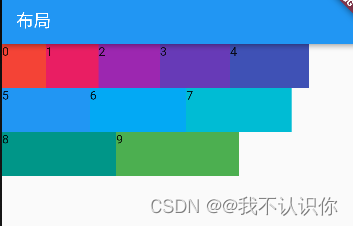
案例
从布局图可以看出整体上是一列,一列有多行。每一行的内容基本一致,分别是图标、标题、后置,因此可以封装成一个单独的组件。消息中心的后置和其他行的内容不一样,内容可以单独拆成一个组件。文章中的这个案例还是很重要并且基础的,讲解了组件的拆分、组合。
行组件
// 行组件,只是展示不需要状态 class _MyItem extends StatelessWidget { final IconData iconData; //图标 final Color iconColor; //图标颜色 final String title; //标题 final Widget suffix; //后缀 //类的构造函数 const _MyItem( {required Key key, //每一个组件的key,标识唯一 required this.iconData, required this.iconColor, required this.title, required this.suffix}) : super(key: key); @override Widget build(BuildContext context) { // Row组件没有宽度,外层套一个SizedBox return SizedBox( height: 45, child: Row( children: [ //用来占位,充当padding const SizedBox(width: 40,), //图标 Icon(iconData,color: iconColor), const SizedBox(width: 30,), //标题,Expanded自动填充剩余空间 Expanded(child: Text(title)), const SizedBox(width: 10,), //后缀 suffix, const SizedBox(width: 15,), ], ), ); } }- 1
- 2
- 3
- 4
- 5
- 6
- 7
- 8
- 9
- 10
- 11
- 12
- 13
- 14
- 15
- 16
- 17
- 18
- 19
- 20
- 21
- 22
- 23
- 24
- 25
- 26
- 27
- 28
- 29
- 30
- 31
- 32
- 33
- 34
- 35
- 36
- 37
- 38
- 39
后缀
后缀可以分成带红色背景的组件和灰色字体的组件
- 红色背景组件
//红色字体组件 class _NotificationsText extends StatelessWidget { //文字 final String text; const _NotificationsText(this.text, {Key? key}) : super(key: key); @override Widget build(BuildContext context) { return Container( padding: const EdgeInsets.symmetric(horizontal: 10), //装饰,盒子装饰 decoration: const BoxDecoration( shape: BoxShape.rectangle, //外形是矩形 borderRadius: BorderRadius.all( Radius.circular(10), ), color: Colors.red), //文本 child: Text(text,style: const TextStyle(color: Colors.white),), ); } }- 1
- 2
- 3
- 4
- 5
- 6
- 7
- 8
- 9
- 10
- 11
- 12
- 13
- 14
- 15
- 16
- 17
- 18
- 19
- 20
- 21
- 22
- 灰色字体组件
//灰色字体组件 class _Suffix extends StatelessWidget{ final String text; const _Suffix(this.text,{Key?key}) :super(key:key); @override Widget build(BuildContext context) { return Text(text,style: TextStyle(color: Colors.grey.withOpacity(.5)),) } }- 1
- 2
- 3
- 4
- 5
- 6
- 7
- 8
- 9
组装
return Column( children: const [ _MyItem( iconData: Icons.notifications, iconColor: Colors.blue, title: '消息中心', suffix: _NotificationsText('2'), ), _MyItem( iconData: Icons.thumb_up, iconColor: Colors.green, title: '我赞过的', suffix: _Suffix('121篇',), ) ], ); }- 1
- 2
- 3
- 4
- 5
- 6
- 7
- 8
- 9
- 10
- 11
- 12
- 13
- 14
- 15
- 16
- 17
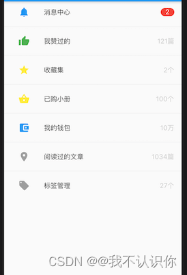
效果

左侧是原图,右侧是成果图 -
相关阅读:
Vivado综合属性系列之十一 GATED_CLOCK
040_小驰私房菜_MTK平台,添加camera客制化size
重磅推荐 | 朱嘉明:元宇宙——创意、思想、意识协作的下一代网络
解决web项目导入到idea后,文件的蓝色小点消失了(web文件资源根路径)
nodejs格式化输入
2.12 IC类元器件的封装应该怎么创建?
python学习—第一步—聪明方法学python
Android动态权限详解
一、C#—概述环境安装(1)
phoenix的安装与使用(Hbase的客户端)
- 原文地址:https://blog.csdn.net/weixin_41897680/article/details/127378653
